Histograms are indispensable tool for statistical analysis and data representation. This comprehensive guide demystifies histograms, making them accessible to educators aiming to bring clarity and engagement to mathematics teaching. Through practical examples, it breaks down how histograms organize and display data distributions over intervals, offering insights into patterns, spread, and central tendencies. Ideal for classroom instruction, this guide empowers teachers to facilitate students’ understanding of data in a visually compelling and easy-to-grasp manner.
What are Histograms – Definition
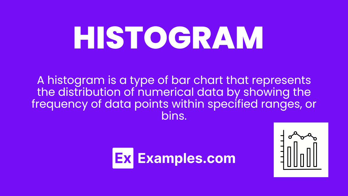
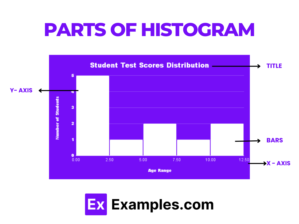
A histogram is a type of bar chart that represents the distribution of numerical data by showing the frequency of data points within specified ranges, or bins. Unlike bar charts for categorical data, histograms are used for continuous data, where each bar represents an interval of values and the height signifies the frequency or count of data points within that interval.
What is the Best Example of Histogram?

Distribution of Test Scores
One of the most illustrative examples of a histogram is the distribution of test scores for a class. By grouping scores into intervals (e.g., 0-59, 60-69, 70-79, 80-89, 90-100), the histogram visually displays how many students fall into each score range, providing insights into the overall performance, such as the majority’s score range, and whether the scores are skewed towards high or low ends. This visualization helps educators identify trends, assess class performance, and tailor their teaching strategies to address students’ needs effectively.
Histogram Graph
A histogram graph is a powerful visualization tool that displays the frequency distribution of numerical data. It’s essential for analyzing patterns, identifying skewness, and understanding the spread within datasets. By grouping data into bins or intervals, histograms offer a clear picture of distribution density and variation, making them invaluable for statistical analysis across fields such as economics, psychology, and environmental science.
Examples
1. Age Distribution in a Population:
Shows the number of individuals within specific age ranges in a community.
Explanation: Helps in planning for age-specific services or programs.
Make a Copy in Google Sheets2. Daily Rainfall Over a Month:
Illustrates the frequency of different rainfall amounts recorded daily.
Explanation: Useful for understanding climate patterns and water resource management.
3. Customer Wait Times:
Depicts how long customers wait before being served at a service center.
Explanation: Can indicate efficiency of service and help improve operations.
4. Grades Distribution in a Class:
Displays the spread of grades among students in a particular subject.
Explanation: Assists educators in evaluating class performance and curriculum effectiveness.
5. Product Prices Across Stores:
Shows the variation in prices of a specific product sold at different stores.
Explanation: Offers insights into market competition and consumer choices.
How to Make a Histogram?
Creating a histogram involves several steps to accurately represent the distribution of a dataset. This process is crucial for data analysis, allowing for a deeper understanding of the dataset’s characteristics. Histograms are particularly useful for revealing the underlying frequency distribution of data sets, helping analysts, students, and professionals to make informed decisions based on the visual patterns observed.
Steps
1. Collect Data:
Gather numerical data that you want to analyze.
Explanation: Ensures a relevant and robust dataset for analysis.
2. Determine Bins:
Divide the entire range of values into a series of intervals.
Explanation: Bins group the data points into manageable numbers of intervals.
3. Count Frequency:
Tally how many data points fall into each bin.
Explanation: Determines the height of each bar in the histogram.
4. Draw the Graph:
Plot the bins on the x-axis and frequencies on the y-axis, then draw bars for each bin.
Explanation: Visualizes the data distribution clearly and effectively.
5. Analyze:
Interpret the histogram to understand data trends and patterns.
Explanation: Offers insights into the dataset’s distribution, central tendency, and spread.
By following these steps, one can create a histogram that effectively communicates the distribution characteristics of a dataset, facilitating both descriptive analysis and inferential statistics.
Frequency Histogram
A frequency histogram is a graphical representation that displays the frequency of data points within specified ranges or bins. It’s an essential tool for analyzing and understanding the distribution of data sets in statistics and mathematics. By visually breaking down the data into intervals, frequency histograms offer insights into patterns, spread, and central tendencies of the data, making complex data sets comprehensible and accessible for both educators and students. This type of histogram is particularly useful in identifying skewness, outliers, and the modality of the data.
Examples
1. Daily Temperatures:
Tracks the frequency of daily temperature ranges over a month, helping to visualize weather patterns.
Explanation: This histogram can show how often temperatures fell into each range, highlighting the most common temperature intervals.
2. Student Test Scores:
Represents the number of students scoring within specified score intervals in a test.
Explanation: Enables educators to quickly assess class performance and identify clusters of high, medium, or low scores.
3. Height Distribution in a Population:
Shows how individuals’ heights are distributed across various height intervals within a group.
Explanation: Useful in biostatistics for observing standard variations in human height.
4. Website Traffic by Hour:
Displays the frequency of website visits at different hours of the day.
Explanation: Helps webmasters understand peak traffic times to optimize content delivery.
5. Book Sales by Price Range:
Illustrates how many books are sold within certain price ranges.
Explanation: Publishers can identify the most popular price points for books.
Types of Histograms
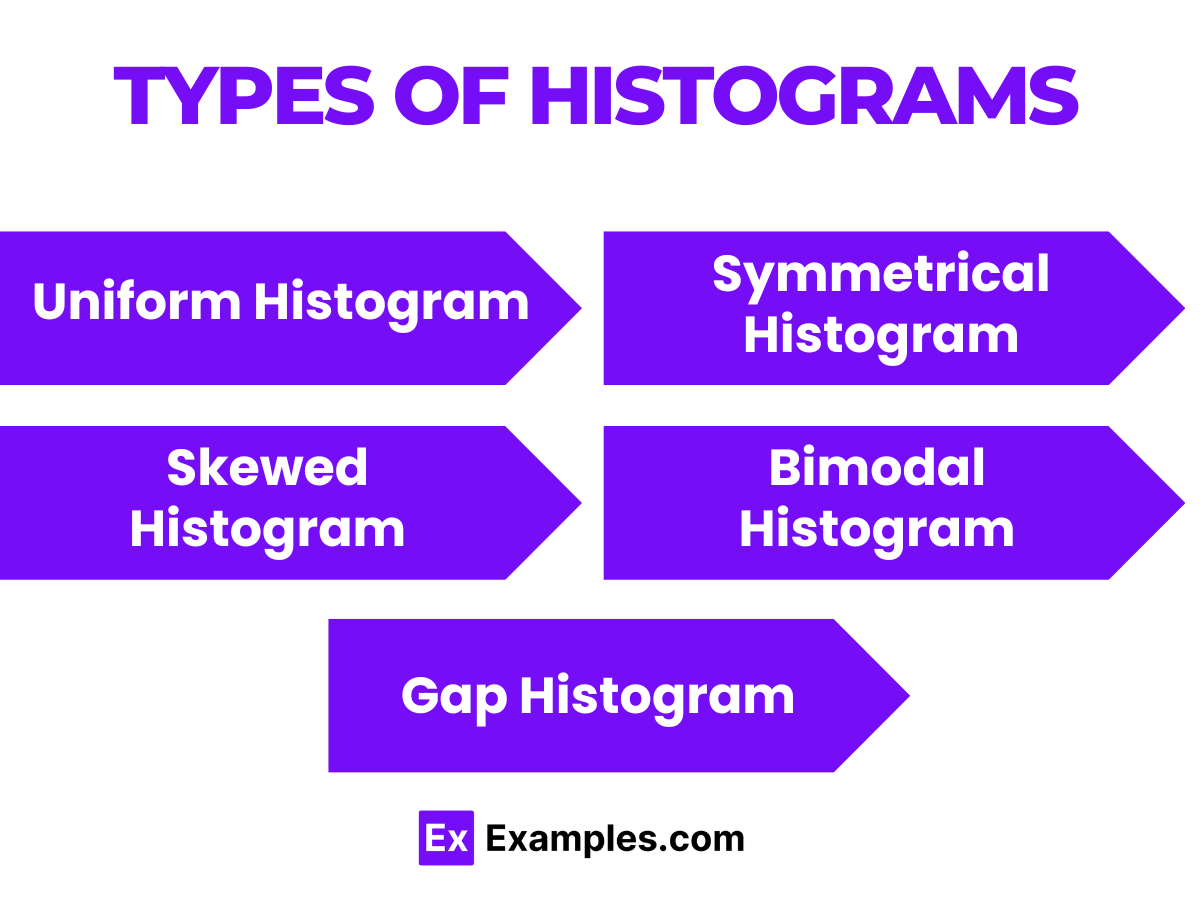
Histograms can be categorized based on how they display data distributions, each type offering unique insights into the data set. Understanding these variations is crucial for accurately interpreting and communicating statistical information.
Examples
1. Uniform Histogram:
Every bin has a similar frequency, indicating a uniform distribution of data across intervals.
Explanation: Suggests that all outcomes in the dataset are equally likely, common in manufactured products’ dimensions.
2. Symmetrical Histogram:
The histogram looks the same on both sides of a central value.
Explanation: Often indicates that the data is normally distributed, which is vital in many statistical analyses.
3. Skewed Histogram:
Data points are clustered towards one end of the histogram, showing skewness to the left or right.
Explanation: Helps in understanding the direction and intensity of skewness in data distribution.
4. Bimodal Histogram:
Features two distinct peaks, suggesting two dominant groups within the dataset.
Explanation: Useful for identifying the presence of two different populations or preferences in the sampled data.
5. Gap Histogram:
Displays clear gaps or empty bins within the data range, indicating discontinuities.
Explanation: Can highlight missing data ranges or separate clusters of data, useful in quality control and market segmentation.
Each type of histogram sheds light on different aspects of the data, from its central tendency to variability, skewness, and modality. Selecting the appropriate histogram type allows for more effective data analysis and decision-making.
Difference Between a Bar Chart and a Histogram
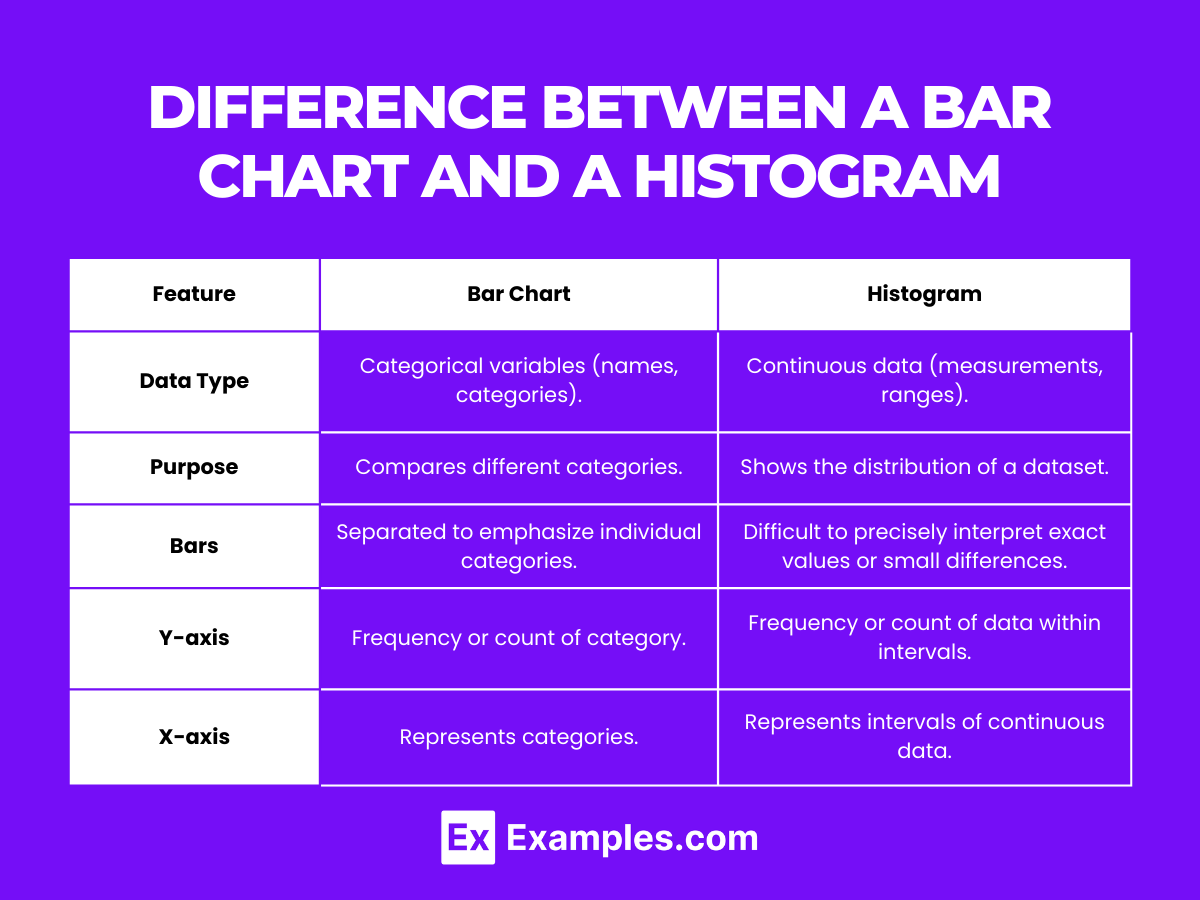
| Feature | Bar Chart | Histogram |
|---|---|---|
| Data Type | Categorical variables (names, categories). | Continuous data (measurements, ranges). |
| Purpose | Compares different categories. | Shows the distribution of a dataset. |
| Bars | Separated to emphasize individual categories. | Touching to indicate the continuity of data. |
| Orientation | Bars can be vertical or horizontal. | Typically vertical, representing frequency of data intervals. |
| X-axis | Represents categories. | Represents intervals of continuous data. |
| Y-axis | Frequency or count of category. | Frequency or count of data within intervals. |
Bar charts and histograms serve distinct purposes in data visualization, with bar charts comparing individual categories and histograms showing the distribution of continuous data.
Histogram Examples in Real Life
1. Age Distribution in a Population
Shows the number of individuals within various age groups.
Helps in planning for community services and understanding demographic trends.
2. Daily Temperature Variations
Displays frequency of days falling into temperature ranges over a month.
Useful for climatological studies and understanding weather patterns.
3. Income Distribution
Visualizes the number of households within different income brackets.
Provides insights into economic status and wealth distribution in a region.
4. Grain Size Distribution in Soils
Illustrates the proportion of different grain sizes in a soil sample.
Crucial for geological surveys and agricultural planning.
5. Traffic Flow During Different Times of Day
Represents the number of vehicles passing a point during time intervals.
Aids in urban planning and the management of traffic flow.
Histogram Examples for Students
1. Test Scores Distribution
Displays how many students scored within certain score ranges.
Helps teachers identify overall class performance and areas needing improvement.
2. Number of Books Read by Students Over Summer
Shows the distribution of the number of books read by students.
Encourages reading and allows comparison of reading habits.
3. Daily Study Hours
Visualizes how many hours students dedicate to studying each day.
Promotes time management and study habit discussions among students.
4. Height Distribution in a Class
Depicts the range of student heights.
Can be used in biology classes to discuss human growth patterns.
5. Frequency of Using Digital Devices
Shows how often students use devices like tablets and smartphones.
Useful for discussions on digital literacy and health implications of screen time.
What is a Histogram in Statistics?
A histogram is a graphical representation showing the distribution of numerical data through bars, where each bar represents the frequency of data in specific intervals.
What is a Histogram Used For?
Histograms are used to visualize the distribution patterns of numerical data, making it easier to identify trends, peaks, and outliers within a dataset.
What is a Histogram Graph?
A histogram graph displays continuous data by dividing it into intervals, using bars to show the frequency or count of data points within each interval.
What is a Relative Frequency Histogram?
A relative frequency histogram represents the proportion or percentage of data points within each interval relative to the total dataset, highlighting distribution patterns.
How are Histograms Used Around?
Histograms are widely used in various fields, including statistics, business, science, and education, to analyze and interpret continuous data distributions.
How Does a Histogram Represent Data?
A histogram represents data by grouping numbers into ranges and showing these ranges with bars, indicating how many data points fall into each range.
In summary, histograms are a powerful tool for visualizing and understanding the distribution of numerical data. They offer clear insights into data trends and patterns, making them indispensable in both educational and professional settings. By effectively representing continuous data, histograms facilitate data analysis, enhancing students’ and teachers’ ability to interpret and communicate statistical information.