Scatter Plot – Examples, Types, Analysis, Differences

Scatter Plot – Examples, Types, Analysis, Differences
Scatter Plots a pivotal tool in data visualization and analysis. This detailed guide demystifies scatter plots, making them accessible and engaging for both educators and students. By showcasing practical examples, we illuminate how scatter plots reveal relationships, trends, and outliers in data sets, enhancing statistical understanding. Ideal for classroom instruction, this resource empowers teachers to guide students in uncovering the stories behind the data, fostering analytical skills through visual exploration.
What are Scatter Plots – Definition
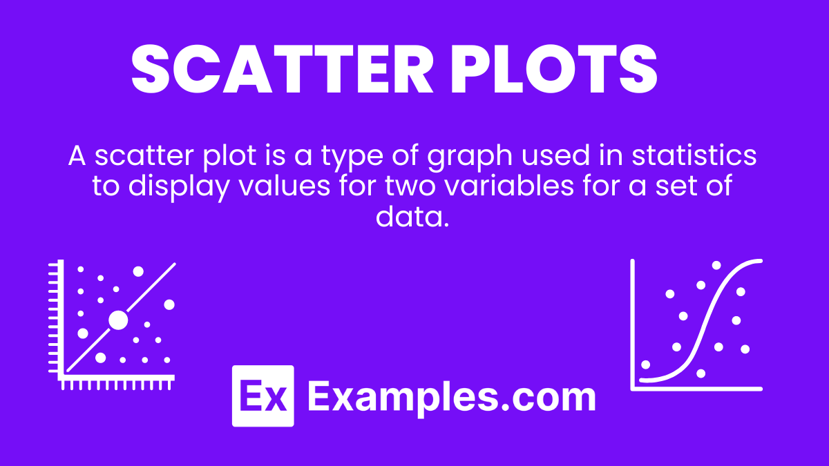
A scatter plot is a type of graph used in statistics to display values for two variables for a set of data. The data is presented as a collection of points, each having the value of one variable determining the position on the horizontal axis and the value of the other variable determining the position on the vertical axis. Scatter plots are instrumental in identifying the type of relationship, if any, between two variables.
What is the Best Example of Scatter Plots?

Correlation Between Study Time and Exam Scores
One of the most illustrative examples of scatter plots is examining the relationship between the amount of time spent studying and the scores on an exam. By plotting study hours on the x-axis and exam scores on the y-axis, each point represents a student’s performance. This visualization can reveal patterns such as positive correlation (higher study hours correlating with higher scores), aiding educators in emphasizing the importance of study habits. It serves as a practical application of scatter plots in educational settings, helping students grasp the impact of preparation on outcomes.
Scatter Plots Examples
Scatter plots vividly illustrate relationships and trends between two variables, making them indispensable in data analysis across various fields. By mapping out individual data points on a graph, scatter plots provide insights into the correlation and distribution patterns, enhancing understanding and decision-making.
Examples
1. Height vs. Weight Distribution
Plots individuals’ heights against their weights to study the correlation between physical attributes.
Explanation: Helps identify trends in body metrics, useful in health and fitness studies.
2. Economic Growth vs. Environmental Impact
Compares GDP growth rates of countries to their carbon emissions.
Explanation: Reveals the relationship between economic development and environmental sustainability.
3. Advertising Spend vs. Sales Revenue
Displays a company’s advertising expenditure against sales outcomes over time.
Explanation: Aids in evaluating the effectiveness of marketing strategies.
4. Temperature vs. Ice Cream Sales
Shows the relationship between daily temperatures and ice cream sales.
Explanation: Typically demonstrates a positive correlation, useful for seasonal business planning.
5. Age vs. Technology Adoption Rate
Compares different age groups against their rates of adopting new technology.
Explanation: Provides insights into demographic preferences and technology usage patterns.
Scatter Plots in Statistics
In statistics, scatter plots are a foundational tool for visualizing and analyzing the strength, direction, and form of relationships between two quantitative variables. They facilitate hypothesis testing and model development by laying out data in an interpretable format.
Examples
1. Correlation Coefficient Analysis
Uses scatter plots to visually assess the correlation between variables before calculating Pearson’s or Spearman’s coefficients.
Explanation: Supports the preliminary evaluation of linear or non-linear relationships.
2. Regression Analysis
Scatter plots depict the data points and the regression line to predict values.
Explanation: Essential for understanding and building predictive models.
3. Outlier Detection
Identifies outliers that deviate significantly from the overall pattern.
Explanation: Critical for data cleaning and ensuring analysis accuracy.
4. Homoscedasticity Assessment
Evaluates the consistency of variance across the data range.
Explanation: Important for validating regression assumptions.
5. Time Series Analysis
Compares time-dependent variables to discover trends and cyclic patterns.
Explanation: Facilitates forecasting and understanding temporal dynamics.
Scatter Plots in Research
Scatter plots are widely used in research to explore and present the relationships between variables, allowing for intuitive understanding and discovery of underlying patterns or anomalies in datasets.
Examples
1. Clinical Trials
Analyzes the dosage of a drug against the magnitude of its effect.
Explanation: Assists in determining optimal dosages for therapeutic efficacy.
2. Ecological Studies
Compares biodiversity measures against environmental gradients.
Explanation: Helps understand how species distribution is influenced by environmental factors.
3. Sociological Research
Studies the relationship between educational attainment and income level.
Explanation: Explores social factors affecting economic status.
4. Psychological Research
Examines the impact of stress levels on cognitive performance.
Explanation: Aids in understanding how psychological factors influence mental functions.
5. Market Research
Maps consumer satisfaction ratings against brand loyalty metrics.
Explanation: Provides insights into consumer behavior and brand performance.
When You Should Use a Scatter Plot
Scatter plots are ideal when analyzing and visualizing the relationship between two continuous variables. They help in identifying trends, patterns, correlations, or potential outliers within datasets. Use a scatter plot to explore cause-and-effect relationships, test hypotheses, or find areas for further research, making them invaluable in fields ranging from education to scientific studies and business analytics.
Examples
1. Health Studies: Examining the correlation between exercise frequency and cholesterol levels.
Explanation: Helps in understanding if increased physical activity influences heart health.
2. Economic Analysis: Visualizing the relationship between income level and expenditure on luxury goods.
Explanation: Identifies spending habits across different income brackets.
3. Agricultural Research: Analyzing the impact of rainfall on crop yield.
Explanation: Determines how weather conditions affect agricultural production.
4. Educational Performance: Relating study hours to academic achievement.
Explanation: Highlights the importance of dedication and time management in student success.
5. Market Trends: Observing sales volume against advertising spend.
Explanation: Assesses the effectiveness of marketing strategies on sales performance.
Interpreting a Scatter Plot
Interpreting a scatter plot involves analyzing the spread, direction, and form of data points to identify the nature of the relationship between two variables. Look for patterns such as linearity, clusters, or outliers that can indicate correlations, dependencies, or unique data behaviors, offering insights into underlying trends and potential causal relationships.
Examples
1. Positive Correlation: Data points slope upward from left to right.
Explanation: Indicates that as one variable increases, the other also increases.
2. Negative Correlation: Data points slope downward.
Explanation: Shows that as one variable increases, the other decreases.
3. No Correlation: Data points are scattered without a clear pattern.
Explanation: Suggests no apparent relationship between the variables.
Outliers: Points that fall far from the main data cluster.
4. Explanation: May indicate anomalies or errors in data collection.
Clusters: Groups of points that form distinct gatherings.
Explanation: Can reveal subgroups within the dataset with similar characteristics.
Types of Scatter Plot
Scatter plots can vary based on their purpose and the complexity of the data they represent. From simple two-variable plots to more advanced variations incorporating additional data dimensions, each type offers unique insights.
Examples
1. Simple Scatter Plot: Plots two variables.
Explanation: Basic form used to explore the relationship between two continuous variables.
2. Grouped Scatter Plot: Uses colors or symbols for different groups.
Explanation: Distinguishes between categories within the data, allowing for comparisons.
3. Bubble Scatter Plot: Incorporates a third variable represented by bubble size.
Explanation: Adds depth by showing volume, intensity, or importance of data points.
4. 3D Scatter Plot: Plots three variables in three-dimensional space.
Explanation: Offers a more complex view for analyzing relationships involving three continuous variables.
5. Time Series Scatter Plot: Highlights changes over time.
Explanation: Tracks the evolution of two variables, emphasizing temporal trends and patterns.
What is Scatter Plot Analysis?
Scatter plot analysis is a powerful statistical tool used to determine the relationship between two variables, showcasing patterns, trends, and correlations within a dataset. By visually representing individual data points on a graph, analysts can identify whether variables are positively or negatively correlated, spot outliers, and infer potential causal relationships. This method is invaluable in fields ranging from education to economics, enabling researchers to derive meaningful insights from raw data and make informed decisions.
Examples
1. Health Studies – Body Mass Index (BMI) vs. Exercise Frequency:
Analyzing BMI against exercise frequency can reveal if regular physical activity correlates with lower BMI.
Explanation: A negative correlation might be observed, indicating that higher exercise frequencies are associated with lower BMI values.
2. Economics – Household Income vs. Expenditure on Luxury Goods:
Investigating the relationship between income and luxury spending can highlight consumption patterns.
Explanation: A positive correlation is likely, showing that as income increases, expenditure on luxury goods does too.
3. Education – Class Attendance vs. Final Grades:
Comparing attendance records with final grades can uncover the impact of attendance on academic success.
Explanation: A positive correlation might be found, suggesting regular attendance contributes to higher grades.
4. Environmental Science – Air Quality Index vs. Respiratory Health Issues:
Examining air quality against the incidence of respiratory problems can indicate environmental impacts on health.
Explanation: A positive correlation may emerge, indicating poor air quality correlates with increased respiratory issues.
5. Technology – Internet Speed vs. User Satisfaction:
Assessing the relationship between internet speed and user satisfaction can reveal service effectiveness.
Explanation: Likely a positive correlation, indicating faster internet speeds lead to higher user satisfaction.
How Can You Differentiate Between a Positive and Negative Correlation on a Scatter Plot?
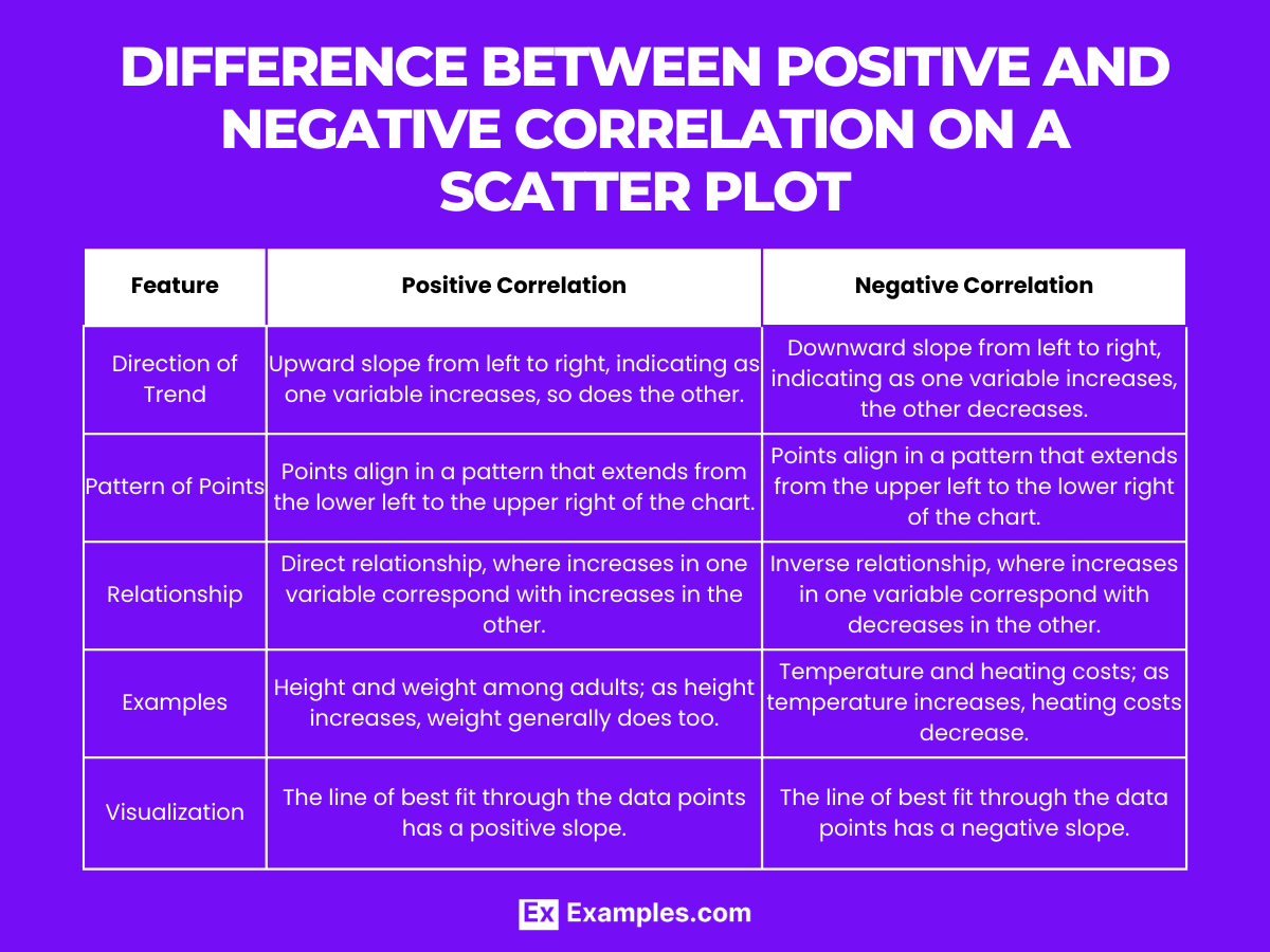
| Feature | Positive Correlation | Negative Correlation |
|---|---|---|
| Direction of Trend | Upward slope from left to right, indicating as one variable increases, so does the other. | Downward slope from left to right, indicating as one variable increases, the other decreases. |
| Pattern of Points | Points align in a pattern that extends from the lower left to the upper right of the chart. | Points align in a pattern that extends from the upper left to the lower right of the chart. |
| Relationship | Direct relationship, where increases in one variable correspond with increases in the other. | Inverse relationship, where increases in one variable correspond with decreases in the other. |
| Examples | Height and weight among adults; as height increases, weight generally does too. | Temperature and heating costs; as temperature increases, heating costs decrease. |
| Visualization | The line of best fit through the data points has a positive slope. | The line of best fit through the data points has a negative slope. |
Differentiating between positive and negative correlations in a scatter plot allows for a clear understanding of how two variables interact, providing valuable insights into the nature of their relationship.
In conclusion, scatter plots are essential tools for identifying and visualizing relationships between two variables. They offer a straightforward method to observe trends, patterns, and outliers within data sets. By providing a clear visual representation, scatter plots facilitate better understanding and analysis of data, making them invaluable in various fields such as statistics, economics, and the sciences.
Share :
