PageVis: Facebook Data Visualization Tool
Heng Somnang
#1
, Kor Sokchea
#2
#
Department of Information Technology Engineering, FE, Royal University of Phnom Penh
Phnom Penh, Cambodia
1
heng.somnang.2018@rupp.edu.kh
2
kor.sokchea@rupp.edu.kh
Abstract
— Facebook has become a major social media platform
that is growing exponentially because it is best for the connection
between
particular
people,
institutions,
businesses,
and
organizations as well as government and non-government. With
its popularity, many business owners ranging from small to big
businesses start to shift their promotion campaign from
traditional advertisement to Facebook advertising platform. In
order to create a successful advertising campaign or provide
personalized services, business owners need to understand their
target customer by analysing user’s data. Looking at raw data
directly, it is not convenient. It needs tools and techniques that can
turn data into graphic form. In this paper, we present a data
visualization tool called PageVis that convert data fetching from
Facebook through Facebook Graph API into wide variety of
graphical representations. With this representation, it can help
advertisers or business owners to understand their customer.
Keywords
—
Facebook, Data Visualization, Facebook Graph API,
PageVis, Visualization Tool
I.
I
NTRODUCTION
Facebook is a social media platform that is very popular in
the world and also in Cambodia. It has around 2.934 billion
monthly active users in July 2022 making it the most famous
social media in the world [10]. With a large number of active
users, various business owners has started to use social media
platforms like Facebook for the promotions campaign instead
of using traditional advertisement. The potential way to
produce a successful advertising campaign and personalized
service requirement, advertisers need to understand the user
preference by analysing the data of users through provided data
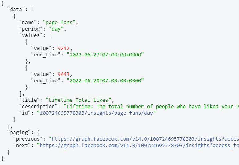
from Facebook Graph APIs. Facebook provides the graph API
that allows analysers to fetch those data for analysing their
target user. However, the data returning from Facebook Graph
API is the raw data which is inconvenient for human to
understand. Numeric representation is convenient for computer
to read but not for human. Therefore, numeric representation
needs to transform into graph representations by using
visualization techniques in order to allow advertisers to gain
insight into their target user.
In this paper, we will present a data visualization tool
called
PageVis
that enable users to visualize various data from
the Facebook page which aggregates structured and
unstructured data sources including the data of the Facebook
page insight, user data, and demographic data and converts
them to virtual viewing through a dashboard of the software.
With this tool, it gives a convenient way for a business owner
to understand their audience and prepare strategies for the next
advertising campaign in return for success.
II.
L
ITERATURE
R
EVIEW
The growth of data has been hailed as one of the greatest
challenges of the 21st century due to the volume of data [1].
Data growth is defined as large, complex, high-velocity data
sets [2]. However, big data brings new opportunities for
research and new insights across a wide variety of fields [3] and
by visually exploring and analysing the data. To capitalize on
the data insight of social media platforms, visualization allows
faster interpretation of the data, much of which is generated in
real-time. Moreover, the goal of many businesses regarding
data analysis is to recognize such patterns, emphasizing the
need for data visualization to achieve strategic objectives.
Visualizations can be likened to the front end of big data [4]
and can be used to access and interpret the data, making the
insights and trends more apparent. The Twitter analyser also
uses the streamgraph to represent the behaviour of user interests’
change over time [5]. Moreover, data from the tweet and
retweets were plotted as a timeline with a line graph illustrating
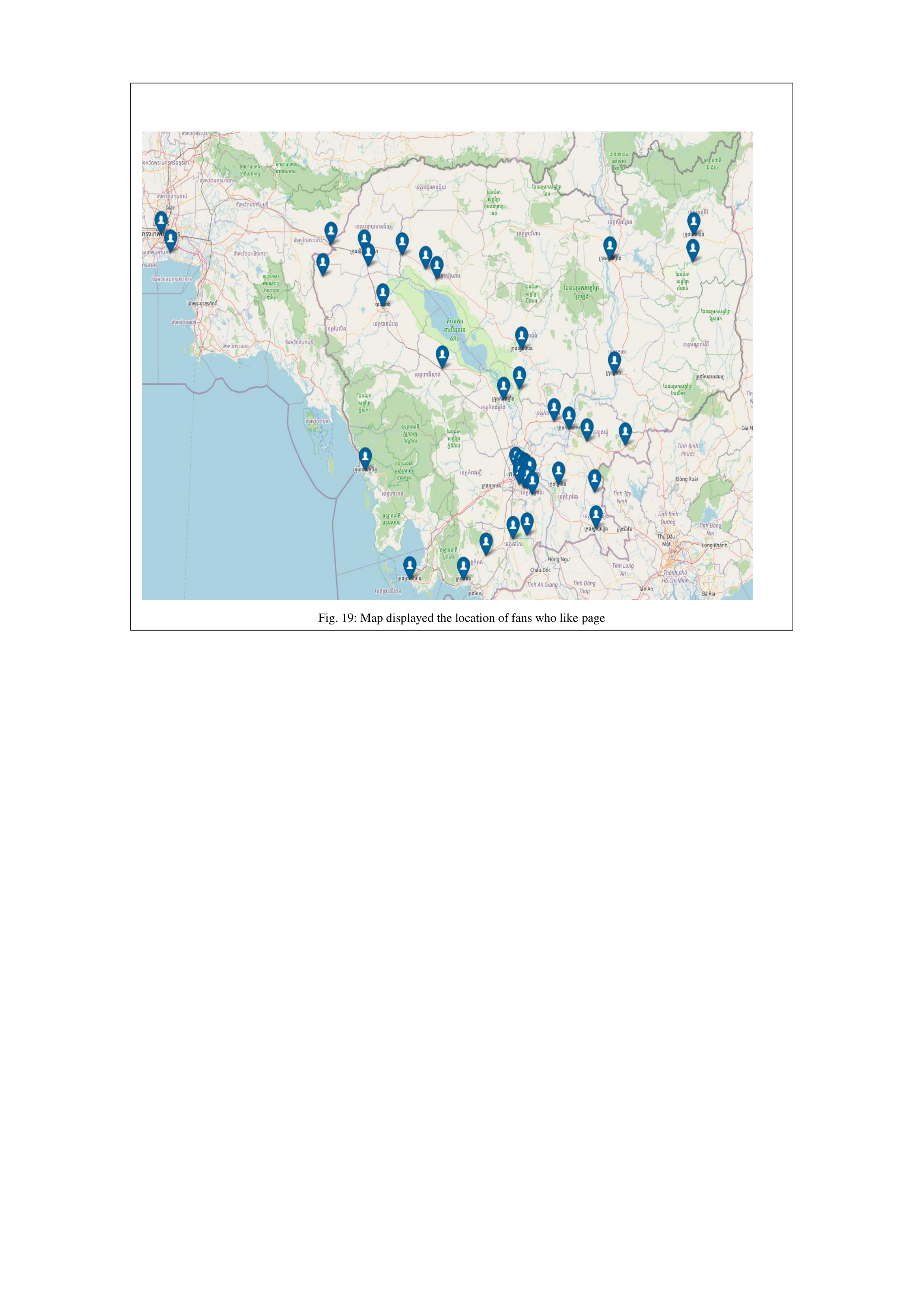
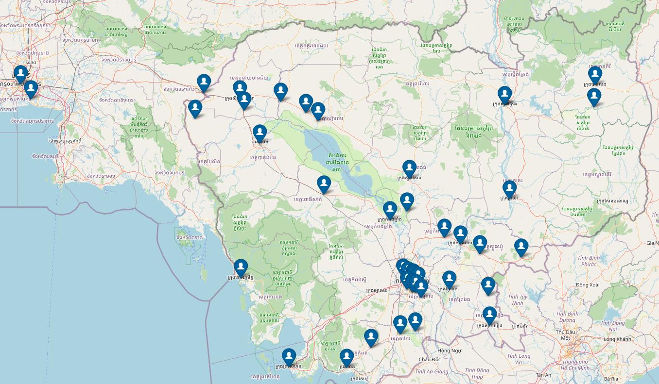
[6]. Twitter is one of the social media providing an API that
could retrieve data geo-location coordinates and uses
visualization techniques to plot data on the map by using
OpenStreetMaps to compare the data for a period between
different locations [7].
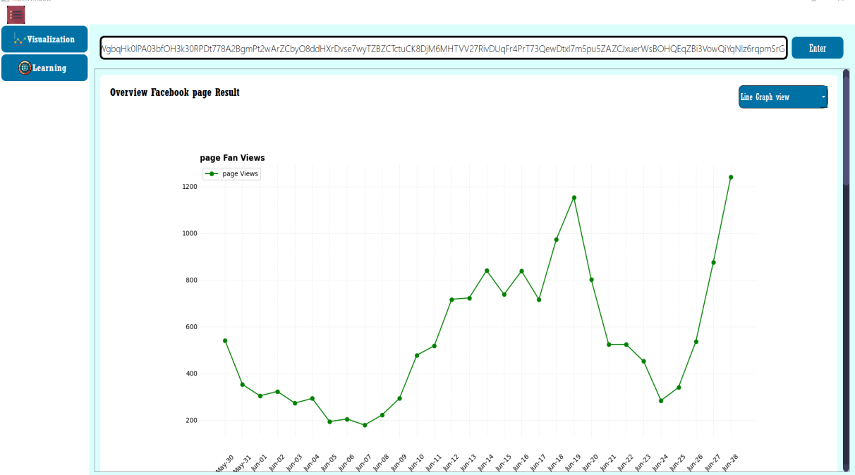
Common data visualization techniques to represent data are line
charts, bar charts, area charts, graphs, and maps.
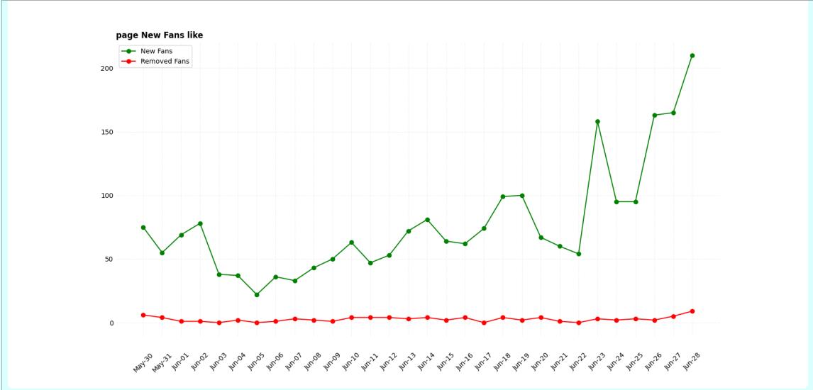
Line Charts are one of the most basic visualization
techniques. They make the data more appealing and visualized.
It shows the relationship between two patterns and compares
several values at the same time interval. It is the most effective
approach when changes in a variable or variables need to be
displayed [7].
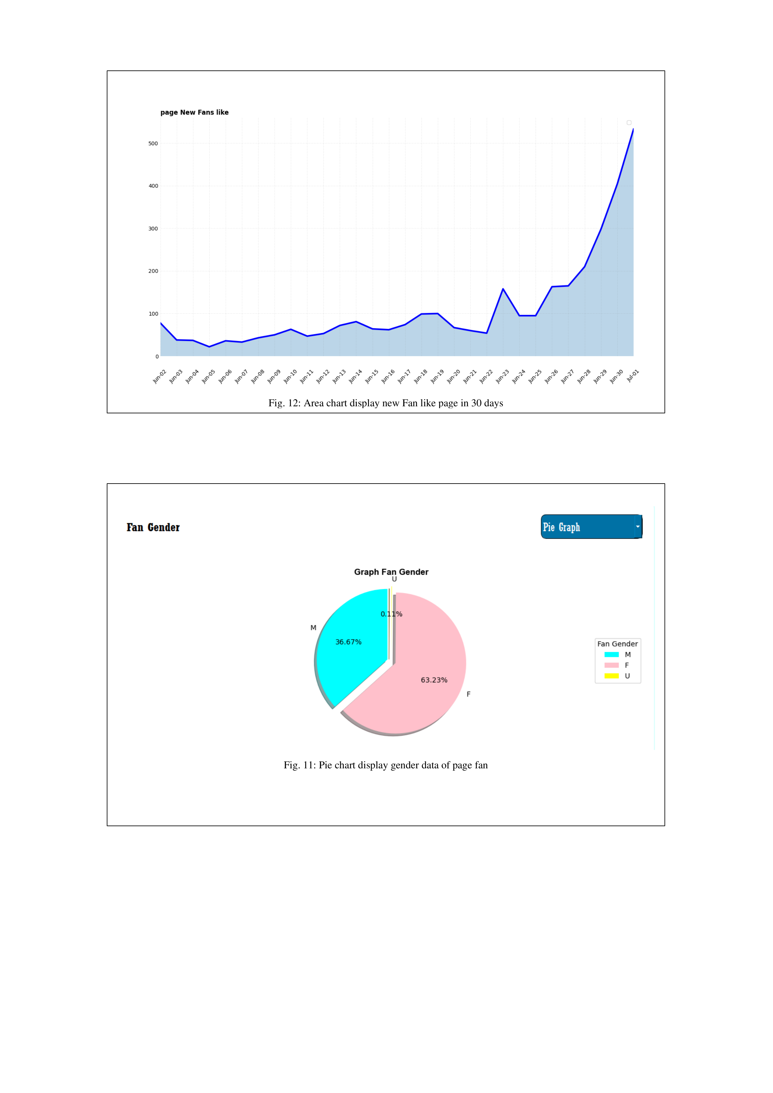
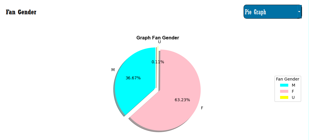
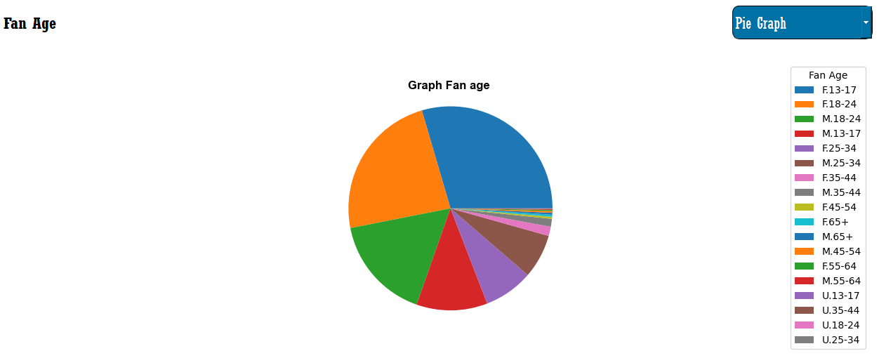
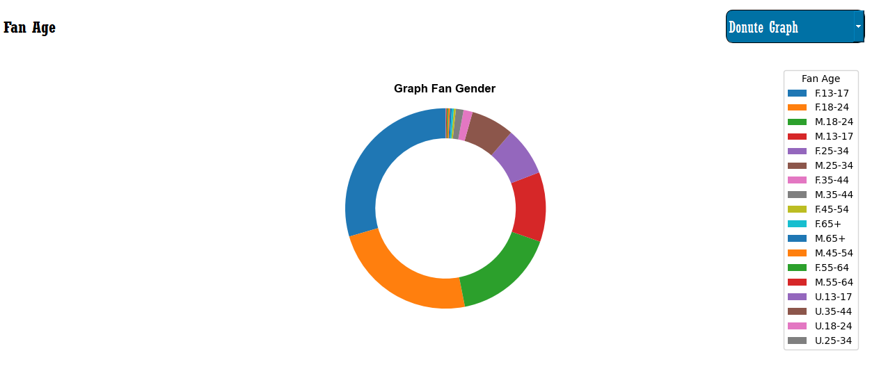
Pie Chart is used to represent data in the form of a pie slice.
The slice shows the amount of data. It is used to show the
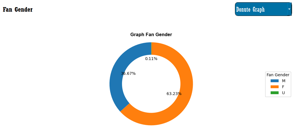
component’s percentage of the whole. Moreover, Donut chat is
one of the variations of pie charts [8].