
Candlestick chart was first discovered by a Japanese person Homma. Candlestick chart visually represents and communicates the price movements in the market space. The size of the price representing elements in the charts differ from each other and that is symbolized by using different colors. This chart is helpful to the traders to make investment and trading decisions following the daily changing patterns as it helps to forecast the effective price directions.
[bb_toc content=”][/bb_toc]
What is the Bar Charts?
The bar chart is not much unique than a candlestick chart both used to frame the prices and its history in the graphical representation. Bar charts and the candlestick charts are the most common of all to frame this sort of data. Both the chart look different but has similar sort of approaches while communicating the information. Technically, the bar charts or candle charts help to frame and map the study of the trends and the price patterns. This sort of study helps both in interpreting the market and reverse the market conditions.
Bar charts and candlestick charts are always categorised into separate time frames, each reflects high low open and the close price for a particular period. In a daily chart, each bar or candle reflects one-day trading activities, and while looking at a time-based chart each reflects a periodical trading activity. Bar charts and candle chart uses the same way for representing the data in the visual graph that sheds light on all the market movements.
7+ Candlestick Chart Analysis Examples in PDF | DOC
1. Sample Candlestick Chart Example
2. Basic Candlestick Charts Example
3. Candlestick Charting and Trading Example
4. Plot Candlestick Charts Example
5. Standard Candlestick Charts Example
6. Simple Candlestick Charts Example
7. Printable Candlestick Chart Example
8. Candlestick Chart Strategy Example
What are the Several Candlestick Components?
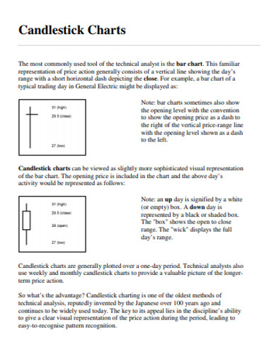
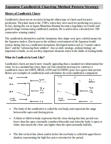
All sorts of charts and charting do carry different sorts of patterns to symbolise the different components in the chart. Such different components are required to communicate several markets’ open and closed conditions and the price movements. This chart has something called the “real body” which represents varying price ranges between the close and open tradings of the day.
The close condition was lower or higher than the open is defined by when the real body is filled or empty. When it’s filled it means the close lower than the open when it is empty it is higher than the open. The application of colors and representation communicates better as it uses candle shape patterns to represent the market condition. Red is always the representation of the down situation, and up candles are often shaded as green.
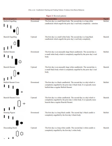
Different Types of Candlestick Patterns
Basic Candlestick
Candlestick charting are prepared with the price fluctuation and movements which may occur sometimes randomly and sometimes in patterns. Patterns are often categorised and separated into bullish and bearish. Bullish patterns are used to communicate the price may rise and bearish patterns are used to communicate that the price may fall. Candlestick patterns communicate tendencies and do not make guarantees of anything.
Bearish Engulfing Pattern
When sellers are much greater in number than the buyers bearish engulfing patterns develop positively in trend. Such a situation in trade is symbolised by a red real body covering a small green real body.
Bullish Engulfing Pattern
When the number of buyers outruns the number of sellers in the market the bullish engulfing pattern side of the takes place. Indicated by a long green real body covering a small red real body.
Bearish Evening Star
The evening star is a name used for topping patterns in the candlestick chartings. This is called as evening star because it is placed in the last candle pattern that opens just below the previous day’s real body. This body can be both red or green. Before two days itself, the real body is engulfed with the last candle. It indicates how sellers take control of the market when buyers are stalled to develop more selling.
Bearish Harami
Bearish harami is always seen inside the previous day’s real body often red and small. This pattern is often monitored by the traders as it reflects the indecisive buyer. All the stock may be in an uptrend if the price keeps rising higher but the down candle, on the other hand, indicates an advanced slide.
Bullish Harami
Bullish harami is the opposite of what bearish harami is. This indicates the market is facing downtrend and the green real body is occurring inside the red real body. This notifies the technicians that the trend is pausing and it can go more upside if followed by the other day
Bearish Harami Cross
It normally occurs in the uptrend at the time when the candle gets followed by the session which allows equal virtual open and close space. This session is known by the name ‘Doji’.
Bullish Harami Cross
Bullish harami cross normally occurs in a downtrend in which a Doji follows a down candle. It has the same implications as the bullish harami has.
Apart from the above-mentioned patterns candlestick charting also deals with black and white charts like bullish rising three, bearish falling three, and the bottom line.