19+ T Chart Examples to Download
Sometimes it is very difficult to understand the cause-and-effect relationship present in a specific phenomenon occurs due to the complexity of the world. One of the easiest ways to do this is to create a Cause and Effect T chart that can succinctly break down all the elements present in a phenomenon.
1. T Chart Graphic Organizer Template
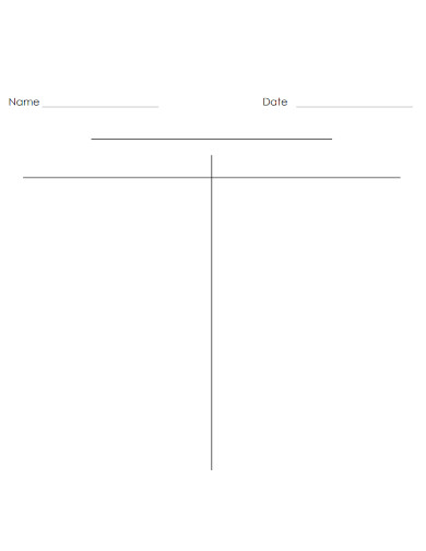
2. Basic T Chart Template
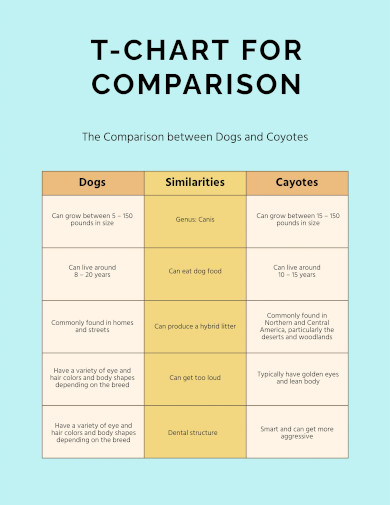
3. T Chart for Comparison
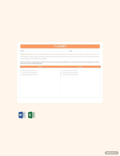
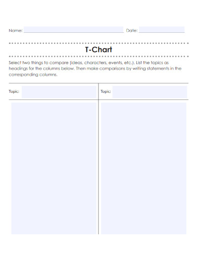
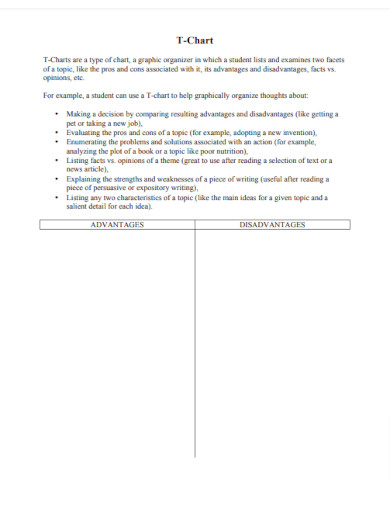
4. Sample T-Chart Template
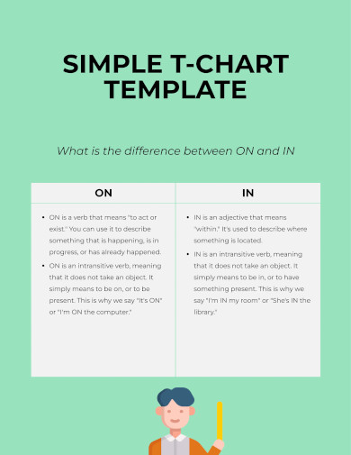
5. Simple T-Chart Template
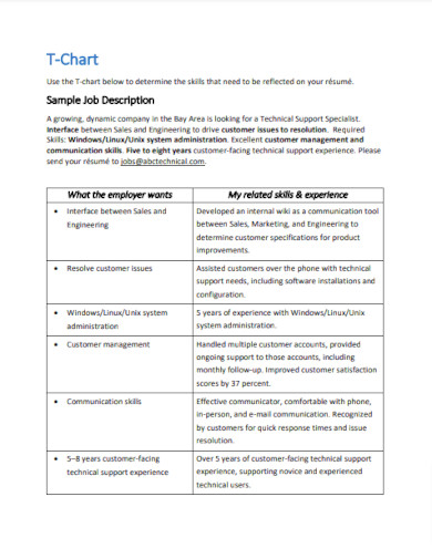
6. T-Chart Template
7. T Chart Template Layer
8. T-Chart Graphic Organizer
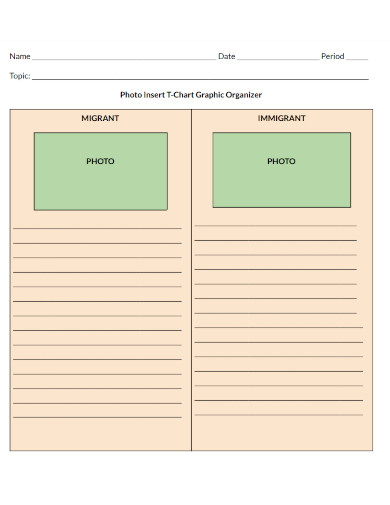
9. Photo Insert T-Chart Graphic Organizer
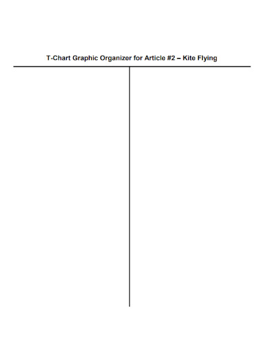
10. Article T-Chart Graphic Organizer
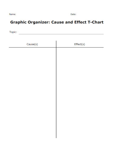
11. Cause and Effect T-Chart
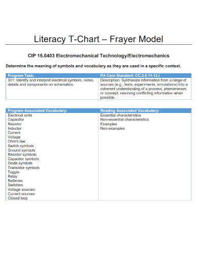
12. Literacy T-Chart
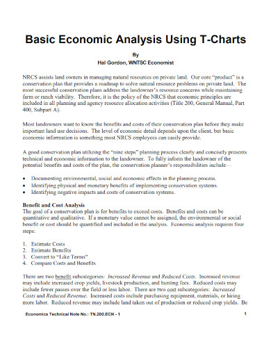
13. Basic Economic Analysis Using T-Charts
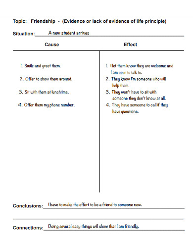
14. Example Friendship T chart
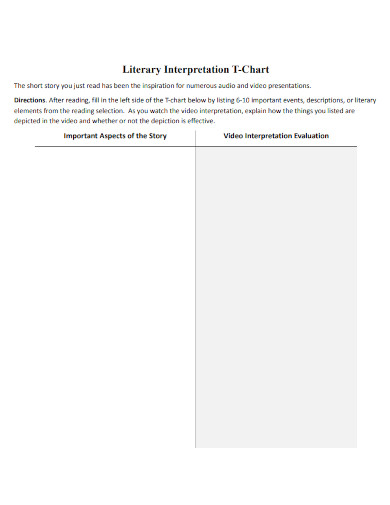
15. Literary Interpretation T-Chart
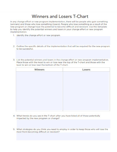
16. Winners and Losers T-Chart
17. Creative T Chart Examples
bento.cdn.pbs.org
18. T-Chart of Behaviors
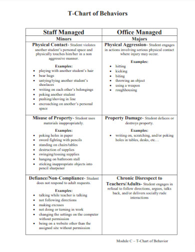
kmsd.edu
19. Modern T-Chart Template
novaworks.org
20. Standard T-Chart Template
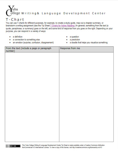
yc.yccd.edu
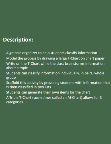
What Is a T Chart
A T chart is a kind of diagram that is distinguished by its column having the form of a “T.” This column gives the user the ability to list a variety of items under each category that is given in the column. This makes it possible for the individual to quickly draw a conclusion based on the connections between the items that are provided in the columns.
How to Use a T chart
A well-written T chart allows the reader to make inferences and deductions about the content inside the T chart. When creating a T chart is important to have T chart references, T chart examples, and T chart templates to help guide you.
Step 1: Select a Subject or Topic
Begin by selecting a subject or topic you want to use the T chart on. This will allow you to outline and provide the context and tone of the whole T chart. Not only that, but the topic will also dictate the number of columns or dividers used in the diagram.
Step 2: Create a Column or a Divider and Categorize Each Element
After you have selected the subject or topic of your T chart, you must split the T chart into two or more elements or sections. Afterward, you must categorize each element or section depending on your intention with the T chart.
Step 3: List Down the Content of Each Element or Section
The contents that will make up each part depending on the category must be filled in and listed once the diagram’s components and sections have been created and categorized. Remember that there is no restriction on how many items you may list in the column.
Step 4: Analyze the Content of the T Chart
You can now analyze the contents of the T chart by contrasting, comparing, and juxtaposing all the contents of the columns with one another. The actions you will do here will provide you with information and knowledge about the subject in the T chart.
FAQs
Can a T chart have three or more columns?
Yes, a T chart is not only limited to only two columns for its categories. This means that the T chart can have three or more columns to act as more categories or points of contention. For example, if one were to compare two businesses’ services or products, one can use a T chart with three columns featuring the unique characteristics of both products or services and the similarities the products share. Therefore, if the context requires the T chart to have more columns then the said chart can be composed of three or more columns.
What is the example of a T chart in the classroom?
A T chart may be used in a variety of ways as an educational tool for teachers and students. On the topic of science and the many states of matter, this may be done as an illustration. The instructor might ask their pupils to build a T chart that will demonstrate the similarities and contrasts of each state of matter. Another method a teacher may use a T chart in the classroom is to attempt to lay all the pros and downsides of a given action to better explain why students shouldn’t undertake the specific activity or action.
Can you use T charts for statistics?
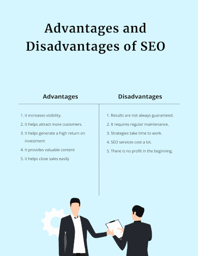
Yes, T charts can be used in many statistical ways due to their ability to wholistically present information to the intended audience. For example, if one were in an ethical dilemma that will result in negative consequences or cognitive dissonance, they may use a T chart to list out the pros and cons of each of their actions. Another way to use T charts for statistical analysis is to list out the advantages and disadvantages of pursuing a specific goal or objective. Due to the T chart’s flexibility, one can use it to statistically analyze and approach a specific problem or situation.
In order to compare and contrast the qualities or consequences of a given topic, a T chart may be used. This chart is made up of a series of columns. A T chart that has been carefully constructed and written may help a person make a choice that is in line with their values and goals. As a result, a T chart is a practical resource for daily usage.