Charts are posts containing a capsulized information about certain subjects, which primarily serves to inform a large number of audiences. At a young age, we have probably learned many things about charts, like the basic types of charts (e.g. bar chart, pie charts, line charts, flow charts etc).
Tables, diagrams, graphic symbols, and other visual elements make charts effective in disseminating information. Such elements aid charts in explaining some points better, especially since most people are naturally visual learners. Let’s discuss about Pareto charts, while referring to some chart examples found in this article.
Free Pareto Chart
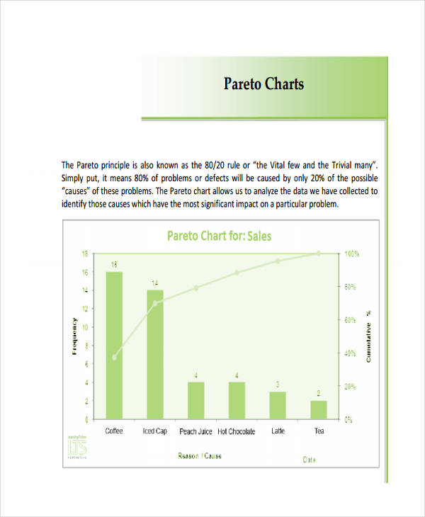
Basic Pareto Example
Simple Pareto Chart
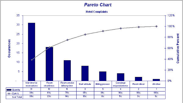
Pareto Chart in PDF
What Is a Pareto Chart?
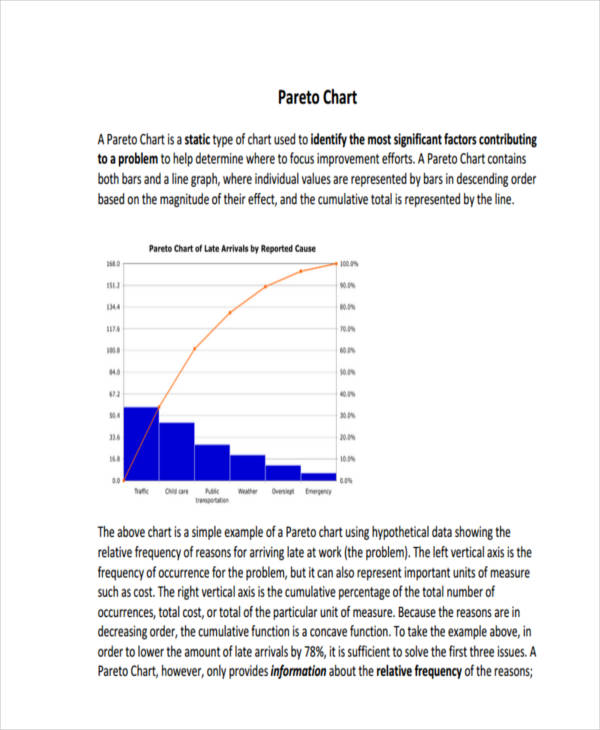
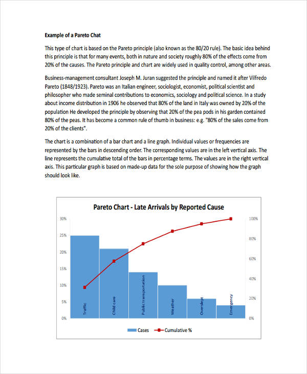
A Pareto chart in PDF (also known as Pareto diagram or Pareto distribution diagram), is a bar chart used to show the relative differences between various data. Named after Vilfredo Pareto, an Italian sociologist, economist, engineer, and philosopher, Pareto charts contain bar graphs and line graphs which present different values.
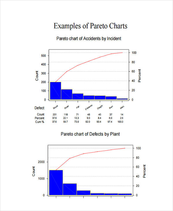
The descending length of bars arranged with the longest bar to the left, and shortest bar to the right, with each vertical bar representing frequency (time) or cost (money). The line signifies the cumulative sum of all counts (percentage) of each bar, which starts from the leftmost to the rightmost bar.
When to Use a Pareto Chart
The Pareto chart is a concept devised to visually convey the significance of different aspects affecting a specific field. It shows the separation of the more significant matters (represented by the longest bars) from the less significant ones (represented by the shortest bars). Here are some of the instances of using a Pareto chart.
- When conveying information on the difference in problem significance.
- When identifying problems responsible for company losses and complaints.
- When determining areas or matters to prioritize or focus on.
- When building consensus or resolving conflicts between team members
- When communicating with the team members, and people outside of the team.
Printable Pareto Chart
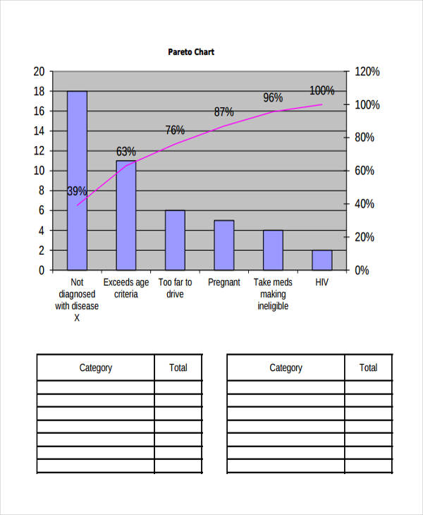
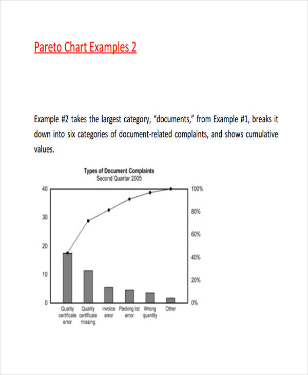
Pareto Chart Example
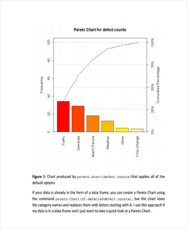
Pareto Chart Sample
How to Make a Pareto Chart
Pareto charts may include complex data which one needs to consider. However, creating a Pareto chart can be pretty simple. Here are some guidelines one needs to remember in making a Pareto chart.
- Collect raw data. Identify the problem which needs consideration. Gather the data including causes, and/or items related to such problem.
- Record the data you collected. Make a tally of the data you recently gathered. Make sure you organize your data in order to avoid confusion, especially when you start to input such data in your chart.
- Identify the standard way of measuring such data. You can choose from different ways of data measurement, such as: frequency, time, cost, etc.
- Create the contents of your chart. Create the bar graphs based on the data you have collected, and assign labels to your chart components.
- Add the lines for the cumulative sum. Add the amounts for the items you included in your sample chart and identify the total for such items. Indicate such total using lines.
Before creating a Pareto chart, one must first need to familiarize how it works, and how to interpret the data presented. This is basically to ensure the efficiency of your work.