Our brains process images faster than text, which makes visual elements highly effective in conveying information. Visualizing research findings, often filled with scholarly text, can greatly improve the communication of case studies. Case studies are detailed analyses conducted over time, but their technical nature can discourage readers outside the research circle. Using infographics helps transform complex data into clear, engaging visuals that are easier to understand. With the help of infographic templates, researchers can present their findings in a simplified, visually appealing format that captures attention and makes information accessible to a wider audience.
6+ Infographic Case Study Templates
Communication can come in multiple formats. It can be as simple and direct as “Roses are red.” The difficulty increases when you are supposed to hold the audience’s attention while discussing technical details. And you will not always be presenting your study to people in the same field as you. You might be asked to present in a corporate meeting. Maybe you are to talk in a public convention with people from different walks of life attending. How do you translate statistical data and jargon into something an ordinary person without extensive background about your study can understand easily? This is where infographics come in. Infographics are used in presentations to reduce lengthy, complex findings into bitesize information in a format that the audience are used to. Learn why infographics should be your next medium in communicating your research findings with the following tips.
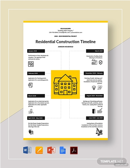
1. Residential Construction Timeline Template
Symbolism is present around us. People associate shapes and images with what these represent. The meaning of each symbol is recognized and understood by most people, which makes symbolism a useful tool for communication. Even each letter in this text signifies an abstract concept. An “a” can be anything when taken outside context. You can incorporate the same idea into your media presentations. For example, your market research aims to track how much a small group of early professionals spends for housing in urban areas. Instead of unnecessarily writing “House Repair” or “Bills,” you can place icons that represent these subheadings. Symbolism, with the use of icons and vectors, makes navigation through your infographic easier for people because they already recognized the image in the context provided. As a plus, the use of templates like the Simple Infographics Template (shown above) also saves you space for your results.
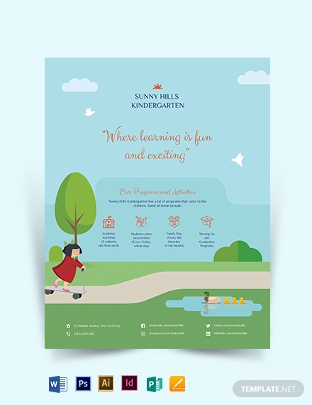
2. Kindergarten Flyer Template
People can forget that over 76,000 deaths in the US were attributed to diabetes last 2014. However, they will remember that diabetes can be fatal, and they should live a healthier life. Your presentation should be more than a barrage of facts and figures. No matter how hard we try, humans aren’t good at recalling long lists and numbers without context. In fact, 3x memory sports world champion Alex Mullen admitted to having the same challenge. Instead, he paints a mental image of something which he can recall later on. It is easier for people to remember things when these are told in a more memorable convention, such as in stories. Visual cues and references?—photos, icons, or illustrations?—add the speed element to the narrative that will drive home the point. The next time you present your study, tell a memorable story with this Creative Infographics Template.
3. Outline Company Organizational Chart Template
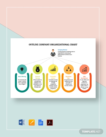
Maybe you have already mastered how to simplify your study into an organized presentation. How do you turn it into an appealing infographic that will draw in an audience? You should cash in on the fact that the eyes are naturally drawn to warm colors and illustrations. It is the hook that will attract an audience into reading your infographic. You can refer to a color chart or a color wheel that tells you which colors you can use. Even if your design is very colorful, it can be an eyesore when the colors are warring. If you have no time to study color theory, download and stand out for all the right reasons with the Infographic Organizational Chart Template embedded above! Is there an increase in the tendency of people to buy the marketed product when it is being sold online? Place an icon showing an increasing trend in the circle and the summary statistics at the bottom. You can also modify this template to suit your needs.
4. Production Timeline Template
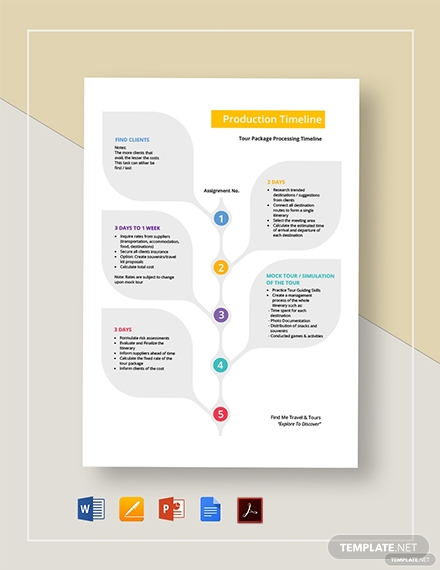
With the rise of technology and the Internet, we have a canteen of infinite resources that we can utilize for our purpose. With this option to do it yourself, people, wanting to save on design costs, tend to do their graphics-centered projects. We often see poorly-conceived graphic designs that do not make sense if we don’t analyze the entire thing. Usually, that’s because of how the layout is presented. That defeats the purpose of visual aids. People often read from left to right then up to down. However, using visual cues, we can redirect and influence how the audience views the entire design, even though that’s not the natural way of reading. Take the Process and Development Template (shown above) as an excellent example. It is a general understanding that most plants grow vertically, with the apex of the stem being the newest part and the bottom the oldest. You can use it to illustrate a process or development in your infographic. The earliest step or finding would be nearest the base. If you are going to depict growth and progression, you will find this downloadable template handy for your presentation.
5. Free Project Flow Chart Template
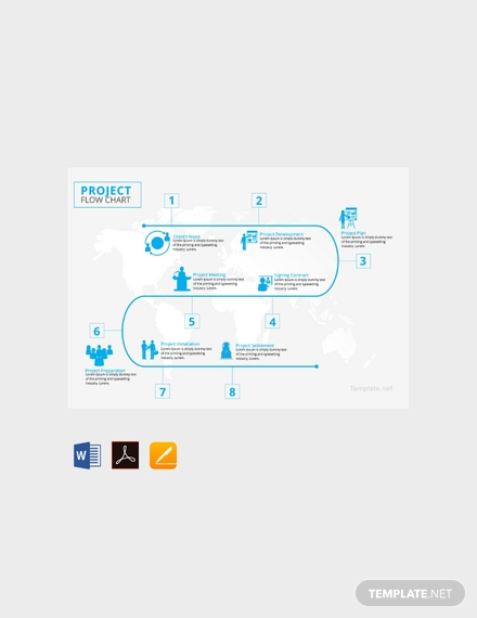
Slide presentations can contain a lot of information distributed per slide. However, infographics do not give you as much liberty. Since you are condensing a large amount of information into one page only, you should make sure that the key details are there. A well-structured infographic presents the highlights of the study while, at the same time, efficiently guides your audience from beginning to end. The entire thing can be bold and attractive in the right way, but if the content design is all over the place, you will lose your audience. The Free Project Infographic Template (pictured above) exemplifies an attractive design that does that not leave the eyes of the audience to stray anywhere in the infographic. Instead, it allows the viewer to follow a fixed system from start to finish that will make them understand the content of the study better. You can use this to present the progression of events, the history of a subject, or what you deem suitable. In any case, you can be sure that the viewers will appreciate the easy-to-follow format of your infographic.
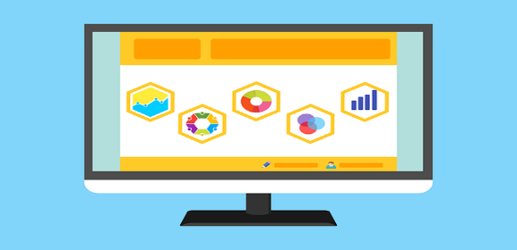
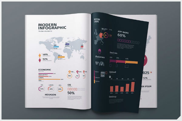
6. Modern Infographic Template
creativemarket.com
The rise in popularity of infographics shows that people prefer fast and easy consumption of information. We can point to smartphones, computers, social media, and the Internet as the root of this phenomenon. The strategic use of colors and typography, fast-paced and uncomplicated material structure and the bottomless pit of content keep us hooked to our screens. We cannot duplicate the last element into our infographics, but we can abide by the same principles that keep people absorbed in websites and other digital content. Keep your illustrations look professionally designed and sorted. The design of the icons must be friendly to the eyes. You can provide color contrasts to make the content pop, but the colors should contribute to a coherent big picture. You should also skip on the cursive and the playful, decorative fonts for now. They might look good when used for large text, but they can become unreadable. Keep the text simple and concise. It is called “information graphics” for a reason. The illustrations should help deliver the message. Your infographic is a visual translation of the important ideas in your research presented in a way that people can readily understand and appreciate. Templates like the Modern Infographic Template (shown above) allows you to incorporate vectors, icons, and images that will rightly serve your project’s purpose.