10+ Sign Examples to Download
Signs are also a form of communication that makes use of graphic images, illustrations, and visuals to express their message, rather than formulate words for their intentions. They are used to share information which is sometimes geared toward a specific audience, and oftentimes to the general public.
Signs can be used to direct traffic and inform travelers. But they can also be prominently displayed on storefronts, shopping centers, and even advertisements. They are used to share public service announcements and share information. It’s basically a graphic language that can be used to broadcast many different messages.
Elements of an Effective Sign
Since signs don’t give much of an explanation for the message that they are trying to convey, it is important that people immediately grasp what it is trying to stay without much thought. Otherwise, the sign’s design will be deemed ineffective, which means that all the efforts put into it will be wasted and the message will remain undelivered. To ensure that your sign can successfully promote your message, keep these tips in mind for effective sign design:
- Simplicity: Effective sign designs quickly and clearly display a message using as few words as possible since, most of the time, viewers have a very limited amount of time to decipher its contents. Spend some time determining the message that you want to convey and keep your environment in mind when creating your signage. You may also see caution signage designs.
- Plenty of white space: In accordance with the first rule about keeping it simple, a sign must have at least 30–40% white space. An overabundance of text and graphics overwhelms viewers. They may fail to see the sign’s real message because they are too distracted by its aesthetic elements. A sign must always be functional before it can be pretty.
- Readable typefaces: Fancy typefaces don’t make for better sign design. They can just lead to confusion, and unreadable typefaces are completely useless. The human eye can more easily decipher block letters and proper capitalization, so opt for clear, straight typefaces that are easily readable using bold letters or slightly larger text for emphasis.
- Good colors: Although we did mention that you need to have a good amount of white space, this doesn’t mean that you will abandon colors altogether. White text is very difficult to read. Extensive research shows that black, dark blue, or read text on a background of white or yellow is the most readable combination. If you use multiple signs in close proximity, make sure that the colors and designs are consistent to avoid a scattered, busy atmosphere.
- Carefully used images: If you do choose to use images on your signs, make sure that they are large enough to be discerned, and that they have a clear and immediate connection to the message of your sign.
14+ Sign Templates
Workplace Sign Design

Warehouse Sign Template
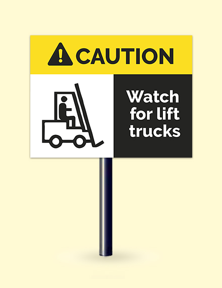
Security Sign Template
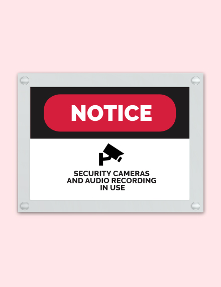
School Sign Template
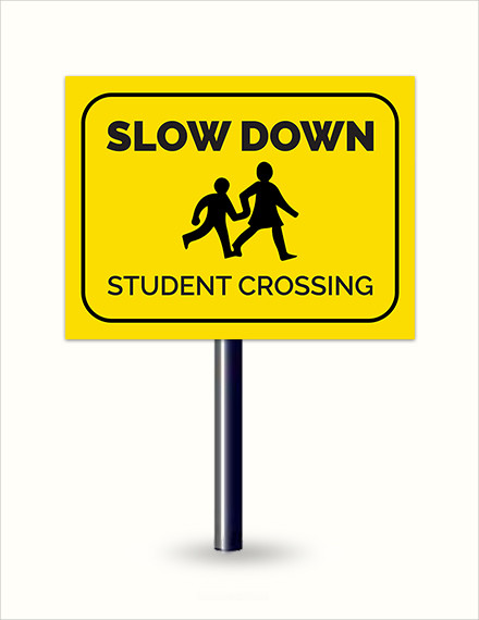
Safety Sign Template
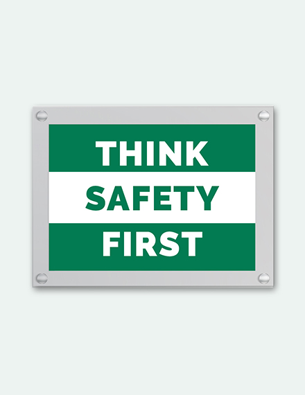
Real Estate Sign Template

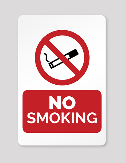
No Smoking Sign Template
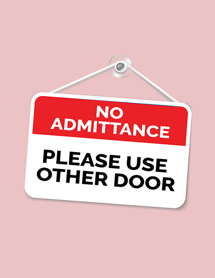
Door Sign Template
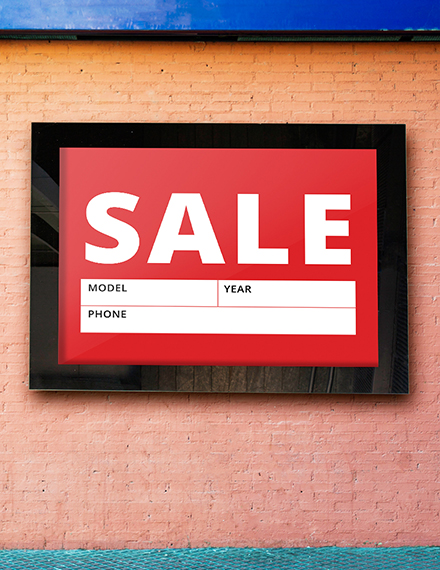
Sale Sign Template
Business Sign Template

Simple Tips for an Excellent Sign Layout
Though designing a sign is not exactly rocket science, you still have to pay a great amount of attention to some basics, otherwise, you will not achieve your desired results. Here are a few tips to consider as you start this process:
1. Color and Typestyle
Color and typestyle are important aspects of your sign’s layout. A graphic on your sign will catch the readers’ attention and add a flair to your signage. The typestyles used should be appropriate to the message that you have to convey. We all know that a picture is worth a thousand words, and it is never more true that with signage. Pictures elicit emotion and involvement much faster than type.
2. Text Size
One of the most common questions asked when designing signs is “How big should the letters be?” Well, this primarily depends on how far away you need the message to be seen by the viewer. Of course colors, the typestyle used, and lighting conditions all effect viewing distance. However, as a rule of thumb, 1 inch of letter height is needed for every 10 feet of viewing distance.
3. Materials
The length of time you expect the sign to last will be your determining factor for deciding the material you should use to produce the sign. Sign codes, environmental factors, and sign placements will also dictate the material choice.
How to Create a Sign
Here are some tips for designing and creating custom signs:
A. Use universal symbols.
Signs, especially those that function as warnings, ensure the safety of others. Which means that using signs completely incomprehensible and unrecognizable by a big part of the public’s population will only put everyone in danger. Using universal symbols is essential since the information will be more understood across language, cultural, or age barriers. For example, the infamous black skull-and-crossbones symbol, which consists of a human skull and two bones crossed together behind it, is generally used as a warning of danger, particularly in regard to poisonous substances. So if you are in need of a sign to warn people about the presence of harmful toxic, look no further because this sign is universally eloquent for that purpose.
B. Let colors convey meaning.
There are certain common associations between colors and what they represent. Leveraging this existing understanding will add emphasis and further meaning to the sign that you are designing. For example, red represents danger and warning, while yellow is often used to give caution to people before proceeding.
3. Consider the location.
Knowing where a sign will be located is a big factor in deciding how you will design it and, as we’ve already discussed, the materials you will use to make it. While you may not always have a specific answer or physical address, think about it in terms of primary placement.
Will the design be featured in the sky, such as a billboard; on the ground, such as a yard sign; on a moving vehicle, such as a wrap or magnet; will it be indoors? Does the sign have a border? Once you’ve established an answer to these questions, proceed by asking what color background is present in the location. This knowledge will help you select a color palette that contrasts with that environment to make your sign readable.You may also see price signage designs
The location also plays a role in determining other factors about signage. For example, there may be local rules as to the types of messages, images, or words on a sign as directed by the local government. Always make sure that you check the code and regulations in your area before getting too far along in the process.
Types of Signs
Signs and visual graphics make the world a more organized place. They can be used to communicate messages in a variety of places and to all of your key audiences. Listed below are some of the types of signs and visual graphics in existence.
- A-Frames. A-frame signs are those you frequently see in cafes and other stores. Businesses gravitate toward these signs because of their friendly design, strength, and versatility. They are meant to catch the attention of passersby with their easy-to-read attractive designs. Have you ever walked past a restaurant and had your attention diverted to their outdoor sign listing their specials and specialties? Well, that’s because A-frame signs are hard to ignore!
- ADA Signs. This type is commonly used in the architectural, construction, and signage industries with the advent of the Americans with Disabilities Act or ADA. These are often misunderstood as being synonymous with braille signs, but they are actually very different. Braille consists of raised characters on signs, while ADA refers to every sign that would be considered architectural.
- Banners. Banners are a piece of cloth attached by one edge to a staff and usually used by a leader as a standard. It often displays a distinctive or symbolic device or legend.
- Braille Signs. Braille signage is a requirement of the US Americans with Disabilities Act to ensure that people who cannot see can still read the print.You may also see welcome signage designs
- Building Directories. Have you ever gone to a particular mall for the first time, and don’t know where everything is? Well, since there aren’t exactly tour guides in malls, they offer building directories to help you instead. They ensure that visitors have a great experience by knowing where to go. Building directories signs are typically made of aluminum or plastic. Many of them feature removable inserts so that you can easily switch directory information.
- Bumper Stickers. Bumper stickers are a small sign on a car’s bumper that expresses an opinion, tells a joke, or gives information about the passengers in the car. They may also carry a slogan or an advertisement, and often has a political, religious, or humorous message.
- Bus Wraps. Have you ever noticed buses or any type of vehicle that has a poster of an advertisement from a certain company? Those are what we call wrap advertising or vehicle wrap. It’s the marketing practice of completely or partially covering a vehicle, often a bus because of the large surface it offers, in an advertisement. The result of the process is essentially a mobile billboard.
- Business Cards.This is one thing that you will own at some point in your life, especially if your career is part of an industry where networking is not only important but necessary. It’s basically a small card printed with one’s name, professional occupation, company position, business address, and other contact information. It makes exchanging details with prospective clients and possible job opportunities easier and more professional.
- Diplomas. A piece of paper most of us aim for, diplomas are given by a school, a college, or a university to show that you have successfully completed a course of study.
Signage Sizes
Signs differ in size depending on their purpose, their location, and the amount of message that they need to accommodate. Especially for outdoor signs which are most commonly designed to be bigger, thus making them more noticeable. This list contains standard and most common outdoor sign dimensions you can use as a guideline when creating your own sign.
US Standard Outdoor Sign Sizes
Dimensions (mm)
- 2.438,4 × 1.219,2
- 1.219,2 × 1.219,2
- 1.219,2 × 914,4
- 1.219.2 × 609,6
- 914.4 × 609,6
- 685,8 × 457,2
- 609,6 × 457,2
- 304,8 × 609,6
- 304,8 × 457,2
Dimensions (in)
- 96 × 48
- 48 × 48
- 48 × 36
- 48 × 24
- 36 × 24
- 27 × 18
- 24 × 24
- 24 × 18
- 12 × 24
- 12 × 18
Other Standard Outdoor Sign Sizes
Format and Dimensions (mm)
- Blade – 2155 high × 600, 800 or 1,000 wide
- Barracude – 2130 high × 800, 1,000 or 1,200 wide
- Excaliber – 2130 high × 800 or 1,500 wide
- Stretch VT – 2,000 high × 800 or 1,000 wide
- Rollow – 2,000 high × 800 wide
- Advance 1 – 2130 high × 800 or 1,500 wide
- Imagine – 2,130 high × 800, 1,000 or 1,200 wide
- Discovery – 2,120 high × 800 or 1,000 wide
- Uno 1 – 2,120 high × 800 or 1,000 wide
- Uno Curved – 2,200 high × 800 wide
Other Common Outdoor Sign Sizes
Dimensions (mm)
- 1,250 × 3,000
- 1,000 × 3,000
- 1,000 × 2,500
- 1,800 × 1,200
- 2,000 × 800
- 1,800 × 620
- 1,200 × 900
- 1,200 × 800
- 1,200 × 600
Dimensions (in)
- 49,213 × 118,11
- 29,27 × 118,11
- 39,37 × 98,425
- 70,866 × 47,244
- 78,74 × 31,496
- 70,866 × 24,409
- 47,244 × 35,433
- 47,244 × 31,496
- 47,244 × 23,622
Signs FAQs
What is the plural form of signage?
Signs collectively; public signs; signposts.
What is signage system?
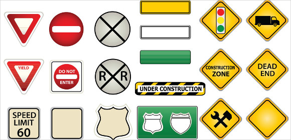
Signage systems are visually oriented information systems, consisting of signs, maps, arrows, color-coding systems, pictograms, and different typographic elements. They differ from other methods of information presentation because they are typically used to guide people’s passage through the physical world, such as road signs on a highway, station identification signs in a subway, and overhead signs in an airport.
Signs are an effective way of communicating without the use of words. If you are planning on making one, make sure you remember the suggestions we’ve discussed to produce an effective design.
10+ Sign Examples to Download
Signs are also a form of communication that makes use of graphic images, illustrations, and visuals to express their message, rather than formulate words for their intentions. They are used to share information which is sometimes geared toward a specific audience, and oftentimes to the general public.
Signs can be used to direct traffic and inform travelers. But they can also be prominently displayed on storefronts, shopping centers, and even advertisements. They are used to share public service announcements and share information. It’s basically a graphic language that can be used to broadcast many different messages.
Elements of an Effective Sign
Since signs don’t give much of an explanation for the message that they are trying to convey, it is important that people immediately grasp what it is trying to stay without much thought. Otherwise, the sign’s design will be deemed ineffective, which means that all the efforts put into it will be wasted and the message will remain undelivered. To ensure that your sign can successfully promote your message, keep these tips in mind for effective sign design:
Simplicity: Effective sign designs quickly and clearly display a message using as few words as possible since, most of the time, viewers have a very limited amount of time to decipher its contents. Spend some time determining the message that you want to convey and keep your environment in mind when creating your signage. You may also see caution signage designs.
Plenty of white space: In accordance with the first rule about keeping it simple, a sign must have at least 30–40% white space. An overabundance of text and graphics overwhelms viewers. They may fail to see the sign’s real message because they are too distracted by its aesthetic elements. A sign must always be functional before it can be pretty.
Readable typefaces: Fancy typefaces don’t make for better sign design. They can just lead to confusion, and unreadable typefaces are completely useless. The human eye can more easily decipher block letters and proper capitalization, so opt for clear, straight typefaces that are easily readable using bold letters or slightly larger text for emphasis.
Good colors: Although we did mention that you need to have a good amount of white space, this doesn’t mean that you will abandon colors altogether. White text is very difficult to read. Extensive research shows that black, dark blue, or read text on a background of white or yellow is the most readable combination. If you use multiple signs in close proximity, make sure that the colors and designs are consistent to avoid a scattered, busy atmosphere.
Carefully used images: If you do choose to use images on your signs, make sure that they are large enough to be discerned, and that they have a clear and immediate connection to the message of your sign.
14+ Sign Templates
Workplace Sign Design

Template Details
Warehouse Sign Template

Template Details
Security Sign Template

Template Details
School Sign Template

Template Details
Safety Sign Template

Template Details
Real Estate Sign Template

Template Details
No Smoking Sign Template

Template Details
Door Sign Template

Template Details
Sale Sign Template

Template Details
Business Sign Template

Template Details
Simple Tips for an Excellent Sign Layout
Though designing a sign is not exactly rocket science, you still have to pay a great amount of attention to some basics, otherwise, you will not achieve your desired results. Here are a few tips to consider as you start this process:
1. Color and Typestyle
Color and typestyle are important aspects of your sign’s layout. A graphic on your sign will catch the readers’ attention and add a flair to your signage. The typestyles used should be appropriate to the message that you have to convey. We all know that a picture is worth a thousand words, and it is never more true that with signage. Pictures elicit emotion and involvement much faster than type.
2. Text Size
One of the most common questions asked when designing signs is “How big should the letters be?” Well, this primarily depends on how far away you need the message to be seen by the viewer. Of course colors, the typestyle used, and lighting conditions all effect viewing distance. However, as a rule of thumb, 1 inch of letter height is needed for every 10 feet of viewing distance.
3. Materials
The length of time you expect the sign to last will be your determining factor for deciding the material you should use to produce the sign. Sign codes, environmental factors, and sign placements will also dictate the material choice.
How to Create a Sign
Here are some tips for designing and creating custom signs:
A. Use universal symbols.
Signs, especially those that function as warnings, ensure the safety of others. Which means that using signs completely incomprehensible and unrecognizable by a big part of the public’s population will only put everyone in danger. Using universal symbols is essential since the information will be more understood across language, cultural, or age barriers. For example, the infamous black skull-and-crossbones symbol, which consists of a human skull and two bones crossed together behind it, is generally used as a warning of danger, particularly in regard to poisonous substances. So if you are in need of a sign to warn people about the presence of harmful toxic, look no further because this sign is universally eloquent for that purpose.
B. Let colors convey meaning.
There are certain common associations between colors and what they represent. Leveraging this existing understanding will add emphasis and further meaning to the sign that you are designing. For example, red represents danger and warning, while yellow is often used to give caution to people before proceeding.
3. Consider the location.
Knowing where a sign will be located is a big factor in deciding how you will design it and, as we’ve already discussed, the materials you will use to make it. While you may not always have a specific answer or physical address, think about it in terms of primary placement.
Will the design be featured in the sky, such as a billboard; on the ground, such as a yard sign; on a moving vehicle, such as a wrap or magnet; will it be indoors? Does the sign have a border? Once you’ve established an answer to these questions, proceed by asking what color background is present in the location. This knowledge will help you select a color palette that contrasts with that environment to make your sign readable.You may also see price signage designs
The location also plays a role in determining other factors about signage. For example, there may be local rules as to the types of messages, images, or words on a sign as directed by the local government. Always make sure that you check the code and regulations in your area before getting too far along in the process.
Types of Signs
Signs and visual graphics make the world a more organized place. They can be used to communicate messages in a variety of places and to all of your key audiences. Listed below are some of the types of signs and visual graphics in existence.
A-Frames. A-frame signs are those you frequently see in cafes and other stores. Businesses gravitate toward these signs because of their friendly design, strength, and versatility. They are meant to catch the attention of passersby with their easy-to-read attractive designs. Have you ever walked past a restaurant and had your attention diverted to their outdoor sign listing their specials and specialties? Well, that’s because A-frame signs are hard to ignore!
ADA Signs. This type is commonly used in the architectural, construction, and signage industries with the advent of the Americans with Disabilities Act or ADA. These are often misunderstood as being synonymous with braille signs, but they are actually very different. Braille consists of raised characters on signs, while ADA refers to every sign that would be considered architectural.
Banners. Banners are a piece of cloth attached by one edge to a staff and usually used by a leader as a standard. It often displays a distinctive or symbolic device or legend.
Braille Signs. Braille signage is a requirement of the US Americans with Disabilities Act to ensure that people who cannot see can still read the print.You may also see welcome signage designs
Building Directories. Have you ever gone to a particular mall for the first time, and don’t know where everything is? Well, since there aren’t exactly tour guides in malls, they offer building directories to help you instead. They ensure that visitors have a great experience by knowing where to go. Building directories signs are typically made of aluminum or plastic. Many of them feature removable inserts so that you can easily switch directory information.
Bumper Stickers. Bumper stickers are a small sign on a car’s bumper that expresses an opinion, tells a joke, or gives information about the passengers in the car. They may also carry a slogan or an advertisement, and often has a political, religious, or humorous message.
Bus Wraps. Have you ever noticed buses or any type of vehicle that has a poster of an advertisement from a certain company? Those are what we call wrap advertising or vehicle wrap. It’s the marketing practice of completely or partially covering a vehicle, often a bus because of the large surface it offers, in an advertisement. The result of the process is essentially a mobile billboard.
Business Cards.This is one thing that you will own at some point in your life, especially if your career is part of an industry where networking is not only important but necessary. It’s basically a small card printed with one’s name, professional occupation, company position, business address, and other contact information. It makes exchanging details with prospective clients and possible job opportunities easier and more professional.
Diplomas. A piece of paper most of us aim for, diplomas are given by a school, a college, or a university to show that you have successfully completed a course of study.
Signage Sizes
Signs differ in size depending on their purpose, their location, and the amount of message that they need to accommodate. Especially for outdoor signs which are most commonly designed to be bigger, thus making them more noticeable. This list contains standard and most common outdoor sign dimensions you can use as a guideline when creating your own sign.
US Standard Outdoor Sign Sizes
Dimensions (mm)
2.438,4 × 1.219,2
1.219,2 × 1.219,2
1.219,2 × 914,4
1.219.2 × 609,6
914.4 × 609,6
685,8 × 457,2
609,6 × 457,2
304,8 × 609,6
304,8 × 457,2
Dimensions (in)
96 × 48
48 × 48
48 × 36
48 × 24
36 × 24
27 × 18
24 × 24
24 × 18
12 × 24
12 × 18
Other Standard Outdoor Sign Sizes
Format and Dimensions (mm)
Blade – 2155 high × 600, 800 or 1,000 wide
Barracude – 2130 high × 800, 1,000 or 1,200 wide
Excaliber – 2130 high × 800 or 1,500 wide
Stretch VT – 2,000 high × 800 or 1,000 wide
Rollow – 2,000 high × 800 wide
Advance 1 – 2130 high × 800 or 1,500 wide
Imagine – 2,130 high × 800, 1,000 or 1,200 wide
Discovery – 2,120 high × 800 or 1,000 wide
Uno 1 – 2,120 high × 800 or 1,000 wide
Uno Curved – 2,200 high × 800 wide
Other Common Outdoor Sign Sizes
Dimensions (mm)
1,250 × 3,000
1,000 × 3,000
1,000 × 2,500
1,800 × 1,200
2,000 × 800
1,800 × 620
1,200 × 900
1,200 × 800
1,200 × 600
Dimensions (in)
49,213 × 118,11
29,27 × 118,11
39,37 × 98,425
70,866 × 47,244
78,74 × 31,496
70,866 × 24,409
47,244 × 35,433
47,244 × 31,496
47,244 × 23,622
Signs FAQs
What is the plural form of signage?
Signs collectively; public signs; signposts.
What is signage system?
Signage systems are visually oriented information systems, consisting of signs, maps, arrows, color-coding systems, pictograms, and different typographic elements. They differ from other methods of information presentation because they are typically used to guide people’s passage through the physical world, such as road signs on a highway, station identification signs in a subway, and overhead signs in an airport.
Signs are an effective way of communicating without the use of words. If you are planning on making one, make sure you remember the suggestions we’ve discussed to produce an effective design.

