Pie Charts – Examples, Uses, Advantages, Formula
Pie charts are visually engaging tool crucial for data presentation and analysis. This comprehensive guide unlocks the potential of pie charts to simplify complex information into digestible, colorful slices, making it a favorite for educators and students alike. By converting numerical data into proportional segments of a circle, pie charts offer an intuitive snapshot of data distribution, enhancing understanding and communication in various subjects.
What are Pie Charts – Definition
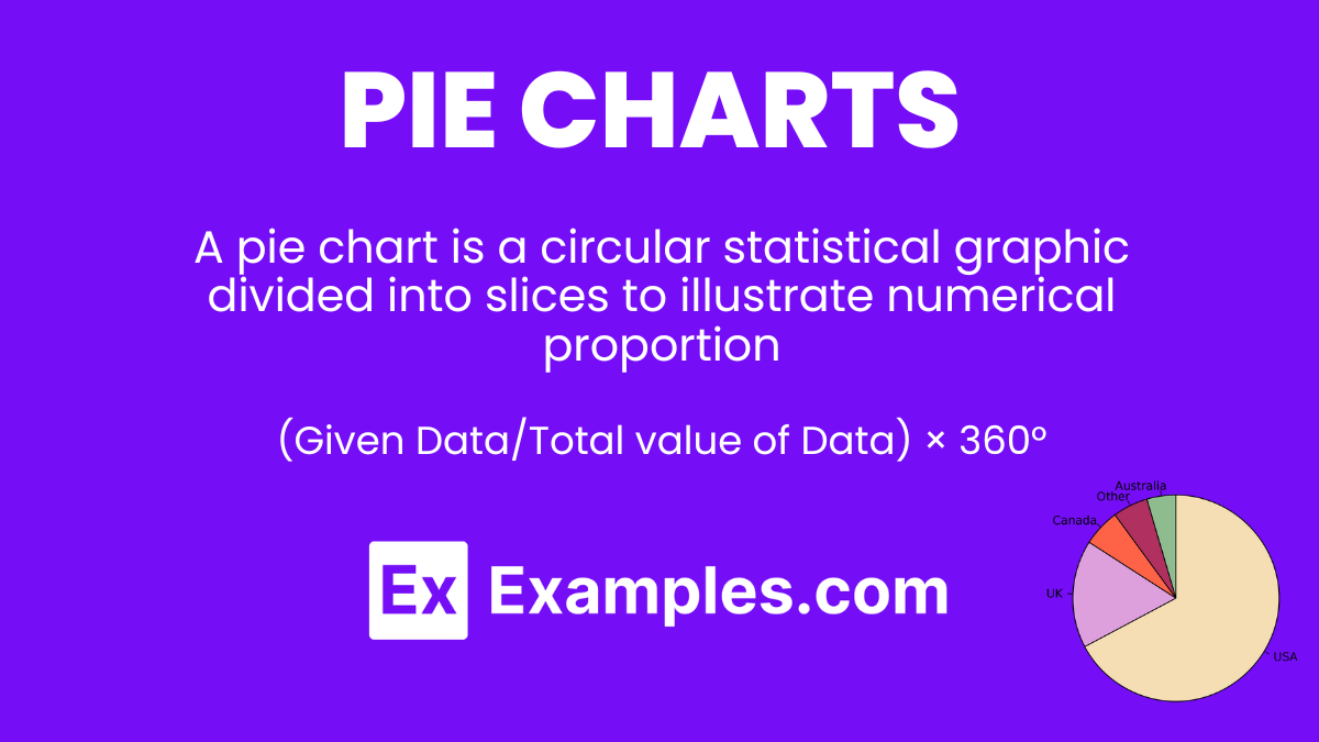
A pie chart is a circular statistical graphic divided into slices to illustrate numerical proportion. Each slice of the pie represents a category’s contribution to the whole, making it easy to compare parts of a dataset at a glance. Pie charts are particularly effective for showing the composition of a whole when there are limited categories with clear, proportional differences.
What is the Best Example of Pie Charts?
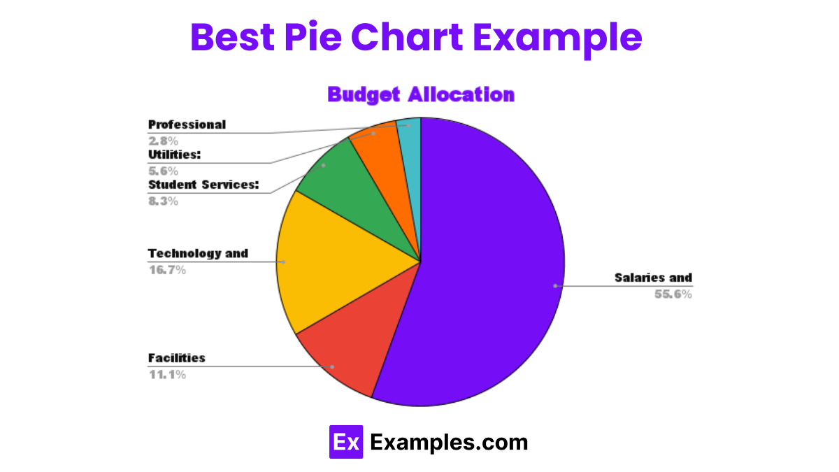
Budget Allocation
One of the best examples of pie charts is displaying a household or company’s budget allocation. By representing different spending categories (like rent, utilities, groceries, and entertainment) as slices of a pie, stakeholders can instantly visualize how the total budget is divided. This visual representation helps in understanding spending habits, prioritizing expenses, and making informed financial decisions.
Pie Charts Formula
Pie charts translate data into a visual medium without a specific “formula” but rely on the principle of converting data points into percentages of the total sum, which then correspond to proportional segments of a circle (360 degrees). For instance, if a category represents 25% of the total data, its pie chart slice would occupy 25% of the circle, or 90 degrees. This method ensures that all pieces of the pie collectively represent the whole dataset accurately, making pie charts a straightforward yet powerful tool for data visualization.
(Given Data/Total value of Data) × 360°
How to Create a Pie Chart?
Crafting a pie chart is an intuitive process for visualizing the proportional makeup of various data components. This graphical tool transforms numerical data into a circular representation, where each slice corresponds to a category’s share of the total. Perfect for educators, students, and professionals, pie charts facilitate quick comparisons and insightful data analysis. Follow these steps to create an engaging and informative pie chart that enhances data presentation and storytelling.
Step-by-Step Guide:
- Collect Data: Gather the data you wish to represent. Ensure it’s categorical and sums up to a whole.
- Calculate Percentages: Convert each category’s value into a percentage of the total sum.
- Draw the Circle: Use any software with chart capabilities or draw by hand. Label the chart for clarity.
- Divide the Circle: Segment the circle into slices based on the calculated percentages. Each slice represents a category.
- Add Labels: Clearly label each slice with the category name and percentage to provide context.
- Color Code: Apply different colors to each slice for visual distinction and easier interpretation.
Example with Data: Classroom Attendance
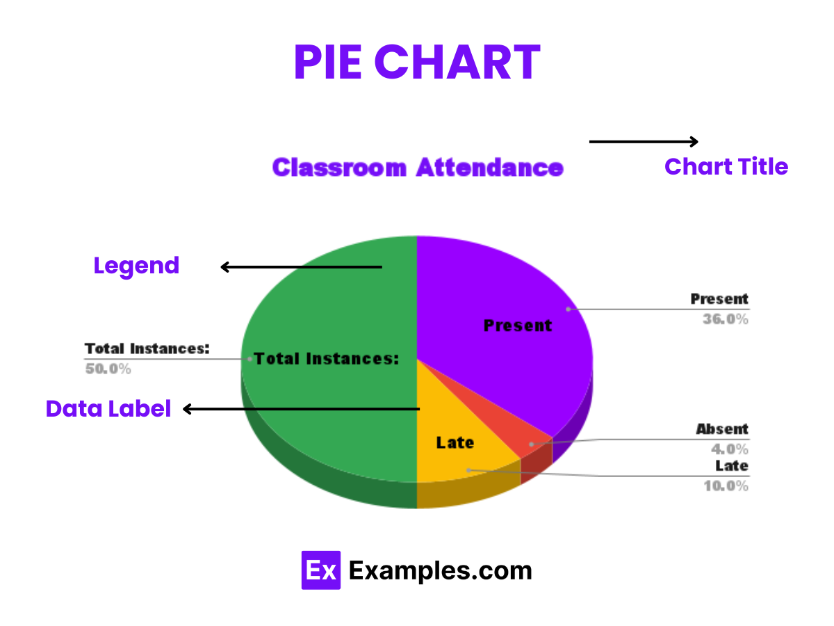 Imagine a teacher tracking attendance for their class over a week with categories like Present, Absent, and Late.
| Category | Number of Instances |
|---|---|
| Present | 18 |
| Absent | 2 |
| Late | 5 |
- Total Instances: 25
- Percentages: Present (72%), Absent (8%), Late (20%)
Using these percentages, the teacher draws a pie chart to visualize attendance patterns, providing a clear, immediate understanding of class participation. Each slice is color-coded—green for Present, red for Absent, and yellow for Late—offering a quick glance at the week’s attendance dynamics. This pie chart not only aids in immediate data comprehension but also helps in planning interventions for improving attendance.
How to Solve Pie Chart Questions?
Solving pie chart questions involves interpreting the chart to understand data distribution, calculating percentages or values, and applying this information to answer specific queries. This skill enhances data literacy, aiding in decision-making and critical analysis. Perfect for teachers and students, mastering pie charts transforms complex datasets into understandable visual insights, fostering a deeper comprehension of numerical information.
Example: School Club Membership
Make a copy in Google SheetsData: A school has 200 students participating in clubs, distributed as follows: Science Club (40 students), Drama Club (50 students), Art Club (30 students), and Sports Club (80 students).
Pie Chart Question: What percentage of the club members are in the Sports Club?
Solution Steps:
- Total Members: Confirm the total number of students in clubs is 200.
- Identify the Segment: Locate the Sports Club segment on the pie chart.
- Calculate the Percentage: Since the Sports Club has 80 students out of 200, the percentage is (80/200)×100=40.
Conclusion: 40% of the students participating in clubs are members of the Sports Club.
Examples for Practice
1. Library Book Categories
Data: 1,000 books: Fiction (300), Non-Fiction (400), Reference (200), Magazines (100).
Question: What fraction of the library’s collection is Non-Fiction?
Explanation: Non-Fiction books make up 400 out of 1,000 books, so the fraction is 400/1000=2/5.
2. Annual Sales Distribution
Data: Total sales $500,000: Q1 ($125,000), Q2 ($150,000), Q3 ($100,000), Q4 ($125,000).
Question: What percentage of annual sales occurred in Q2?
Explanation: Q2 sales are 30% of the annual total ($150,000 / $500,000) \times 100.
3. Voter Turnout
Data: 2,000 voters: Male (900), Female (1,100).
Question: What percentage of voters were female?
Explanation: Female voters constitute 55% of the total turnout (1,100/2,000)×100.
4. Company Expense Report
Data: Total expenses $10,000: Salaries ($5,000), Utilities ($2,000), Rent ($3,000).
Question: What is the largest expense and its percentage of the total?
Explanation: Salaries are the largest at 50% of total expenses ($5,000 / $10,000) \times 100.
5. Daily Internet Usage
Data: Total 10 hours: Social Media (4 hours), Study (3 hours), Entertainment (2 hours), Others (1 hour).
Question: How much more time is spent on Social Media than Entertainment?
Explanation: Social Media takes up 2 more hours than Entertainment.
These examples provide a framework for solving pie chart questions by identifying key data points, calculating percentages or differences, and applying this information to answer specific questions, enhancing understanding and analytical skills.
Types of Pie Charts
Pie charts are versatile tools for visualizing data proportions within a whole. Their simplicity makes them popular for presentations and reports, where understanding the distribution of parts to a whole is crucial. Here are some common types of pie charts used in data visualization:
Standard Pie Chart
Make a Copy in Google SheetsThe standard pie chart is the most basic form, where a circle is divided into slices to represent data proportions. Each slice’s size is proportional to its dataset’s value, making it straightforward to compare parts of the whole.
Exploded Pie Chart
| Product Category | Revenue Share |
| Electronics | 30% |
| Apparel | 25% |
| Home and Kitchen | 20% |
| Books and Media | 10% |
| Beauty and Personal Care | 15% |
Make a copy in Google Sheets
Exploded pie charts separate one or more slices from the main pie to emphasize certain data points. This style is useful for drawing attention to specific categories or differences within the data.
Doughnut Chart
Make a copy in Google Sheets
Doughnut charts resemble pie charts but with a central hole, turning the pie into a ring. This format can display multiple series of data simultaneously and is useful for comparing nested categories.
Percentage Pie Chart
Make a copy in Google SheetsThese pie charts explicitly label each slice with its corresponding percentage of the total, alongside or instead of the category name. This type is particularly useful for audiences that benefit from seeing precise proportions.
3D Pie Chart
Make a copy in Google Sheets3D pie charts add depth to the traditional pie chart, creating a more visually striking presentation. While they can enhance visual appeal, they may distort perception of the sizes of slices and are best used when clarity is not compromised.
Polar Area Diagram
Also known as a Coxcomb chart, this variation uses radial bars for each category instead of slices. The length of each bar is proportional to the category’s value, offering a different way to visualize proportional data, especially over time or categories.
Each type of pie chart serves different visualization needs, from simple part-to-whole relationships to more detailed data comparisons or emphasizing specific segments. The choice of chart depends on the data’s complexity, the story you wish to tell, and how you want your audience to understand the information.
Uses of Pie Chart
Pie charts serve as an intuitive visual tool to display the proportional data of different categories in a dataset, making complex information easily digestible. They are particularly effective in educational settings for teaching statistical analysis and data representation, providing a clear visual comparison of parts to the whole. Whether in business, education, or media, pie charts simplify the communication of numerical data, enhancing understanding and engagement.
Examples
1. Market Share Visualization:
Businesses use pie charts to depict their market share relative to competitors, offering a clear picture of their standing in the market.
Explanation: This helps stakeholders understand competitive dynamics and strategize accordingly.
2. Budget Allocation:
Organizations and individuals employ pie charts for visualizing budget distributions across different departments or expenses.
Explanation: It facilitates financial planning and highlights areas of significant spending.
3. Survey Results:
Researchers and marketers display survey data with pie charts to summarize responses in categories like customer preferences.
Explanation: This visual summary aids in quickly grasping public opinion or consumer behavior.
4. Academic Grades:
Educators use pie charts to represent student performance across different subjects or assessments.
Explanation: It provides a visual breakdown of strengths and areas needing improvement.
5. Population Demographics:
Demographers and social scientists visualize population distributions by age, ethnicity, or gender using pie charts.
Explanation: This helps in understanding demographic structures and planning for social services.
Advantages And Disadvantages of Pie Chart
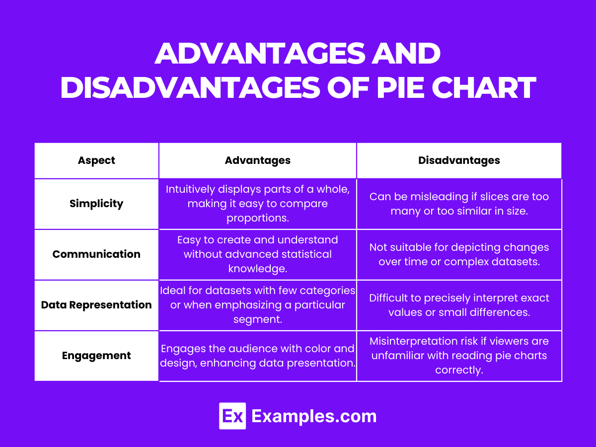
| Aspect | Advantages | Disadvantages |
|---|---|---|
| Visualization | Intuitively displays parts of a whole, making it easy to compare proportions. | Can be misleading if slices are too many or too similar in size. |
| Simplicity | Easy to create and understand without advanced statistical knowledge. | Not suitable for depicting changes over time or complex datasets. |
| Communication | Effectively communicates category dominance or significance at a glance. | Overuse or improper design can lead to information overload. |
| Data Representation | Ideal for datasets with few categories or when emphasizing a particular segment. | Difficult to precisely interpret exact values or small differences. |
| Engagement | Engages the audience with color and design, enhancing data presentation. | Misinterpretation risk if viewers are unfamiliar with reading pie charts correctly. |
Pie charts, with their ability to simplify data presentation and highlight key information, are invaluable in many contexts. However, their effectiveness is contingent on proper construction and the complexity of the data they represent. Teachers can use these insights to guide students in the judicious use of pie charts, balancing simplicity and clarity with the nuances of data interpretation.
How to Calculate the Percentage of Data in the Pie Chart
Divide the value of each slice by the total dataset value, then multiply by 100. This yields each slice’s percentage of the whole pie.
How to Find the Total Number of Pieces of Data in a Slice of a Pie Chart
Multiply the pie slice’s percentage by the total number of data points and divide by 100 to find the data count in a slice.
Interpreting Pie Chart
Examine each slice’s size relative to the whole pie to understand the proportion of categories within the total dataset.
In conclusion, pie charts offer a visually intuitive method to display and interpret categorical data proportions within a whole. By transforming numerical data into proportional slices, they provide a clear and engaging way to present information, making them an indispensable tool in educational and professional settings alike.
Share :
