Area Charts – Examples, Types, Benefits, Uses, Components
Step into the engaging world of Area Charts, an essential guide designed for educators keen on simplifying data interpretation for their students. This guide introduces the basics of area charts through easy-to-understand examples, enriching the teaching and learning experience. Ideal for presenting accumulated data over time, it helps in making comparisons and spotting trends effortlessly. Tailored for teachers and students, this guide enhances English communication skills by breaking down complex data insights into manageable lessons, promoting a more interactive and insightful educational journey.
What are Area Charts – Definition
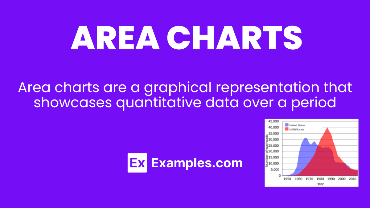
Area charts are a graphical representation that showcases quantitative data over a period. Similar to line charts, but with the area below the line filled in, they provide a vivid picture of volume or magnitude changes over time. This fill helps to highlight the extent of change, making it easier for students to grasp the concept of trends and data fluctuations. Simple, yet powerful, area charts are a fantastic tool for teachers aiming to illustrate complex data in a more accessible way, fostering an environment where students can visually connect with the material presented.
What is the Best Example of Area Charts?
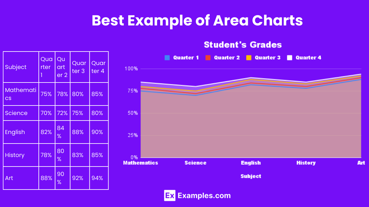
An exemplary use of area charts can be found in tracking the progress of a student’s grades throughout the academic year. By plotting time on the horizontal axis and grades on the vertical axis, the chart fills the area under the line, showcasing how grades have improved or declined over time. This visual tool not only aids teachers in explaining the importance of consistent study habits but also enables students to visually assess their performance. Through such practical applications, area charts become an invaluable resource in education, turning abstract numbers into meaningful narratives that encourage student engagement and understanding.
Area Chart Examples
Area charts are versatile tools in data visualization, effectively illustrating changes over time and comparing different categories. They excel in displaying cumulative totals using color-filled areas beneath lines, making it easier to understand volume changes or trends within datasets. Ideal for educators, students, and professionals, area charts facilitate a clearer comprehension of complex information through visual representation.
1. Monthly Rainfall Measurement
An area chart can display the total rainfall each month over a year, with the vertical axis representing rainfall amount and the horizontal axis the months. This visualizes seasonal weather patterns effectively.
2. Website Traffic Sources
This example uses an area chart to show the proportion of website traffic coming from different channels (e.g., direct, referral, social) over time, highlighting trends in how viewers discover the site.
3. Annual Sales Comparison
Compare yearly sales data across different product lines. An area chart can help in visualizing which products are leading sales and how sales trends are evolving over the years.
4. Stock Market Trends
An area chart can track the fluctuating value of stocks over time, offering investors a clear view of market trends and helping in making informed decisions.
5. Energy Consumption Over a Day
This chart can illustrate the hourly energy consumption in a building, showing peaks during daytime and lower usage at night, aiding in energy management and planning.
Area Chart vs. Line Chart
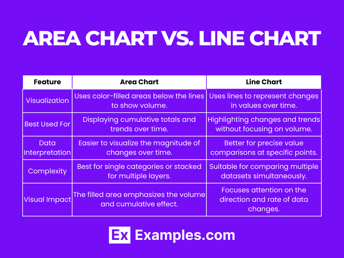
| Feature | Area Chart | Line Chart |
|---|---|---|
| Visualization | Uses color-filled areas below the lines to show volume. | Uses lines to represent changes in values over time. |
| Best Used For | Displaying cumulative totals and trends over time. | Highlighting changes and trends without focusing on volume. |
| Data Interpretation | Easier to visualize the magnitude of changes over time. | Better for precise value comparisons at specific points. |
| Complexity | Best for single categories or stacked for multiple layers. | Suitable for comparing multiple datasets simultaneously. |
| Visual Impact | The filled area emphasizes the volume and cumulative effect. | Focuses attention on the direction and rate of data changes. |
Types Of Area Charts
Area charts come in various forms, each suited for different analytical purposes, enhancing data storytelling with visual depth and clarity.
1. Stacked Area Chart
Stacked area charts are perfect for comparing the composition of multiple data groups over time, showing how each category contributes to the total volume.
2. Percent Stacked Area Chart
This variation shows how each category’s proportion of the total changes over time, ideal for understanding relative distribution within a whole.
3. 3D Area Chart
Adds a three-dimensional aspect to the visualization, enhancing the aesthetic appeal and making the data presentation more engaging, although sometimes at the cost of clarity.
4. Streamgraph
A modern take on the traditional area chart, streamgraphs display data in a flowing, organic shape, often used for more artistic data visualization.
5. Range Area Chart
Highlights the range between two data series for each point in time, effectively visualizing the variance and trends within the dataset, such as temperature highs and lows over a year.
When To Use Area Charts
Area charts excel in visualizing how a quantity evolves over time, making them ideal for displaying accumulated values, trends, and volumes. They are particularly useful in educational settings to teach students about data analysis, emphasizing changes within datasets over periods. Area charts facilitate the comparison of multiple categories visually, helping to highlight growth patterns, declines, or cyclical movements in a clear, intuitive manner. Their application ranges from comparing sales figures, website traffic, to analyzing economic data, offering a versatile tool for educators to integrate into lessons.
- Comparing Annual Sales Figures: An area chart can display the total sales of different product lines over several years, illustrating growth trends or declines.
Explanation: This helps students understand market dynamics and the impact of strategic decisions on sales. - Website Traffic Analysis: Teachers can use area charts to show how website visits fluctuate throughout the year, identifying peak periods.
Explanation: It serves as a practical example of using data to inform marketing strategies. - Environmental Studies – Temperature Changes: Displaying average temperature changes over decades to discuss global warming.
Explanation: Facilitates a discussion on climate change and its long-term impacts. - Economic Growth Comparison: Comparing the GDP growth rates of countries over time to teach economic principles.
Explanation: Students can visually grasp how economies expand or contract in different regions. - School Attendance Records: Showcasing attendance trends across different grades over the school year.
Explanation: Useful for analyzing patterns in absenteeism and planning interventions.
Area Graphs Tips & Best Practices
- Start the Y-axis at zero: To accurately represent the data volume.
- Use contrasting colors: When comparing different data sets for clarity.
- Keep it simple: Avoid cluttering with too many data series to maintain readability.
- Label clearly: Ensure axes, data series, and key points are well-labeled.
- Highlight key information: Use annotations to draw attention to significant data insights.
Pros & Cons of Area Charts
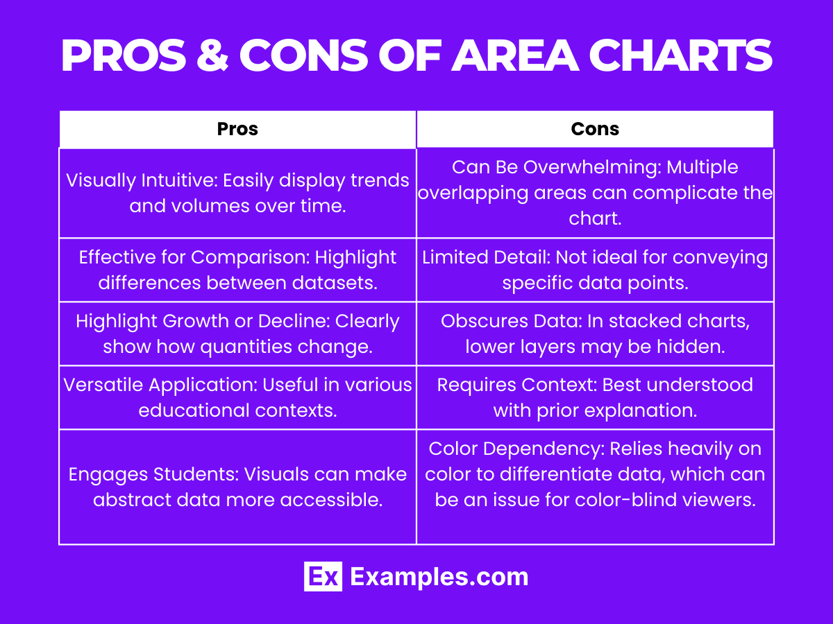
| Pros | Cons |
|---|---|
| Visually Intuitive: Easily display trends and volumes over time. | Can Be Overwhelming: Multiple overlapping areas can complicate the chart. |
| Effective for Comparison: Highlight differences between datasets. | Limited Detail: Not ideal for conveying specific data points. |
| Highlight Growth or Decline: Clearly show how quantities change. | Obscures Data: In stacked charts, lower layers may be hidden. |
| Versatile Application: Useful in various educational contexts. | Requires Context: Best understood with prior explanation. |
| Engages Students: Visuals can make abstract data more accessible. | Color Dependency: Relies heavily on color to differentiate data, which can be an issue for color-blind viewers. |
Area Chart vs. Bubble Chart
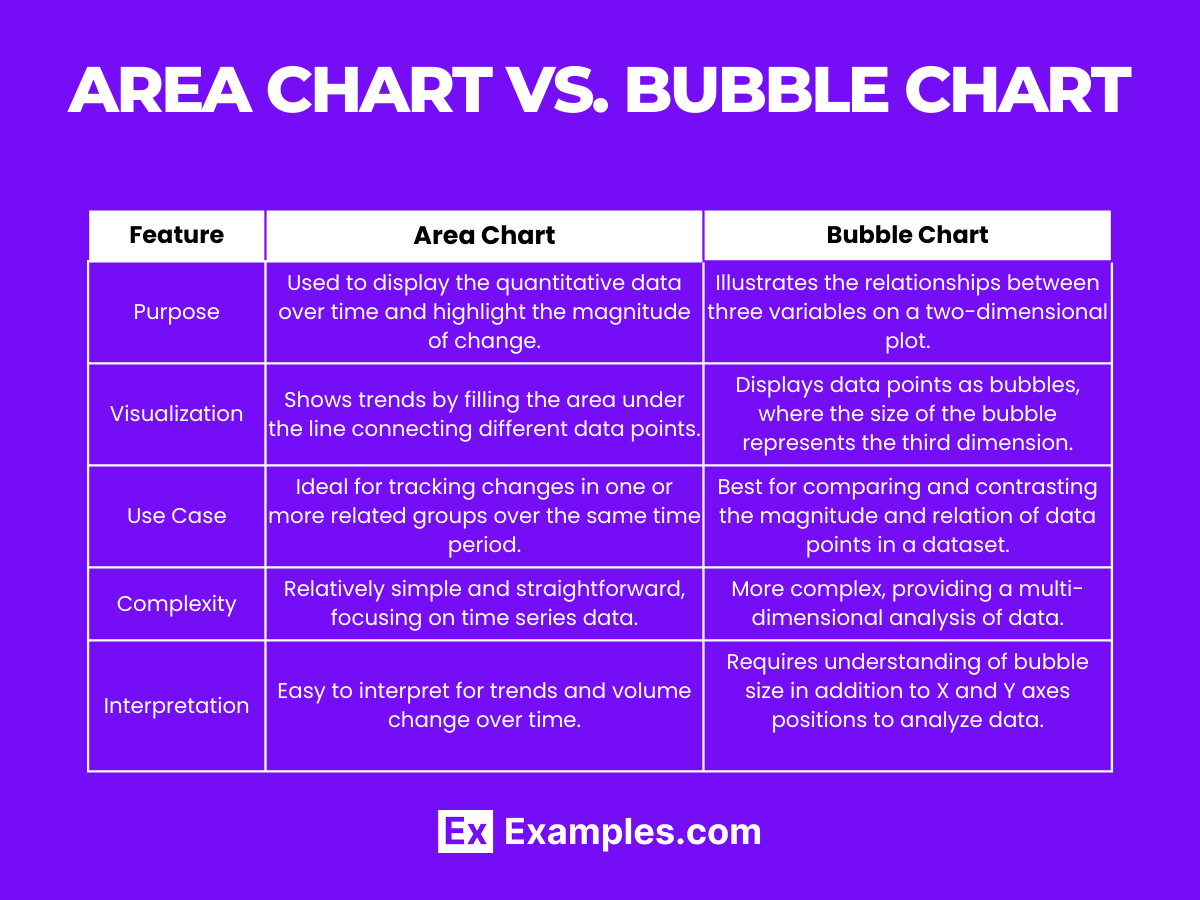
| Feature | Area Chart | Bubble Chart |
|---|---|---|
| Purpose | Used to display the quantitative data over time and highlight the magnitude of change. | Illustrates the relationships between three variables on a two-dimensional plot. |
| Visualization | Shows trends by filling the area under the line connecting different data points. | Displays data points as bubbles, where the size of the bubble represents the third dimension. |
| Use Case | Ideal for tracking changes in one or more related groups over the same time period. | Best for comparing and contrasting the magnitude and relation of data points in a dataset. |
| Complexity | Relatively simple and straightforward, focusing on time series data. | More complex, providing a multi-dimensional analysis of data. |
| Interpretation | Easy to interpret for trends and volume change over time. | Requires understanding of bubble size in addition to X and Y axes positions to analyze data. |
What are the Components of an Area Chart?
1. X-Axis (Horizontal Axis): Represents the time period or the categories being compared.
- Explanation: Acts as the baseline for the data, indicating the time frame over which data is measured or the categories under comparison.
2. Y-Axis (Vertical Axis): Indicates the quantitative value that each point on the X-axis represents.
- Explanation: Provides the scale of values that the data points represent, allowing for the measurement of magnitude.
3. Data Points: Specific values plotted on the chart that represent the intersection of X and Y values.
- Explanation: These are the individual values for each category or time period, providing the basis for the trend line.
4. Trend Line (or Line Graph): Connects the data points, showing the change over time or categories.
- Explanation: Offers a visual representation of the data’s direction, speed of change, and trends over the selected period.
5. Fill Area: The area between the trend line and the X-axis, typically shaded or colored.
- Explanation: Highlights the volume or magnitude of the data covered under the trend line, enhancing visual interpretation of the data’s weight or significance.
Use Cases of Area Charts
1. Financial Analysis: Tracking Stock Market Trends
- Explanation: Area charts are widely used in finance to visualize stock prices over time, helping investors identify patterns and trends.
2. Environmental Studies: Monitoring Temperature Changes
- Explanation: Researchers utilize area charts to display temperature variations across different seasons or years, facilitating the analysis of climate change.
3. Marketing Analysis: Website Traffic Over Time
- Explanation: Digital marketers employ area charts to observe website traffic trends, assessing the effectiveness of campaigns or content strategies.
4. Health Sector: Patient Admission Rates
- Explanation: Hospitals can use area charts to track patient admissions over time, aiding in resource planning and identifying peak illness periods.
5. Education: Analyzing Test Scores
- Explanation: Educators find area charts useful for comparing test scores across different periods or academic years, helping to evaluate teaching effectiveness and student performance.
Benefits of Area Charts
Area charts offer a visually impactful way to display data trends over time, making them ideal for educational and analytical purposes. They highlight volume change, enabling educators and students to grasp complex concepts quickly. With their ability to compare multiple datasets on the same graph, area charts simplify data analysis, fostering a deeper understanding of statistical information. This makes them an invaluable tool in both classroom settings and professional data analysis.
- Visual Clarity in Trend Analysis Area charts provide a clear representation of how values sum up over a period, making trend analysis intuitive for students and teachers alike. This clarity is essential in subjects like economics and environmental studies.
- Effective Comparison Between Data Sets By filling the area under lines, these charts allow for easy comparison between different data sets, such as comparing sales figures across multiple years in a business course.
- Highlighting Volume Changes Area charts excel in showing how quantities grow or shrink over time, helping students understand concepts like population growth or decline in geography classes.
- Simplifying Data Interpretation Their straightforward design aids in simplifying complex data, making it easier for students to interpret and analyze statistical information without getting overwhelmed.
- Enhancing Communication Skills Discussing area charts in classroom presentations or homework assignments can enhance students’ communication skills, as they learn to describe and interpret data trends effectively.
Interpreting Patterns in Area Charts
Interpreting patterns in area charts allows for a nuanced understanding of data trends, enabling educators to teach critical thinking and analytical skills. This analysis is crucial in identifying correlations, understanding market trends, or assessing environmental changes, thereby enriching educational content with real-world applications and insights.
- Identifying Seasonal Trends Area charts can reveal seasonal trends, such as increased retail sales during the holiday season, by showing volume peaks and troughs over the course of a year.
- Understanding Market Fluctuations In finance education, these charts help students recognize bullish or bearish market trends by observing the growth or decline in stock volumes over time.
- Assessing Product Performance Companies use area charts to compare the performance of different products over time, offering practical insights into product lifecycle management for business students.
- Analyzing Environmental Data Environmental studies benefit from area charts by visually tracking changes in pollution levels or deforestation over periods, illustrating the impact of human activities on the environment.
- Educational Progress Tracking Educators can use area charts to monitor students’ academic progress across semesters, identifying areas of improvement and excellence over the academic year.
In summary, area charts are a powerful visual tool for both teaching and learning, offering clear insights into data trends and comparisons over time. They enhance the educational process by simplifying complex data interpretation, fostering critical thinking, and improving communication skills. Whether in economics, environmental studies, or market analysis, area charts facilitate a deeper understanding of subjects, making them indispensable in the classroom and beyond.
Share :
