15+ Pie Chart Examples to Download
Pie charts are a more ingenious way to display data. Instead of the regular table displaying numbers, pie charts can bring color and distinction to the otherwise dull figures. This is also perhaps the most ubiquitous chart type. In newspapers, business reports, school, and especially in statistics, pie chart is a recurring figure. Charts and graphs are important in the business world. They give visualization to a series of numbers that are difficult to understand by those who do not speak the language of statistics.You may also see sales flow chart examples & samples.
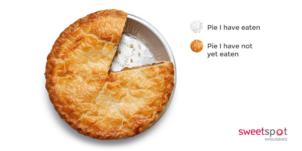
Pie chart is named thus because of its resemblance to a pie. (Yes, the kind that you eat.) Also, just like those delicious pies, pie charts are divided into slices to show the difference between data. This type of chart is most effective when used for simple calculations and measurements. However, for more complex information, it is best to rely on other charts such as the bar graph. However, as common and as simple as these are, a lot of people actually still could not grasp how it works.You may also see Flow Chart Examples
Pie Chart Template
Pie Chart Analysis

Process Pie Chart

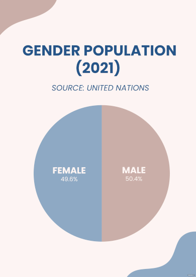
Gender Pie Chart
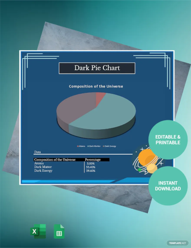
Dark Pie Chart
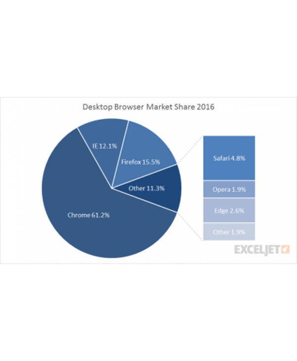
Pie Chart in Different Shades of Blue Example
Basic Two-Sliced Pie Chart
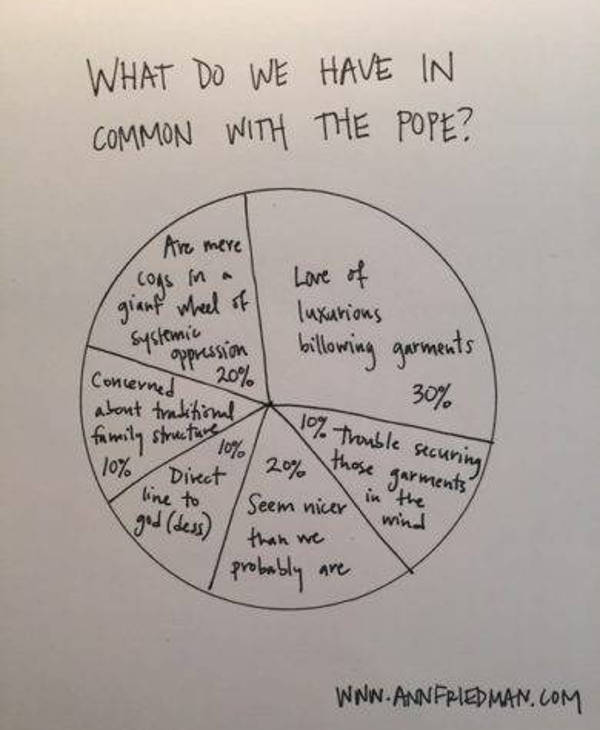
Handmade Pontiff Pie Example
So How Does a Pie Chart Work?
The most basic form of a pie chart is two-dimensional with a few, probably three or four, slices. An important detail that most people miss about this chart type though is how all of the slices, when combined, actually make up one whole entity. Which means that the data you include in your chart is actually just divided parts of a whole.You may also like management flow chart example
To elaborate: when you add up all of the slices, you get the complete pie, or the exact percentage of the data. Eliminate one slice and your data will be incomplete. Enlarge one slice and all the other slices will have to shrink in order to give their part to the expanded slice. So the entire pie and all its smaller slices are one and the same thing, divided only to show different points that should be considered. For example, you want to cipher how many books you have sold in one month all in all. To do this, you will need to divide the pie for every genre or book type you’ve sold. Once you have a general idea of all the individual numbers, add it all up and you will get the exact number of sales.You may also see project flow chart examples
Since every slice is reliant on its neighbor to be complete it, any data that is not a part of a whole should not be in a pie chart. For example, you want to tally the number of books sold and the total number of people who entered your store. Since these two are not directly related, they cannot be in the same pie chart.You may also like marketing flow chart examples
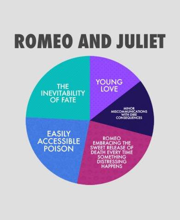
Romeo and Juliet Pie Chart Example
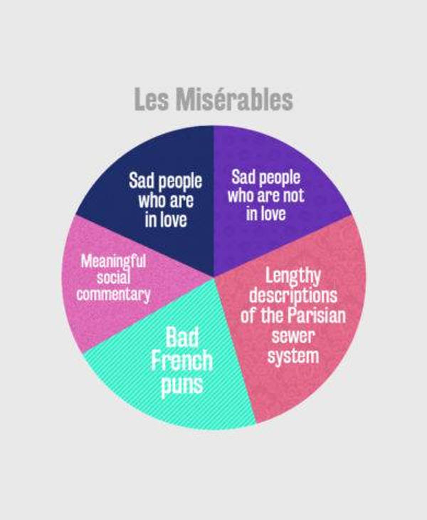
Les Miserables Pie Chart Example
When Should You Use Pie Charts?
Pie charts are best used when you are trying to compute all the smaller parts of a whole. Unlike line graphs, they cannot show changes within a span of time. This can only work if your data is divided into categories. Like the example above, if you want to tally your book sales, you can use the different book genres as categories. Which is why a pie chart is effective in this example because the data is subdivided.You may also check out process flowchart examples
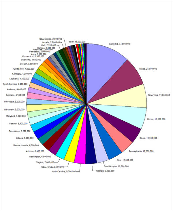
Pie charts are also effective in trying to see an outline of the areas where a business or department has grown. You can enumerate the different aspects of a business department through the pie slices, add all percentage, and get an overview of how much you have improved. Also, as a general advice, pie charts should only have a maximum of seven slices since more would make each slice size indistinguishable to the audience.You may also see nursing flowchart examples
These charts are usually colorful since they are designed to have a distinct color for each slice. This makes pie charts aesthetically pleasing. So if your data coincides with the functions of a pie chart, then it is best to give this chart a try.You may also like business flow chart examples
Adorable Real Pie Chart
Modern Pie Chart Example
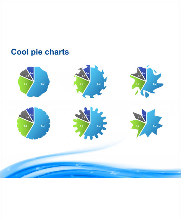
Cool Pie Chart Example
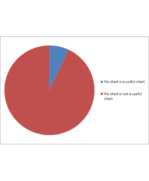
Flawed Pie Chart
Advantages of Pie Charts
An advantage of pie chart is that the way it presents its data is simple and understandable even to those who are not used to mathematical figures. At first glance, the comparisons are already visible, which means that the audience will not have to spend a lot of time in studying the chart. Plus, as aforementioned, pie charts are aesthetically pleasing, and human nature tells us that we are easily attracted to pretty things. They are also easier to understand since our brain are, unfortunately, wired to comprehend attractive objects or illustrations more quickly.You may also see general flowchart
Disadvantages of Pie Charts
A pie chart cannot hold too much data because the circular figure that it takes is only designed for minimal calculations, so this is already a disadvantage especially for those who need to graph more complicated calculations. Pie charts are also not very reliable when making comparisons although this is their main purpose. This is because the size of slices that are almost similar in value often become difficult to decipher, which makes the audience rely on aesthetic impact rather than on technical inspection.You may also see flowchart examples for students.
Alternative to Pie Charts
Doughnut charts are also circular charts with uses similar to pie charts. A distinction, however, is how this chart type can hold multiple, more complex data. You can also utilize the doughnut hole as space to write data labels and calculations to help your audience understand your chart. Bar graphs, on the other hand, can portray data by length which can be helpful for quick, expansive measurement and comparison. This is most effective if you have an extensive set of data that you need to present into one chart since bar graphs are specifically designed for this purpose. This is also very helpful if you want to compare different sets of data into one chart.ou may also like recruitment flow chart examples
Funny Pie Chart Example
What Are Other Types of Charts?
For other needs that pie charts can’t cater to, there are several others to choose from. Aside from pie charts, here are the three other most common chart types:
1. Bar Graph.
This chart type is useful when you want to compare data from three different sources. For example, if you want to compare the amount of food consumption of three different nationalities, a bar graph is most effective for this task.You may also seechore chart examples & samples.
2.Line Graph.
Line graphs are used when you want to compare changes over time. For example, from 2010 to 2018, what is the general level of usage for gift certificates? For measurements of this nature, line graphs are the most reliable.
3. Cartesian Graphs.
This type of graph is a common term in algebra. It refers to charts with both X and Y axis. This type of chart is best used for data that are interrelated and that unavoidably overlap with one another.You may also like sample chart examples.
Other types of chart include the following:
1. Comparison or Relationship Charts.
As its name implies, this type of chart is used when you have two different yet correlated data that you want to show the connection of. Venn diagrams, which are qualitative in nature, are a good example of this chart type.
2. Distribution Charts.
This chart is best when you want to create a visualization of how data is dispersed between the respondents.You may also check out daily chart examples & samples.
3. Composition Charts.
This is generally described as charts that express their data as a whole by showing its divided parts. The most popular example of this chart type is the pie chart.
4. Flow Charts.
This type of chart is also known as a process tree because it shows the systematic flow of the process used when collecting data.You may also see control chart examples & samples.
Pie Chart Example

Charts have different uses. Before you pick one for yourself, first identify the things you want your chart to do for you. After that, choose from this diverse list of charts which one will work best for the task at hand. However, if you are going for an uncomplicated chart that can effectively do one important thing for you, the pie chart is the most reliable graph out there. It is straightforward and pleasing to the eye, without compromising reliability and effectiveness.Business Flow Charts
Share :
