
There’s no denying the fact that people find it easier to understand a given data once they are presented in a physical document containing graphs, tables, or illustrations. For example, chart in PDF. Having a chart makes it easier for us to carefully analyze data. There are various types of charts out there, all of which have a defined purpose. One common example would be a price chart.
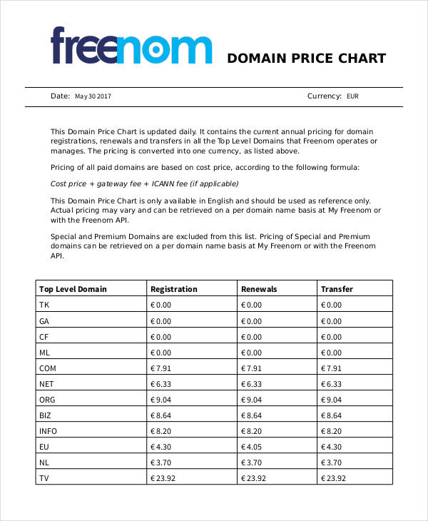
Domain Price Chart
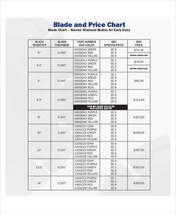
Diamond Price Chart Example
Free Price Chart
Price Chart for Contract
What Is a Price Chart ?
A price chart is just one of the many sample charts that displays relevant information to serve a given purpose. From the name itself, a price chart displays a list of prices for a given item or service.
How to Create a Trading Price Chart ?
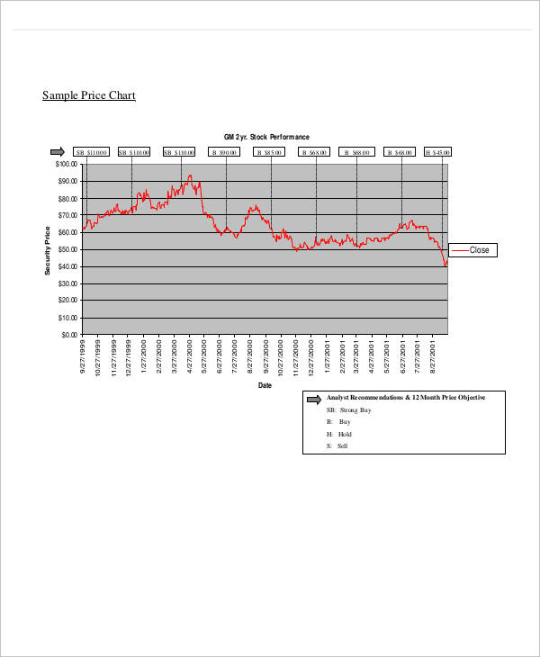
In trading, a price chart is defined as a graphical representation of a given asset in which information is based on the market’s behavior. Like other chart examples, the chart will be useful in measuring behavior and progress over a given time period. One common way to display such is through the use of a single price bar.
Typically, this chart presents information for a single trading period. It also consists of the following prices:
- Open – the recorded price from the first trade
- Low – the lowest price within the trading period
- High – the highest price within the trading period
- Close – the recorded price from the last trade
The full list of traded prices throughout a given time period are then presented by a vertical bar.
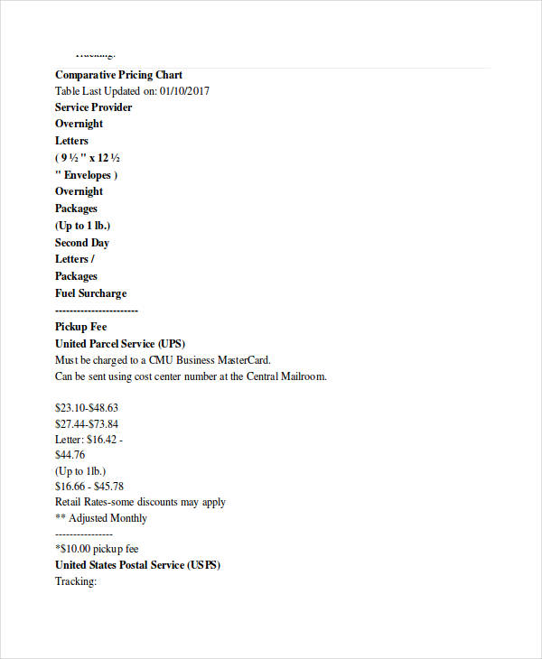
Comparative Pricing Chart
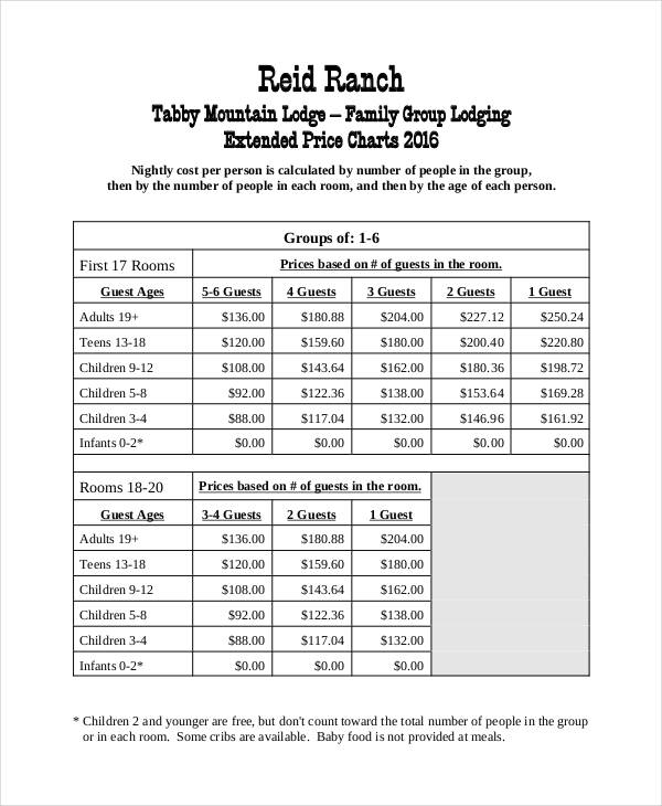
Extended Price Chart Example
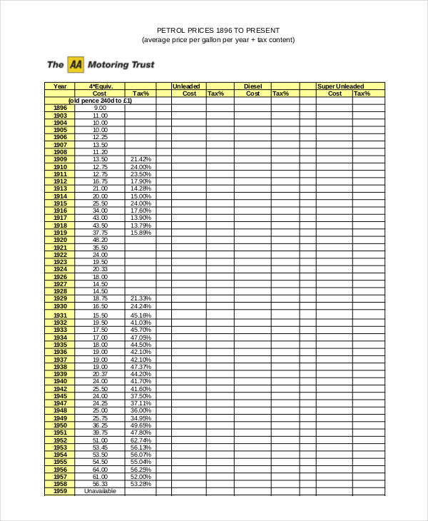
Petrol Price Chart
Importance of a Price Chart
For starters, making assumptions for an item’s worth isn’t a very good practice. This is probably the easiest way to lose money. It’s important for a business to provide a price chart to guide their employees accordingly.
Of course, this can be seen from a retailer’s point of view. If you view things from a customer’s perspective, a price chart can help a customer make proper decisions.
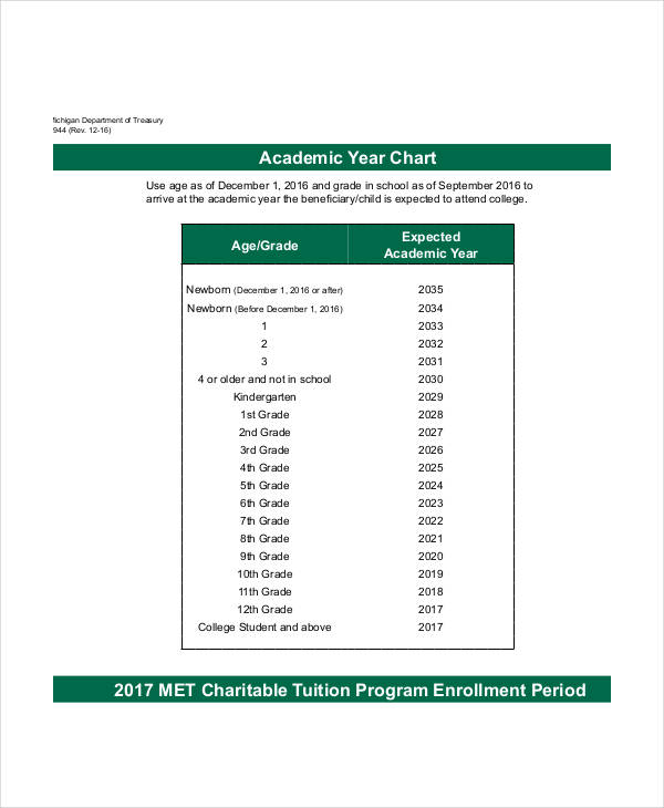
For instance, a mother would like to enroll her child in an academic program. Similar to a size chart, a price chart will provide the mother with total costs and other significant details that she can assess to come up with a decision.
After all, money is pretty hard to find.
Tips for Writing a Price Chart
- List items sequentially. Whatever sequence you want to follow, it’s important that data is presented in an orderly manner. This would make it easier for individuals to find what they’re looking for.
- Properly section items. Items with their corresponding prices should be properly sectioned in the chart. This can be done through the use of tables or invisible columns and rows.
- Specify the currency being used. Displaying amounts without a currency may be misleading to a reader. Remember, the British Pound is a lot different from the US Dollar.
- Include a disclaimer if necessary. If the prices listed are exclusive of additional costs, it’s important to state this by adding a note at the bottom part of your chart.
- Make sure to update. Price comparison charts with outdated information can be unreliable and deceiving.