
When you think of charting, basic charts, such as bar charts and Sample flow charts, come to mind. But there’s a wide variety of charts that are used for different purposes. For instance, size charts are used for retail purposes while weekly charts are used to monitor progress. Whatever the reason may be, charts allow us to document significant data in a simple yet systematic manner.
Temperature Chart Template
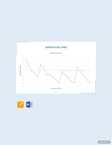
Temperature Chart
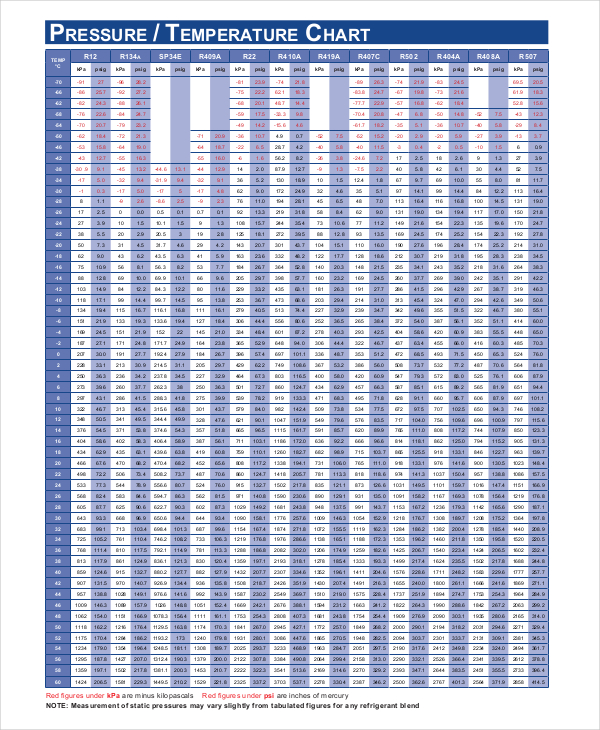
Pressure Temperature
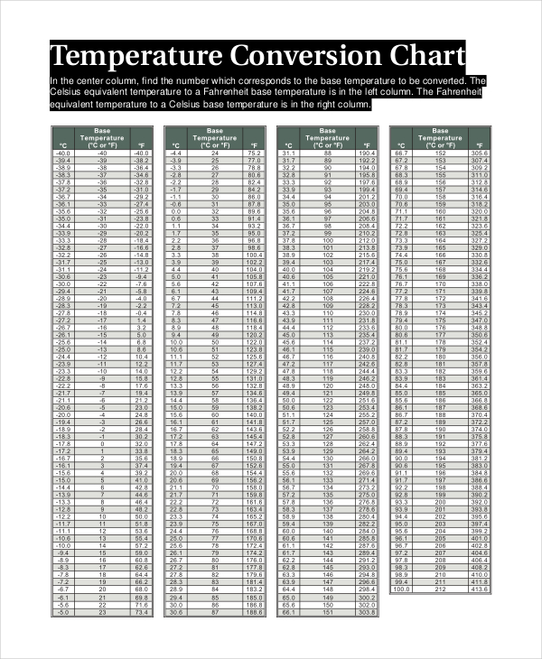
Temperature Conversion
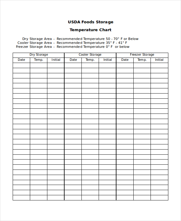
Blank Food Temperature Chart
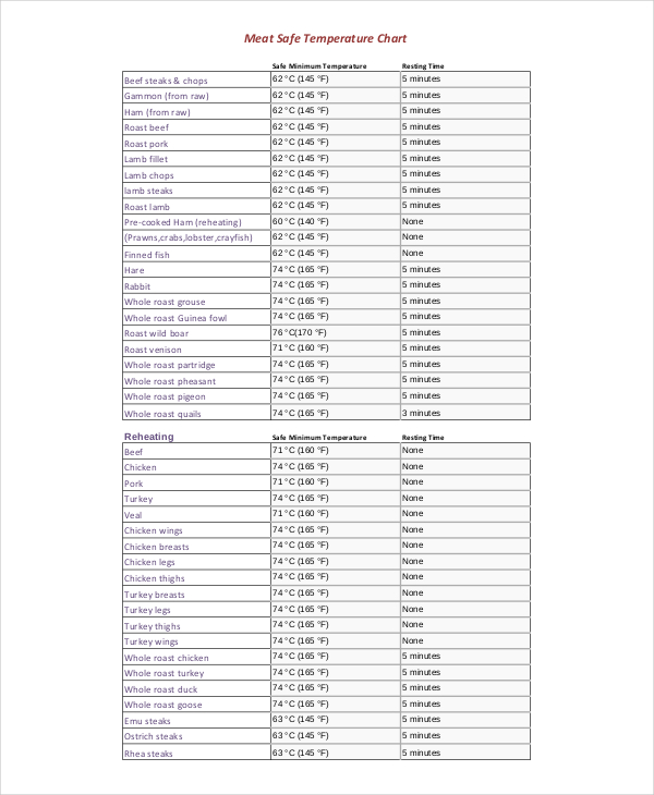
Meat Temperature
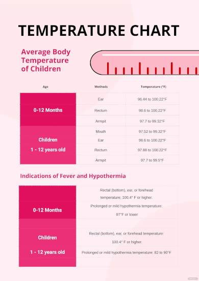
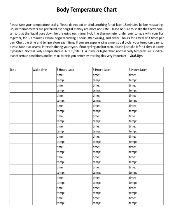
Body Temperature
What Is a Temperature Chart?
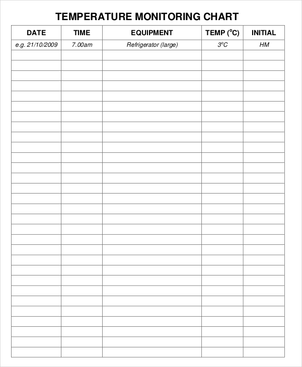
A temperature chart is simply a chart that is used to document and record a body or a material’s temperature. It typically consists of temperature measurements. Just like other chart examples, it provides a visual overview of the data presented. This makes it easier to observe and draw conclusions on particular matters.
How to Calibrate Temperature Chart Recorder?
Nowadays, a lot of temperature chart recorders are designed to have advanced monitoring and alarming capabilities for effective temperature control. To calibrate a standard chart recorder, do the following steps:
- Turn the unit on and hold both the power button and the adjust-down button. The led will then turn amber and then turn green after a few seconds. Release the power and adjust-down button. After which, the led will appear amber and only the pen being adjusted will be on display.
- You can now adjust-up and adjust-down to raise and lower the unit of measure respectively. Pen home then stores the current adjustment value.
- Once you are finished, you may now press the power button to turn the unit off.
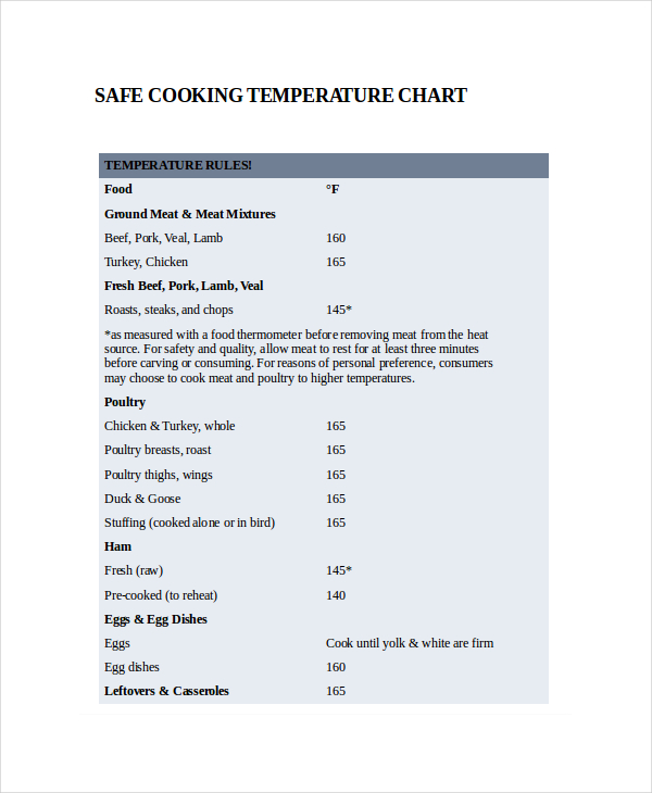
Safe Cooking Temperature
Blank Temperature Monitoring
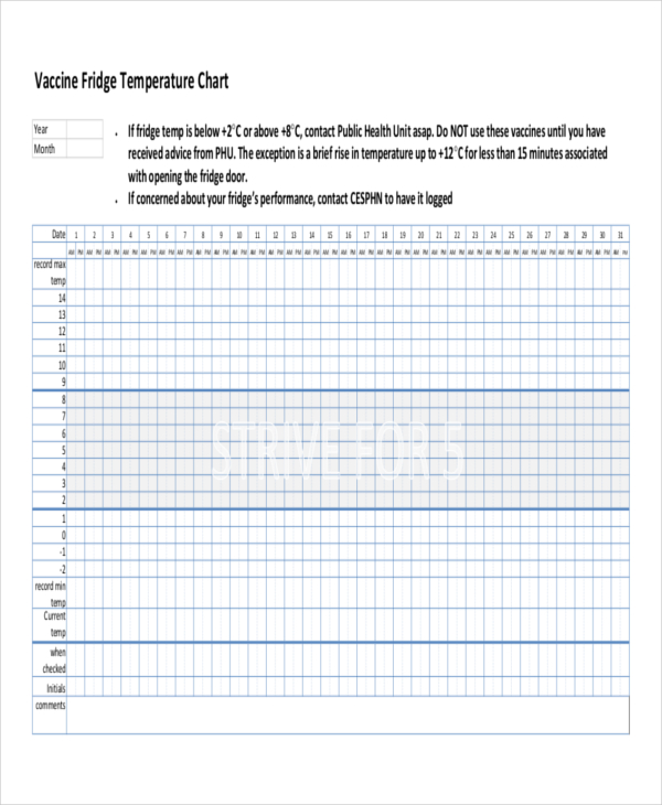
Vaccine Temperature Chart
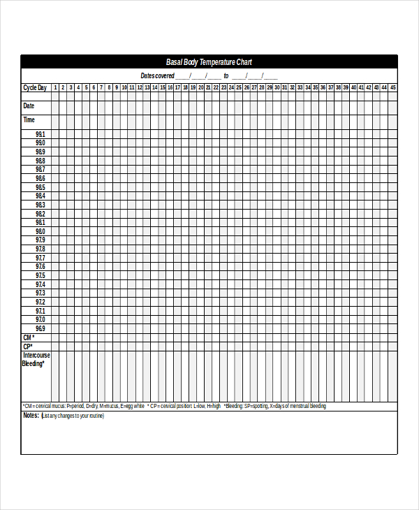
Basal Body Temperature
How to Use a Pressure Temperature Chart?
Machines that contain refrigerants, such as refrigerators and air conditioners, need pressure temperature charts to show the relationship between the pressure and temperature of the machine.
To use such chart, simply determine the units of the measured temperature and pressure. Read the values given in the chart. If the left column represents temperature values, this means that the other cells provide the pressure at which the temperature has reached. If the pressure is given, then the following cells provide temperature readings at which the pressure has reached. Note that temperature is measured by either Celsius or Fahrenheit while pressure is typically measured by pounds per square inch or psi.
There are chart examples in PDF format that you could use for your personal chart.
What Is a Coverline Temperature? How do I Chart it?
A coverline is an important step in temperature charting as it shows the shifts and surges in temperature.
This helps you determine when you have ovulated and it allows you to monitor your temperature after your ovulation period. The easiest way to chart your coverline is to look into the six days prior to your ovulation period. Identify the highest temperature and then draw a horizontal line that is at least two-tenths of a degree higher than your highest temperature.
Your temperatures post ovulation should then stay higher than the cover line. A basal body temperature chart is just one of many sample chart examples that we use to monitor a status.