10+ Excel Chart Examples to Download

Today’s technology is the highlight of business expansion, advanced performance, and convenience. Because there are various sectors in the industry that support and hold data, it is a given to produce a comprehensive and easy to understand analysis and other reports. With this, communication would be more accessible, and sending messages will be fast and secure. Good thing, along with the innovations, is the Excel chart that most administrators use because it presents a visual of datasheets. Who knows this can work for you, too. So, check out the Excel chart samples below to see how you will start.
10+ Excel Chart Examples & Templates
1. Elegant Excel Chart
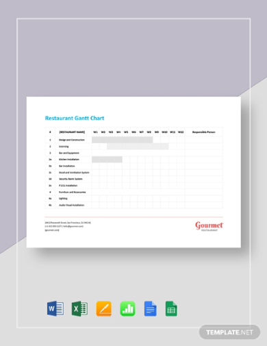
2. Restaurant Excel Gantt Chart
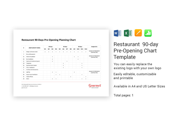
3. Restaurant 90-Day Pre-Opening Excel Chart
4. Simple Excel Chart
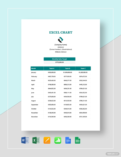
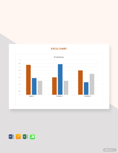
5. Basic Sales Excel Chart
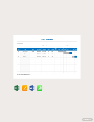
6. Basic Excel Gantt Chart
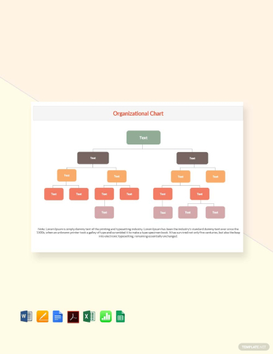
7. Beautiful Organizational Excel Chart
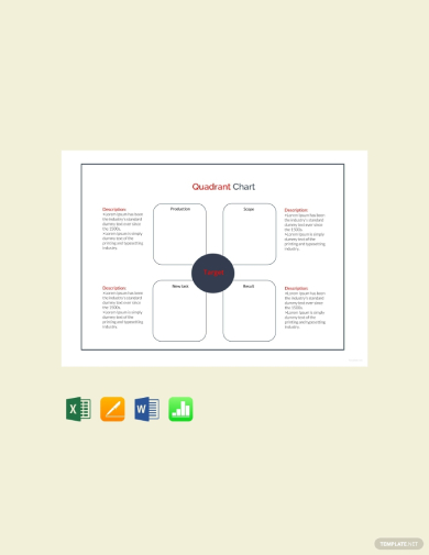
8. Quadrant Excel Chart
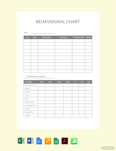
9. Minimalist Behavioral Excel Chart
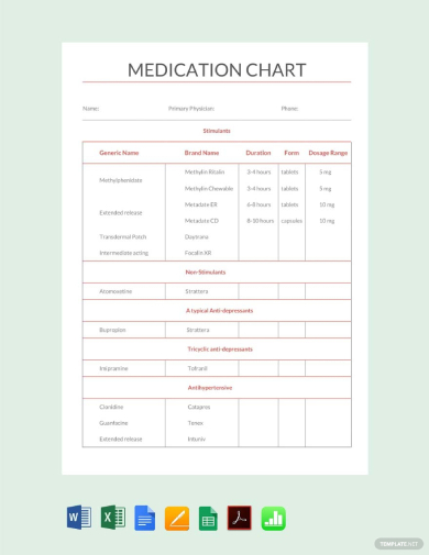
10. Simple Medication Excel Chart
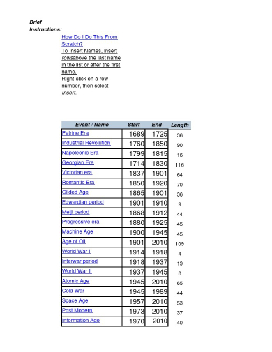
11. Plain Timeline Excel Chart
What Is an Excel Chart?
In this modern era, charts, or graphs are among the useful tools that you may utilize in exhibiting complex data analysis reports in various creative ways. It is a visual that helps picture out and convey a message. Though there are many chart formats you may use in exhibiting your information, you still need to be wary since not all of them are applicable in all cases.
The Advantage of Using Charts
As part of the growing business project plans, many companies would consider the use of visuals. In this way, they can secure that the workforce can easily understand the bits and pieces of their responsibilities. Perhaps, according to the report published by the Small Business Chron, the advantages of charts include customization, which enables users to take control of the adding, editing, and formatting of data that will be useful to consider different options. If this is the case, many organizations will benefit from charts for plans.
How To Make an Excel Chart
Making a basic excel chart is easy. But you have to remember that is will only be manageable when you know what you will be doing. Because charts need to be easy to understand, you have to specify different elements in your document. To know how, follow the list of steps below.
1. Collect Data and Resources
When making a business chart, you should start with data gathering. Since business reports and project plans have different purposes, start from a blank sheet, and have research with your team. From here, you can come up with an idea to go about the content, such as the designs. By data gathering, you are also engaging the audience to listen.
2. Construct the Chart
Next, bring all the resources to the table. Here, you can begin with the construction of excel graphs by deriving your chart from the outline of data that you have. You can present your chart by using a line, pie, or bar. With this, it is easier to provide a comparison, especially with data that involves numbers.
3. Include the Label
To make it more compelling, but the labels appropriately. Don’t just add them for the sake of it. Instead, put a legend on the side. For research project proposals, you are free to calculate values, amount, or percentages involved. Then, write the correct labels in your chart. With this, you are prioritizing better understanding and communication for your audience’s benefits.
4. Customize and Review It
Lastly, complete your executive report, finish it up by adding colors to it. However, this isn’t for creative purposes. Combining different colors help you differentiate the variables or items from one another. Because of this, the comparison will be clear.
FAQ’s
How is a table chart defined?
A table chart is a material that organizes data in sequence, rows, and columns. It is used for different purposes, such as in research and case studies.
What are three of the many types of charts?
Among the three types of charts are the area chart, pie chart, and bar chart.
How can you choose a chart?
Choosing a chart is easier when you know what it is for. You have to determine how many variables are necessary to complete your report. Then, see the scale of your axis.
Creating a business report means you have to deliver it well and without error. In companies, it is common to give confusion to the audience, especially when your visuals are not that clear. So, to address this issue, it is essential to create a chart. You can follow the steps above and come up with an overall output.
Share :
