In the advanced world of technology today, designing a simple website is not really the thing in this era anymore. You see, the growth of mobile and smart devices, such as smartphones, iPads, tablets, smart watch, etc., are skyrocketing along with the web technologies today. And because of this multi-device market, the responsive web design are in rage in the creative business today.
What’s a responsive web design, you may ask? Well, to put it simpler, it is a web design that has the capability of adjusting to any screen size of devices, not only in PC but in smart devices as well. The best thing about the responsive web design is that it provides an interactive, engaging and great user experiences across many screen sizes of smart devices. As a matter of fact, designing a responsive website is now a requirement in web design.
How Does It Work?
In the past technology, a website can only adjust to any screen sizes if it has a separate code which is only created to fit for that specific size. Now, with the responsive web design, the website itself will automatically adjust to fit that specific screen size without ruining its design and the placement of text and other elements. That way, the whole website is still in good form and is still readable and easy to navigate.
And as I said earlier, the technology is rapidly advancing especially when it comes to responsive web designing. You don’t have to burden yourself in designing a responsive website with lots and lots of codes (and you have to actually learn all of that). There is also a rapid growth of tools that can help you and ease your pain in creating a responsive design to simplify all things.
Let’s take a look at the best tools for responsive web design.
Gridset
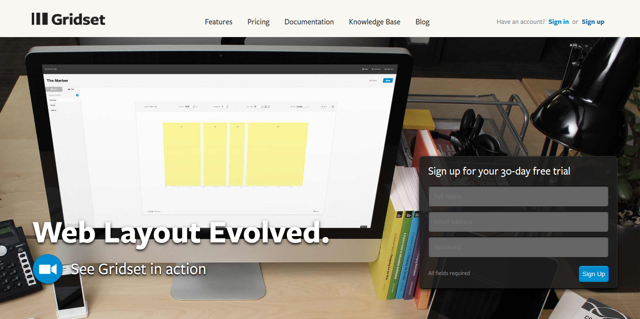
Gridset is one of the best tools in creating custom, responsive grid-based layouts for websites. Designers and developers use this tool to build prototype and beta mode projects. One of its main features is that it can create any type of grid that you want to use, such as the regular columnar grids.
Best part? Gridset allows you to work with a different content management system, including Joomla, Drupal, and WordPress. Plus, it also works with the best graphic application software such as Photoshop and Fireworks.
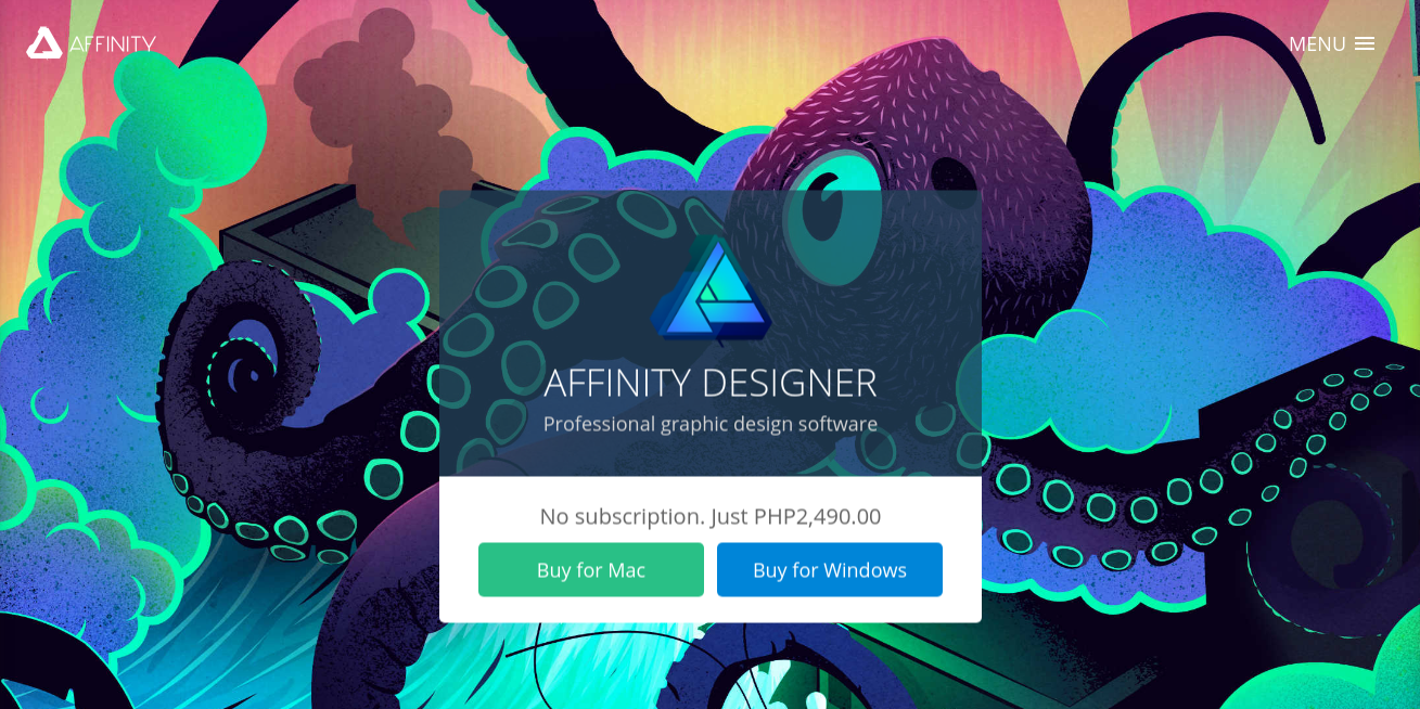
Affinity
Affinity Designer was created by the company Serif. Many designers and developer dubbed this tool as the “Photoshop Killer” and it is not really hard to see why. When you visit their site, you can see its well and beautifully designed website. This tool is really made to be a web and graphic design tool.
One of its amazing features is that it has adjustable and non-destructive layers, meaning you can adjust, resize, and modify the images or vector designs without losing its quality. Plus it has 1,000,000 percent zoom so you can really get close to your image. This tool is also very useful, Affinity allows you to undo your step for at least 8,000 moves!
Avocode
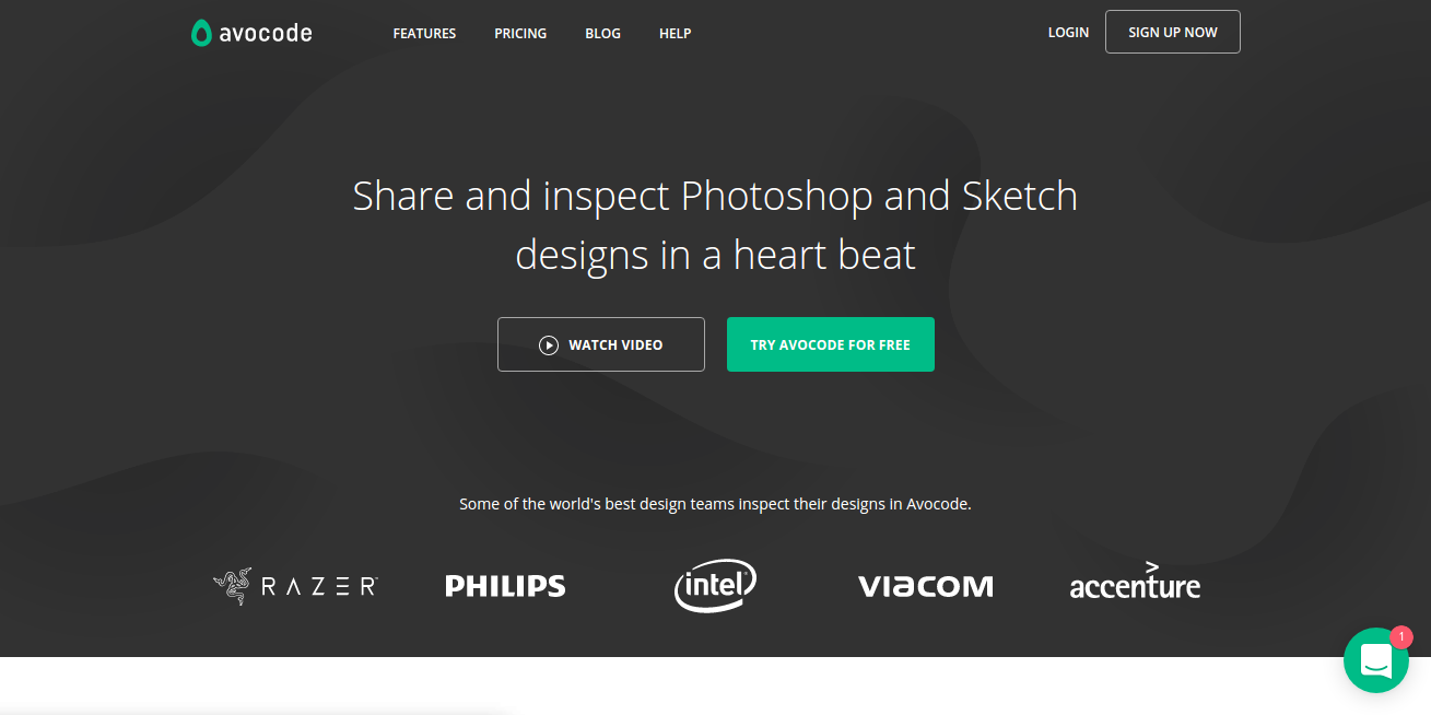
This tool allows the designer to code website or mobile application straight directly from Photoshop or Sketch which makes it extremely easy for them and convenient as well. Avocode was created by the team that introduced us to CSS Hat and PNG Hat. So, it is not really hard to see why they take exporting process to whole a new level.
What makes this tool absolutely amazing is that it has a Photoshop plugin where you can sync your PSD file into Avocode with just one click then analyze your PSD file and turn everything into a beautifully designed UI. Avocode really step up the game here!
Bootstrap
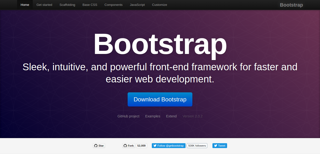
Bootstrap is also a great choice for creating a responsive web design. This was built in the Twitter environment by Mark Otto and Jacob Thornton. Bootstrap provides a wide variety of components and elements. They are easily configurable CSS front-end framework and made to look and behave well in any devices. Perfect for developing effective and efficient websites.
Export Kit
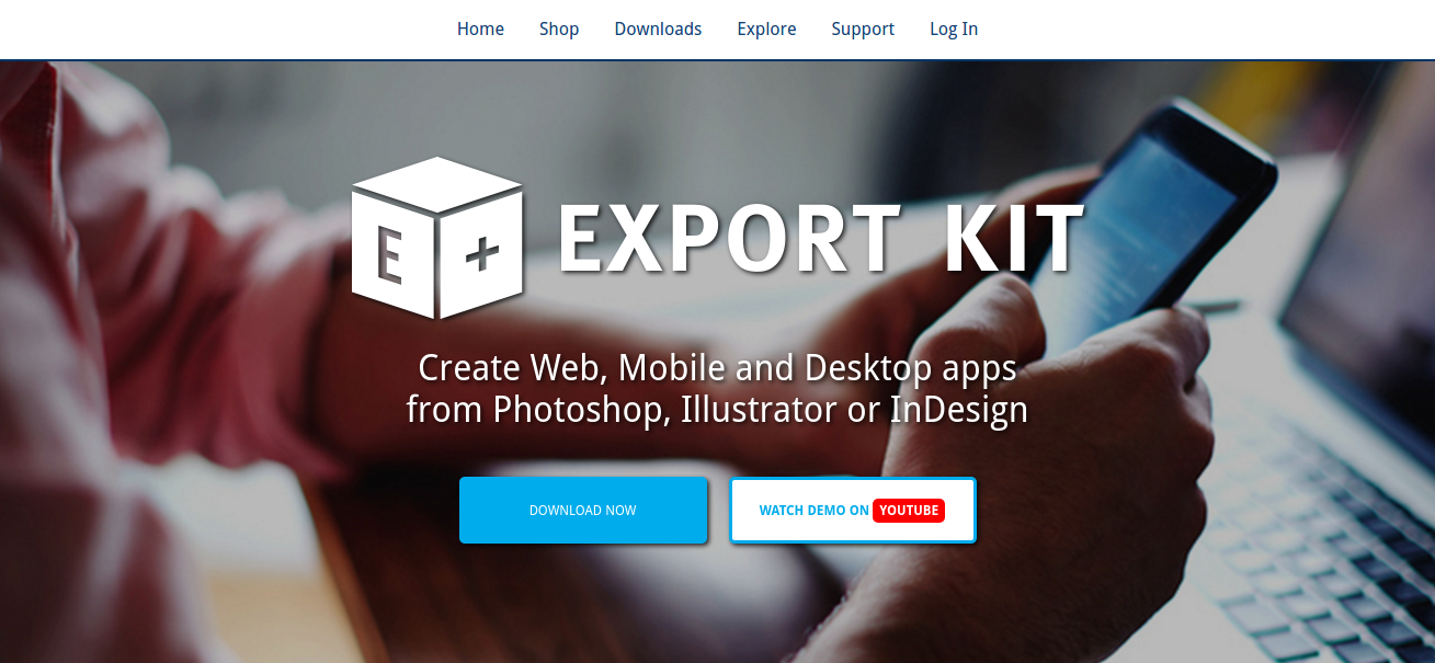
Export Kit allows the designer and developer to use Photoshop in designing website as this tool can create a design in Photoshop and immediately turned it into a full-fledged website or mobile application without having to use any exporting tools and a lot of codes.
Export Kit also makes it extremely easy for the designers and developers to link their project and their code by immediately converting any Photoshop file into HTML, CSS, JS, WordPress, Drupal, Joomla, Android, iOS and more.
Adobe Edge Reflow
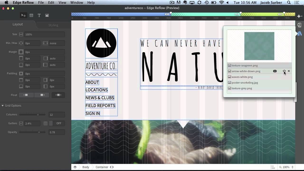
Adobe launches this amazing tool but it still in beta mode. However, this tools is increasingly becoming one of the favorites of most designers. Edge Reflow is not like the Photoshop which mainly focuses on graphics and images editing, Edge Reflow was created expressly to handle responsive layouts, including grid systems, media queries, and generating advanced CSS layouts.
Adobe Edge Inspect
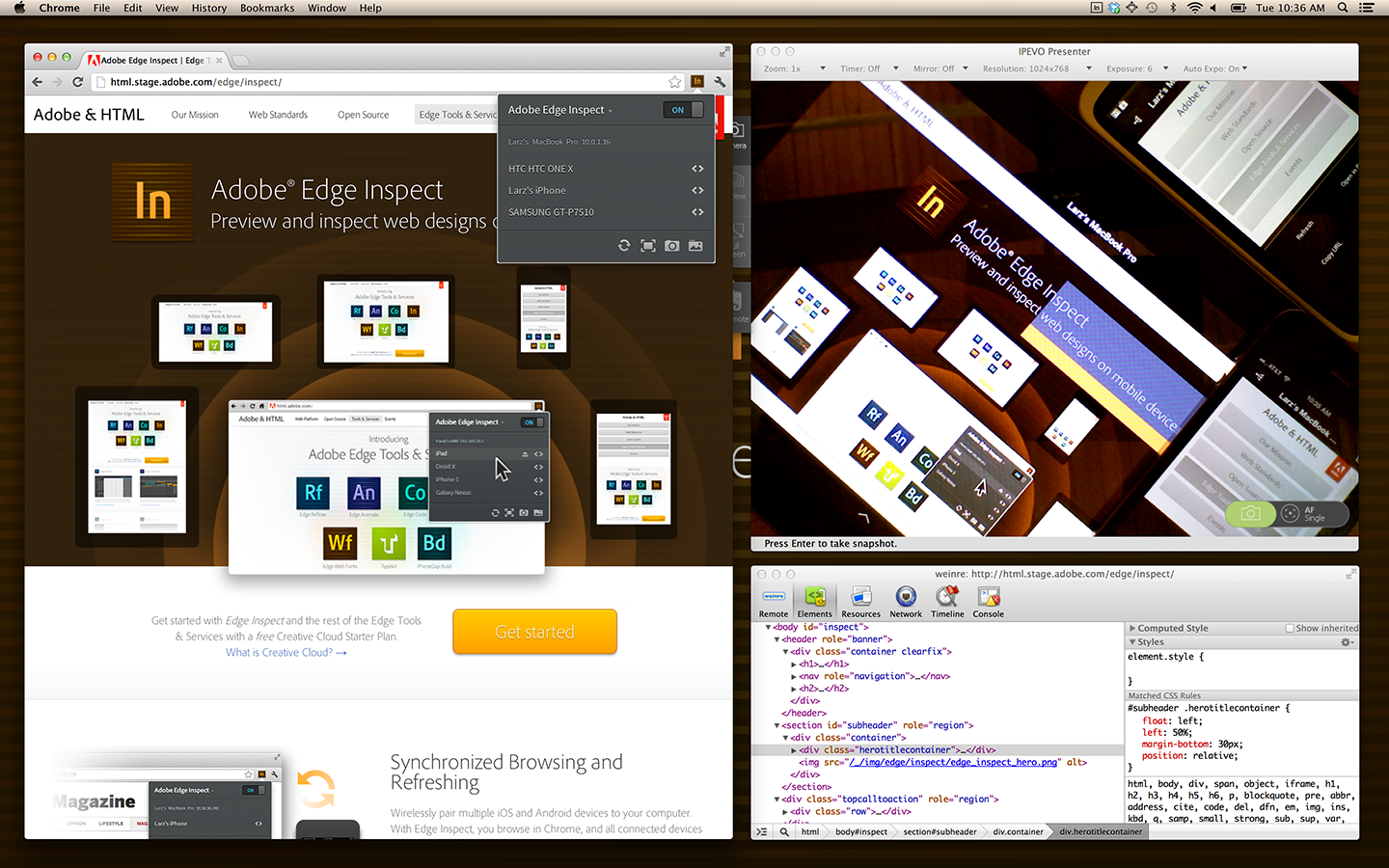
Adobe Edge Inspect is the perfect tool when you want to know how your responsive web page will look like in any devices and different screen sizes.
With Adobe Edge Inspect, you do not have to test your website using different physical devices. This tool will allow you to preview your responsive website as it would be viewed on an iPhone, iPad, Droid X, Galaxy, Google Nexus and other devices on one single tool.
Form
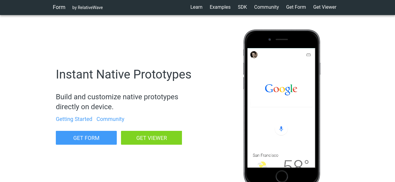
RelativeWave’s Form is one of the best prototyping tools. It has a clean and simple interface and that there’s no tools or layers palette. Many designers and developer describe this tool as a mixed of design and code.
The only downside of this tool is that you can not create graphics straight from the app. However, Form has a tool called “patches” where you can insert graphics and add gestures and interactions. The Mac version of this app requires you to have an iOS app so you can view and interact with your prototype in real time.
Invision
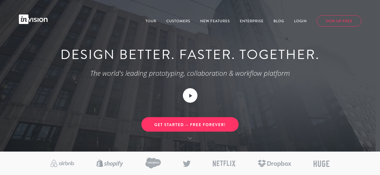
Not only does this tools can create amazing responsive web designs, it is also very useful when communicating your design transitions and your accomplishments between your other team members. Invision allows you to upload your working designs and create real-time interactions between users.
But, what makes this tool stand out is that it has the ability to send clickable designs to your phone via SMS. Pretty cool, right? Plus, the support of Invision for Android phones was recently announced.
Macaw
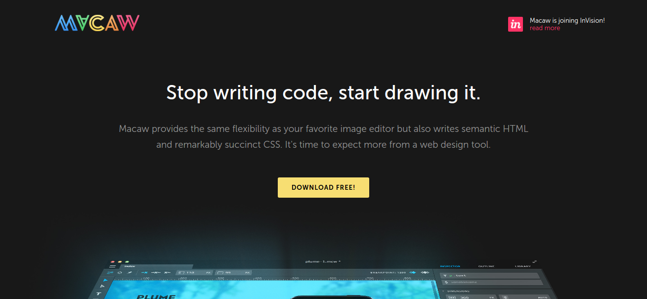
Macaw is certainly my favorite. Without touching or creating any codes, you can create a responsive web design that works great across any type of devices and different screen sizes. Without touching any codes is usually the reason why apps fall down, but Macaw somehow managed to create a magic code that got it right!
You can even create a simple responsive web layout in just 30 minutes that works pretty well. This tool allows you to bring up options to adjust the layout, and you can present your output in real-time, enabling you to see the changes that can affect the design. You will be amazed by the simplicity of the design.
Marvel
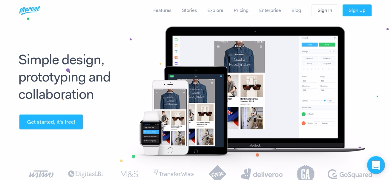
Marvel is a “code-free” prototyping tool that transforms images and sketches into interactive prototypes that look and feel like real apps and websites. That’s how Murat Mutlu, the co-founder of Marvel describes the tool.
One of its primary features is that when you first open the tool, it will ask you to connect your Dropbox account. This will allow the tool to grab the necessary files it needs to create your project. That is the only way you can export your files into Marvel.
However, once you have export your PSD file, you can then use Marvel to build beautiful UI in minutes to connect your pages together. This tool also allows you to create a transition between links and pages and provide you a preview of how it will look like in the browser.
Pattern Lab
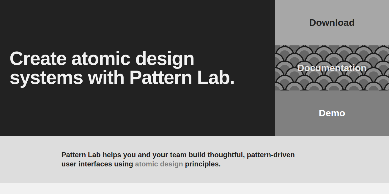
Pattern Lab was created by Dave OIsen and Brad Frost. It is a pattern-driven tool that was based on the concept of the “Atomic Design,” which stated that in order for you to create a best responsive web design, you should break the design into its smallest parts (like atom) and combine them to form bigger, reusable components (molecules and organisms) that the output can be turned into usable templates.
Sketch
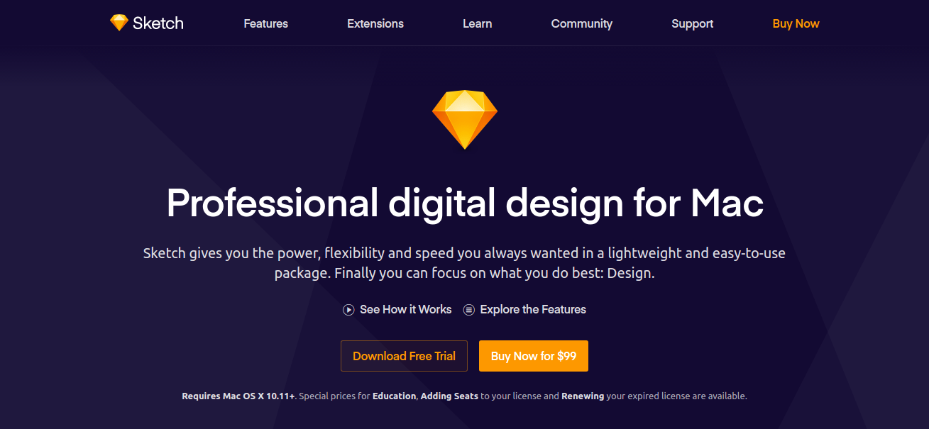
Sketch was launched way back 2008 and since then it gained a massive following. Sketch incorporated CSS logic which makes converting your designs into CSS much easier, but in order for you to do that you have to use CSS logic when applying styles.
Another feature of Sketch is the Automatic Slicing that speeds up the design and the development crossover and creates assets using one-click export without having to manually add slices, which will then be exported at 0.5x, 1x, 2x and 3x and in various formats such as PNG, JPG, and TIFF.
Style Tiles
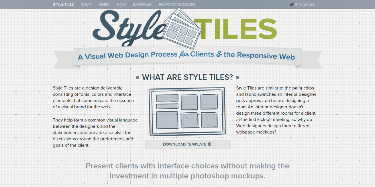
Style Tiles level up the gap between creating a style and coding, which makes it much easier when creating a responsive web design. Style Tiles does this through a Photoshop-style template where the colors, basic layout, and flat logo designs can be added directly to your website and can be able to adjust to fit your requirements.
UXPin
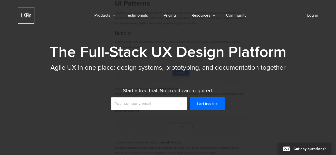
UXPin is a wireframing and collaborative design tool that allows the designer to create prototypes that are interactive. It also allows the designer to create rapid low-fidelity wireframes as easily as creating hi-fidelity interactive prototypes. One of its major advantages is that it allows you to have so much flexibility within the app, such as creating an opt to start with an empty iPhone app or responsive website template and designing everything in just one app.
There is also an option where you can import any design from Photoshop and Sketch and add interactivity to it. If you are building a responsive web design from scratch, you do not have to worry much as this tool provides many element libraries that you can use, including UX patterns from frameworks such as Bootstrap, Foundation, iOS and so much more.
Vivaldi
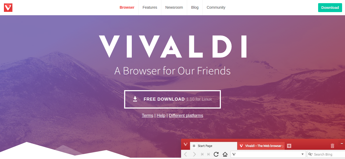
Vivaldi was created by the same team who brought us Opera. It is named as the “browser for our friends”. Well, we can argue with that. Vivaldi is a fast, customizable web browser for power-users created using web technologies, such as JavaScript and React for the interface and Node.js and lots of NPM modules for back-end process.
Not only it is fast and customizable, other features of Vivaldi includes command line control, a taking note section, tab stacking and tiling, and web panels allowing the users to put their favorites sites in one place.
Webflow
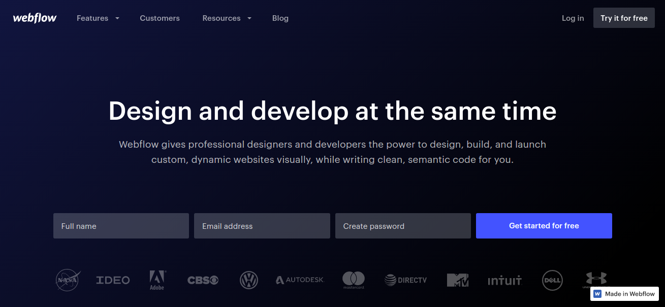
Webflow is also another good option in creating a responsive web design that allows you to design production-ready websites with a “code-free” method. It has a clean and unobtrusive UI design allowing you to focus on the components and elements to build a beautiful web design.
This tool takes the whole “code-free” method to a new level as this tool has an option to view the design at popular breakpoints and a feature that allows you to into a preview mode where you can have a full control over the viewport size. Another amazing feature of this tool is that is has a drawing tool so you can use your imagination and you are not limited on what you can create.
Wirefy
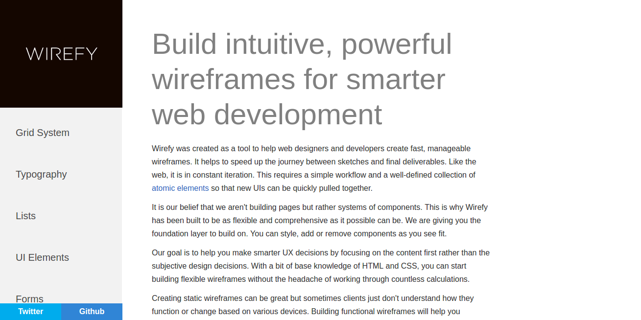
With some knowledge of HTML and CSS, you can create a responsive web design in no time. Wirefy is a great tool for creating responsive web designs, it is easy to use and you can easily create creative wireframes without the anxiety of having to write so many codes.
To make it so much easy for the designer, Wirefy has a collection of responsive HTML snippets and templates that can be used in any responsive design. The HTML snippets and templates will automatically scale and adjust to fit any size of the browser or across multiple devices. This tool is perfect for you if you prefer to create the content of the website first at the base and then start designing the responsive web later.