25+ Chart Examples to Download
There is no better way of understanding a process, a change, or an improvement, than seeing it in a chart examples . Charts make it easier for us to get the idea or to see what is different. You see, mere words fail to provide us with the information we need at first glance. You’d still have to make an effort to read the document multiple times until you can fully grasp the message it’s trying to convey. It’s even more difficult to asses when you’re meant to make comparisons between two different subjects. With a chart, people would no longer need to create mental pictures in their head as the chart does the work for them.
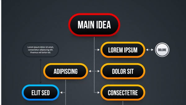
Flow Chart
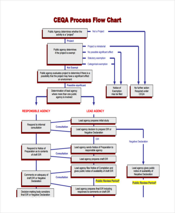
Process Flow Chart Example
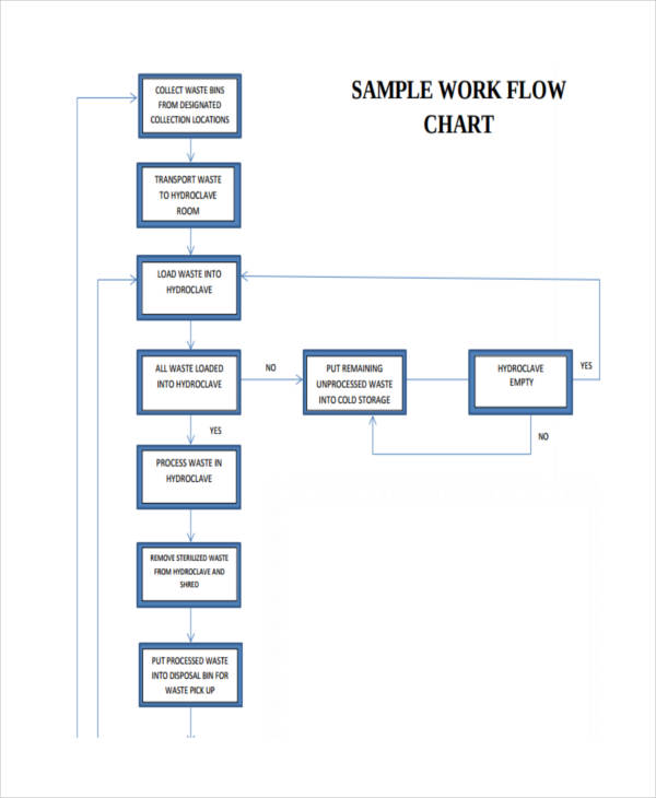
Work Flow Chart
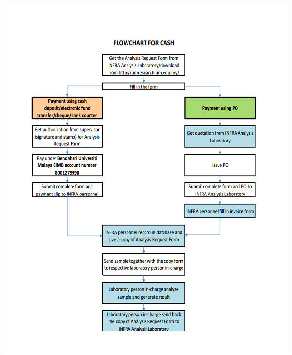
Cash Flowchart Sample
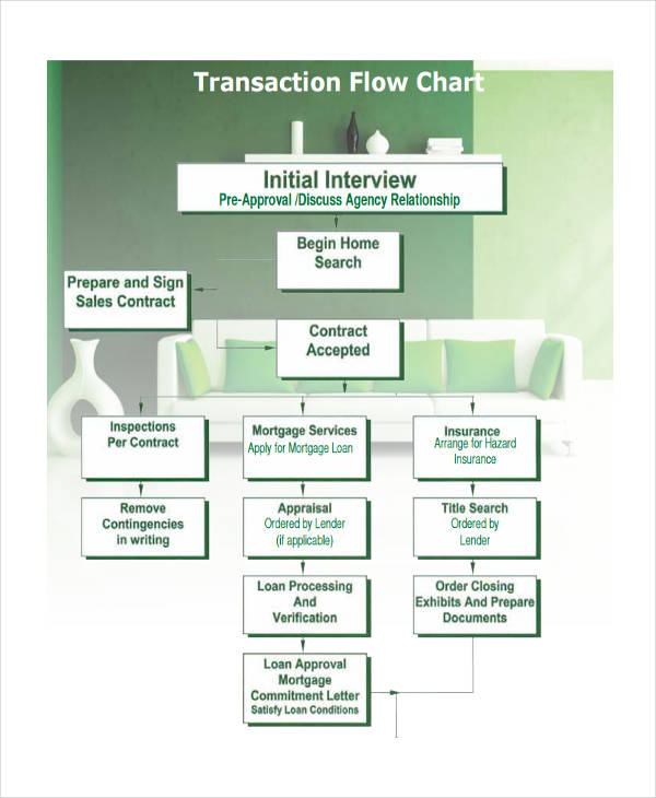
Transaction Flowchart
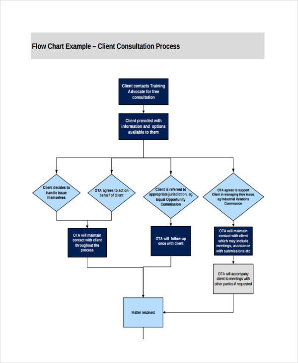
Free Flow Chart
What Is a Chart?
Charts are seen as graphical representations of data. They can come in different types, such as Gantt charts, pie charts and flowcharts. This is because they each have unique purposes with different data to display. They could either be used in academics or business. Charts are used for several different purposes, depending on how you wish to present your data. For instance, flowcharts are considered to be road maps that show how a process or a system flows. It presents information in a chronological order that is simple enough to comprehend. The information depicted in a given chart makes it easier for us to analyze and draw conclusions. Although charts may come in various forms, they’re all considered to be an effective way to present facts and statistics.
What Is a Business Chart?
While charts may be used in any field, they’re particularly useful in business. Business charts are those charts that represent business-related information. The data in these charts come from an extensive research on stock values, market trends, and survey statistics collected by the company. It serves as an effective tool used in analyzing a company’s internal and external aspects. To be more specific, business flowcharts are typically used for comparing sales data, income and other financial data. Through this analysis, a company may then formulate strategies and plans for the business.
Pie Chart
Blank Pie Chart
Gantt Chart
Gantt Chart for Project
Gantt Chart Sample
Gantt Chart for Research
Gantt Chart Example
Uses of Charts
We define charts as sheets that present us with information. This could be through a graph, a diagram, or a table. Now, imagine life without charts, and that would refer to everything that’s considered to be a chart. If you think about it, we’d be all over the place. Not to say that living would be impossible without charts examples, but it might as well be a lot more challenging. For starters, charts are meant to keep things organized. If we decide on comparing two items based on their corresponding specifications, it would be difficult for us to evaluate such if it’s being described in paragraphs. But if we use tables or diagrams, we can easily point out each item’s unique features. Using charts save us the time and effort in evaluating the given data of a subject.
Organizational Chart
Official Organizational Sample
Administrative Organizational Chart
City Organizational Chart Example
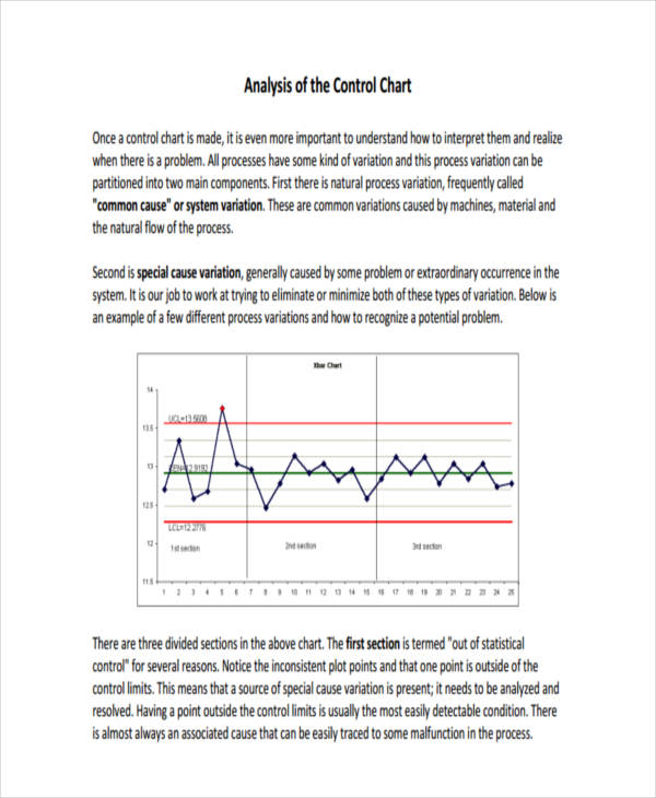
Control Chart
Control Chart Sample
Basic Control Chart
Analysis Control Chart Example
Using the Right Charts for Data
Data analysis comes in three particular forms, this could be through a comparison, a transition, or even a composition of data.
- Comparison. From the word itself, this involves comparing one entity from the others. In this type of chart, we are able to identify the highs and lows of a particular data. Examples of charts that follow into this category are column charts, comparison charts, and size charts.
- Transition. This is for data that deals with time. Through this chart, we can see the changes in trends over a given time period. Line charts and area charts are just some of the examples that belong to this category.
- Composition. One good example that falls under such is a pie chart. The use of a pie chart lets us know that the data given is a part of a whole. However, a composition analysis may also display the increase and decrease in data to come up with a final value.
The use of charts do not stop there, as there are various charts that may fall into all three categories. For instance, a table. Tables are good for presenting precise values, but it may only display a few variables and data points. This is because there may be scenarios when a transition or change may not easily be grasped when presented in a table. It’s best to consider the amount and behavior of your data in determining your chart.
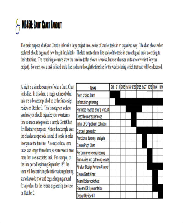
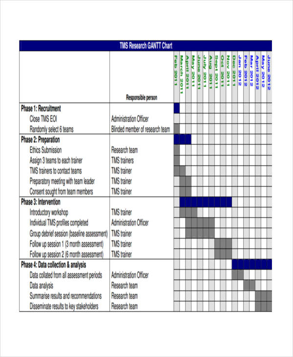
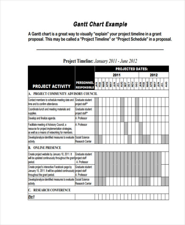
What Is a Gantt Chart?
A Gantt chart is considered to be a type of bar chart that depicts a project schedule. This typically includes the activities involved in the planning and development process of a project. This is so that project members may be guided on target dates and deadlines for each aspect of the given project. Aside from project management, Gantt charts are also used in employee scheduling, wherein employee shifts and tasks are tracked by an employer. In the past, Gantt charts were handwritten time bars that were created on paper. Nowadays, thanks to technology, Gantt charts may be created with the help of various online applications.
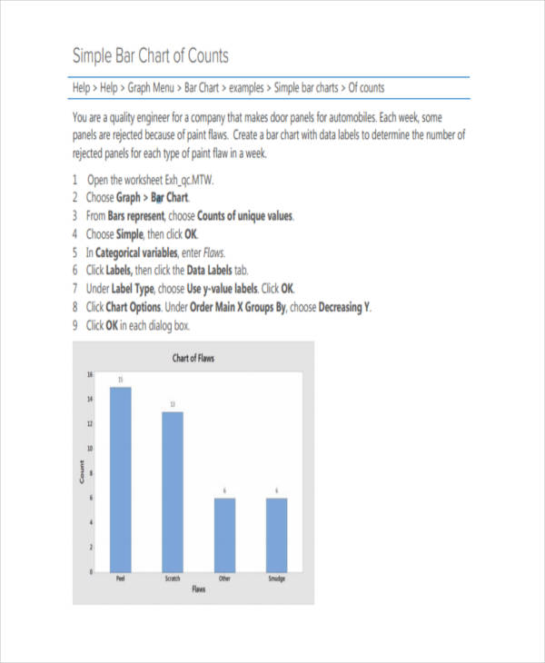
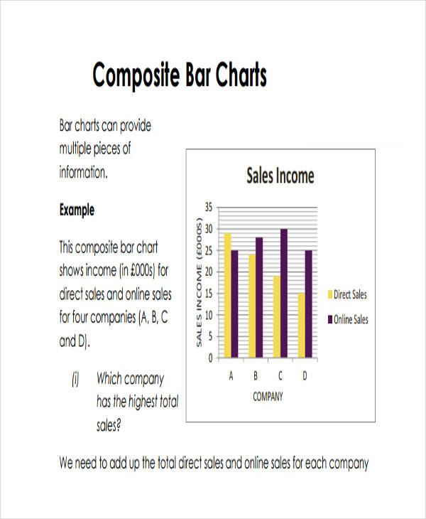
Bar Chart
Simple Bar Chart
Composite Bar Chart Sample
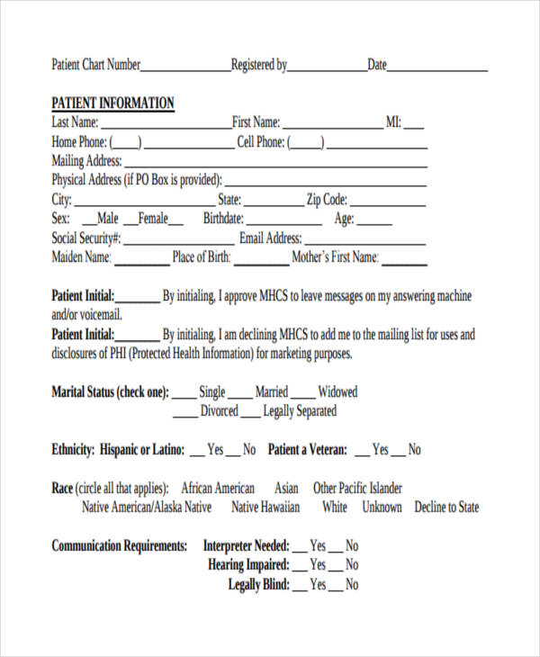
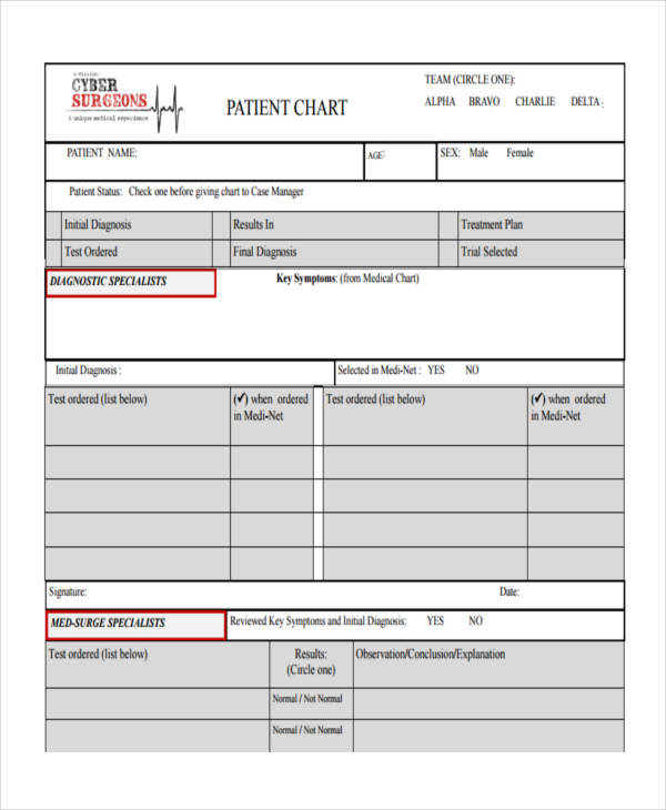
Patient Chart
Blank Patient Chart
Hospital Patient Chart
Patient Observation Chart Example
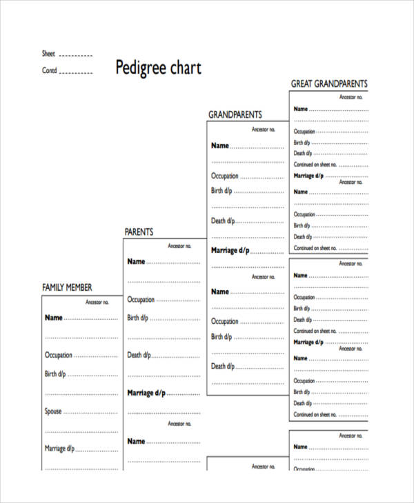
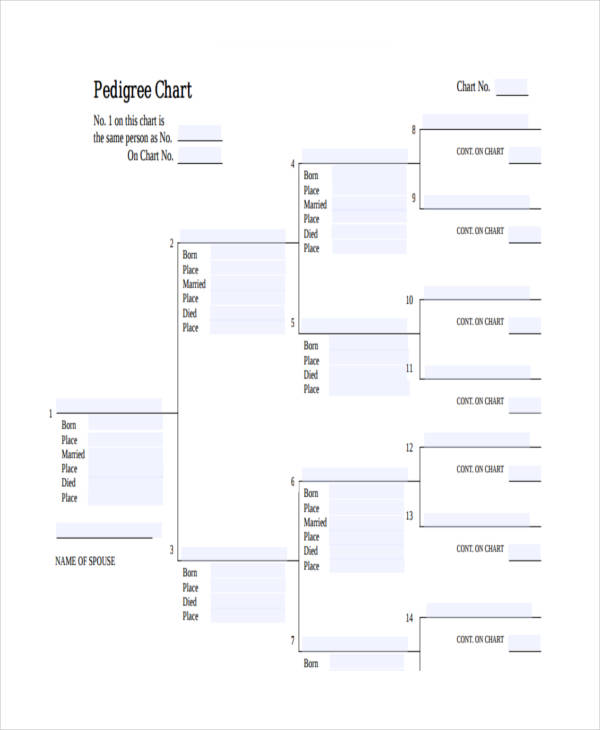
Pedigree Chart
Blank Pedigree Chart Sample
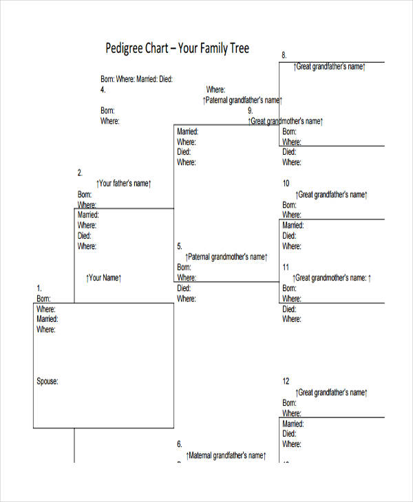
Family Pedigree Chart
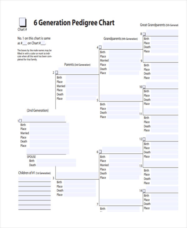
Generation Pedigree Chart Example
Pedigree Chart in PDF
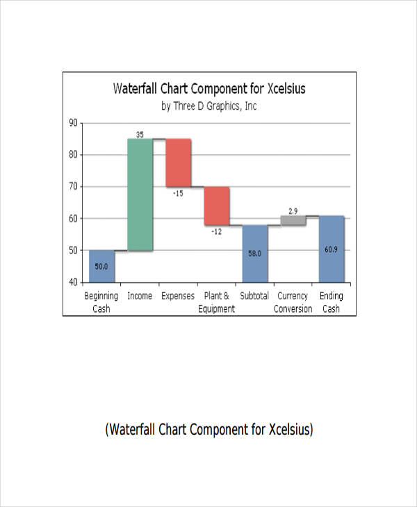
Waterfall Chart
Difference between Gantt Charts and PERT Charts
A Gantt chart and a PERT chart are two project management tools used to display tasks involved in completing a project. However, each has its own distinct feature.
In a Gantt chart, data is represented similarly to a bar chart. The length of the bar represents the duration of which it is being worked on while the position reflects the start and end date of each. This provides an precise time duration to complete a task, as well as the percentage completed so far. The relationship of each task is then shown in the form of an arrow.
A PERT chart, on the other hand, comes in the form of a flowchart example or a network diagram. Contrary to a Gantt chart, a PERT chart is utilized for larger and more complex projects with a high intertask dependency. Since it is composed of interconnecting networks of independent tasks, this chart is utilized to focus on smaller parts of the project.
Share :

25+ Chart Examples to Download
There is no better way of understanding a process, a change, or an improvement, than seeing it in a chart examples . Charts make it easier for us to get the idea or to see what is different. You see, mere words fail to provide us with the information we need at first glance. You’d still have to make an effort to read the document multiple times until you can fully grasp the message it’s trying to convey. It’s even more difficult to asses when you’re meant to make comparisons between two different subjects. With a chart, people would no longer need to create mental pictures in their head as the chart does the work for them.
Flow Chart
Process Flow Chart Example
energy.ca.gov
Details
File Format
PDF
Size: 78 KB
Work Flow Chart
hydroclave.com
Details
File Format
PDF
Size: 123 KB
Cash Flowchart Sample
um.edu.my
Details
File Format
PDF
Size: 177 KB
Transaction Flowchart
morgantownrealestate.com
Details
File Format
PDF
Size: 273 KB
Free Flow Chart
trainingadvocate.sa.gov.au
Details
File Format
PDF
Size: 43 KB
What Is a Chart?
Charts are seen as graphical representations of data. They can come in different types, such as Gantt charts, pie charts and flowcharts. This is because they each have unique purposes with different data to display. They could either be used in academics or business. Charts are used for several different purposes, depending on how you wish to present your data. For instance, flowcharts are considered to be road maps that show how a process or a system flows. It presents information in a chronological order that is simple enough to comprehend. The information depicted in a given chart makes it easier for us to analyze and draw conclusions. Although charts may come in various forms, they’re all considered to be an effective way to present facts and statistics.
What Is a Business Chart?
While charts may be used in any field, they’re particularly useful in business. Business charts are those charts that represent business-related information. The data in these charts come from an extensive research on stock values, market trends, and survey statistics collected by the company. It serves as an effective tool used in analyzing a company’s internal and external aspects. To be more specific, business flowcharts are typically used for comparing sales data, income and other financial data. Through this analysis, a company may then formulate strategies and plans for the business.
Pie Chart
Blank Pie Chart
studenthandouts.com
Details
File Format
PDF
Size: 174 KB
Gantt Chart
Gantt Chart for Project

senseinternational.org.uk
Details
File Format
PDF
Size: 42 KB
Gantt Chart Sample
personal.umich.edu
Details
File Format
PDF
Size: 125 KB
Gantt Chart for Research
health.qld.gov.au
Details
File Format
PDF
Size: 26 KB
Gantt Chart Example
odu.edu
Details
File Format
PDF
Size: 110 KB
Uses of Charts
We define charts as sheets that present us with information. This could be through a graph, a diagram, or a table. Now, imagine life without charts, and that would refer to everything that’s considered to be a chart. If you think about it, we’d be all over the place. Not to say that living would be impossible without charts examples, but it might as well be a lot more challenging. For starters, charts are meant to keep things organized. If we decide on comparing two items based on their corresponding specifications, it would be difficult for us to evaluate such if it’s being described in paragraphs. But if we use tables or diagrams, we can easily point out each item’s unique features. Using charts save us the time and effort in evaluating the given data of a subject.
Organizational Chart
Official Organizational Sample
peterarado.files.wordpress.com
Details
File Format
PDF
Size: 158 KB
Administrative Organizational Chart
atu.edu
Details
File Format
PDF
Size: 68 KB
City Organizational Chart Example
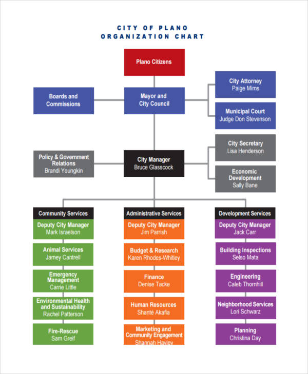
plano.gov
Details
File Format
PDF
Size: 713 KB
Control Chart
Control Chart Sample
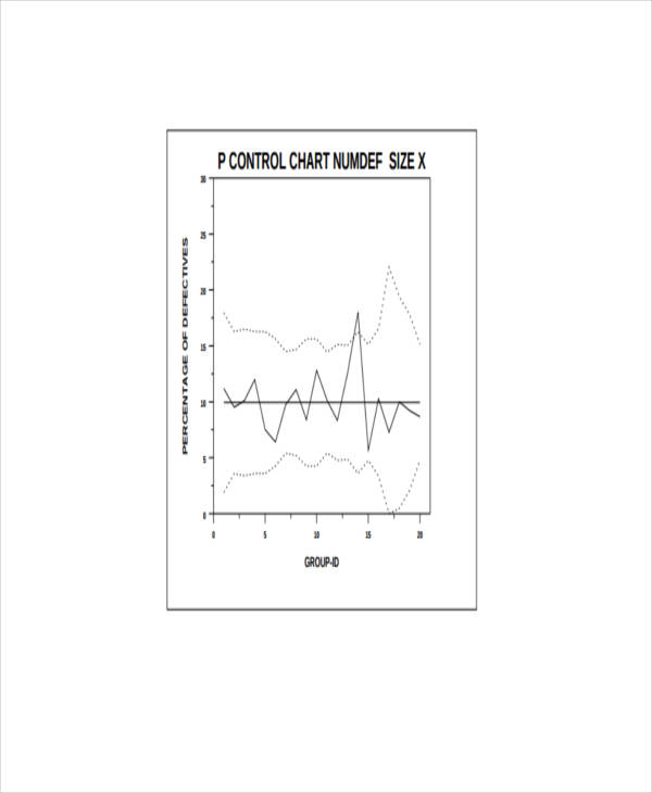
itl.nist.gov
Details
File Format
PDF
Size: 9 KB
Basic Control Chart
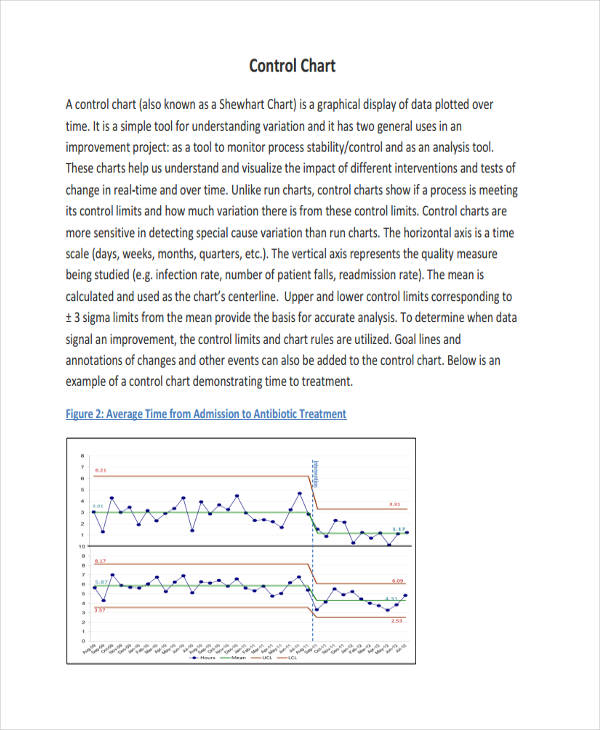
med.unc.edu
Details
File Format
PDF
Size: 384 KB
Analysis Control Chart Example
whaqualitycenter.org
Details
File Format
PDF
Size: 205 KB
Using the Right Charts for Data
Data analysis comes in three particular forms, this could be through a comparison, a transition, or even a composition of data.
Comparison. From the word itself, this involves comparing one entity from the others. In this type of chart, we are able to identify the highs and lows of a particular data. Examples of charts that follow into this category are column charts, comparison charts, and size charts.
Transition. This is for data that deals with time. Through this chart, we can see the changes in trends over a given time period. Line charts and area charts are just some of the examples that belong to this category.
Composition. One good example that falls under such is a pie chart. The use of a pie chart lets us know that the data given is a part of a whole. However, a composition analysis may also display the increase and decrease in data to come up with a final value.
The use of charts do not stop there, as there are various charts that may fall into all three categories. For instance, a table. Tables are good for presenting precise values, but it may only display a few variables and data points. This is because there may be scenarios when a transition or change may not easily be grasped when presented in a table. It’s best to consider the amount and behavior of your data in determining your chart.
What Is a Gantt Chart?
A Gantt chart is considered to be a type of bar chart that depicts a project schedule. This typically includes the activities involved in the planning and development process of a project. This is so that project members may be guided on target dates and deadlines for each aspect of the given project. Aside from project management, Gantt charts are also used in employee scheduling, wherein employee shifts and tasks are tracked by an employer. In the past, Gantt charts were handwritten time bars that were created on paper. Nowadays, thanks to technology, Gantt charts may be created with the help of various online applications.
Bar Chart
Simple Bar Chart
minitab.com
Details
File Format
PDF
Size: 83 KB
Composite Bar Chart Sample
mathcentre.ac.uk
Details
File Format
PDF
Size: 328 KB
Patient Chart
Blank Patient Chart
mtnhealth.org
Details
File Format
PDF
Size: 290 KB
Hospital Patient Chart
e-missions.net
Details
File Format
PDF
Size: 336 KB
Patient Observation Chart Example
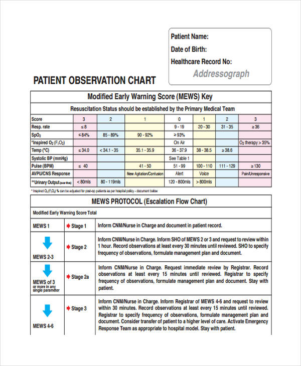
hse.ie
Details
File Format
PDF
Size: 1 MB
Pedigree Chart
Blank Pedigree Chart Sample
bbc.co.uk
Details
File Format
PDF
Size: 519 KB
Family Pedigree Chart
Sourcescgsgenealogy.com
Details
File Format
PDF
Size: 122 KB
Generation Pedigree Chart Example
misbach.org
Details
File Format
PDF
Size: 47 KB
Pedigree Chart in PDF
dar.org
Details
File Format
PDF
Size: 13 KB
Waterfall Chart
threedgraphics.com
Details
File Format
PDF
Size: 339 KB
Difference between Gantt Charts and PERT Charts
A Gantt chart and a PERT chart are two project management tools used to display tasks involved in completing a project. However, each has its own distinct feature.
In a Gantt chart, data is represented similarly to a bar chart. The length of the bar represents the duration of which it is being worked on while the position reflects the start and end date of each. This provides an precise time duration to complete a task, as well as the percentage completed so far. The relationship of each task is then shown in the form of an arrow.
A PERT chart, on the other hand, comes in the form of a flowchart example or a network diagram. Contrary to a Gantt chart, a PERT chart is utilized for larger and more complex projects with a high intertask dependency. Since it is composed of interconnecting networks of independent tasks, this chart is utilized to focus on smaller parts of the project.