9+ Good Email Signature Examples to Download
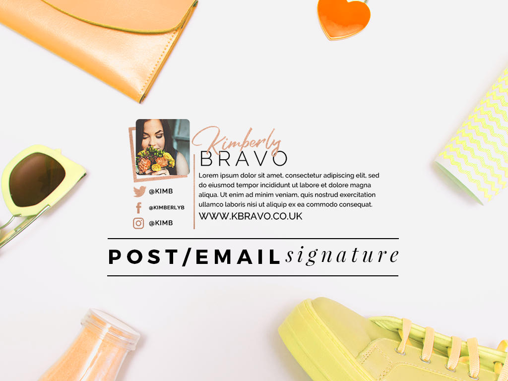
Ever noticed how some people like to attach images with their details on it at the end of every email? These so-called “images” are called email signatures, and they do more than just display your name and title.
Email signatures play an important role in personal branding. We spend parts of our day sending emails, and each email we send leaves an impression to its respective recipients. Knowing this, you’d want to make an email signature that is attractive enough to affect a person’s perception towards a given brand. But it’s more than just about being “pretty”, as you must also consider every aspect of the design and how it may look across several platforms.

So whether it’s a professional email signature or a personal one, here are 10 dos and don’ts in email signature design you must know about:
1. Do Design for Mobiles.
These days, about 50% of emails are opened on various mobile devices, such as smartphones and tablets. Since these devices vary from the average computers and laptops, content size becomes an issue. It might be difficult for people to read items from your email signature or click on the link available. To avoid this from happening, fonts with an 11-14 point size are highly recommended for the benefit of all users.
2. Don’t Animate.
It might seem tempting to add motion graphics to make your email signature stand out even more. Unfortunately, in most corporate emails, there are instances when you won’t be permitted to watch embedded videos nor will you be able to see the animation in a gif. So as much as you want to, it would be best not to bother with animations if they won’t be of help anyway.
3. Do Encourage Social Connection.
Every marketer knows the significance of social media in business. That being said, inserting social links to your email signature is a great way to build a connection with your audience, out of the standard online mailing. Considering how people spend more time browsing on social media than on their own emails, this makes it a lot easier for you to keep your followers updated on product releases, announcements, social events, and more. It’s also best to use Follow and Share buttons than actual links that direct users to another page since people are less likely to spend that extra time and effort to do it.
4. Don’t Use Too Many Colors.
In graphic design, colors are used to draw attention. While it’s always good to add a pop of color to your email signature, you don’t want to overdo it. The information on your email signature must not be outshined by the different colors you add, or you might end up defying its whole purpose. You need to choose a color pattern that works well with the purpose of your email, as well as the brand you represent.
5. Do Apply Brand Guidelines.
Your email is bound to reach either of these two entities: the people that are a part of your company or those who are not. When your email does end up with someone out of your inner circle, everything about the email gives a direct representation of your business as a whole. This includes your email address, the content of your email, along with your email signature. If your email signature fails to reflect what you stand for in a positive light, then recipients could think negatively about your brand. With that in mind, making an email signature that’s accompanied by your contact details and company logo is essential.
6. Don’t Use Bullets.
Using bullets to list items accordingly is great for keeping things organized. However, bullets on an email signature can be a bad thing. They can render differently on various applications, so you might not always attain the look you were initially going for.

7. Do Follow a Table Layout.
Since bullets are not an option, you can use the different rows of a table instead. This allows you to be more in control of how you want your layout to be. Items can be sectioned into different cells of the table, and you don’t have to worry about words being squashed together or appearing in the wrong spot. If you’re worried about the unattractive lines brought by grids and borders, transparency is your best solution.
8. Don’t Utilize Custom Type.
Custom fonts are desirable in some cases, but you can’t expect the same impact with an email signature. While it does showcase individuality and creativity, it can sometimes be perceived as amateurish. It takes away the formality of the email, most especially in terms of consistency.
Instead, it would be best to choose a type that’s in line with the rest of your email. If you use Verdana in sending emails, then you’d want to use the same font style for your email signature as well. Other recommendable fonts include Tahoma, Sans-serif, and Arial, just make sure you refrain from using Comic Sans in any case.
9. Do Aim for Simplicity.
Designing an email signature isn’t as difficult as it seems. Your primary goal is to create an email signature that is informative enough to be effective. It must have include details that are considered useful to the recipient. These details must also be showcased in a proper layout, where each item is clear and visible enough for one to notice.
10. Don’t Add Anything Irrelevant.
Three of the most important things of an email signature is your name, title, and contact details. Anything other than those mentioned can be added to support what you stand for. But if it’s deemed irrelevant to the overall purpose of the email signature, then don’t include it. Quotes are okay if it’s used to represent your brand, so avoid adding personal quotes that may go against another individual’s own values. It may not be your main intention to offend anyone, but matters like that are often inevitable.

At the end of the day, it’s always going to be usability over design. It’s almost as if design is added more as a support system to emphasize the email signature. If it has the ability to visually appeal to an audience, the the it should also encourage a call to action.
Share :
