
Famous magazines like Vogue and Cosmopolitan make it seem effortless in catching the attention of readers everywhere. How so? One of the key goals when it comes to designing a magazine cover is to achieve that effect. For you to successfully do so, you have to make sure that your background design is eye-catching and creative. In this article, we will discuss how to get readers to grab a copy of your latest issue by making a great magazine cover.
[bb_toc content=”][/bb_toc]
20+ Magazine Cover Templates
Architecture Magazine Cover Page Template

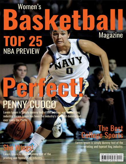
Basketball Magazine Cover Template
Business Magazine Cover Page Template

Creative Magazine Cover Page Template

Financial Magazine Cover Page Template

Healthy Food Magazine Cover Template

Men’s Fashion Magazine Cover Template

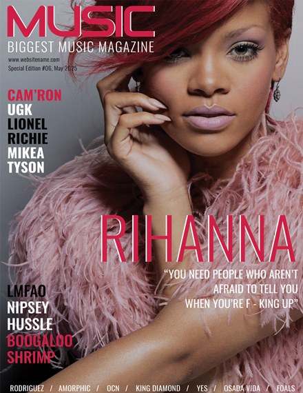
Music Magazine Cover Template
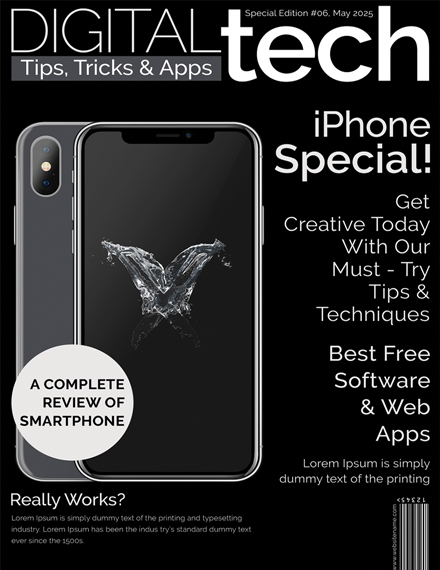
Technology Magazine Cover Page Template
Women Fashion Magazine Cover Template

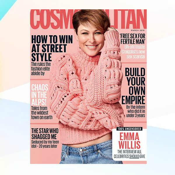
Cosmopolitan Magazine Cover Sample
Discover Magazine Cover Example

ESPN Magazine Cover

Esquire Magazine Cover

Good Housekeeping Magazine Cover

Harper’s Bazaar Magazine Cover

InStyle Magazine Cover Sample

Marie Claire Australia Magazine Cover

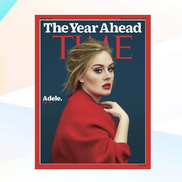
Time Magazine Cover Example
Bloomberg Businessweek Magazine Cover

What Is a Magazine Cover?
As its name suggests, a magazine cover is the front part of a magazine. It usually contains a featured image or art that can catch a reader’s attention. Apart from that, it includes previews and information about what the magazine is, be it music, beauty, travel, etc. It is the role of a magazine cover design to give a brief message about the magazine.
How To Design a Magazine Cover
According to Statista research, the magazine industry in the United States has an aggregate revenue of $28 billion in 2017. If you want your magazine to be a part of this number, you need to find ways of increasing your readership. A straightforward way to do that is to make a great cover that will attract readers.
1. Know What Your Content is About
Before you can think about what to put in your magazine, know what it is all about. You have to determine what kind of content your issue will be so that you get the right readers from the get-go. For example, if your magazine is about food, you can make your magazine cover display related designs.
2. Decide the Design Elements
Once you have figured out your content, it should be easy for you to come up with design elements for your magazine cover. For starters, you can incorporate photography that is relevant to your current issue. For example, if you are designing for a fashion magazine, you can use images of models in modern clothes on the front cover of your magazine. You can also incorporate designs like minimalist themes and aesthetics, for instance.
3. Be Clever with Color
The use of color can give you an edge in making your magazine cover a lot more useful on its purpose. However, take some time to use it in adding contrast to make the other essential elements of your magazine cover pop out. Wrong use of color can make your cover unattractive and turn potential readers off.
4. Add Headlines
If your magazine contains articles and news, then you can include headlines of your featured topics. This should attract potential readers, especially if it appeals to their interests. For example, if you are working on a game magazine, you can add headlines to your articles regarding games set for release sometime soon. Sharing this kind of preview for your content will surely get more people to grab a copy of your magazine.
FAQs
Why are magazine covers important?
A magazine cover is a significant part of the magazine and is thought of as the most crucial part. The first thing that a potential reader will read in a magazine is its cover. Whatever you put in it will be the factor that could either make a potential customer buy your magazine or ignore it altogether.
What is the purpose of a magazine cover?
Magazine covers serve several purposes. It should be visually appealing so that it can sell the brand effectively, and it should also be distinct among other magazine covers to stand out. Magazine covers give the readers a brief overview of the contents of a magazine.
What are some of the standard sizes for magazines?
Magazine cover sizes rely on the overall size of the magazine. Magazines have three common formats: the standard size that comes in 8.5 × 11 inches and the digest size, which comes in 5.5 × 8.5 inches. Some magazine covers come in A4 size.
Designing a magazine cover poses a lot of challenges. It involves a lot of brainstorming and efforts to come up with a magazine cover design that could make you stand out. Also, bear in mind that your final layout could either make or break the overall impact of your material. But if given the right concepts and inspiration, you can create a magazine cover design that will surely be a masterpiece.