13+ Banner Ad Examples to Download
Online advertising has become a popular form of product and service marketing because of how efficient and effective it is. In fact, it’s hard not to encounter even a single advertising banner when browsing the World Wide Web. This type of advertisement consists of either static or animated images, depending on how it is made by the advertiser. But regardless of its type, banner ads serve one standard function: to lead potential customers to the advertiser’s website. While they may look pretty simple, their presence on the virtual world can make a huge difference for a lot of online-based companies and brands.
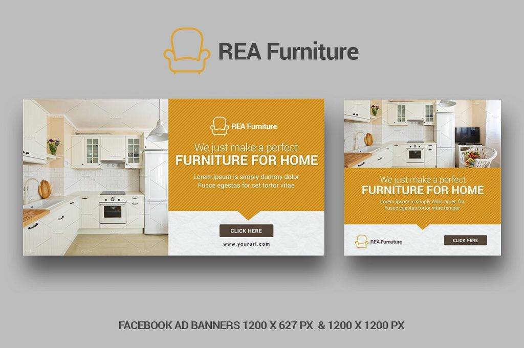
Facebook Ad Banner
Website Ad Banner
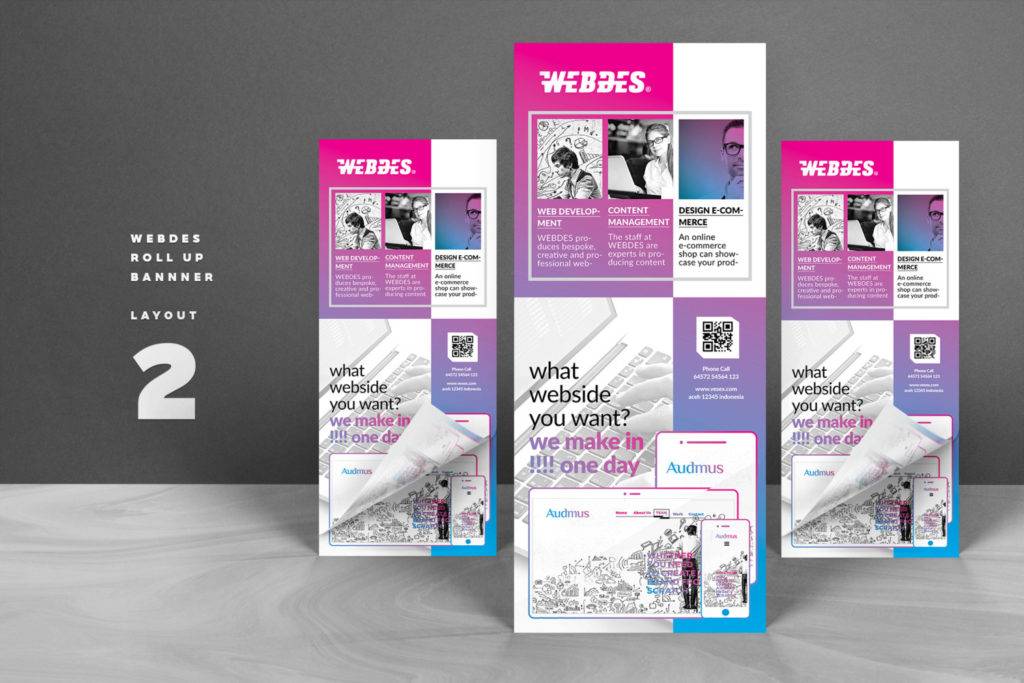
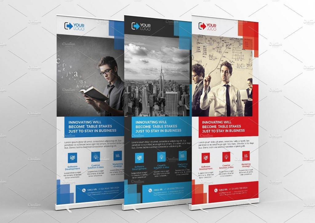
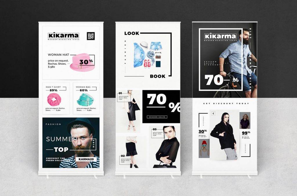
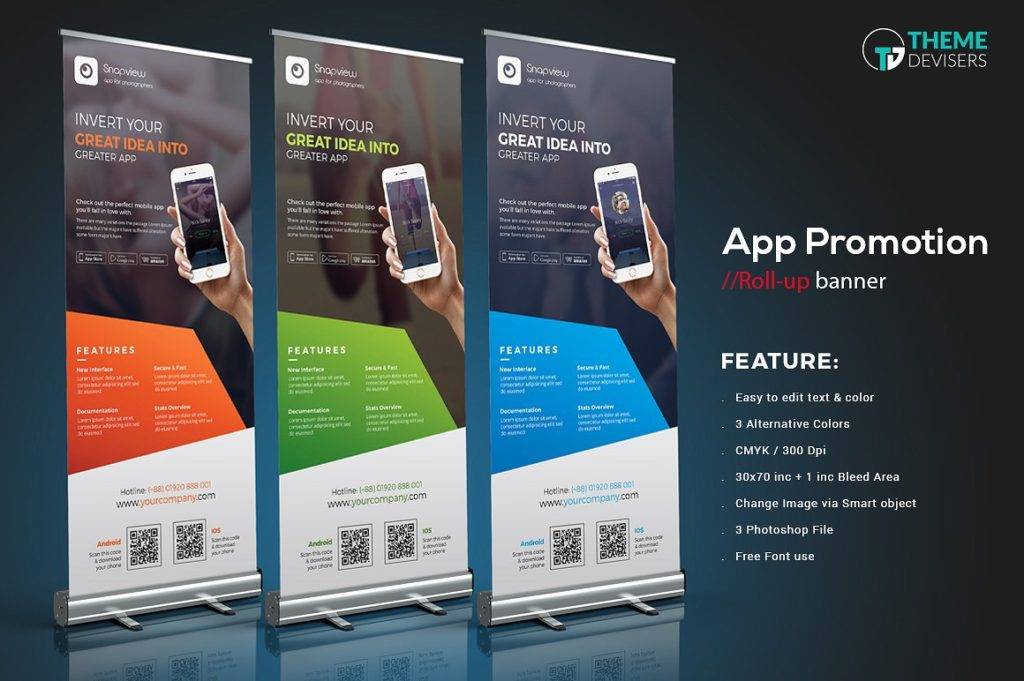
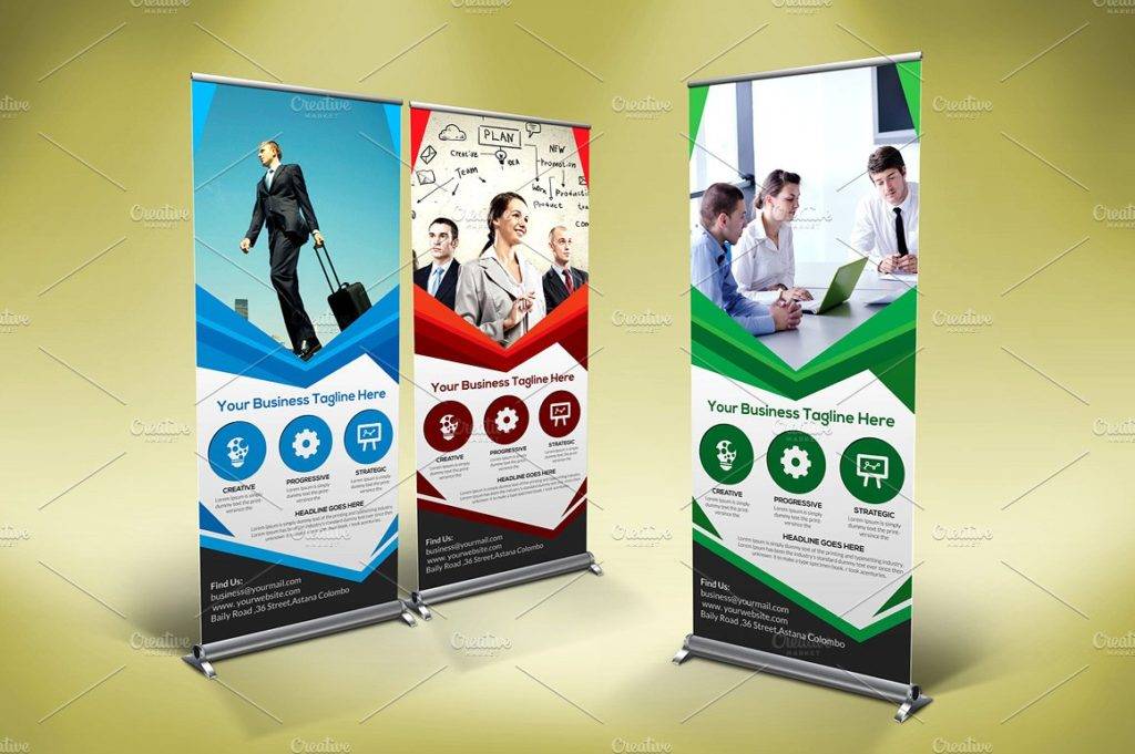
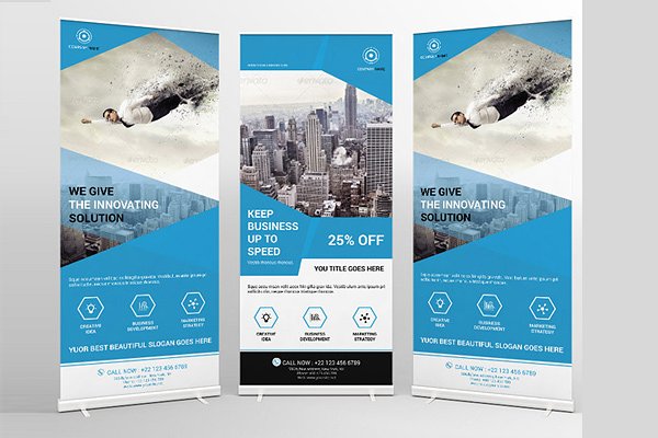
Roll-Up Ad Banner
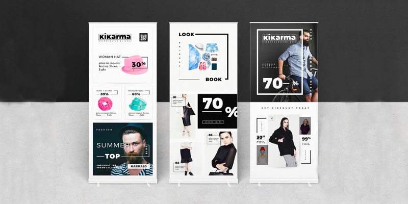
Fashion Ad Stand Banner
Mobile App Ad Banner
Basic Types of Banners
If you’re looking for a different way to reach out to your target audience without having to spend thousands on huge billboard ads and TV commercials, then banner advertisements are a perfect choice. But banner ads also come in different forms, and it’s important for you to choose the one that best suits your business and specific purpose.
Printed Banners
If you’ve been to a job fair, a convention, or some business conference, then you might have encountered these printed banner ads. They are often larger in size compared to the average poster design, but they still serve the same purpose. Banner stands and roll-up banners are a common type of advertising medium used to promote a business and its products or services offered. What makes it an effective promotional tool is its ability to convey a message thanks to its size and design elements. But because of how visible a printed banner can be, you have to make sure that the materials used to make it along with its printed design are of high-quality.
Web Banner Ads
Long gone are the days when company brochures and event flyers were the only means of marketing. Nowadays, websites and blogs have become an ideal platform for digital advertising. Web banner ads, as they are called, are used by businesses to generate sales on their products and services. But deciding on which type of web banner ad suits you the most is crucial to the process, as this would determine how your message may be delivered. That being said, here’s an outline of the commonly-used web banner ads to help you weigh down your options:
- Static Banners – Static banner ads are considered to be the most basic type of banner design due to its simple texts and graphic elements. It is also a popular choice among advertisers because of how cost-effective it is. However, this traditional type of web banner can be quite tricky to produce. Not only should it be attractive enough to draw attention, but it should also stay meaningful. The challenge comes with creating a banner ad that bears a clean, conservative look which would not distract a viewer from the other elements of the website.
- Flash Banners – Thanks to the advancement of technology, we can now create mini commercials in the form of flash banners. Using motion graphics or animation as a web banner is a great way to keep viewers engaged. Its interactive nature can help you create strong advertising campaigns with a smoother finish, allowing viewers to click on links without much hassle. And don’t worry about it slowing down the website since flash banners come in small sizes for faster loading periods.
- Animated GIF Banners – From the name itself, this type of banner comes in a GIF file format which is comprised of a series of frames that are played in a particular sequence. But unlike flash banners, these animated GIFs focus on substance rather than flashiness. These are often made to communicate a message through visual storytelling, and its mobile-friendly nature makes it a lot easier for advertisers to create.
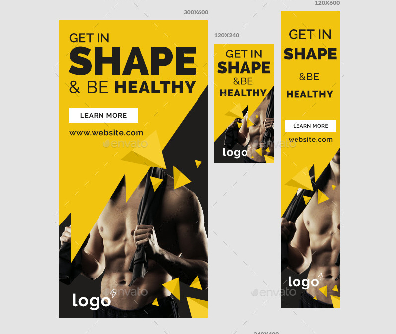
Fitness Gym Ad Banner
Retail Marketing Web Banner Ad
Fashion Ad Banner Template

Multipurpose Roll-Up Banner Ad
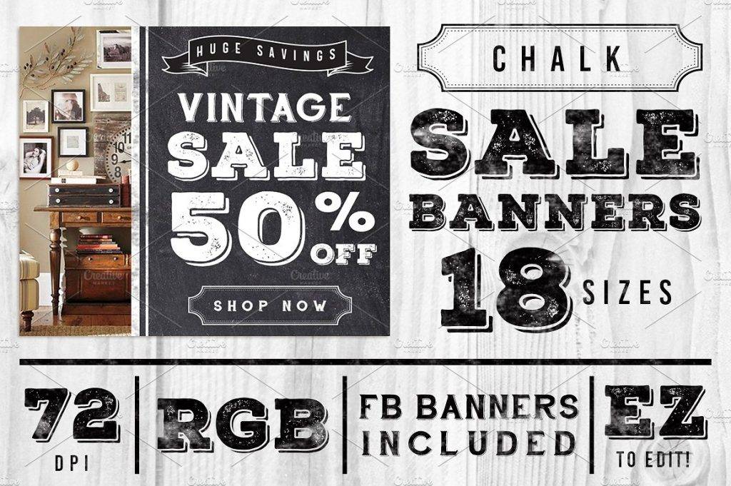
Chalk Vintage Banner Ad
The Significance of Banner Ads in Advertising
You must be wondering, why do people use banner ads? Well, it’s a known fact that banner ads are considered to be visually impactful. Its visual content can effectively increase brand awareness, allowing a business to make its online presence known.
Banner ads are beneficial in a number of ways. For one, they help increase customer traffic on the advertiser’s website. The design elements of the banner is enough to spark interest among potential customers, prompting them to click on the ad to feed their curiosity. But grabbing a person’s attention is no easy task, especially when one is too focused on the actual content of the website they are in rather than the ads that decorate it. Knowing this, advertisers must find a way to make click-worthy banner ad designs.
Another advantage of using a banner ad is the ability to relay a message to your online market. Because of how often we browse the internet on a daily basis, a banner ad allows you to spread news and reach out to consumers from wherever they are in the world. This gives you the opportunity to make announcements about sales and discounts that customers might want to avail of, which can then help your business prosper by selling products from your website. And do you know what’s the best part about this advertising tool? Businesses don’t have to worry about making large investments because of how affordable banner ads are to produce.
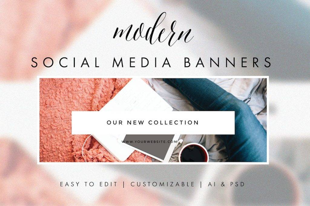
Modern Social Media Banner
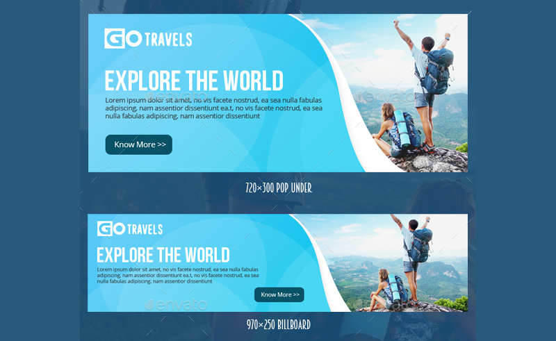
Travel Ad Banner
Corporate Rollup Banner
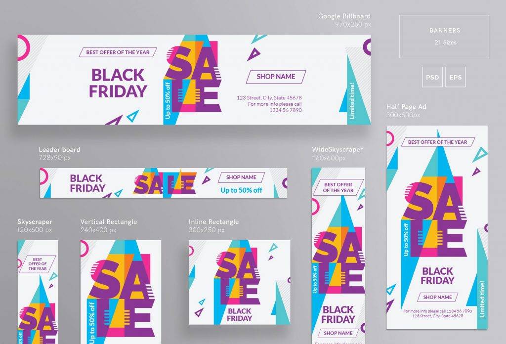
Black Friday Banner Ad
Creative Tricks for Clickable Banner Ads
There are three basic components of a good banner ad: a logo design, a value proposition, and a call to action. These components are essential in increasing brand awareness and visitor traffic for a website. With that being said, advertisers must strive to create a banner ad that can generate those clicks in an instant. So, here are some creative techniques to make an appealing banner ad:
- Position your banner ads accordingly. Banner ads come in various sizes, and they may be situated in specific areas of a website. But when purchasing an ad space, you need to make sure your banner is featured close to the main content of a page. This can depend on the size of your banner, as well as the visual elements it bears. For instance, flash banners can be quite distracting when positioned as a half page (300x600px) advertisement on a site, forcing visitors to either leave the page or close the advertisement.
- Make it readable. Remember, viewers will only be able to grasp the message you are trying to convey if you make it clear enough for them to read. First, choose an appropriate size for your banner. This will help you determine the size of your text along with the colors to be used to design the ad. One way to earn a person’s trust is to create a banner that blends in perfectly with the site it is featured in, as this may also affect the visibility of the ad.
- Maintain simplicity. As much as you want to attract an audience, try not to go a bit too overboard with your design. Keep it as simple as possible. Viewers are likely to spend a few seconds looking at your banner ad, so you need to make sure significant details are showcased loud and clear.
- Pay attention to imagery. Being unique is an important factor in design, but that doesn’t mean abstract concepts can do you great favors every time. Choosing the right graphic elements that are relevant to the content of your ad can help emphasize your message. You can purchase professional stock photos online or create your own illustration to set yourself apart from the competition. But images aren’t always necessary for banner ads, as good typography can still garner positive results just as effectively.
- Experiment with animation. Simple animations tend to outshine the typical static banners, so you might want to venture towards that. It doesn’t need to be overly extravagant for one to notice, as complex designs aren’t everyone’s cup of tea. Focus on keeping the animation to a bare minimum, wherein the overall look of the ad stays easy on the eyes.
- Take note of proper branding. Like a company logo, good branding is reflected on the image you create, the colors you choose, and the text used for your banner ad. It’s important to develop consistency with your brand by making an ad that matches your website’s landing page. This must be done so as to not confuse your potential customers.
In creating a banner ad, the primary goal of every designer is to make it clickable. It’s more than just crafting an ad that’s attractive to look at, as it’s also about developing a clear call of action. This is an essential element of online marketing that every business must take advantage of. There’s no doubt that banner ads are a powerful advertising tool that can have a significant impact on your business. So what are you waiting for? Create your own banner ad today!
Share :
