Have you ever seen a poster design or billboard that really caught your eyes, not because it is visually pleasing, but because it just gives distraction and the feeling that you want to correct the typographical error or you want to drag something to a position you think is proper for it? Well, you are not alone. Many are suffering and keeping the urge to edit errors in typography may it be accessible for public viewing as that of banner design, advertising flyers, and ads or for personal documents such as formal papers, mails, blogs, and write-ups. People with slight to intense obsessive-compulsive disorder ((OCD) or even those that are just keen observer can easily notice typographical errors as well as the odd centering, margin, orientation, and other strange objects that do not belong to the whole picture.
In this era of the fast-paced digital world, designing something over the internet can be done in a matter of seconds, and the traditional way of typography is becoming obsolete. Unlike digital typography where you can easily adjust the size of each letter to achieve a centered and well-placed structure, traditional typography requires precision and definiteness of the artist in order for the words or phrases to fit into the desired area or space without the problem of overcrowding or unreadable text.
However, our concern here is not mainly about which is better between traditional and digital typography; instead, we will give emphasis on the basics and importance of typography as well as the quick tips on how to create a visually pleasing piece.
In this article, we will also discuss typography, typography basics, elements, and how typography is being incorporated into menus.
What is Typography?
Typography, as per Merriam-Webster Dictionary, is the style, arrangement, and appearance of typeset matter. It is about balancing the art and function. A typographer must be keen on the symmetry and proportion and be concerned about the sizes of the letters or number, the spaces between each character as well as the spaces per line, and the organization of the whole image to achieve an artsy look and, more importantly, to enhance readability.
Until the digital generation, typography was a specialized job. It is not a simple job as you think for there are many rules in typography rules that must be placed in your mind. The coordination of each character and putting up the whole picture are few of the challenges that every typographer is experiencing. It was a specialized before since not everyone has an access to the internet and not everyone studied properly the mechanisms of typography. Only when digitization advances and there is already fast access to the internet this has been opened to everyone. Anyone can be a typographer and work as a typesetter, graphic designer, comic book artists, manga artists, graffiti artists, and those that work in publications and newsletters.
Typography encompasses a wide topic nowadays since in everything we see, typography is almost always present—in plastic cups, car designs, bags, notebook covers, billboards, pamphlets, creative brochures, business coupons, and even menu designs.
Typography vs Calligraphy
As stated above, typography is concerned with the arrangement of words, letters, numbers, or characters that enhances the readability of the text and creates a visually pleasing pattern or image.
Calligraphy, on the other hand, is the art of beautiful handwriting. It is about the penmanship of a person or the calligrapher. As calligraphy evolved, it became an art does not only present beautiful handwriting but also showcase an art, the decoration of the letters and pouring out of emotion by an artist.
Although the two is concerned about letters and numbers, they are different in some other ways. Be informed that calligraphy is a subset of typography, while typography is so much broader compared to calligraphy. Calligraphy focuses on the art of handwriting while typography is about arranging the letters, numbers, and symbols, not only limiting to the art of handwriting.
To avoid confusion, one must keep in mind that calligraphy’s subject is a narrow one compared to that of typography.
Elements of Good Typography
Consistency
Consistency of your formatting is critical as formatting adds a look of professionalism to your overall design and keeps your readers focused on the content and not on the formatting. It keeps the face of your page organized and not overcrowded, and it can also guide viewers on their reading. For example, if you are using a square bullet to present the main list, use square bullets throughout the text. Always check for inconsistencies when doing typography as this is one of the critical points of a good typography.
Hierarchy and Scale
If everything in your article has the same font size, it is hard to distinguish the key ideas and the general topic. Having order and hierarchy of letters can enhance the understandability of the whole subject matter. In order to guide the reader to the headings and subheadings, different sizes of fonts or different font types are used; usually, headings are larger than subheadings and subheadings are larger than normal, regular paragraphs. However, size is not the only way to achieve the order of your headings; it can also be executed through spacing, weight, and color. The way you arrange the characters, typography, is the concluding factor.
Alignment
The alignment is also one of the most important things to bear in mind, may it be flush left or flush right, ensure to connect the viewer’s perspective as to that of yours. Create an effect of your alignment for the viewer’s eye to follow as it is said that alignment makes the whole picture unified. A quick tip from elite typographers: a flush left or flush right alignment provides a more sophisticated look than centered alignment.
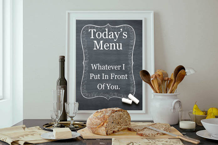
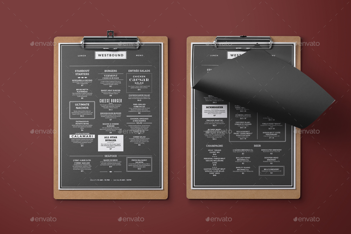
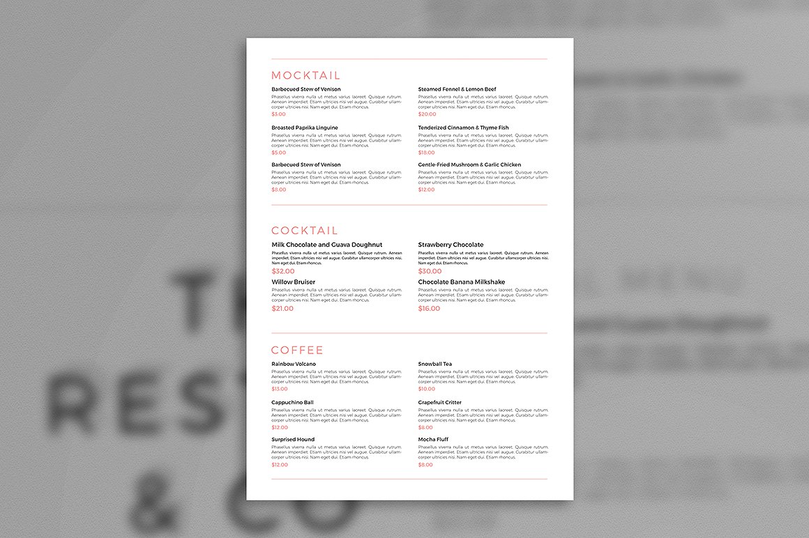
Typography Menu Designs
Because not only design but also an arrangement of the text and the overall picture of the page matters, it is important to apply this in creating your menu. Bear in mind that you have to balance art and function—art in the sense that it is organized well and the text complements well with the design and function in the sense that it is customer friendly and the text can be read well with clarity and correct highlights and emphasis. Below are menu designs that may help you in your startup.
Classic Typography Menu
Typography Restaurant Menu
Clean and Simple Food Menu
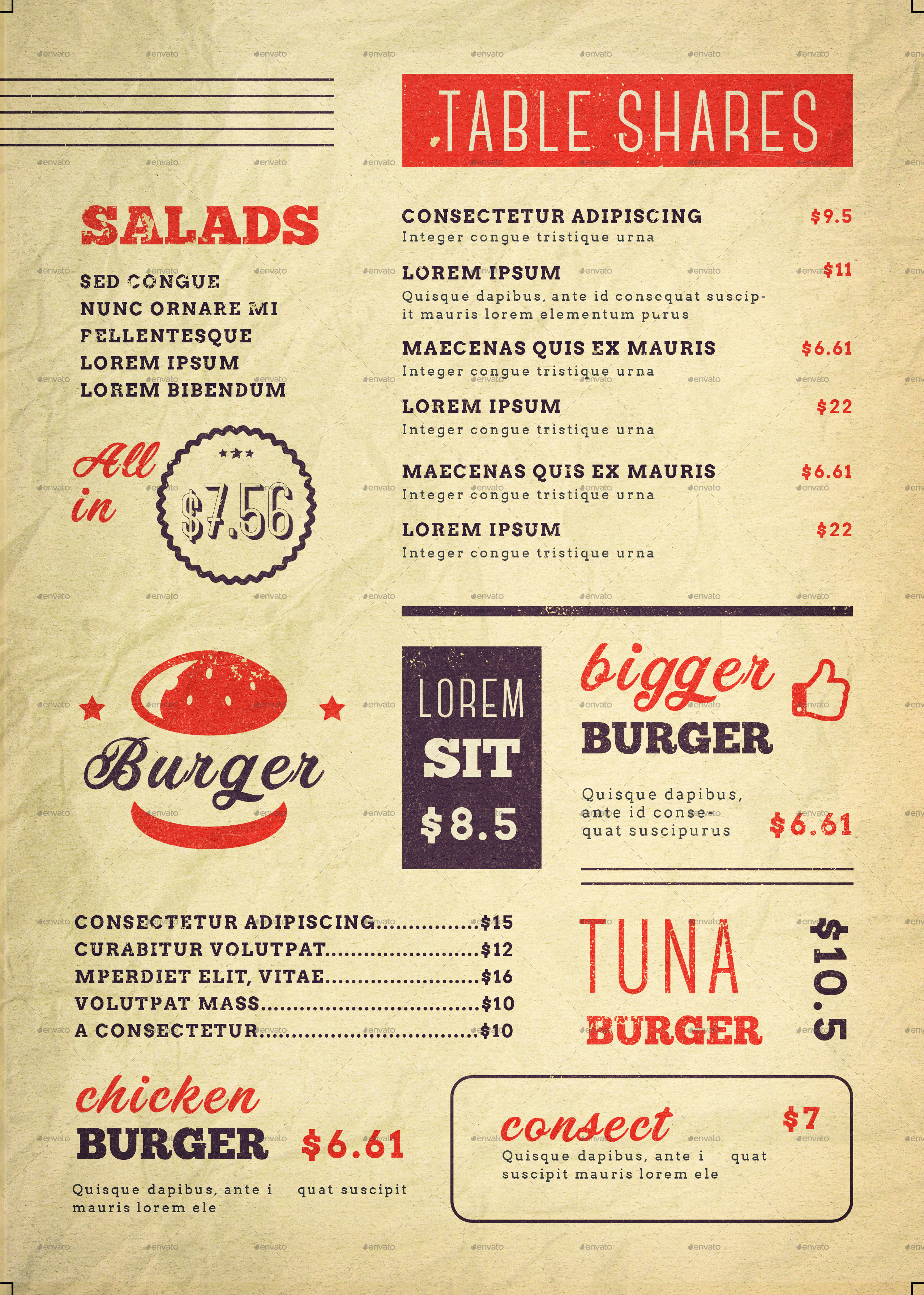
Vintage Typography Menu
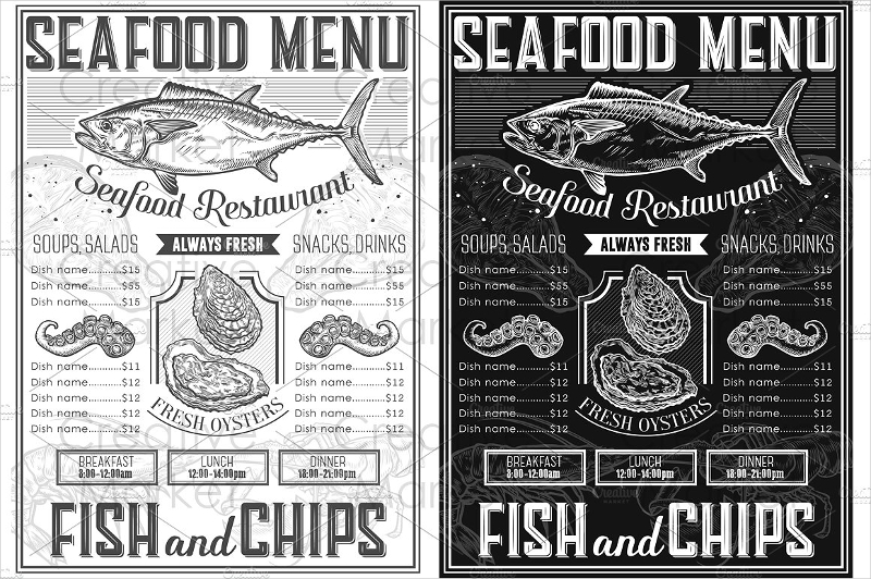
Seafood Retro Menu Templates
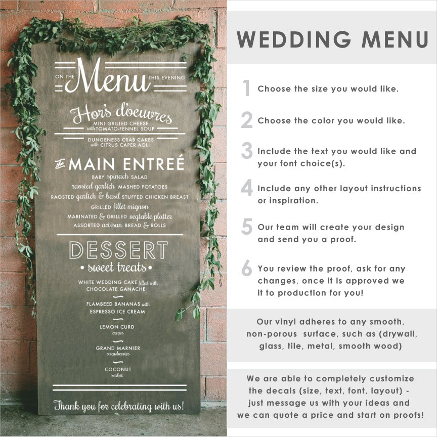
Wedding Menu Typography Sign
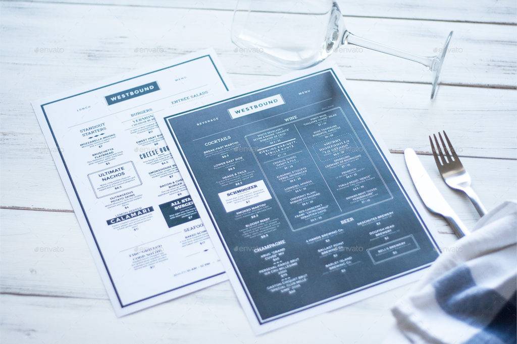
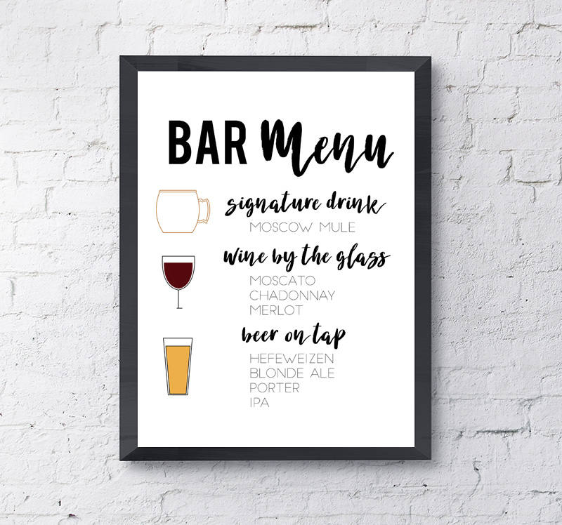
Typography Restaurant Drink Menu
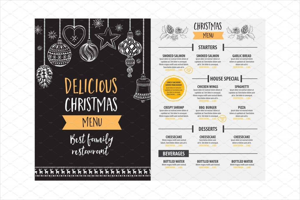
Christmas Holiday Menu
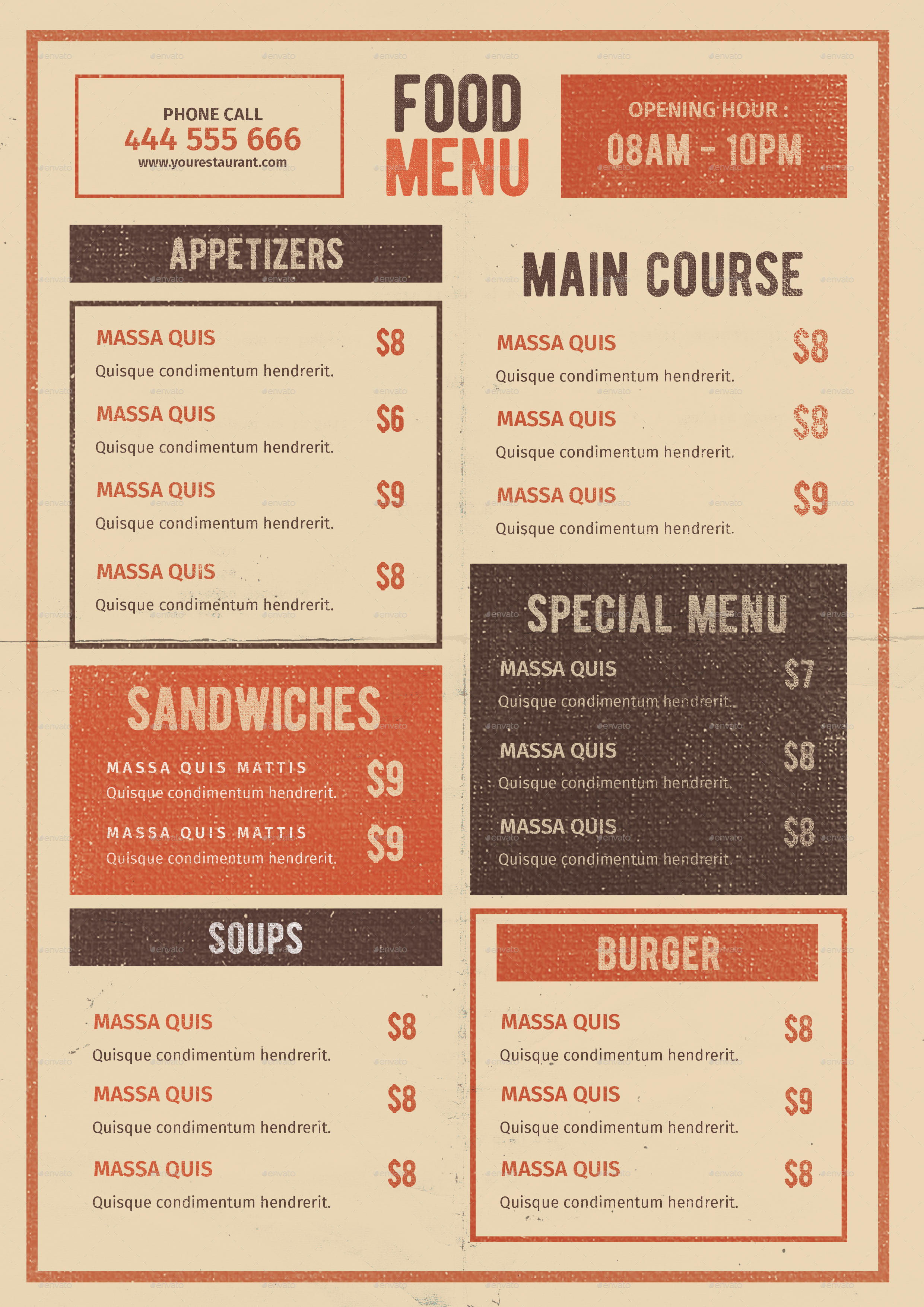
Retro Food Menu
Custom Typography Wedding Bar Drink Menu
Importance of Typography
For sure, by now, you already grasp what typography is all about and its significance and usage in our everyday lives. Below are the importance of typography that a company or an individual must know to appreciate its impact not only in business but also in the way we handle even the small things that require attention and detail.
Catches People’s Attention
A well-arranged text generates a great impact to people. Imagine you pass by a banner or poster that has a carefully arranged letter or words with perfect spaces and a very organized overall image. This will undoubtedly make you pause or turn around and look back for further reading on the poster. In contrast to posters with odd colors and chaotic arrangement of fonts, posters with good typography can catch every person’s eye including even those that are so much busy fiddling their phones and gadgets.
Strengthens Your Brand
How can typography help you strengthen your branding design? Choosing a good font for your advertisements or logo design can really help in strengthening your branding since people’s attention will be captured if you present a well-arranged banner that is readable and eye-catching. As discussed before, a good typography catches people’s attention and creates interest in your product and, in turn, gives emphasis to your branding. When people are hooked by your advertisement, surely, your brand and company will be recognized, thus, keeping your brand in the spotlight and ahead of the competition.
Conveys Your Message
How can you convey a message if you cannot catch someone’s attention? The role of typography is, first, catch people’s attention and, subsequently, convey a message. For example, in advertising your product, when you already have the attention that you need from a customer, you can now start conveying your message. But, it’s not as simple as feeding all the information they need at once. You still need the powerful command of typography to make your customers keep reading. Choosing a text that is not overly stylized is the thing. Even us, ourselves, do not want to read a text with different colors and different font styles and font types; it is usual to have a simple and minimalist font to keep us to further our reading. Readability does matter a lot in typography; you can assess the greatness of your typographical skills on the basis of the number of people who got to read your full text without getting bored and without dragging his or her eyes to the bottom of the page.