
In case you haven’t noticed by now, even after the major shift in the design of the iOS 6 to the iOS 7, flat Web designs are the biggest craze in design today. So, what’s in it for web designers then?
The flat design trend has become a huge thing lately, is a popular approach among large to small-scale companies and brands. To put it simply, designers have finally bid farewell to the design elements we’ve become accustomed to, like the standard shadows, strokes, and gradients. And the best part about it all? It makes it easier for designers to develop projects that users could understand and interact with effortlessly.
Flat Design in Today’s Digital World
If you’ve been familiar with everything hi-tech for the past couple of years, you’ll know how flat designs have made its mark and how they are practically everywhere, anything from flat logos to flat Web designs. While there’s no doubt we’ve learned to welcome three-dimensional designs with open arms in the past, you can’t help but appreciate the classic 2D creations. Well-known companies such as Apple and Microsoft have made iconic transitions with flat designs, making it a popular trend in the world of technology.
When to Use Flat Designs?
While flat designs might seem like a popular trend to follow, it’s definitely not for all. For instance, a flat design wouldn’t go well for gaming websites and interactive children’s websites. That’s because these types of websites consist of fun and complex elements that are difficult to achieve with a flat design. This is why it’s always important to keep your target market’s best interest in mind while developing your Web design. If you think you can deliver your purpose effectively with a flat design, then go for it. Otherwise, it would be best not to take the risk.
Key Principles of a Flat Web Design
1. Minimalist Design
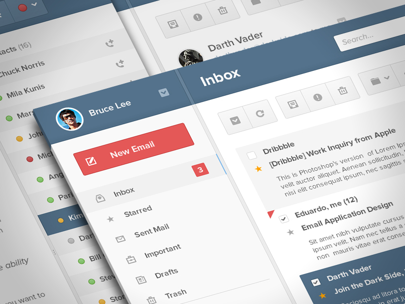
If there’s one way to describe a website with a flat design, it has to be minimalistic. Because this type of design steers clear of the standard strokes and shadows that were used to seeing in 3D designs, it holds a fresh and modern look and feel to it, giving off a visually pleasing creation that an audience will love.
As a minimalist Web design, it should only bear the necessary elements for it to fully function as intended. You’ll also notice how this type of design maximizes the use of empty spaces to bring the given subject into focus. The Web design is organized in such a way that its content and functions are readable and understandable for all. It simply consists of the basic UI design elements and vivid color schemes made to offer a positive user experience.
2. Simple UI
We’re all well aware of how essential a good user interface design is for bringing a good user experience. Apart from being minimal, a flat Web design is one that is simple enough for one to navigate through effortlessly as well. This includes the icons and buttons of your website or application, along with the standard qualities of the shapes you choose to use for such. Interaction should be kept in mind when developing this, especially since the purpose of a particular function must still remain clear to the average user without an in-depth explanation of what it does.
Additionally, there should be a consistent flow of actions in order to attain a smooth overall performance.
3. Colors and Type
Typography and colors have always been important, even for the basic logo designs. For one thing, type can do a lot for a Web design, possibly tell a story or provide emphasis on a given content or function. It provides direction and guidance on what a user must know, as well as portray professionalism for the nature of the website or application.
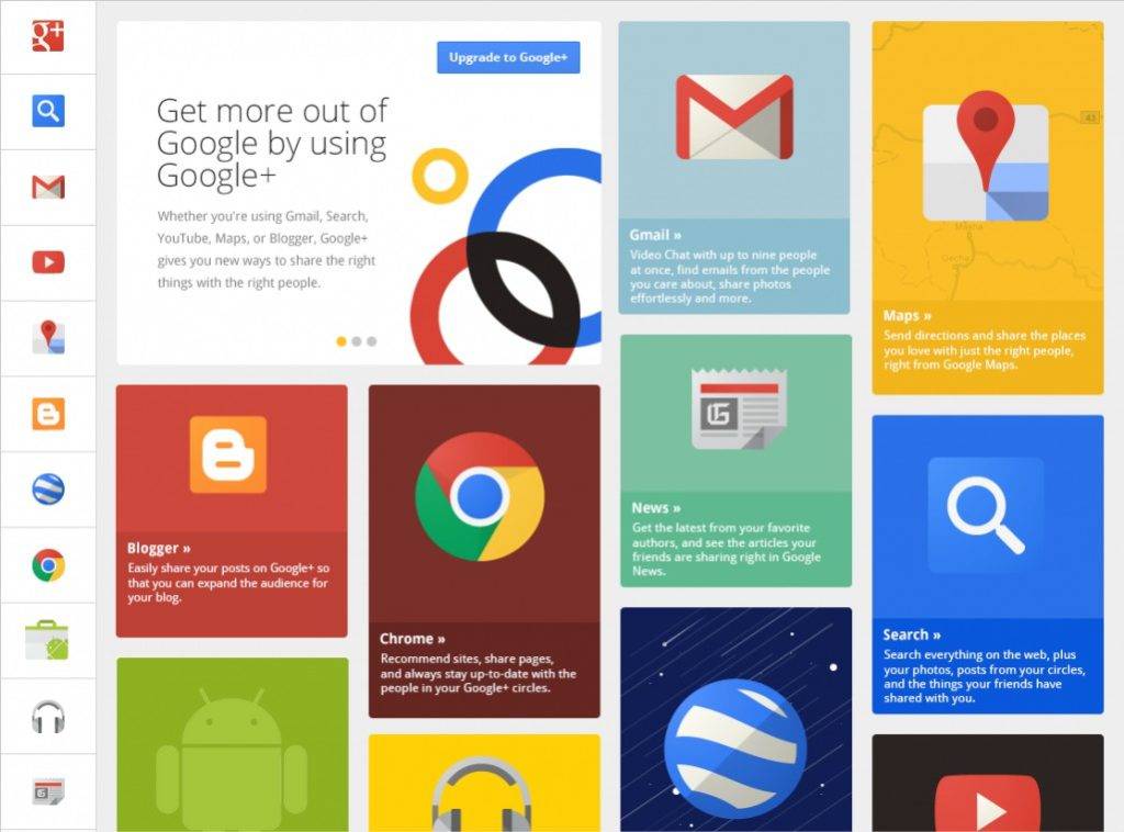
As for colors, flat Web designs typically consist of much more vibrant and colorful patterns than the others. It provides emphasis on particular elements of the design and gives life to the design to save it from falling a little too flat. But make sure you don’t go overboard when doing so, either.
4. Absence of Depth
It’s not difficult to tell a 3D design apart from a 2D one, especially when there are certain qualities that the former possesses that are easily distinguishable. For one thing, we know that 3D modeling designs come with its signature feature, the drop shadows, which are almost impossible to miss. This feature creates depth to the design, making it seem like the object in the subject is popping out of a screen. So with a flat Web design, you won’t be seeing anything of that type present anywhere. Modern-day Web designers have learned to create realistic effects without the three-dimensional feature through a few tricks of the trade. It’s a simplified approach that works just as good (or maybe even better) as the depth Web era.
5. Visual Hierarchy
The common problem faced by designers is creating clickable design elements without the use of shadows and gradients. The absence of such is considered to be a challenge for users, as they find it more difficult to click their element of choice. To avoid this problem, it would be best to create a visual hierarchy for your Web design. You can do so by distinguishing given elements using a certain color and font size for each. Make sure to apply this only when necessary, so as to not cause any form of confusion for the end users.
Like everything else in this world, this design trend will run a smooth course for the time being but will eventually make way for something even more revolutionary in the near future. Although there’s no telling when that could happen, we have yet to see how designers will innovate this style into something even better. So for now, be creative. Explore the design. Don’t hesitate on experimenting with the style. At the end of the day, you’ll come to find that it’s all about taking the leap with your creative side to achieve the best form of Web design you can imagine.