Perfect Poster Design Tips Examples to Download
For designers, creating a poster design is one of their most sought-after project. Imagine what they can do with a blank canvas. The possibilities are endless. They can bend the rules with so many different ways and they can design it with whatever they want. As a matter of fact, designers like to design poster because they can provoke many emotions in one simple illustration. They can get the viewers pumped up and be excited about the event or movie.
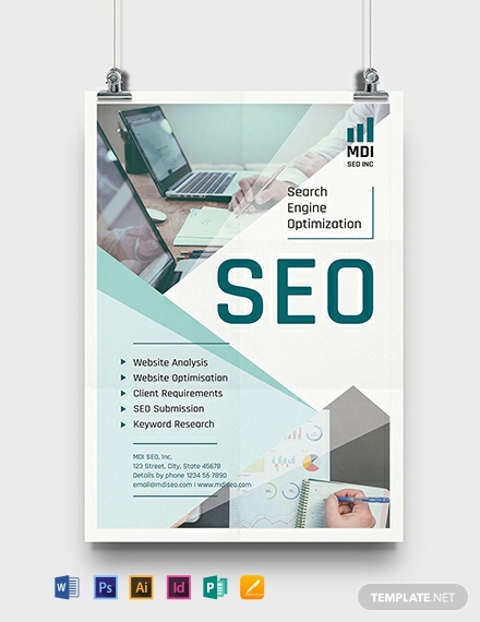
SEO Poster Template
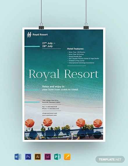
Royal Resort Poster Template
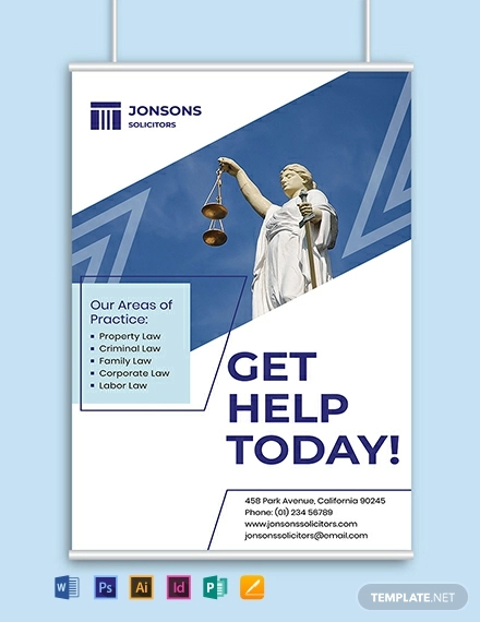
Law Firm A3 Poster Template
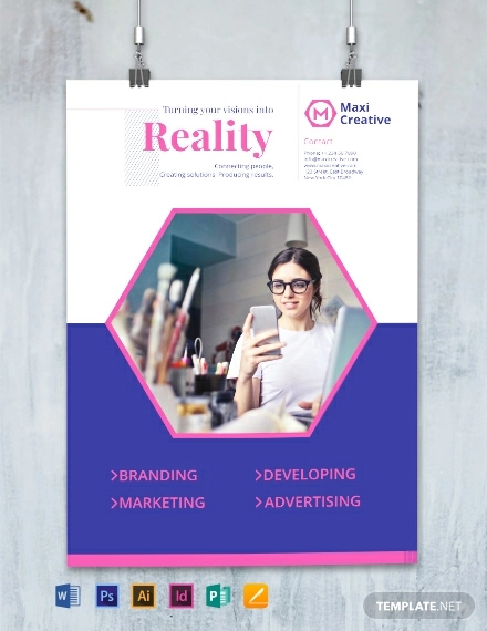
Creative Agency Poster Template
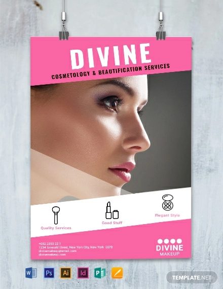
Makeup Artist Poster Template
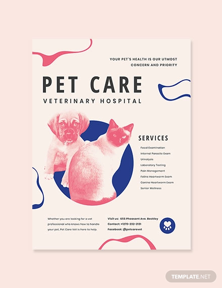
Animal Hospital Poster Template
For business-minded people posters are just a simple (but effective) promotional material (i.e., advertising posters) that communicates important information about a product or an event. In their own ways, these are themselves art. But for designers, they are a finer inspiration.
However, there is a catch. Just like with any other visual design, posters too can be a disappointing source of frustration. Simply because they are not that easy to create and design. Especially to the part where you don’t know where to start, and the worst part is, you can not even get any inspiration. Designers know this dilemma.
Don’t worry about it and don’t let your creative mind be clouded with that frustrations. You are not alone, we have all been there. That is why in this roundup, we will give you 12 tips that can help you create a poster design from scratch (and I mean from a blank canvas).
1. Have a Clear Idea in Mind
Before starting to create or design any posters, you must first think what your poster is going to be all about. You cannot just go directly and create a poster without having a clear idea in mind. Always remember that a great poster is not only about aesthetic and beauty, it is all about the idea that goes along with the poster.
So, if you are lucky enough to create and design a poster, try asking yourself these important questions.
- What is it all about? Is it an event poster? a movie poster? or some other kind of poster?
- What would be the message that you want the poster to convey?
- Who are your target audience, viewers, or readers?
- And lastly, what is the theme of the poster?
If you already have answers to that questions and have a clear idea in mind, then you are on your way to a great poster design.
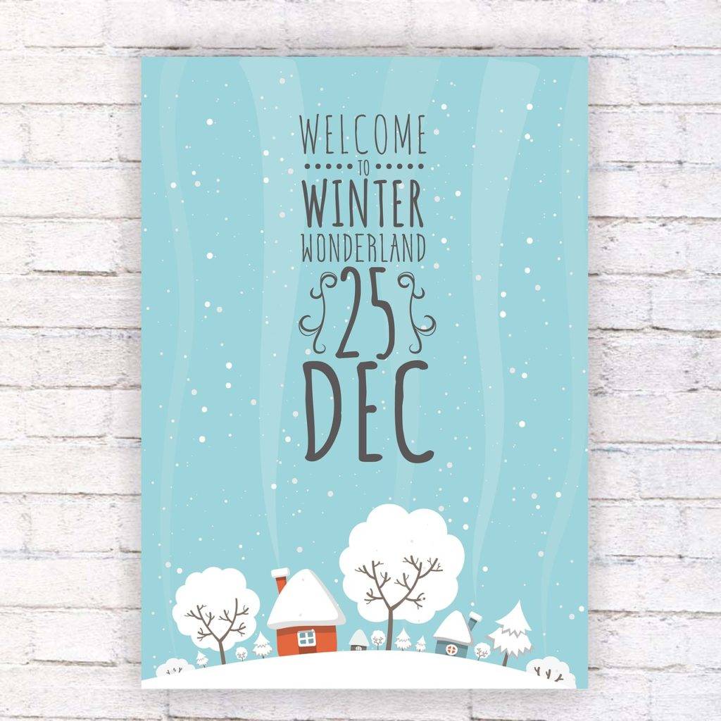
2. It Must Be Readable from a Distance
The main purpose of a poster is to expose someone to an event, and from a distance where people commonly stand to see the poster, the key information should be readable to draw the people’s attention and create a hierarchy in the text.
When designing a poster, consider having the text with three distinct layers:
- Headline – This is the main text on the poster and generally the largest of them all. This should describe what the poster is all about. Is it an event? a cookout? or a concert? When creating the headline, opt for the most readable font.
- Details – This answers the poster’s what, when, and where. This may not be as largest as the headline, but still, it should be readable and easy to grasp. You can cut the size about a half of the headline for the details to create a clear hierarchy of text. The details must provide information in a concise manner.
- Fine print – The name explains itself. This might be an additional information regarding the event or a promotion for a movie poster. But whatever it may be, it should be small should be kept out of the way.
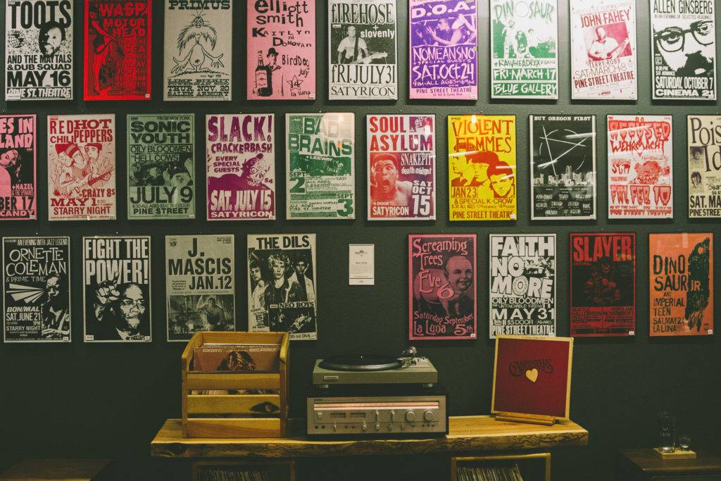
3. Play with Contrast
Remember, you only have one glance to grab the people’s attention with a poster. So, you have to make your poster stand out, especially when it is placed along with some other poster. You can achieve that using a high contrast between elements, and there are a lot of ways to do that.
You can choose opposing colors such blue and red or purple and orange instead of other color palettes. Forget the use of monotone colors with pale gradients, and go for something bold colors partnered with dramatic fonts options.
Or try for new color palettes that you think might be too stupid for other projects. Go ahead and experiment it.
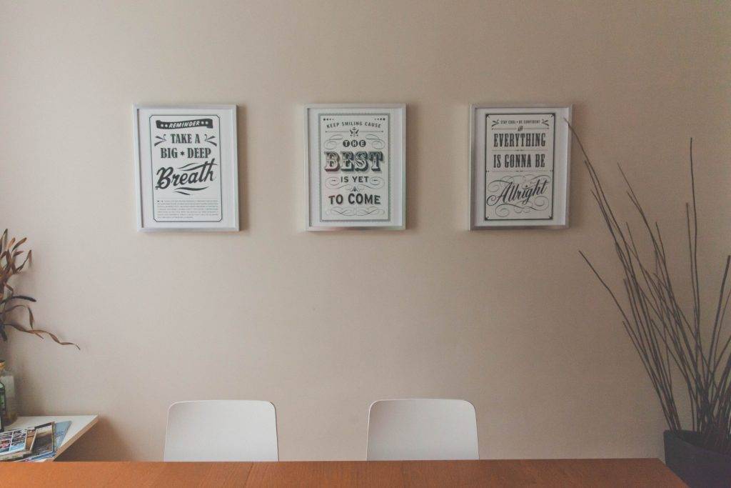
4. Remove Unnecessary Elements
You do not have to put too many elements in your poster just for the sake of adding more. Sometimes, the lesser the elements, the better it could be. Plus, it intrigues the viewer, it gives a sense of mystery in your poster which ultimately the reason why it would attract attention.
Even just a single word or image can communicate more that lots of words or bunch of images and illustrations. A lack of color and simple typeface could also make a huge impact.
So go for a simpler and minimalist design if you want to convey something serious and at the same time mysterious, especially if what is being conveyed is so ingrained in popular culture that a simple reminder is enough to evoke all the layers of meaning behind it.
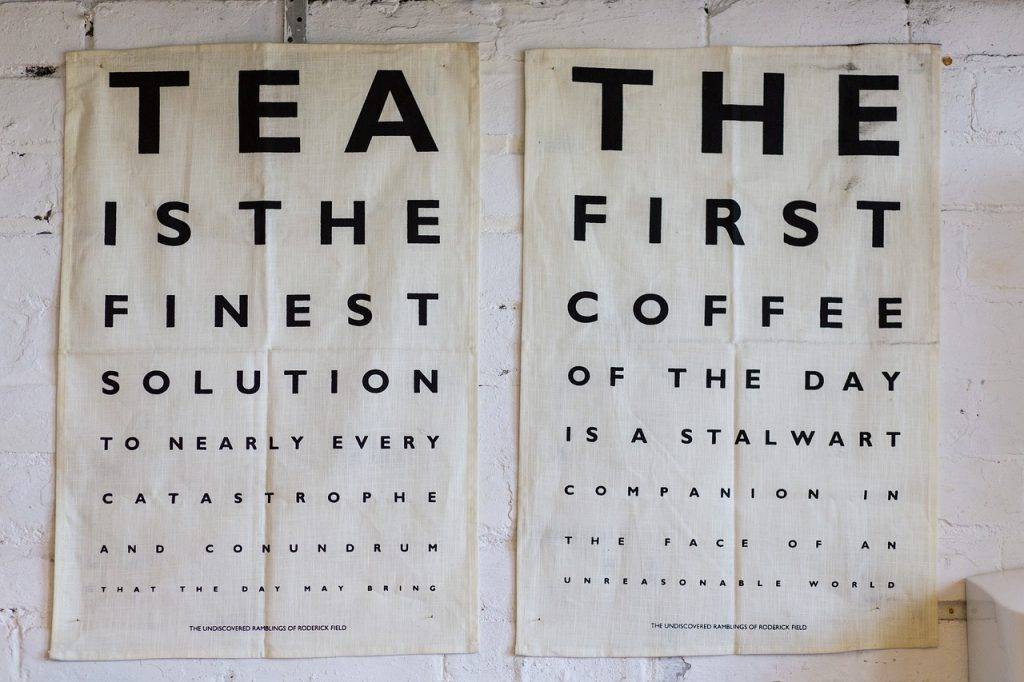
5. Experiment with Typography
The poster is just as good as the fonts being used. You can convey a lot with the poster just from the fonts. You can show seriousness in your poster with a bold sans-serif, use an italic serif to portray elegance and classic in your poster, or you can express fun, playful, or quirky using any loose hand-written fonts.
But for better results, experiment with typography. See how a combination of two typefaces can create a mood or emotion in your poster. When selecting a font, use at least two—one for the headline and one for everything else. Or you can use as many as you want as long as it suits the poster and can create a clean impact.
It is also best if you create your own poster fonts. This way you will know what typeface would be appropriate for your poster designs. But, if you don’t know how and do not have the right typography tools, you can just easily download them from the Internet.
6. Consider Size and Location
One important thing to consider when creating a poster design is knowing where your poster will be placed. The location of your poster can factor several ways, including the size of your poster, the aspect ratio, and the visual clutter around the poster.
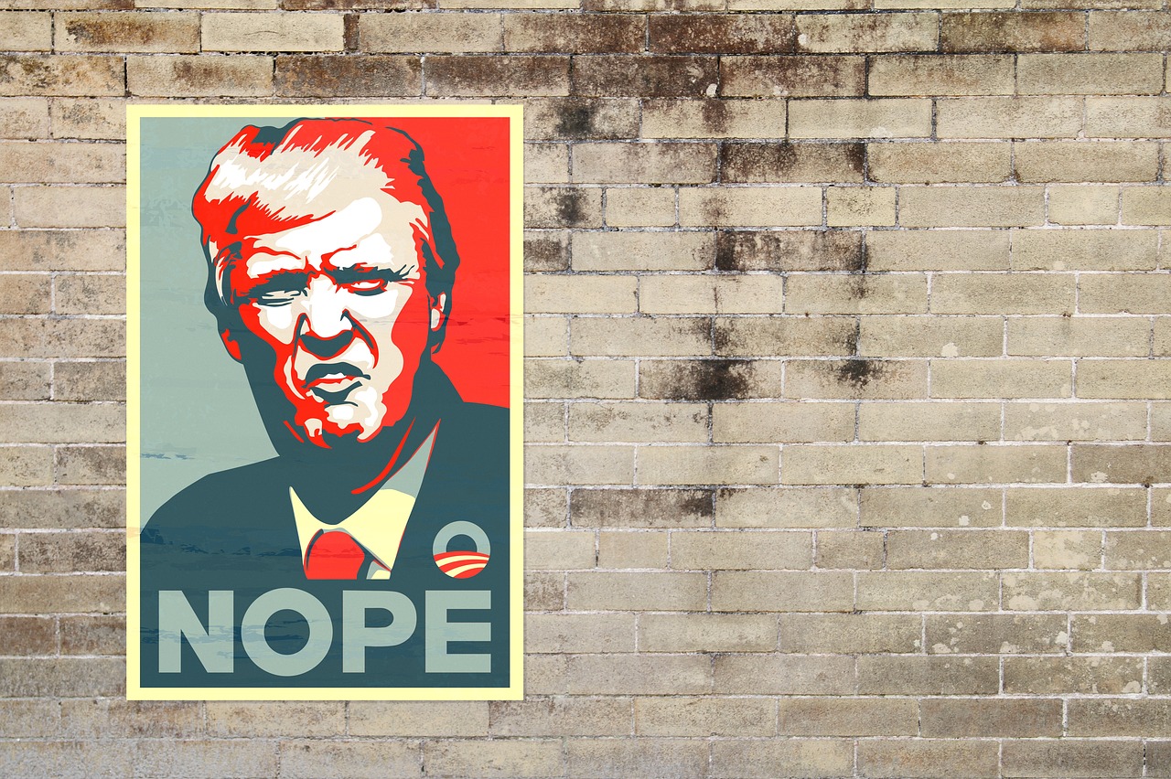
Once you know where it will be placed, you can decide what size is appropriate for your poster and what design is suitable for that location. Not only the size but also for the design as well. For example, if your poster is going to be hung on a brick wall, then you might not want to design a poster that blends into the environment (e.g., red, rough surface, rectangle designs, or anything that mirrors the brick wall too closely).
7. Use Images—and Make Them Big
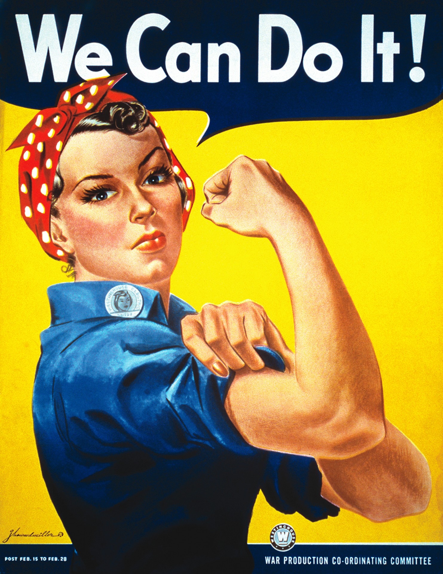
Big and dominant images give more weight to the poster, convey a message clearly, and really grab the attention of the viewer. It is important to make the image big so that it could also be seen from distance and create a larger-than-life impact on the concepts portrayed.
There are lots of ways on how you can maximize the images and make it more appealing when placed on the poster. You can experiment and use a photograph with a focal point. A photo that’s in or out of focus will create drama and mood to the poster.
You can also try placing single-item illustrations, close-up crops of faces or elements, or any image that takes up the whole poster. You will be amazed how this can level up and enhance your poster.
8. Consider Visual Hierarchy
Posters should be easy to read. It is better to rank the information in order of their importance or use different sizes of text to highlight which is the most important and which is fine print. If it has a lot of information, let the type be the focus. Create a big headline followed by chunks of information.
 For more effective results, you can place the information in a manner that the eyes of the viewer follow a single path. Coming from one piece of information to the other, leading to the lower section of the poster.
You will be surprised how a lot of people can easily comprehend your poster and information with this technique.
9. Use Plenty of Space
This may sound absurd, but actually, using plenty of space or increasing the negative space within the poster is a great way to bring attention to the poster. The use of excessive spacing between elements within the poster will dramatically increase the visual impact and readability of the poster from far distances.
Tight spacing between letters can cause the text to blur at distances. Similarly, images with small spaces between them can make the images look like it is one and not separated.
Here are some of the places within the poster where the increased use of spaces is necessary:
- Between images and other elements
- Between individual letters and lines of text
- Around the margins of the poster
However, if the increased of space does not look good on your posters or it ruins the elements within the design, you might as well omit this technique and follow the style that feels right and meets your requirements.
10. Don’t Forget to Include a Call to Action
The call to action can be a great way to make the poster effective. Since the goal of every poster is expose someone to something, such as inviting them to a concert, movie, or any other event, a call to action would be necessary and vital in that situation. Similar to website or a mobile application where a call-to-action button is used to let the user take an action to the website or app.
Unlike on a website, where “click me” or “read more” are the common calls to action, in poster design, there is a different approach. Usually, the information regarding the event or the contact information is the poster’s call to action and it is very important that the poster should have that.
However, placing event and contact information on a poster is not very common nowadays, or at least only a few vintage posters still have these features. Many designers today integrate QR codes in their posters where the audience can easily scan the codes using their phones and have the all information pop up right away in their phones.
11. Use Humor and Creativity
You do not have to be so serious when designing a poster. It is okay to be silly and express your funny side. After all, posters are created for anyone to see and enjoy. And there are actually a ton of ways you can do that.

You can play with words, use unexpected and humorous images (not unless, of course, if you have a serious subject—that is of course a totally different story), create visually exciting illustrations, or any way you could think of. A good rule of thumb is that it had to be fun and a bit risky to make—in turn it will make the people wonder what kind of fun they will expect if they attend the event or watch the movie.
In addition to that, being funny and humorous in designing a poster links to being creative. So, if you are not sure on how you can adequately make the poster convey a humor, then use your creativity instead and just focus on making it unique.
12. Break the Rules and Have Fun
Designing a poster can be a great platform where designers can have a lot of fun. Although there are so many things to consider when designing a poster, it is an area where you can break the rules and go a little crazy with how you will design the poster.
So do not be afraid. Explore the things you have always wanted to try in terms of designing or try something new and expand your capabilities. You can even stretch your imagination to create something that no one has ever done it before. All it takes is just little rule-breaking.
What’s important is that you know the rules. And once you know them, you could break them.
Share :
