84+ Brochure Examples to Download
Brochures have been extensively used in advertising, public relations, and information dissemination by companies and different businesses in the world. They offer extensive information on a product, a service, a promotional offering, and the like. Using brochure templates can make it easier to create professional and visually appealing brochures that effectively communicate your message to the target audience.
they offer a lot of advantages. They are easy to produce, inexpensive, and can hand out useful information to people of all kinds in a certain are. If you want to make a company brochure but don’t know how to, here are some excellent brochure examples for you to be able to look at and download to serve as a guide. Scroll down to look and choose some, and don’t hesitate to click on that download button.
One Page Brochure Template
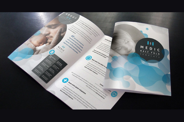
Half Fold Brochure Template
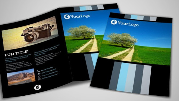
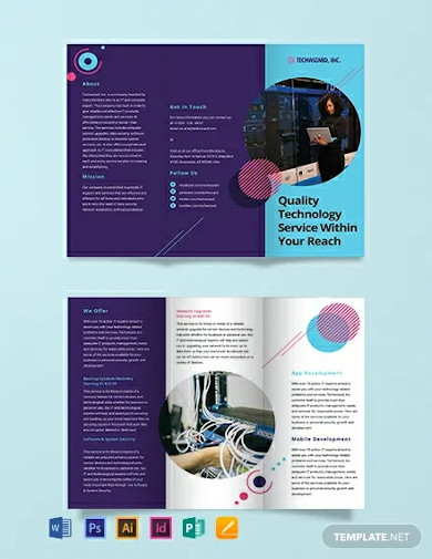
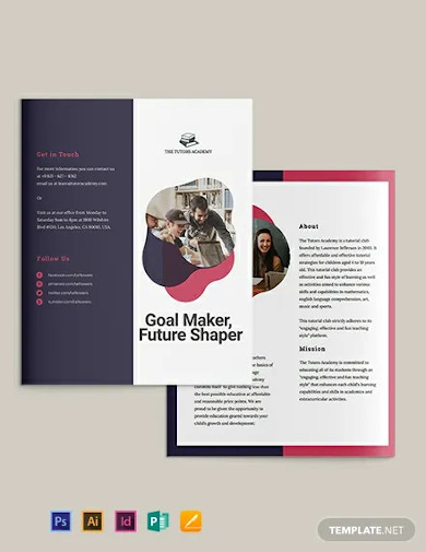
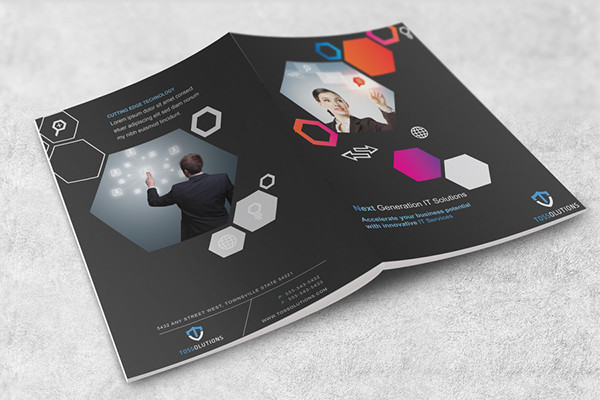
IT Company Tri-Fold Brochure Template
Gate Fold Brochure Template
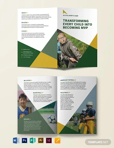
Sports Camp Bi-Fold Brochure Template
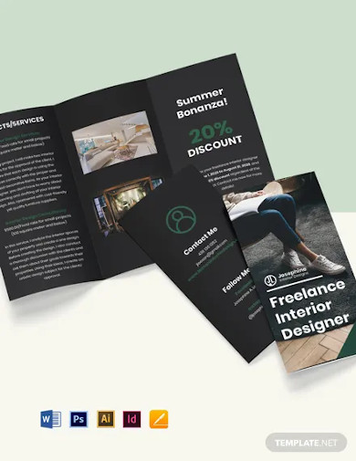
Tri-Fold Freelance Designer Brochure Template
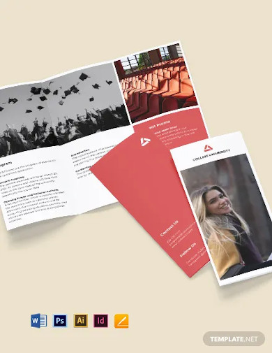
Tri-Fold University Graduation Brochure Template
Realtor Bi-Fold Brochure Template
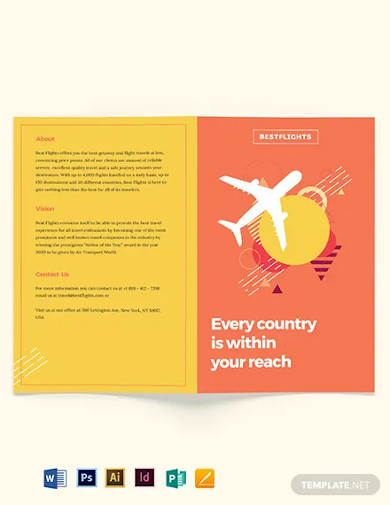
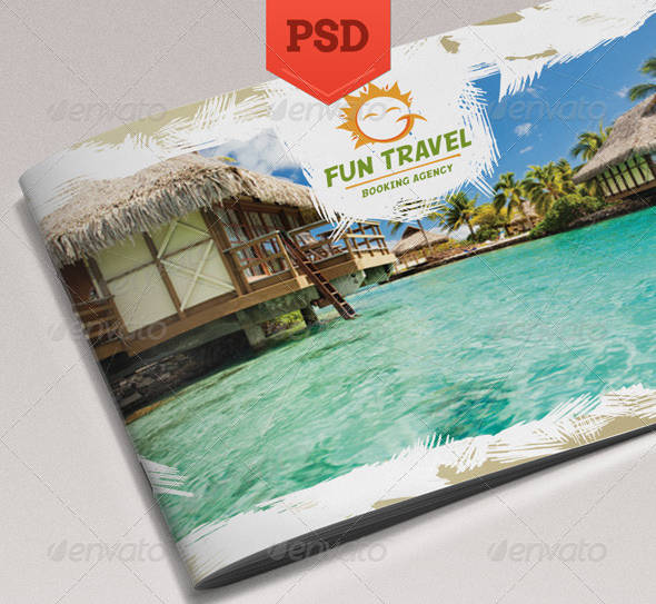
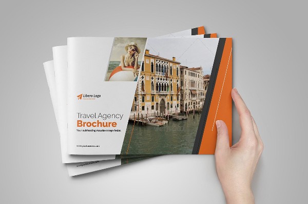
Travel Brochures
Holiday Travel Brochure
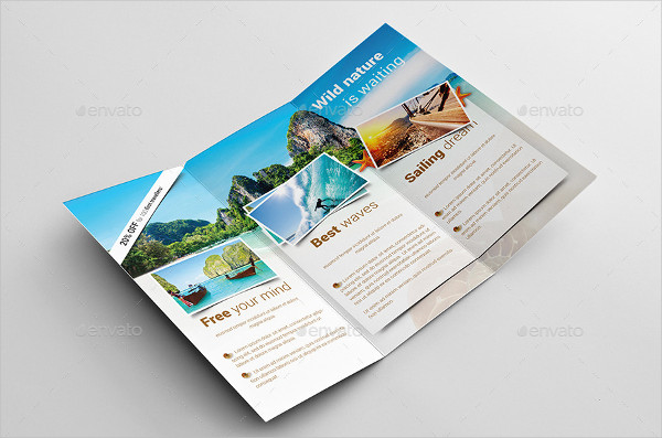
Fun Travel Brochure
Modern Travel Brochure
Travel Tourism Brochure
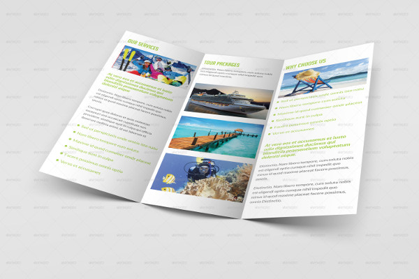
Adventure Travel Brochure
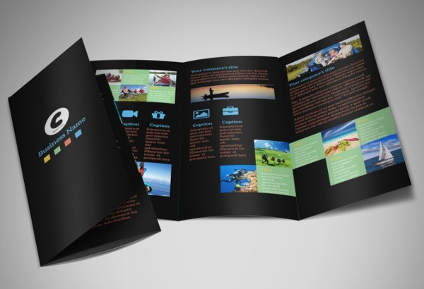
Tri-Fold Brochures
Tri-Fold Travel Brochure

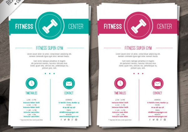
Fitness Tri-Fold Brochure
Corporate Tri-Fold Brochure
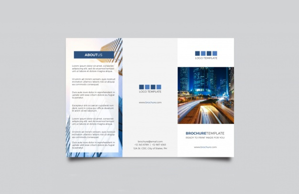
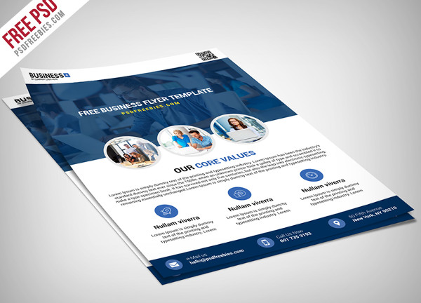
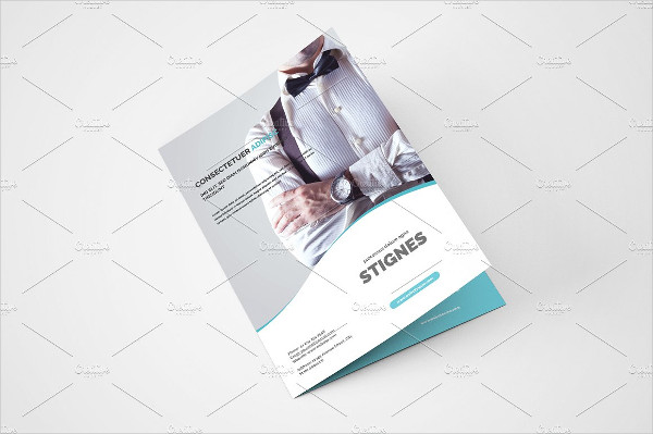
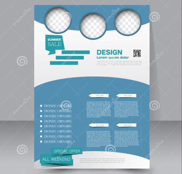
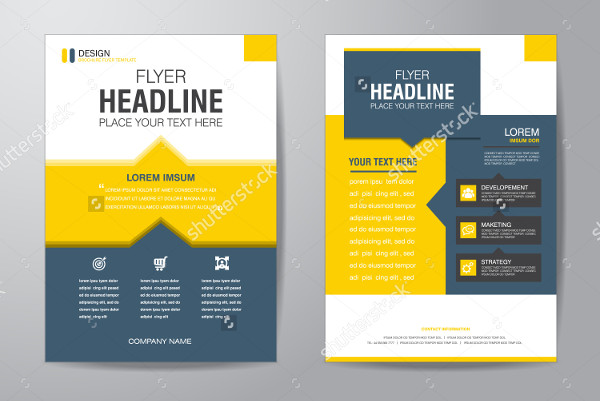
Business Brochure Examples
Multipurpose Business Brochure
Corporate Business Brochure
A4 Business Brochure
Vector Business Brochure
Bi-Fold Brochures
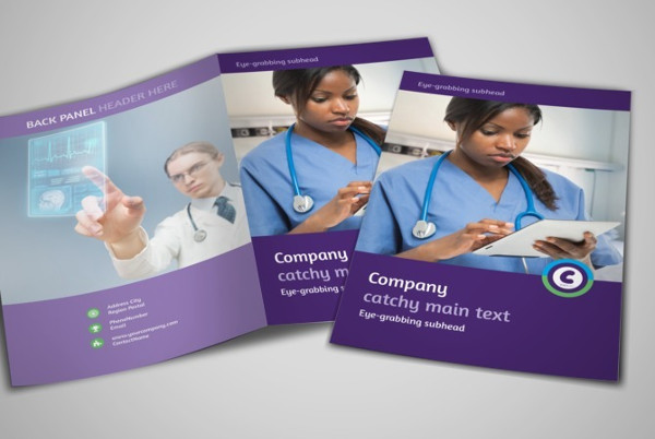
Medical Bi-Fold Brochure
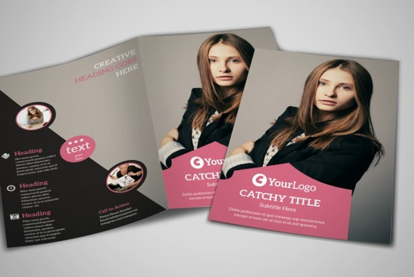
Fashion Bi-Fold Brochure
Landscape Bi-Fold Brochure
Business Bi-Fold Brochure
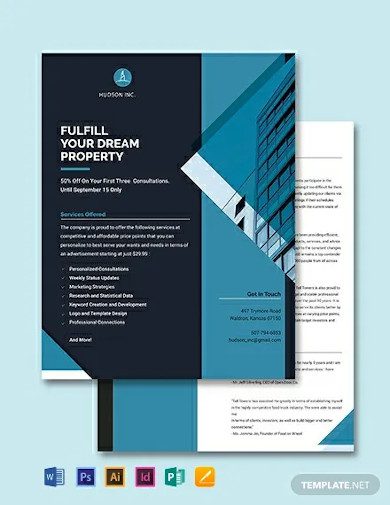
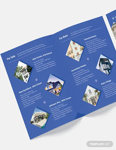
Real Estate Brochure Examples
Luxury Real Estate Brochure
Modern Real Estate Brochure
Church Brochures
Church Tri-Fold Brochure
Clean Church Brochure
Company Brochures
Construction Company Brochure

Security Company Brochure
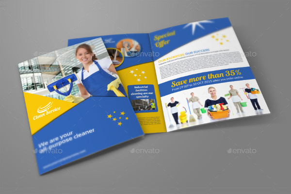
Cleaning Company Brochure
What Are the Uses of Brochures?
Brochures have many uses, but mainly, they are used by different companies, firms, agencies, and businesses of all kinds for promotion. They provide a great deal of information at a really inexpensive price. Other than that, here are more uses of brochures:
- Advertising – In the world of advertising, brochures have been a medium that has been used extensively for a brand, a service, or a company to be able to hand out information to a lot of people for a very low price. If you have walked around your local city business district or downtown, then you surely might have noticed advertising brochures before being handed out to countless numbers of people or lying around on the pavements. This is a testament to the volume by which advertising brochures are used in the industry.
- Public Relations – Brochures are also used extensively by public relation firms in executing their different communication plan as part of their public relations project for a certain client. This tells a lot, since even if the internet is becoming more prominent in terms of communicating with a great number of people, still, nothing beats being in the streets, with brochures still one of the more dominating medium to use in spreading out information to a lot of people and in conveying a particular message.
- Information Dissemination – Brochures, in its core, is used to hand out information to a great number of people. Brochures, along with posters, banner designs, and other print-based media to convey messages, are still very much useful in today’s world which is becoming very digital as the days go by.
- Guides – As digital as the world is today, and with the internet becoming a medium for unlimited information, guides for anything and everything are already available to anyone. Still, some people prefer to have their guides in a physical format, without needing to have security codes, mobile data restrictions and the like to hinder them from using it. That is why a lot of guides are still in business brochure. It could be a map for a tourist to know where he is and how to go to a certain area, or a step-by-step guide on how to do a certain process. At the end of the day, brochure guides are still around and are still available to everyone.
College Brochure Designs
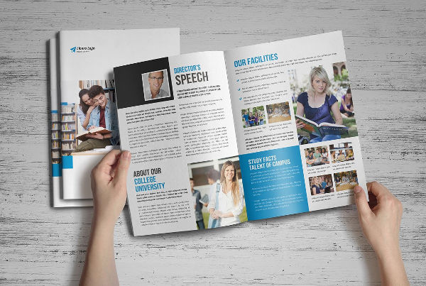
College University Brochure
College Tri-Fold Brochure

Education College Brochure
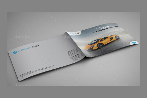
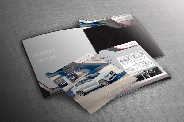
Car Brochures
Modern Car Brochure
Car Presentation Brochure
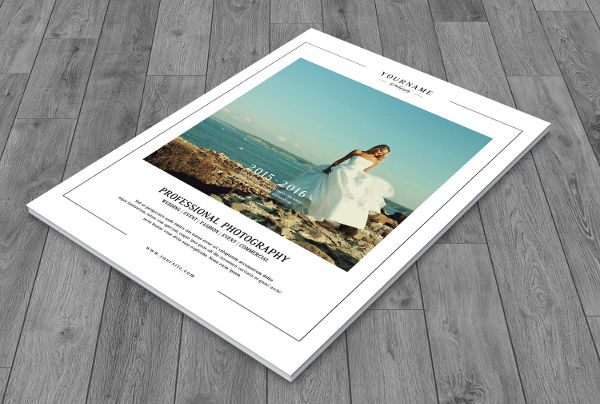
Wedding Brochure Examples
Vintage Wedding Brochure
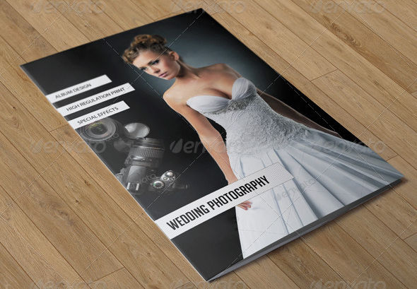
Wedding Photography Brochure
Wedding Bi-Fold Brochure
Product Brochures
Minimal Product Brochure
Square Product Brochure
Marketing Brochures
Multi-Purpose Marketing Brochure
Professional Marketing Brochure

Vacation Brochures
Vacation Bi-Fold Brochure
Summer Vacation Brochure
School Brochure Examples
Graduate Brochure Design
Junior School Brochure
School Bifold Brochure
Corporate Brochures
Indesign Corporate Brochure

Sales Brochures
Product Sales Brochure
Property Sale Brochure
Fashion Sale Brochure
Restaurant Brochures
Clean Restaurant Brochure
Branding Restaurant Brochure
Elegant Cafe Brochure
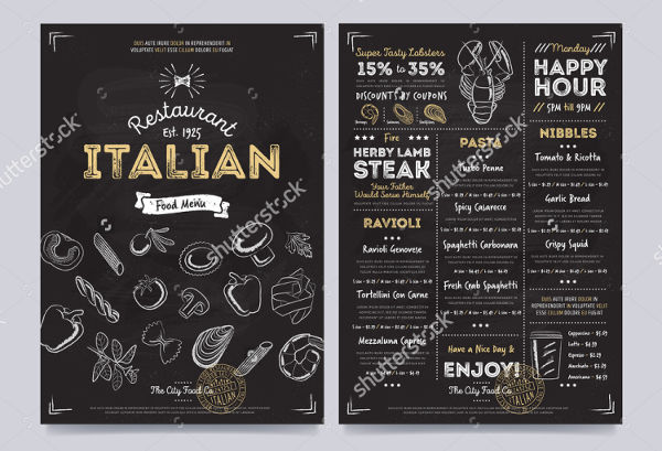
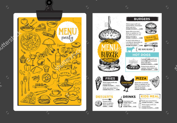
Restaurant Menu Brochure
How to Make a Good Brochure
Making a good brochure will more often be the deal-scorer, of breaker. Of of the emphasis on making a brochure that will catch the eye of people is making a good one. Here are some tips:
- Good design – A good brochure is one that can attract people due to it’s design. An advertising brochure must use good design to be able to tell people “look at me”, though great visual effects that the brochure has.
- Just the right information – Although it’s something that’s often folded, resulting to someone being able to turn pages and such, a advertising flyer is not a comprehensive encyclopedia that is ready to give information overload to anyone. A good copy should be efficient with the words used. Treat it like a poster. It just has the right information, all while being able to put that macho actor with an explosion at his back, right at the center of everything.
- The right information in the right page – Speaking of just the right information, there must be a certain order with regards to the information that’s being communicated to the people. In an academic brochure, for example, it would seem awkward to place the college programs in the second page, and the junior high school program offerings at the next page. Treat copy writing process like a flow chart.
- Quality print – A partnership agreement with an advertising materials solution provider would help with this cause. A good deal that is also offering good quality print is a plus.
Conference Brochures
Meeting Conference Brochure
Tri-Fold Conference Brochure
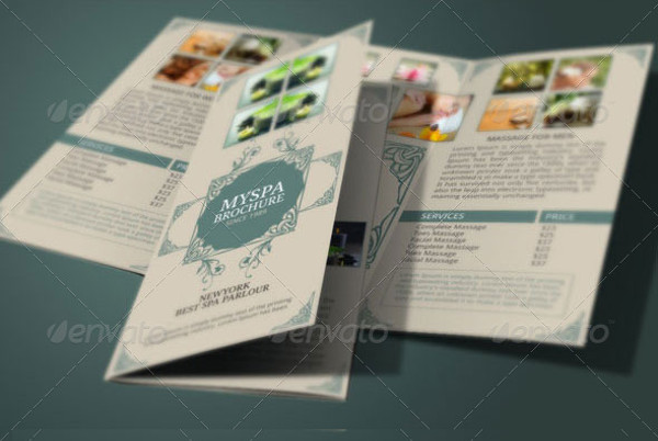
Health Brochure Examples
Health Care Brochure

Health Trifold Brochure
Health Spa Brochure
Dental Brochures
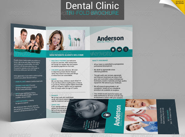
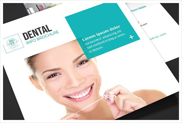
Dental Clinic Brochure
Dental Square Brochure
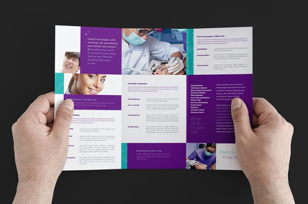
Dental Trifold Brochure
Medical Brochures
Medical Bi-Fold Brochure
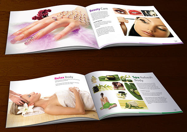
Medical Spa Brochure
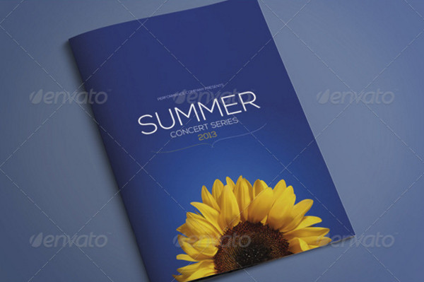
Event Brochure Designs
Music Event Brochure
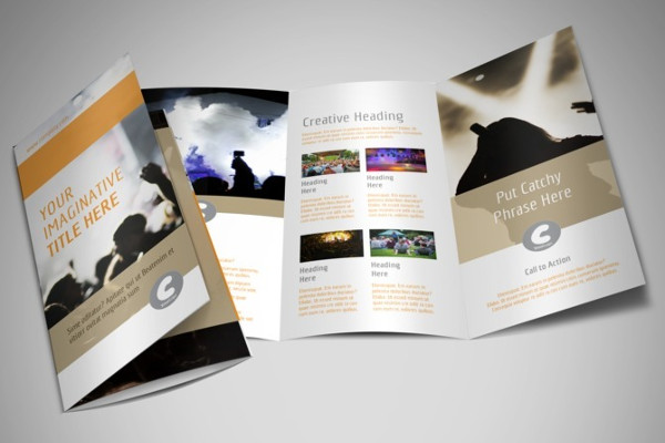
A4 Event Brochure
Photography Brochures
Square Photography Brochure
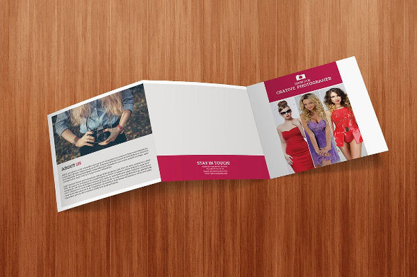
Landscape Photography Brochure
Professional Brochures
Professional Corporate Brochure

Professional Business Brochure
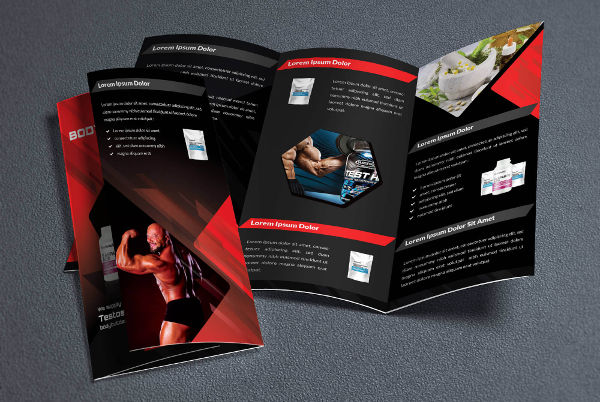
Fitness Brochure Examples
Sports Fitness Brochure
Yoga Fitness Brochure
Fitness Training Brochure
Salon Brochures
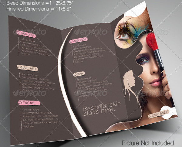
Beauty Salon Brochure
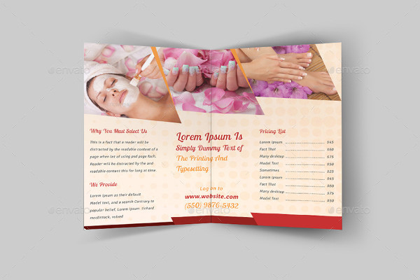
Spa Salon Brochure
Promotional Salon Brochure
Types of Common Brochures
- Travel Brochure – This may be the most common form of brochures, and also the most widely used one. Travel brochures can be all about what places to visit in a certain area, services offered, a travel package or simply as a guide. In a nutshell, this kind of brochure is all about travel, and its main target are usually tourists or a certain area.
- Business Brochure – This kind of brochure mainly has information about services offered by a business applications establishment. These are mainly distributed in places where the target market of a certain business are located. Business brochures will usually have promo packages, offerings, and the like as inclusions in its copy.
- Corporate Brochure – A part of what they call “Grey Literature” – These types of brochures are hard to come by for a person that’s just walking around the streets. Company brochures are commonly distributed only within a certain company. these might be event agendas, reports, postings and the like, and a brochure would be able to do that job easily
All of the brochures mentioned and others have a common denominator–to disseminate information to a lot of people. Brochures are still useful in today’s world because they are inexpensive, spreads information fast, and still gets the job done in a very digital world in which we live in these days. If you’re planning on making a real estate brochure, don’t just make one, make a great one with out different brochure examples that will surely attract people. There are different kinds of brochures available for download here like travel, academic, corporate brochures and some more. Find the one you like, and click on that download button.
Share :
