We all know that every company, regardless of its scale, needs a good logo design to stand out in the market. But after the process of understanding the brand, conceptualizing the design, and then developing it, comes the part where the logo works its magic.
Apart from being plastered on newspaper ads, billboards, websites, and TV commercials, logos are also printed on business cards. And yes, these things still exist. Companies and their employees often make use of business cards for quick and easy advertising. This allows them to communicate with their customers personally, as part of a good marketing strategy. But after this interaction takes place, ask yourself, will your prospective customers remember what has been discussed during the encounter? Have you successfully carried out your message?
With a personal business card, you provide more information about yourself rather than the company you represent. By adding a logo to your card, this can spark interest about the brand, giving it great exposure for successful marketing. It’s not so much that a business card is absolutely useless without a logo, but a logo does play a significant role in professionalism and brand development.
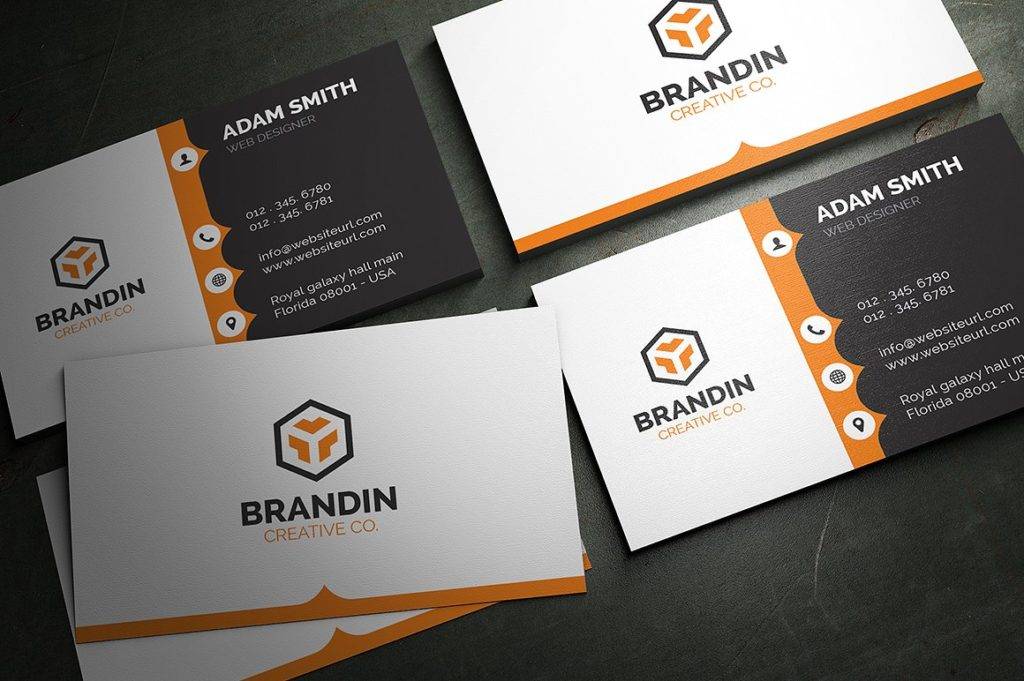
Law Firm Business Card Logo
![]()
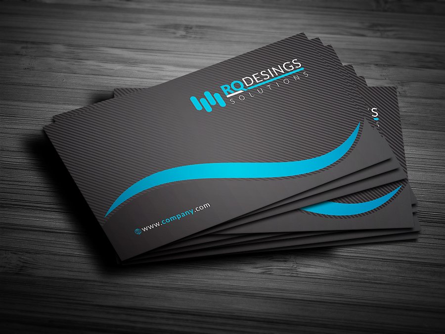
Company Business Card Logo
Fitness Business Card Logo
![]()
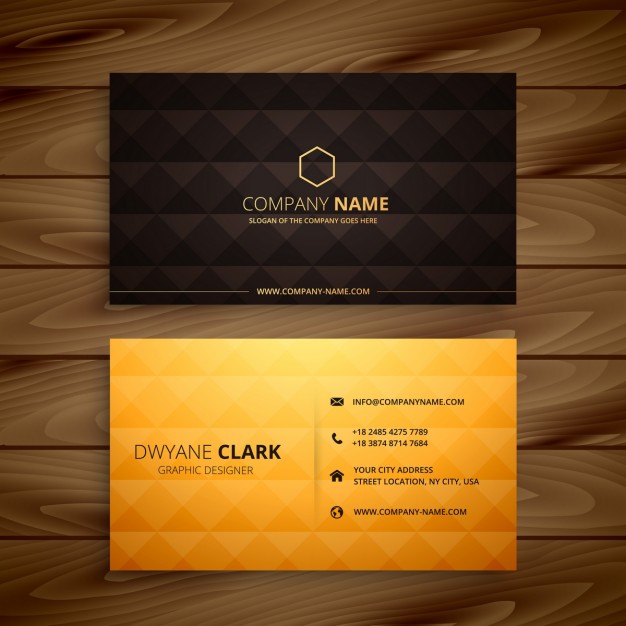
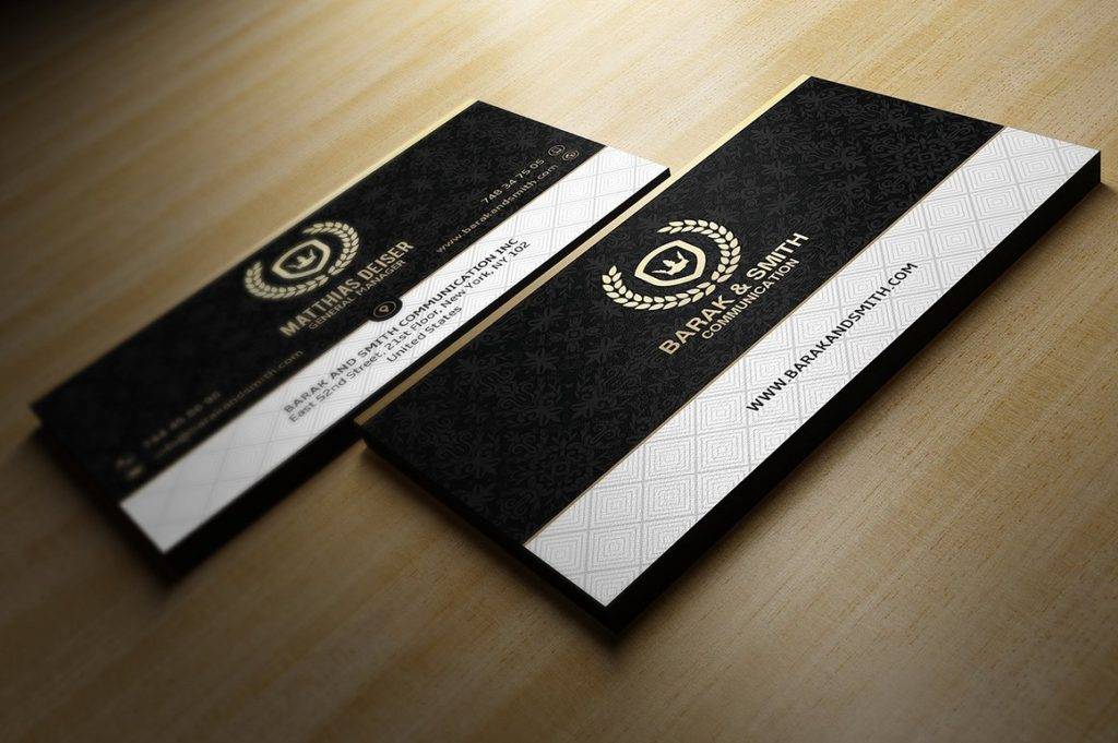
Personal Business Card Logo
Types of Logo Designs You Could Use
Symbol
The symbol logo also referred to as the pictorial logo, can either be a flat logo or a 3D logo representing a brand. Most companies use abstract logos to create a visual image of their business for their prospective audience to enjoy. This allows you to express certain ideas more clearly than with text. But having a mere symbol can be quite tricky, especially without a strong brand recognition to support it.
Wordmark
There’s a long list of well-known companies that have logos consisting of only text. Through this type of logo design, businesses are able to build exposure towards their brand using their company name. But because words aren’t exactly as appealing as images, the beauty of your logo design centers on typography. From the font, you use to the colors you choose, creating a distinctive look for your logo is essential in standing out.
Lettermark
Time for the simplest type of logo design on this list, the lettermark. The lettermark logo is comprised of a company’s initials (think IBM and CNN). This type of logo is great for companies bearing a long name, as it is catchy enough for one to remember. But like the wordmark, typography comes to focus. Because of how concise the logo can be, it would be best for companies to channel their creativity by creating a unique font for the design. Companies that use lettermark logos often create a visual image relevant to their brand, while still allowing it to form the initials of their name.
Combination Mark
The combination mark is popular among companies that have yet to establish themselves in the market. Through the use of an icon and text, one can learn to efficiently and effectively associate one with the other. However, the icon and text can only work separately if the two elements are made well enough to stand alone. This type of logo is often used for business cards as well, as it makes it easier for clients to recognize the company immediately.
Emblem
The concept of an emblem logo is a lot similar to that of a combination mark but instead of the icon and text being presented alongside one another, the text appears to be engraved to the icon, making it almost inseparable. Let’s take for example the popular logistics company, UPS. Without the company’s initials being imprinted on it, the logo can easily be mistaken as a golden brown shield for some medieval-themed business. An emblem logo even carries features resembling a badge or seal, creating a distinctive look that an audience can easily take note of.
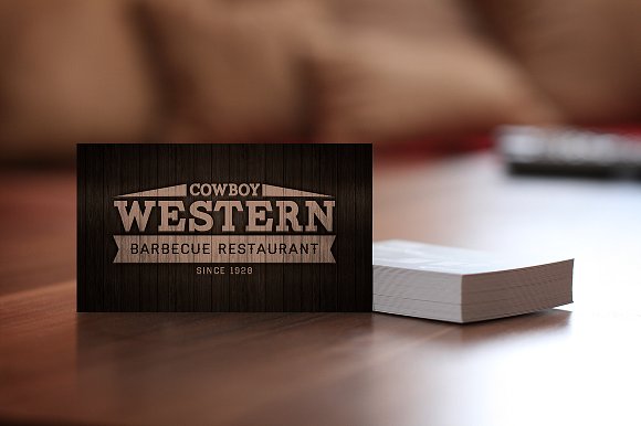
Restaurant Business Card Logo
Modern Business Card Logo
Luxury Business Card Logo
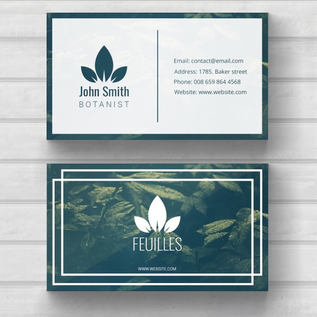
Nature-themed Business Card Logo
Purpose of Logos on Business Cards
Imagine a business card without a company logo being embedded on it, is it trustworthy? Can you rely solely on a person’s identity to represent a brand? Although there are a handful of instances where a business card can work without a logo, it’s not the ideal decision to go with. If we look into the definition of a business card, we’ll know that it’s meant to provide information of a person representing a company. Naturally, without the logo, it would be difficult for us to identify whether or not it is credible enough for us to trust.
Develop Professionalism
For some businesses, a business card serves as their only tool for cost-effective marketing, especially since it’s the easiest and most affordable way to reach out to the public. But the elements of a business card must be taken seriously, as this is an important medium that connects the company with their prospective customers. So by adding a logo, it would be easier for an audience to determine the credibility of the business card, as well as the organization behind it. Not only can this identify you from your competitors, but this can also help leave a good impression among your customers.
Visual communication
A logo is more than just a design used for decoration, as most, if not all, logos possess a deeper meaning into it. By adding a logo to your business card, you add value to the brand it represents. This allows an audience to understand the nature of the company in the subject, such as the industry it is in and the market it serves.
Putting the concept of graphic design into mind, we have to remember that it’s all about effectively communicating with your audience. Your logo is more of a marketing tool used to relay a message. It reminds customers of a perception made, which can often lead to a positive image for your company.
Brand Recognition
For companies that wish to gain a strong recognition for their brand, then adding a logo to your business card is a must. Think of it this way, when you say that “this person is from this company” then not only are you giving credit to the individual, but you are providing exposure for the company as well. Although logos only play a minor part in successful branding, taking full advantage of this type of publicity is essential, especially for start-ups.
Multimedia Business Card Logo
![]()
Moon and Stars Business Card Logo
Retro Business Card Logo
![]()
Free Logo Business Card Design
![]()
Nutrition Business Card Logo
![]()
ORB Business Card Logo Design
![]()
6 Common Mistakes in Logo Design
Even with years of experience to their name, professional logo designers commit mistakes just as much as amateurs do. And with so many critics out there who are ready to scrutinize your work, you can be vigilant by avoiding these common mistakes:
- Following fads – Fads typically die out as soon as it becomes too mainstream for anyone to follow. So, choosing a design based on the latest trends is bound to make your logo seem outdated after some time. Rather than going for the flavor of the month, it would be best to think of a design in terms of longevity. This includes simple yet timeless features that can withstand the changing times.
- Copying successful brands – They say that an imitation is a form of flattery, but the same concept does not apply to creating a business logo. Copying an existing logo design, whether you do this deliberately or subconsciously, speaks a lot about you as a designer. This could mean a lack of creativity and possibly laziness. It doesn’t have to be the whole logo, either. If any significant features of your logo remind viewers of another existing brand, this can leave a bad impression towards your business.
- Overuse of color – Although colors are typically added to entice an audience, it can also ruin the overall look of the logo. Adding too much color to your design will make it appear too busy, causing a distraction from the message you want to relay. It’s important to apply a logical combination of colors to make sure it appeals to your audience.
- Using too many fonts – Similar to the overuse of colors, using much too many fonts for your logo design is never a good idea. A maximum of two fonts can do the trick, but going beyond that number is a risky move. You also have to make sure you choose the right fonts and that they compliment one another accordingly.
- Being overly abstract – It’s easy to get carried away with designing your logo, especially if you’re going for a distinct look. But even then, bear in mind that the simplest designs are also the most memorable. Not only is it worth remembering, but a simple design can also adapt to any form of medium. This would mean that every detail stays as clear as day even when printed on a business card.
- Non-transferable – A logo should always be versatile enough to use anywhere, regardless of the color, background, size, or texture of the medium being used. It would be best to stay on the safe side by focusing on the image of the logo, rather than being reliant on the colors for effects. Otherwise, your logo design will likely lose its essence on different mediums.
Remember, a good logo design will never come to be without a proper understanding of what you want to achieve. A logo design is simply meant to accentuate the values, nature, and overall essence of your company through visual representation.