8+ Common Web Design Mistakes Examples to Download
One reason many website designers fail to create a successful design is that they give more priority to the aesthetic beauty of the website than on its functionality and usability. While it is a mere fact that the design of the website is one of the reasons that attracts the user, it does not, however, make them stay on a website.
Web design mistakes can really hurt your website. So, for this post, we will highlight 8 common web designs mistakes that even professionals still make. We also added a possible solution for every mistake.
1. No Search Box

Your website may be all that. The layout is arranged accordingly, the content is well-placed, and the interface is not complicated. Still, one thing is for sure—not all information you intended to provide is found on your present website page. Some of the information may be hidden, archived, or even placed on the previous pages. And if no search engine available on your website or blog, visitors might find it difficult to look for some information.
A search box is an essential tool for any website. Visitors of your site use the search box as a way for them to easily find or retrieve the information they are looking for on your website. Also, having a search box will make your website look helpful, friendly, and easy to access.
Here’s what you can do:
- Use Google Custom Search. Integrating a search algorithm and search box on your website doesn’t have to be so hard. Let Google help you. The Google Custom Search is the most effective way to give your website a neat, simple, and fully functional search box. All you have to do is to go to Google Custom Search page, copy the search code they have provided, and paste it into your website’s HTML code. It is simple, fast, and will instantly give your website a search engine powered by Google.
2. Lack of Responsive Design

One of the most common mistakes committed by developers and designers is building a website that does not have a responsive design. With the emerging growth of mobile and smart devices, most people nowadays spend more time browsing the Internet on their smartphone browsers rather than on desktop. Without a responsive design, your website may not work well on all devices, which is a not really a good idea since you are aiming that your website will be accessible to all users and on all devices.
Designing a responsive website is now a requirement than a preference. If your website is still not yet responsive then it is time for you make some changes.
Here’s what you can do:
- Use a WordPress mobile responsive theme. If your website is powered by WordPress, choose a theme that is mobile-ready. Since responsiveness is now a requirement for all new themes on WordPress, you can choose from a wide range of a mobile responsive themes and use additional plugins to help you in mobile optimization.
- Use a tool for designing a responsive website. On the other hand, if your website was built from an HTML file, you can use a set of tools to help you in designing a responsive website. There are a lot of tools available on the internet that will make everything easy on your part. To help with that, you will need some tools for responsive web design.
3. Slow Loading Website

There’s nothing worse than an ultra-slow loading website page.
It is nice to have fancy JavasScript animation, cool technologies, and a little gimmick on your website. But if we are talking about your website’s performance and usability, those things that make your website look good will not help it to load faster and will only penalize your website.
If that’s the case, it will drive a large number of users away. No one wants to sit in front of their computer or devices just to wait for the website to finish loading.
Here’s what you can do:
- Focus more on the website’s performance. It is okay to code in some animation or other designs on your website—but always make sure that it will not affect how fast your website loads. Pay attention to your website’s performance budget and plan it accordingly.
- Get a reliable and fast hosting provider. This is also one of the reasons why the website loads slower, because of the hosting provider. Don’t settle for a cheap but low-quality hosting. Go for a reasonably priced provider that will be a fast, reliable, quality host.
4. Bad Content Layout
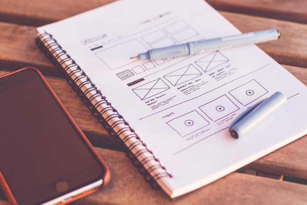
The content of the website is what determines the success or failure of the website, at least. You see, most visitors today visit a website only to scan the content quickly to get the overview of the entirety. This will make them decide if the content is worth a time to read.
However, some of the designers forgot how important the content layout is. Layout sins include not using headings, sub-headings, or bullet points, and putting inaccurate, inaccessible, irrelevant, out-of-date content. A big chunk of text will not help at all and will only make things worse.
It is important to remember that the content layout is what drives the visitor to stay and actually read the content. Even if it is worth gold, if not properly arranged, most visitors will not bother to read.
Here’s what you can do:
- Make use of different font styles, font sizes, and font colors. The best way to make the text appealing is to give it some kind of formatting style. This includes using different fonts with different styles and sizes. However, once you choose the right font and size, be consistent in using it throughout the content.
- Remember that format matters. This includes using headings, subheadings, and bullet points. This ensures that your content is properly arranged to make it easy for the visitors to read and find the important information.
- Divide large content chunks into 3 paragraphs or more. Break the large walls of text into smaller paragraphs. This will make the content easy to digest. Add spaces between lines of text and between paragraphs to make breathing room for the eyes.
- Use images to convey a message. Since most people prefer images over a chunk of text (not to mention they process information faster this way), it also helps to put an image, illustration, or even an infographic to replace an all-text information. After all, a picture speaks a thousand words.
5. Lack of Call to Action

A call-to-action button of a website is one of the most important elements of website design and the focal point of most websites. It moves the visitor towards a response, and will get visitors to focus on what their next step is. To put it simply, a call-to-action button of a website tells the visitor what to do, where to go, and how to do it.
However, for some reasons, many designers and developers forgot to include this essential tool, or at least they make it too hard to find. Some call-to-action buttons are placed at the bottom of the page, some are too hard to notice, and worst of all, there are too many calls to action in a website page, making it very confusing for the user to select which call to action should be answered and which button should be pressed.
Not good.
That’s not how a call-to-action button should be. Instead, it should be clear and visible enough to get the user to do a specific action and can make them easily understand the goal and objectives of your website and what they can get out of it.
Here’s what you can do:
- Display the call-to-action button properly and clearly. It doesn’t have to be too hard to find. It should be placed where it will be visible and would stand out from the rest of the website design. It also needs to be specific. Your goal is to tell the visitor exactly what you would like them to do, and your call-to-action button should properly convey that.
- Make it easy for the visitor to say yes. Don’t make it hard for them to say yes, and don’t make it too complicated for them. If you want them to fill up a form for a newsletter, only ask for the most important information, like name and email address.
- Be careful if using a popup. While a popup is one the most effective calls to action, it can be very annoying for the visitors at inopportune times. So, only use popup if necessary and only show the popup at moments the visitor is more likely to be interested.
6. No Sharing Option

For your website to reach a large number of people, it needs to be spread across the Web—most importantly on social media sites, where a large number of the user base is just sitting there waiting for some content to be shared.
You can’t achieve that by just promoting your website. What you need is a sharing option. Many people will visit a site only if it is shared to them by some of their friends or from their trusted pages. While many people copy and paste content, many others prefer a one-click option where they can instantly share their favorite article to their social media profiles.
And if you want your website to spread across the Web and reach your desired audience, then providing a sharing option is one of the best ways you can help it happen.
Here’s what you can do:
- Place a sharing option on your website. You could put a social share button for Facebook, Twitter, Reddit, or any other social media sites your target audience is most likely to use—and put them at convenient places. It could at the end of your post or hovering at the side of your content so they can share it no matter how far down they’ve scrolled. Also, make it very clear that sharing is option, because if not, visitors will find it annoying.
7. Bad Site Navigation
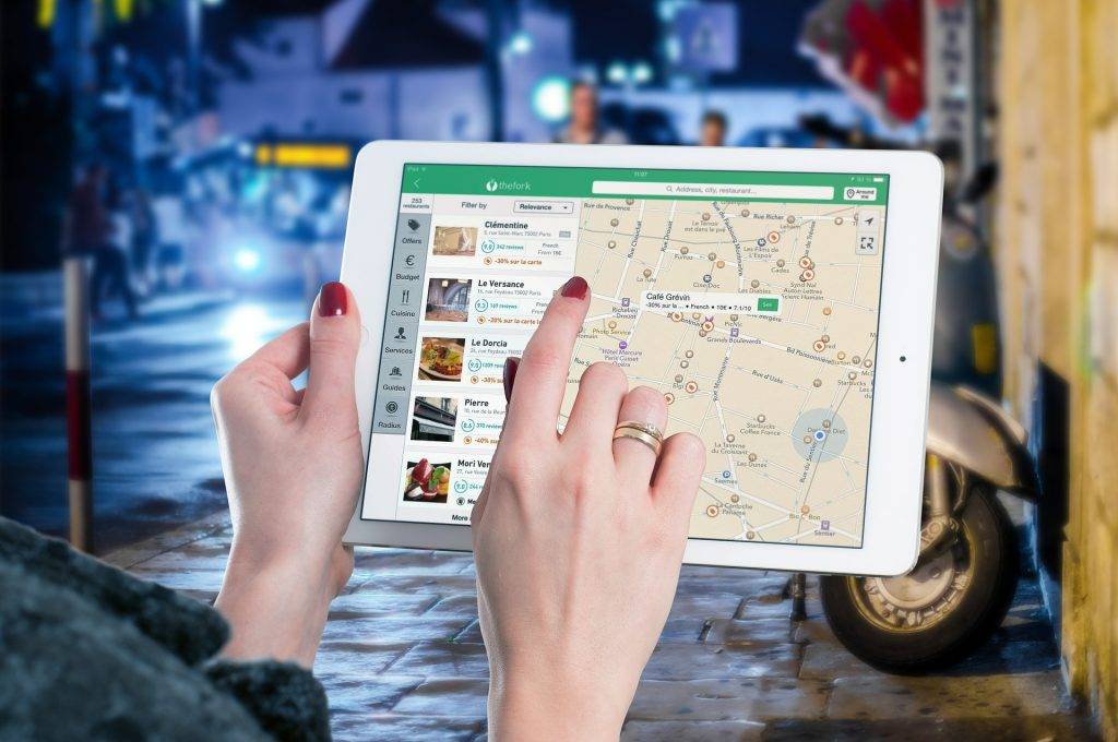
While there are no firm standards for a website’s navigation, it is important that no matter how developers design the navigation of the website, the visitor should be able to find their way around the website easily, or at least find it easy and seamless to navigate and get familiar with the website.
Why is this critical? The reason is simple: If the visitor finds the website too complicated to finish even one action, chances are they will leave the website immediately and never visit the site again. You don’t want to happen that on your website.
Here’s what you can do:
- Organize and structure your website properly. If you use text (microcopy) as road signs to help navigation, make it concise. If you are going to use links, make it stand out from the rest. If you are using menus, then they should be placed where they can be easily recognized and easy to notice.
- Use tools and plugins. There are hundreds of tools and plugins available on the Internet that can help you make the navigation of your website easy and seamless.
8. Not Using Website Analytics Tools
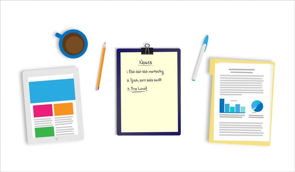
You may think that your website is performing at its highest since it functions well enough and it has few, if any, issues. But, one of the common mistakes committed by people maintaining a website is by not looking at the important data behind a website’s performance.
This is where we all get a little bit disappointed.
You think that your website is all that good but in reality, there are a hundred performance issues running behind your website and almost all of them you don’t even know existed. Yup, that’s what you get when your website doesn’t have analytics tools to help you.
But it is okay. It is one of the most common mistakes when building and maintaining a website, so we don’t blame you. However, we may have a solution for you.
Here’s what you can do:
- Use Google Analytics. Google has been providing us with lots of tools, and one of their most widely used tools is the Google Analytics. If you still don’t have analytics tool for your website, you can install Google Analytics and it’ll have you on your way to instantly track and test your website’s performance. The Google Analytics tool, once set up, can provide you with lots of information about website performance, user behavior, tracking conversion, and a lot more.

