9+ UI/UX Design Dos Examples to Download

Technology has made life a lot easier by allowing us to execute activities efficiently and effectively. We are able to carry out everyday tasks quickly, without exerting much effort into it. It has made things more convenient in such a way that we are able to do things with the help of various online resources. Because of this, user interface (UI) and user experience (UX) play a significant role in tailoring our online experience.
 It’s no secret that UX has gradually evolved since the time computers were first introduced. Expectations have raised significantly, what was considered complex then is understandably seen as simple in the modern times. There are numerous innovations that have allowed us to navigate sites easily, a result from successful design ideas and Web design mistakes that designers learn from. All of which share a common goal, to create a user-friendly experience for all.
As a designer, it might be good to take a step back and see things from the perspective of our online visitors. What are the struggles that they face? What are the things that discourage them from visiting a site again? What can be done to achieve optimum satisfaction?
To answer these questions, let’s do a quick run-through of the dos and don’ts in UI and UX design.
Dos
1. Establish Consistent Experience
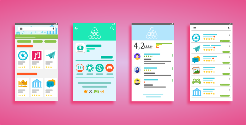
You might have noticed how some sites appear differently on desktop or laptop than on mobile phone or tablet. Sometimes, this makes it more difficult to use, as the application’s capabilities are no longer as functional as they are in another device. This will create a negative impact on user experience, taking a huge toll in the flexibility of your design. It’s essential to create a UI design that will provide the same experience, regardless of the device used.
Keep in mind that the interface on each gadget doesn’t have to be completely the same, as compatibility may sometimes vary depending on the device used to open the site. This is why you need to test out your design before implementing it, otherwise you might encounter even more problems during damage control.
2. Easy Navigation
Visitors of a site only have one thing in mind, and that is to search for content. Most people have a time limit when it comes to doing this task. They open your site, search for what they’re looking for, do what they have to do, and then leave. Knowing this, you need to make your navigation system as simple and as visible as possible.

It’s important to design a navigation that only requires the least amount of clicks possible. This will make scanning and locating much easier for your visitors. Otherwise, they might just decide on leaving without even exploring the content of your site first.
3. Working Links and Buttons
Do you know what’s frustrating? Filling up multiple forms at a time only to find out that the page you’re supposed to be redirected to is not available. It’s even more frustrating when buttons don’t function the way they should. Not only is this a waste of time and effort, but it may also affect the credibility of your site. People will perceive your site to be poor and misleading, all because you failed to check whether everything on your site is fully functional.

Always make sure to check every important function of your site. Pages need to be directed accordingly, buttons need to be functional, and links need to remain active. Otherwise, your visitor may face multiple errors, hindering them from achieving their desired objective.
4. Pay Attention to Detail
Text
It’s ideal to make the text of your site black, as it goes well with the majority of background colors and styles. There might be circumstances when this is not applicable, but the chances are unlikely. For the size of your text, always consider the overall user interface of your site. You need to make it appear legible at a viewing distance so that visitors would no longer feel the need to zoom into your content. If you wish to include a lengthy text, using a smaller size would be most appropriate. You should also consider the space that you’re meant to work with and other elements surrounding your text.

Background
Choosing the right background proves to be a challenge for most designers. Although a plain white background is highly recommended for this, you still need to consider the background of your site’s other features. Most people choose to go darker with their navigation menu, so it would be easier for visitors to locate whatever they are looking for. Remember, it’s important to choose a color scheme that will compliment every element of your site’s design.
5. Create a Focal Point
To better understand this, imagine yourself looking down a city through a bird’s eye view. Naturally, it’s almost impossible to fixate your eyes on a single object. This is due to the fact that there are numerous objects, with their own unique characteristics, seen from your perspective.

It’s important for a website or an application to have a specific item that a visitor can focus on. This could be anything deemed useful, such as an image, product, or simple information. This will make it easier for your visitors to find what they are looking for through a quick scan. You goal should always center on visitor satisfaction.
Don’ts
1. Play It Safe
Being too conscious with every aspect of your design will cause it to appear flat. So maybe you’re just trying to play it safe to avoid any possible mistake, but that should never hinder you from making something unique. Don’t be afraid to challenge design trends, go out of the norm and create something extraordinary.

The excitement in risk-taking lies on how flexible you can be in crafting your design. After all, trends are never meant to last. They often fade from the spotlight to make room for new trends in the industry. These trends only come as a result from new ideas being introduced.
2. Include Non-Related Content
Look at it this way, we do things based on a mission we give ourselves. We go inside a grocery store with the intent of buying a box of cereal. If you know your purpose, then you wouldn’t go looking for your item in the toiletry aisle. Instead, you go directly to the designated aisle to find the specific item.
Including irrelevant content to your website or application will only cause a distraction to your visitors. It would be as if you’re feeding your visitors with things that aren’t even useful to them. Although banner designs may be essential for your own benefit, it’s still important to keep it to a minimum. Make sure that these ads are located at an appropriate section of your site.
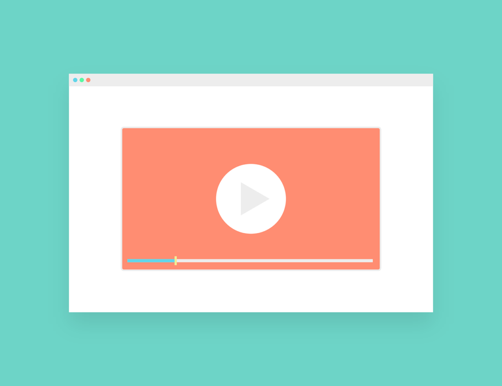
3. Use Too Much Animation
There’s nothing more annoying than visiting a site with multiple animations that seem to be overlapping one another. Unless you’re making a game, the need for animations and motion graphics isn’t that apparent. Sure, adding animations can easily attract an audience, but too much of anything is a recipe for disaster.
 Not only will this cause your site to slow down, but it will also create confusion. This will only make it difficult for a person to focus their attention on a single item. Even if you want to promote a fun user experience, it’s still important to limit the use of animation for the convenience of everyone.
4. Sacrifice Readability
Going over-the-top with your UI design is an honest mistake of many who get too eager with their UX & UI tools. Remember, your content still plays a significant role in developing a site. If you focus more on graphics rather than actual content, you’re bound to have visitors leaving your site in a matter of seconds.
Make use of visuals, images, and animation that visitors can easily interact with. You don’t have to limit yourself with words, as most people find this less appealing. Be sure to make your site’s text readable, in terms of the style and size of your fonts. Your visitors should be able to grasp the idea of each page without much thought.
5. Create Longer Loading Periods
Let’s be real, our patience isn’t that impressive. Our attention span isn’t that long either. We easily get irritated by the slightest things that seem to be wasting our time. It’s important to create a website that won’t make your visitors wait for a considerably long time. One misconception with loading time is that it’s solely based on the strength of one’s Internet connection. But the truth is, your design choices may greatly affect your sites loading period as well. Large files, such as images, motion graphics, and animation, play a significant role in this. You would need to keep your visitors interested, not drive them away with your slow service.
Creating a good UX and UI design shouldn’t be made complicated. Every designer needs to learn how to be open-minded. Take the time to explore the market you serve. Always be open to suggestions, feedback will be helpful in building your strengths and learning from your mistakes.
Share :
