15+ Music Logo Examples to Download
For any business, deciding on a logo design plays a critical role in developing or maintaining a visual brand. This can be quite challenging for companies that wish to refine their image or for startup businesses creating a logo from scratch.
But a company logo is more than just a picture to stamp on corporate goods, as a logo design is meticulously crafted to represent the brand as a whole.
Designing a logo for your business involves a crucial process of brainstorming and conceptualizing. You have to make sure the logo reflects your company’s values, while still being visually appealing to your target audience. If you’re venturing towards the music business, it can be just as challenging, if not more. Considering that the music industry is filled with a wide variety of creative artists, you have to make sure your logo relates to the market you serve.
From music icons for recording studios to audio symbols for up-and-coming DJs, we have a amazing range of vector designs to help you get started with your music business.
Record Studio Logo
Music Studio Logo
Music Production Logo
Sound Music Logo
Types of Logo Designs for a Music Business
You’ve probably heard about flat logos and, thanks to the advancement of technology, three-dimensional logos that companies and organizations often use. But did you know that there are specific types of logo designs?
Although they all revolve around the concept of combining images with typography, each type of logo creates a unique feel for every viewer. And since giving your audience the wow factor is the primary goal, you want to make sure your logo speaks volumes for your business. To give you an idea, here are the basic types of logo designs:
1. Words and Letters
- Wordmarks (logotypes) – Google, Samsung, Coca-cola — what do these companies all have in common? Simple. They all use wordmarks as logos. We see various DJs in the music industry who use wordmarks to present their stage names as well. For this type of logo design, the font you choose or create plays a significant role in the impact it leaves your audience, as this is what captures the essence of your business as a whole. But then again, using this type of logo will also depend on your name. Using a wordmark for short and distinct names can help create an appealing image for your brand but for long names, on the other hand, using a monogram logo would be more practical.
- Lettermarks (monogram logos) – The are a number of well-known companies and organizations that use the initials of their names to represent themselves in a logo. One example would include the multinational technology company IBM (International Business Machines Corporation), which uses lettermarks as a logo because of its long name. It makes perfect sense to do so too, especially if you want a logo design that maintains the identity of your brand. But because the focus is on lettering, creating a unique typeface is highly recommended rather than using an existing font. If you haven’t been able to establish your brand yet, it would be best to add the full name of your business below the logo for easy recognition as well.
2. Pictorial Marks
When we talk about visually appealing logos, pictorial marks definitely deserve the crown. Pictorial marks, also referred to as logo symbols, center on the image you use to represent your brand. For instance, the band logo of the Rolling Stones has become a trademark for branding. Aside from the band’s albums and merchandises, other clothing companies have used the iconic logo to sell their own products to the public. But if you decide on using a pictorial mark, you must consider the image you use because this may potentially represent your brand for the rest of time, or until the day you decide on improving it. However, this could be tricky for companies that don’t bear strong brand recognition or for startup businesses in need of a logo.
3. Combination Marks
For businesses that are yet to establish themselves in the market, combination marks would be the best choice. Popular record labels such as Island Records and Motown Records have used combination marks to symbolize their brands. Designing this type of logo can be very complex, as you have to make sure that the symbol and text compliment one another accordingly. But at the same time, the design makes the logo more flexible to use. Once you have established yourself, you’d then be able to use the text and symbol independently, while still remaining recognizable to your audience.
The best part about using a combination mark is that it is much easier to remember. You get an eye-catching symbol to attract your prospective audience, not to mention great exposure for your name to imprint on everyone’s mind. It’s basically the best of both worlds!
4. Emblems
What makes emblems different from combination marks is that instead of positioning the text alongside the symbol, the text is situated on the symbol, making the two inseparable. In simple terms, one cannot stand without the other. Think Warner Bros. Records and Pure Noise Records. But there’s a huge challenge that comes with using emblem logos, as you have to make sure that the text appears legibly on print. This can be quite tricky, especially when choosing a proper font style and size. But with an eye for art and your target market in mind, developing a logo would be as easy as pie.
Colorful Play Music Logo
Sound Wave Music Logo
Color Music Logo
DJ Infinity Logo
Audios Music Logo
Kids Music Logo
Music DJ Logo
Choosing the Right Logo
Entering the music business can be considered intimidating. Even if you’re selling musical instruments, there are numerous brands that have established themselves through celebrity endorsements and sponsorships, making standing out a grueling trial to overcome. But it’s always a gradual process of building your brand from scratch, and this is where the works of a logo come to play.
Choosing a logo that fits your company’s principles is a difficult task. You have to make sure that your logo reflects who you are, while still being beautiful enough to captivate your audience.
- Understand your market. The music industry is no different from any other industry, where record labels have clients to please and music stores have customers to satisfy. Deciding on what logo would suit you the most would also depend on how you want to connect with your audience. You need to come up with something that one can easily relate to, without losing the essence of your brand.
- Know what you want. Having a clear vision of what you want your logo to look like plays a key role in the decision-making process. Try not to settle for anything mediocre, there’s a huge difference between what is “good”, “better”, and “best”. Being doubtful about your logo design gives a negative image for your brand, as you’re likely to end up changing it multiple times in the long run.
- Think before you decide. You might like how the logo looks now, but will you still have the same sentiments in the next ten years? It’s easy for us to get caught up on what’s trendy, often forgetting that trends eventually fade as time goes by. Knowing this, you have to choose a logo that bears timeless features that are enough to make your customers, and their future grandchildren, develop an emotional connection towards your brand.
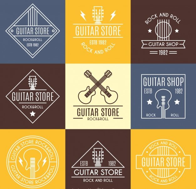
Guitar Shop Logo
Vinyl Record Logo
Modern Music Logo
Music Studio Logo
Flat Guitar Logo
The Purpose of a Logo Design in Branding
Is it absolutely necessary for every band, record label, and music company to have their own logo?
As a matter of fact, it is.
When you run a business, you offer goods and services to the adoring public. Whether you’re giving it away for free or earning a profit from it, you would need to build a brand for your audience to recognize. You see, people could care less about the names and faces of the individuals behind a product, as this can be difficult and complicated to remember.
Through the use of a logo, you can efficiently and effectively symbolize your company in its entirety. This includes the values that you hold, the message you wish to convey, along with what you want your audience to remember you for. Although logo design and branding are different in nature, the logo you create can help in branding your business to the public for you to gradually shape your customers’ perception.
Remember, never lose sight of the bigger picture. Even though a logo serves as the foundation for brand development, this is only a relatively minor part that you have to deal with. A positive impression is good, but a lasting impression is even better. When you create a beautiful logo design, you need to build a strong brand to let it live up to its name.


