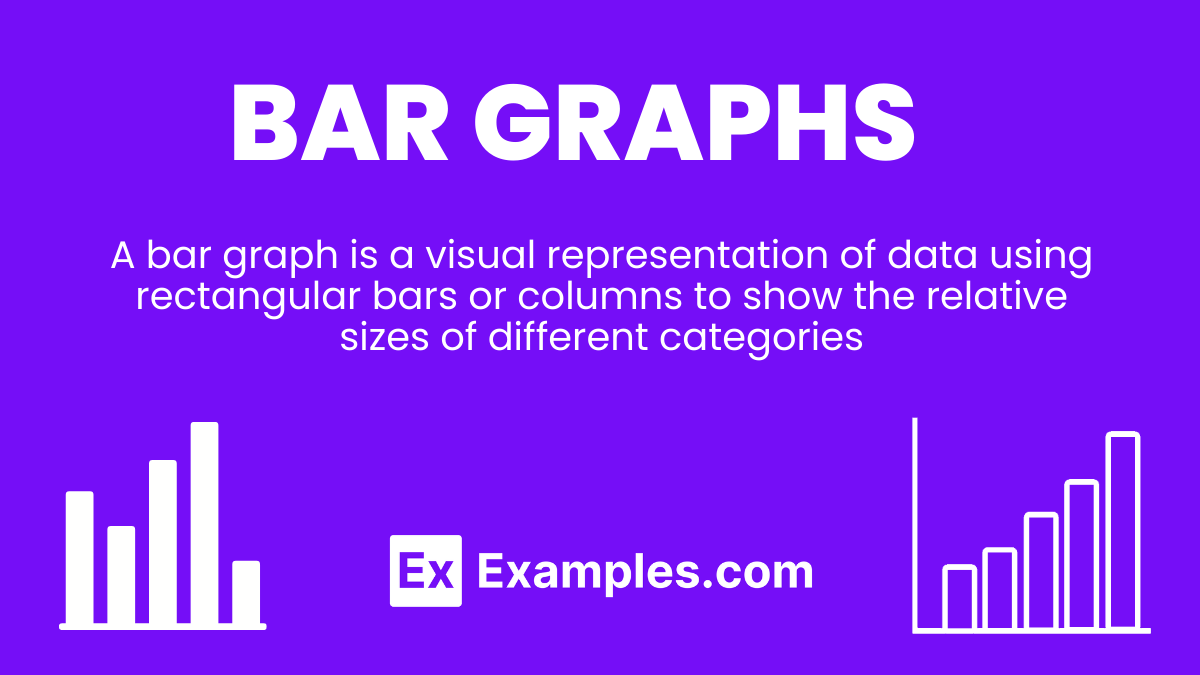
Bar Graphs – Types, Elements, Uses, Properties, Advantages, Differences
Bar graphs is an essential tool for data visualization in education. This comprehensive guide is designed to equip educators and students with the skills to effectively create and interpret bar graphs, turning raw data into compelling visual stories. By breaking down the elements of bar graphs, including axis labeling, bar sizing, and data categorization, we offer a pathway to mastering this crucial statistical tool. Ideal for classroom instruction, our guide enriches lessons with practical examples, fostering a deeper understanding of data analysis and presentation.
What are Bar Graphs – Definition
A bar graph is a visual representation of data using rectangular bars or columns to show the relative sizes of different categories. By plotting bars either vertically or horizontally along axes, bar graphs allow for easy comparison between discrete variables or categories, making them a fundamental tool for quantitative analysis.
What is the Best Example of Bar Graphs?
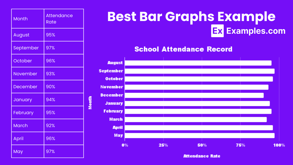
School Attendance Record
A prime example of a bar graph is a school attendance record, where each bar represents the number of students present in each class throughout the week. By displaying classes on the x-axis and student count on the y-axis, the graph clearly illustrates attendance trends, enabling educators to quickly identify patterns, such as days with notably high or low attendance. This visual tool aids in monitoring student engagement and identifying areas for improvement in school participation rates.
Histograms vs Bar Graphs
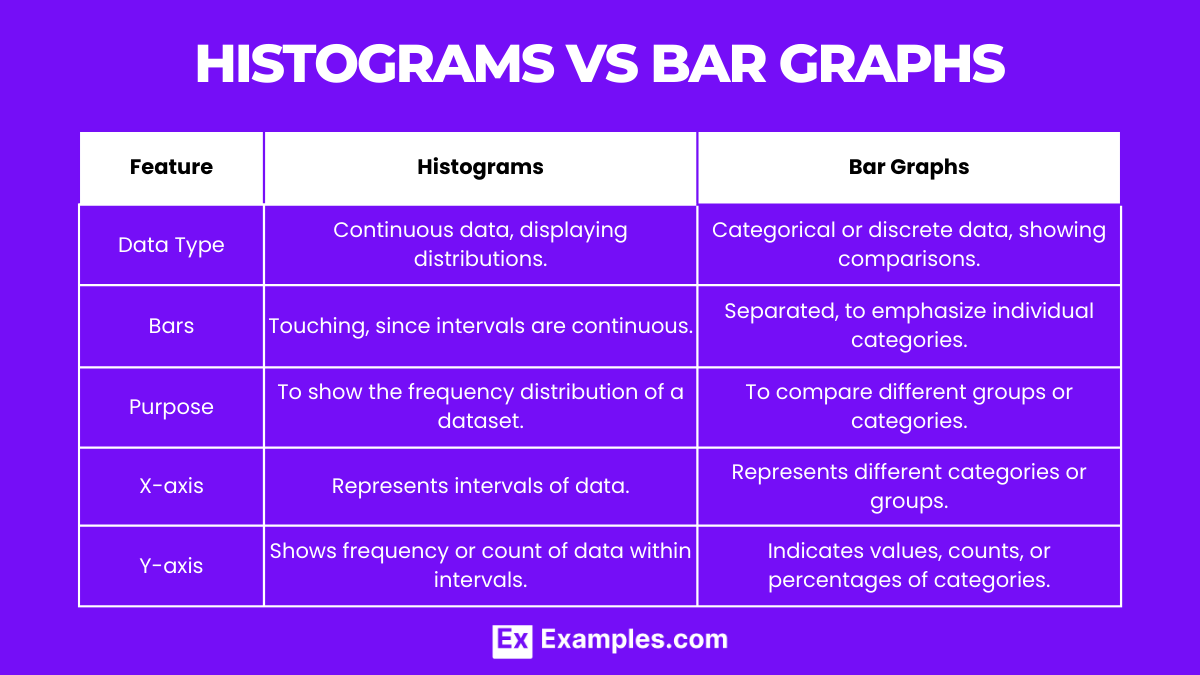
| Feature | Histograms | Bar Graphs |
|---|---|---|
| Data Type | Continuous data, displaying distributions. | Categorical or discrete data, showing comparisons. |
| Bars | Touching, since intervals are continuous. | Separated, to emphasize individual categories. |
| Purpose | To show the frequency distribution of a dataset. | To compare different groups or categories. |
| X-axis | Represents intervals of data. | Represents different categories or groups. |
| Y-axis | Shows frequency or count of data within intervals. | Indicates values, counts, or percentages of categories. |
Histograms and bar graphs serve distinct purposes in data visualization, with histograms focusing on the distribution of continuous data and bar graphs on comparing categories.
Elements of a Bar Graph
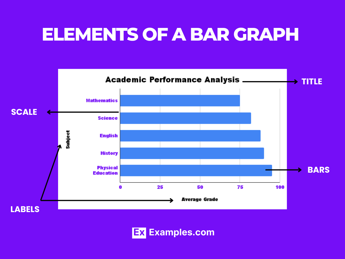
- Title: Clearly indicates what the graph is about.
- X-axis: Shows the categories being compared.
- Y-axis: Represents the measured values or frequency of the categories.
- Bars: Visual representation of the data, varying in height or length.
- Labels: Provide information about the different categories and the units of measurement.
- Legend: Explains any symbols or colors used in the graph, if applicable.
- Scale: Indicates the range of values that the graph covers.
These elements are crucial for creating an informative and easy-to-understand bar graph.
Types of Bar Graph
1. Vertical Bar Graph
Traditional format with bars standing upright.
Explanation: Offers a clear visual comparison of categories on the vertical axis, commonly used for most comparisons.
Make a Copy in Google Sheets2. Horizontal Bar Graph
Bars lay horizontally, extending from the y-axis.
Explanation: Ideal for displaying long category names or when there are many categories.
Make a copy in Google Sheets3. Stacked Bar Graph
Stacks data segments on top of each other in each category bar.
Explanation: Useful for showing total amounts and the composition of those totals by category.
Make a Copy in Google Sheets4. Grouped Bar Graph
Places bars for different sub-categories next to each other for direct comparison.
Explanation: Enables comparison of sub-categories across different main categories.
Make a copy in Google Sheets5. Percent Stacked Bar Graph
Similar to stacked bar graph but shows each segment as a percentage of the total.
Explanation: Focuses on the proportion of categories within the whole rather than absolute values.
Make a Copy in Google SheetsEach type of bar graph offers unique insights, allowing data storytellers to choose the format that best represents their data and the story they wish to tell.
How to Make a Bar Graph?
Creating a bar graph involves a series of steps to accurately represent data visually, enhancing analysis and interpretation. This process, fundamental in data presentation, simplifies complex information, making it accessible to all audiences, especially in educational settings.
- Collect Data: Gather the information you need to display.
- Choose Categories: Decide on the categories you will compare.
- Determine Scale: Set a scale for your y-axis that fits the data range.
- Draw Axes: Label the x-axis with categories and the y-axis with numerical values.
- Plot Bars: For each category, draw a bar whose height reflects its value.
- Label: Add titles, labels for each axis, and a legend if necessary.
- Color Code: Use different colors to distinguish between categories or data sets.
Properties of Bar Graph
Bar graphs are distinguished by specific characteristics that make them an effective tool for data representation. Understanding these properties ensures accurate and meaningful data visualization.
- Discrete Categories: Bar graphs represent separate categories with spaces between bars.
- Vertical or Horizontal Bars: Bars can extend from the x-axis vertically or from the y-axis horizontally.
- Uniform Width: All bars in the graph have the same width.
- Variable Heights: The height of each bar corresponds to its value.
- Axes Labels: The x-axis labels categories, and the y-axis represents values.
- Comparative Analysis: Facilitates comparison between different categories or groups.
Uses of Bar Graph
Bar graphs are a versatile tool in data visualization, used across various fields to simplify the presentation and comparison of discrete data.
- Performance Tracking: Used in business and education to track changes in performance over time.
- Survey Results: Ideal for displaying responses to survey questions by category.
- Inventory Counts: Helps businesses visualize stock levels of different products.
- Demographic Studies: Useful in displaying population characteristics across different categories.
- Financial Analysis: Employed to compare financial data, such as revenue, expenses, or profit, across different time periods or segments.
Bar graphs stand out for their ability to transform numerical data into visual insights, making them indispensable for teachers, students, and professionals alike. Their straightforward design and ease of interpretation facilitate a deeper understanding of data, encouraging informed decisions and discussions.
How are Bar Graphs Used in Real Life?
Bar graphs are integral in everyday life, transforming numerical data into visual insights across various fields. They simplify complex information, making it accessible to diverse audiences. From business analysis to educational tools, bar graphs serve as a bridge between raw data and actionable insights, enhancing decision-making and understanding of trends.
Example
1. Consumer Spending Habits
Businesses analyze monthly sales data across different product categories using bar graphs.
Explanation: This allows companies to visualize which products are most popular and adjust their strategies accordingly.
2. Classroom Attendance
Schools track attendance rates by grade level each month.
Explanation: Educators can identify patterns or issues in student attendance, promoting targeted interventions.
3. Public Opinion Polls
Media outlets display public opinion on various issues, with each bar representing the percentage of respondents in agreement.
Explanation: This offers a clear snapshot of societal views, influencing public discourse.
4. Healthcare Statistics
Hospitals compare the number of patients treated for different conditions annually.
Explanation: Health officials can allocate resources more efficiently, focusing on prevalent health issues.
5. Environmental Data Reporting
Environmental agencies show changes in pollution levels across different cities.
Explanation: Visualizing data aids in raising awareness and driving policy changes for better environmental management.
Applications of Bar Graphs
- Market Research: Understanding consumer preferences and market trends.
- Educational Assessment: Comparing student performance across different subjects.
- Financial Analysis: Visualizing revenue, expenses, and profit margins over time.
- Healthcare Monitoring: Tracking patient admissions, disease outbreaks, and treatment outcomes.
- Environmental Studies: Comparing pollution levels, temperature changes, or species populations.
Advantages and Disadvantages of Bar Chart
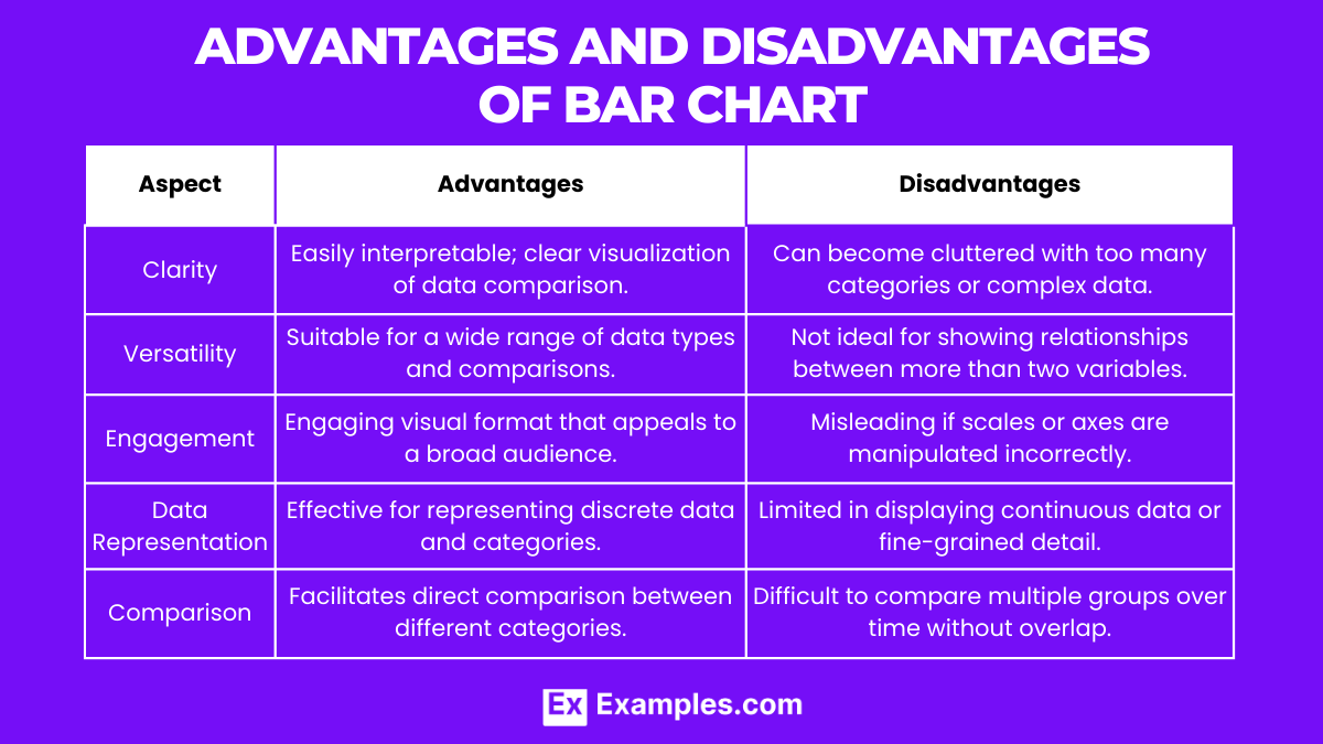
| Aspect | Advantages | Disadvantages |
|---|---|---|
| Clarity | Easily interpretable; clear visualization of data comparison. | Can become cluttered with too many categories or complex data. |
| Versatility | Suitable for a wide range of data types and comparisons. | Not ideal for showing relationships between more than two variables. |
| Engagement | Engaging visual format that appeals to a broad audience. | Misleading if scales or axes are manipulated incorrectly. |
| Data Representation | Effective for representing discrete data and categories. | Limited in displaying continuous data or fine-grained detail. |
| Comparison | Facilitates direct comparison between different categories. | Difficult to compare multiple groups over time without overlap. |
Bar graphs offer a balance between simplicity and functionality, making them popular in both professional and educational settings. However, careful consideration is needed in their design and interpretation to avoid misleading representations and to accommodate the complexity of the data being visualized.
Difference Between Bar Graph and Pie Chart
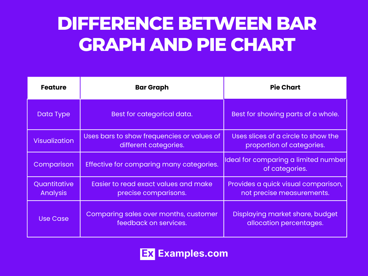
| Feature | Bar Graph | Pie Chart |
|---|---|---|
| Data Type | Best for categorical data. | Best for showing parts of a whole. |
| Visualization | Uses bars to show frequencies or values of different categories. | Uses slices of a circle to show the proportion of categories. |
| Comparison | Effective for comparing many categories. | Ideal for comparing a limited number of categories. |
| Quantitative Analysis | Easier to read exact values and make precise comparisons. | Provides a quick visual comparison, not precise measurements. |
| Use Case | Comparing sales over months, customer feedback on services. | Displaying market share, budget allocation percentages. |
Bar graphs and pie charts cater to different data visualization needs, with bar graphs excelling in detailed comparisons and pie charts providing an intuitive view of data proportions.
Difference Between Bar Graph and Line Graph
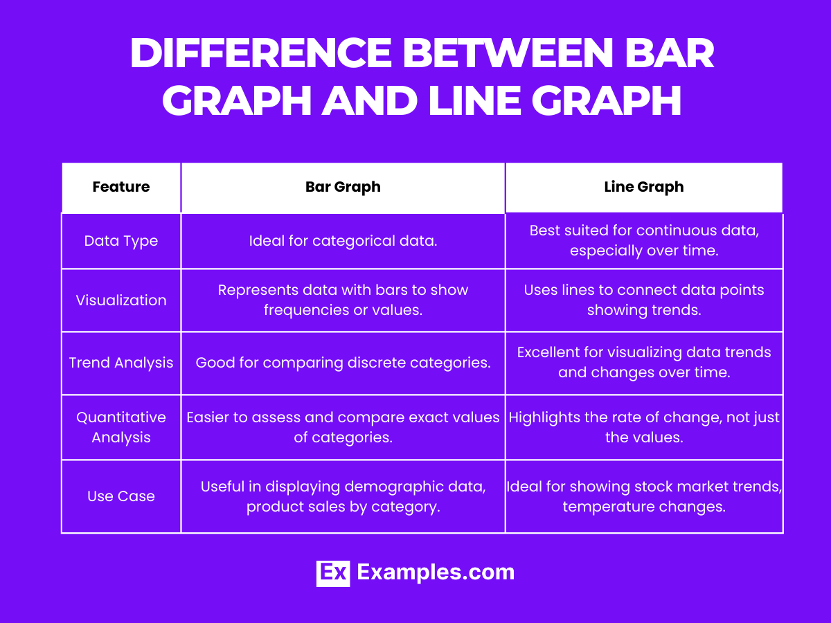
| Feature | Bar Graph | Line Graph |
|---|---|---|
| Data Type | Ideal for categorical data. | Best suited for continuous data, especially over time. |
| Visualization | Represents data with bars to show frequencies or values. | Uses lines to connect data points showing trends. |
| Trend Analysis | Good for comparing discrete categories. | Excellent for visualizing data trends and changes over time. |
| Quantitative Analysis | Easier to assess and compare exact values of categories. | Highlights the rate of change, not just the values. |
| Use Case | Useful in displaying demographic data, product sales by category. | Ideal for showing stock market trends, temperature changes. |
Bar graphs are tailored for categorical comparisons, while line graphs are designed to illustrate trends and changes over time, each serving unique analytical purposes.
What are Bar Graphs Used For?
Bar graphs are used to compare data across different categories, visualize differences in quantities, and easily communicate these comparisons to others.
How to Describe a Bar Graph in Statistics
In statistics, a bar graph is described by its vertical or horizontal bars, each representing a category’s frequency or value, with bar length indicating the size of the data.
How Do You Identify a Bar Graph?
A bar graph can be identified by its rectangular bars aligned either vertically or horizontally, with each bar representing a different category’s value or frequency.
When to Use a Horizontal Bar Chart?
Use a horizontal bar chart when dealing with long category names or a large number of categories to improve readability and comparison.
When to Use a Vertical Bar Chart?
Vertical bar charts are ideal for comparing data across fewer categories, where the focus is on the height of bars to denote values or frequencies.
In summary, bar graphs stand as a versatile tool in data visualization, adept at illustrating comparisons across various categories for educators and students. By choosing the appropriate orientation and understanding their application, bar graphs enhance the clarity and impact of statistical data presentations, making complex information accessible and engaging.
Share :
