
It is always big news when an established company rolls out a new logo design. Before the enthusiastic responses and celebrations and (more often) the shock and outrage, there is always that moment of utter stillness where the customer’s perception of the company tries to regain its balance.
There’s a little wobble, and then if all is well with the foundation of the logo renovation, people laugh or shake their heads and just play along. This pause of surprise or shock is proof of something we’ve all been told at some point or another:
The logo is the embodiment of the company’s image.
Your business’s logo is how your customer pegs your business in their minds, and it will be the image they interact with every time they mention your brand.
It is the face of a larger, otherwise faceless conglomerate that makes it more accessible, or at least memorable.
Drastically changing the logo is the same thing as having a friend go under the knife for total plastic surgery: In the end you know it’s still them, but are they really? The dynamics have changed.
Maybe a little…
…Maybe a lot.
But we’ve also been told something else: The logo is crucial to your company’s success.
Just how much truth is there in this statement?
Famous Logo Makeovers: Before and After
Before we look into this, consider these logo redesigns of some of the most famous brands on the commercial planet earth. Do you think the redesign is a cause of their success, or a sign of it? Or is it neither?
See if you can make the distinction between subtle redesign and complete overhaul.
1. American Airlines
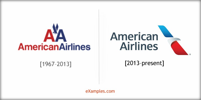
Breaking the bird.
2. Bing
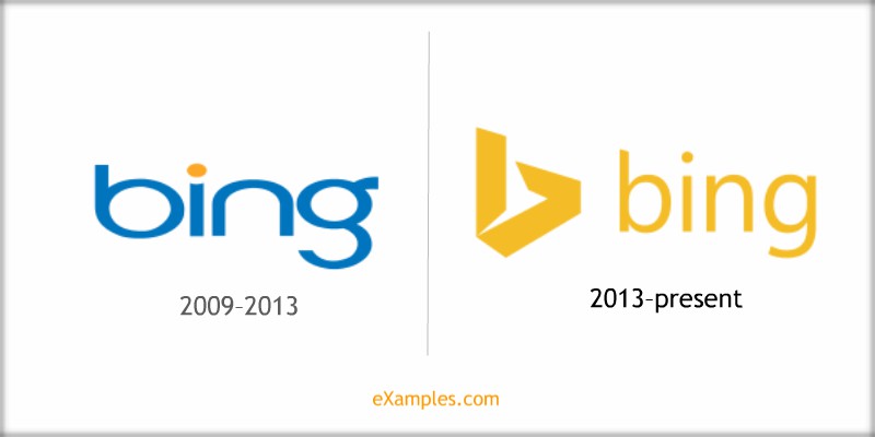
Turning on the gold.
3. Del Monte Foods
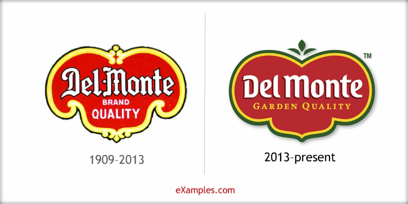
Solidifying.
4. Ebay
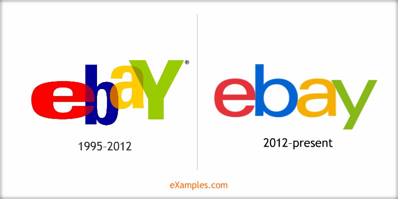
Getting consistent.
5. Firefox
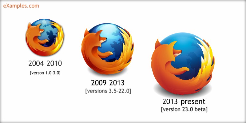
Getting sleeker.
6. Instagram
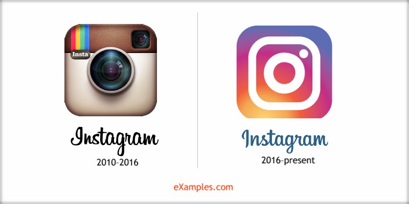
Flowing better.
7. KFC
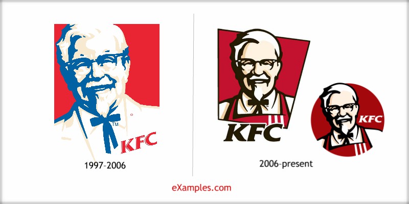
Bringing the colonel to new life.
8. Kraft Foods
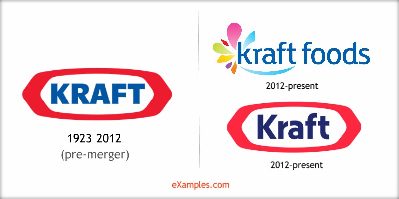
Color food fight, post-merger.
9. Mall of America
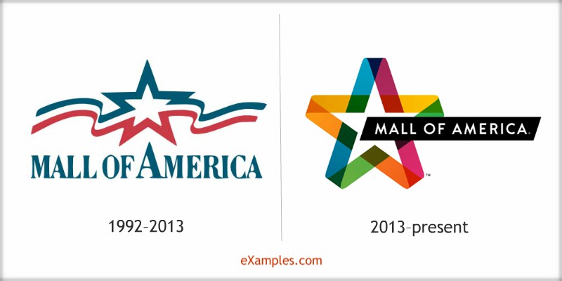
Enter Rainbow America.
10. MasterCard
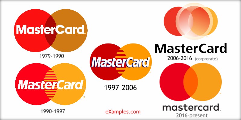
Blowing—then popping—unnecessary bubbles.
11. Microsoft
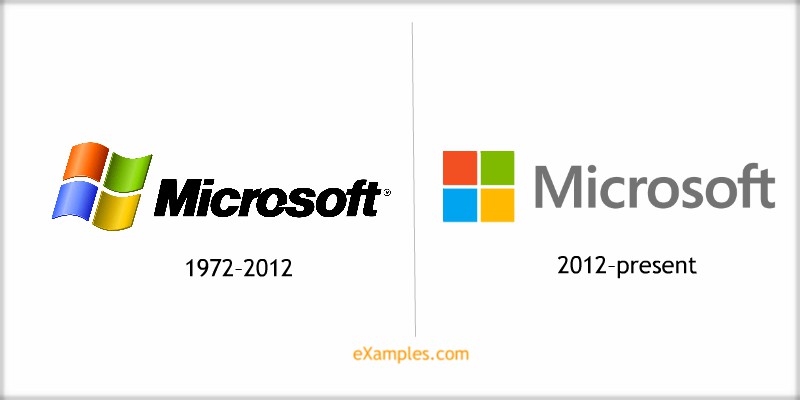
Opening windows.
12. Seattle’s Best Coffee
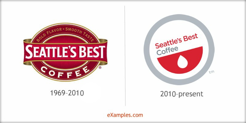
Losing the legend.
13. Spotify

Upgrading.
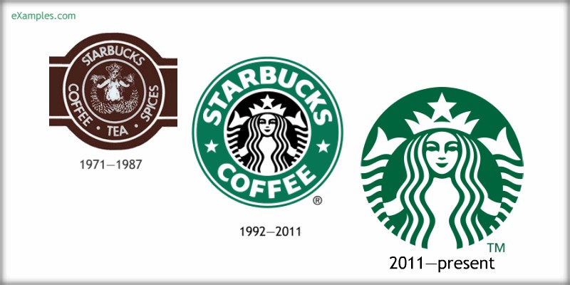
14. Starbucks
Freeing the siren.
15. Subway
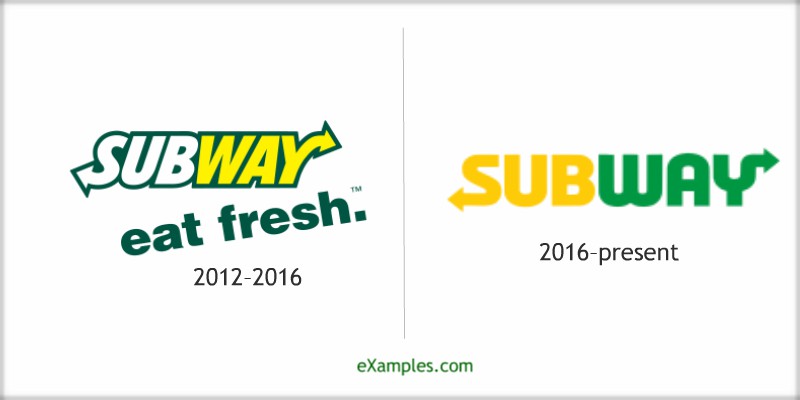
Adding “motion.”
16. TGI Fridays
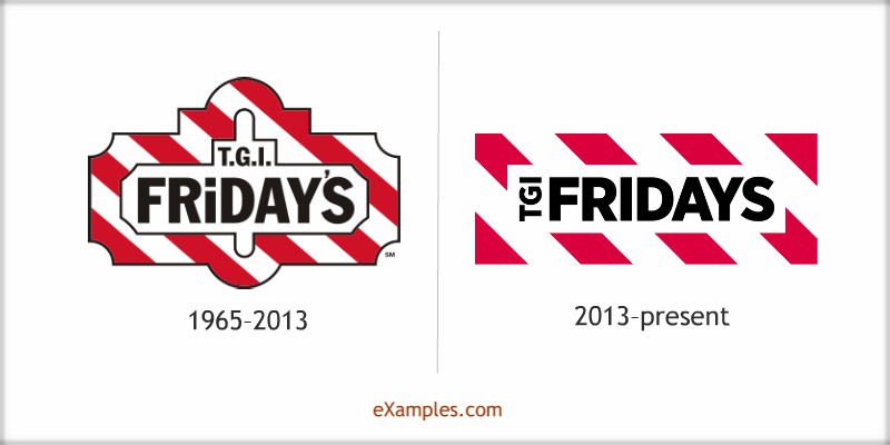
Streamlining.
17. Wendy’s
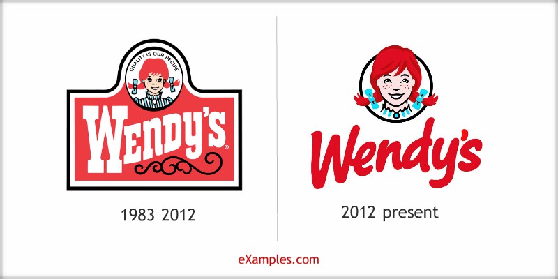
Lightening up.
18. Yahoo!
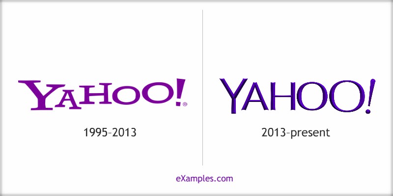
Cutting serifs.
19. Yellow Pages
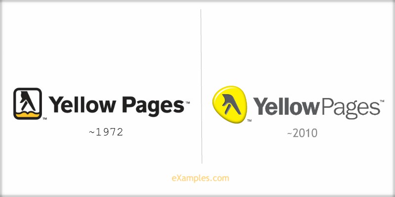
Adding sleekness. Note these are just two of many (untrademarked) YP logo versions around the world.
20. YouTube

Bringing out the icon.
The Value of a Logo: Identity Does Not Equal Success
This is especially important to point out here in an article about logo makeovers: Certain profile elements of your brand image, such as your company logo or your slogan or tagline, will not have that much of a role in bringing you to success.
Let’s be honest: a good logo is not going to help your company survive if the business is based on a lost cause, or on a fundamentally flawed service or product concept.
You can tell from some of the logos of some obviously successful companies that these things are superficial. Some of the biggest brands in the world have mediocre logos or even outright bad ones. The few people who care to do so (or notice), will rip into new redesigns with all the violent joy of outraged controversy—and then buy the product anyway, grumbling about the new designers who deserve to be shot for ruining the face of a once-great company. More often than not, they just don’t like change. People don’t.
Conversely, you might have seen some flourishing business in the neighborhood that had little to no sophistication or taste in its design. Their success is almost solely thanks to their positioning, their location, and the uncontested value of the service they provide. People may not care very much about their logo (again, assuming they notice), but would they really care if the business is providing something invaluable?
So yes, the images are interrelated and definitely have a part in the identification of the brand. But things like your company’s logo design and the tagline are still not that fundamental for, say, financial and critical success.
Rather, financial success as illustrated in your profit-and-loss statement brings these logos and company slogans to the front of the lines, not the other way around.
Logo Design and Staying Power
If the slogan is the battle cry (a one-punch mission statement) of your company in the competitive arenas of local and global markets, then the war cry of the ones who survive will be the loudest voices heard—perhaps the only voices heard. You could be the quietest person in the battle, until you’re among the last ones standing. And then you become the “loudest” by virtue of being among the strongest.
It doesn’t mean you had the best war cry. It means you had the best warriors.
The same goes for a company.
It is very possible for your well-dressed company to go into bankruptcy, its shame written into its financial statements with beautiful letterheads. Then who will remember your brilliant logo fifty years from now, except in case studies of business failures?
A healthy perspective on this is to see it this way:
The logo should be way down the line in terms of conception. It should be, in a way, your company’s mascot. For it to exist, your company should exist first. A good logo’s job is to embody and exude the energy of the company culture and values you’ve established. It does not set the values and it is not the source of that vital energy. It is not the driver. It is your avatar—your company is the engine that makes it work.
Beware Reverse-Engineering: Should You Judge a Company by Its Logo?
Your company logo is a superficial element. This is not a bad thing, just something to keep in mind. People automatically think anything labeled “superficial” is supposed to be negative, but superficiality is still part of the package. It just happens to be the first, thinnest layer.
It is on the uppermost level, which means it still has an important job. The logo is on the front lines.
Consider the cliche of the book cover: “Do not judge a book by the cover” translated as “Do not judge a company by its logo.”
Of course, you do not judge solely by the cover. But the logo is part of the equation and the judgment process. It is part of the overall picture that frames your company.
If your company is a book, the company logo is your book cover. Not everything, certainly, but definitely important and to be ignored at your peril.
Seeing it this way, it makes sense the logo would change to reflect new management, new growth, new horizons. It is like republishing a book as an updated edition under a different publishing house while retaining enough, stylistically, to be recognized.
The point is: Don’t make the right decisions for the wrong reasons.
Don’t expect design decisions to impact financial returns (unless there is a very strong correlation that’s tested as true). Changing from a square logo to a circle one to imitate some of the most popular round-shaped logos out there is not going to help bring you the success that those companies now enjoy.
You will see this misconception in so many articles talking about company logos. They attempt to advise you on how to make a great logo for your company, something that stands the test of time and represents your company beautifully. They will tell you that your logo is critical for your startup’s longevity, for all the reasons that a logo is valuable for a company. They will sell you the notion of dressing for success.
It is a tempting and seductively easy trap to fall into.
What you see is what you get, you think. Ensuring the quality of your logo, you think, equals managing the quality of your product or service. In reality, when you do a cursory, non-investigative look at the arena of current market competitors, what you get is all that you see. The logos that survive in mind are the businesses with strong foundations—not necessarily good logos.
Don’t dress your company for success. Succeed first. Or, better, dress your company how you will, and then succeed on the terms that actually matter.
When to Revamp Your Logo (and When to Leave It Alone)
When your company starts to do well and begins facing the challenges of growth, your goal now becomes thriving instead of merely surviving. And in this case you’ll find you have to strengthen your brand image, and maybe even rebrand.
This could mean revamping your logo, but not always. The crucial point of judgment here is knowing the reason for the change. Perhaps your logo does need a revamp, or you decide to start with a good one. But do remember this is a different sphere of your business.
Successful enterprises established over the course of literally hundreds of years are the least likely to want to upgrade their logo, even as their internal systems are overhauled to match current technology. The wisdom here makes sense. People have come to recognize the company by this existing logo, and they will not take a new look very well.
Smaller companies and startups have more freedom in this regard. As you launch and grow and reiterate, your logo might undergo several “personality changes” (maturation) as you find your footing in the market. You might be among the ones trying to find the correlation between a company’s logo and its success, trying to imitate the unchanging faces of the giants.
Wherever you find yourself, here are some things to keep in mind when considering a redesign.
When Times Change, Change with It
So when should you upgrade your logo?
By now, you’ll know that your decision should be based on grounds separate from the goals of achieving profitability. Rather, it’s about adaptation—improving the look, signifying change and flexibility, or just to conform to the stylistic demands of new management.
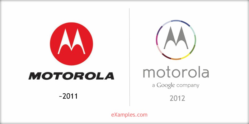
When Motorola (Mobility) was bought by Google, it was expected that the logo would not go untouched.
The scenarios it is recommended to change your logo are limited:
- To reflect new directions and policies, management
- To celebrate milestone success
- To better align closer with the company’s mission and vision
- To break clear from an old (or failed) paradigm or company culture
If you are overhauling your entire company from the ground up, the logo will naturally go with it.
If you’ve started with a good logo design, it will have the versatility factor already built into it. This versatility will not only make sure it works on everything you put it on—billboards, web ads, banner ads, delivery vans, T-shirts, company brochures, merchandise, ad flyers, company stationery—but it itself should be open to seasonal changes without losing its identity.
Who or what is evolving: the world or your company?
The Eyes on the Receiving End
The logo redesigns that get the best reception—or at least the fewest outcries—are the ones done by companies and designers who understand their industries and their audiences very, very well.
They know how the brand was received in the past. They understand the expectations of their current customer base and the limits of what they will realistically tolerate from the company.
This is not the same as giving them only what they want (as Thomas Ford famously quipped, most customers won’t be able to tell you what they want). It is about being mindful of your audience and making sure that your face-lift does not in any critical way harm that relationship established so far.
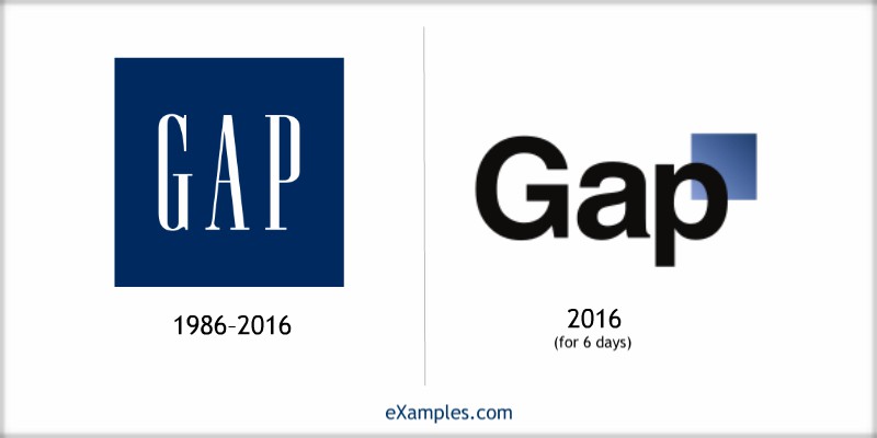
Gap is a popularly berated example of going too far…in the wrong direction.
You will also have to consider the new audience you might attract or repel. For this, you have to understand yourself as well. If audience-awareness will help you keep your existing customer base, company-awareness will help you maintain the core identity of your company and help transmit that (visually) to other people who are yet to be convinced.
We’ve said that the logo embodies the company’s personality and dominant culture. If you are known for being fun and lighthearted and a bit old-fashioned, a new serious look meant to be tech-y will alienate your current fans while attracting others who were misled by what your company really is about.
In both cases, everyone is disappointed.
A Difference in Degree
Considering the point about times changing, sometimes a subtle redesign to “stay modern” is the best way to go. Mozilla’s own logo is the perfect example of this. (Admit it, you didn’t notice there even was a redesign until it was pointed out by all those design blogs, did you?)
This reasonable revamp illustrates perfectly the two current major trends in logo and icon design:
- Switching from shiny, embossed logos to cleaner, minimalistic logo designs.
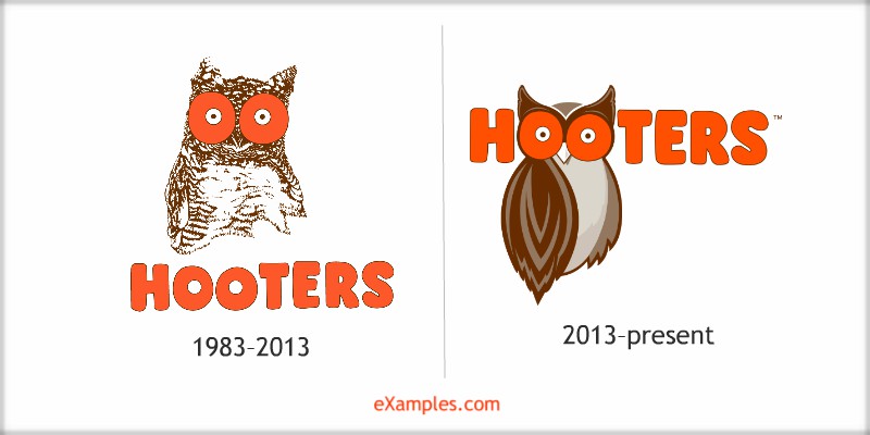
- Switching from skeuomorphic (realistic) icons to more symbolic, flatter designs. (See the restaurant Hooters logo below for this kind of switch.)
Just how far you go with the first consideration (changing with the times) relies heavily on the second consideration (your audience and integrity). This could mean the difference between “updating” to “losing touch.”
A sad case in point for losing touch:
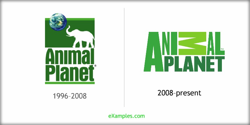
Losing the animal. And the planet.
Toning down the details is usually a good way to take your redesign. But in this case, it would have been better to get a more modern typeface or design a simpler Planet Earth. Now it looks like a toy company. How much has Animal Planet has given up by trying to tone down a bit too much?
Keep these in mind as you contemplate your brand’s own face-lift. Maybe it’s not the right time, and maybe it’s just about time.
Whatever your decision, make it deliberate. If anyone were to look at your redesign and wonder aloud, “What were the designers thinking?” make sure you have a ready answer for them.