Best AI Data Visualization Tools & Examples in May 2026
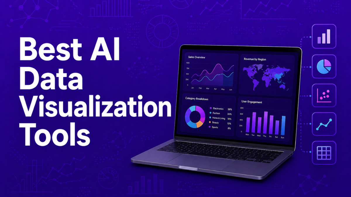
AI data visualization tools use artificial intelligence to automatically transform raw datasets into charts, dashboards, and interactive insights. These platforms combine machine learning, natural language processing, and automated analytics to simplify how organizations explore and understand data. Instead of manually building reports or writing complex queries, teams can generate visualizations instantly, detect trends, and uncover patterns, enabling faster and more informed decision-making across business, product, and analytics teams.
List of the Best AI Data Visualization Tools
The following platforms represent the most widely used AI-powered data visualization tools across enterprise analytics, BI platforms, and AI-first analytics systems.
- Tableau AI
- Microsoft Power BI AI
- Qlik Sense AI
- Looker AI
- ThoughtSpot AI
- Julius AI
- Domo AI
- Zoho Analytics AI
- Metabase AI
- Basedash AI
These tools combine machine learning, natural language querying, and automated insights to simplify data exploration and dashboard creation.
Comparison Table of AI Data Visualization Tools
Choosing the right AI data visualization tool depends on factors such as analytics complexity, integrations, pricing model, and AI capabilities. Some platforms focus on enterprise-scale analytics with deep integrations, while others prioritize conversational AI interfaces and rapid chart generation. The table below compares the leading tools based on common evaluation criteria used by analytics teams and businesses.
| Tool | Best For | Key AI Features | Integrations | Pricing Model | Category |
|---|---|---|---|---|---|
| Tableau AI | Advanced enterprise dashboards and visual exploration | AI insights, predictive analytics, automated explanations | Cloud databases, Salesforce ecosystem, enterprise data warehouses | Subscription (Creator / Explorer / Viewer tiers) | Enterprise BI |
| Microsoft Power BI AI | Organizations in the Microsoft ecosystem | Copilot-powered analytics, natural language Q&A, predictive models | Excel, Azure, Teams, SQL Server, hundreds of connectors | From ~$10/user/month | Enterprise BI |
| ThoughtSpot AI | Search-driven analytics and conversational BI | Natural language search analytics, automated insight discovery | Cloud data warehouses, Snowflake, Databricks, SaaS connectors | From ~$25/user/month | AI-first analytics |
| Looker AI | Google Cloud analytics environments | AI-powered dashboards, semantic modeling, conversational analytics | BigQuery, Google Cloud, marketing and SaaS data sources | Custom enterprise pricing | Enterprise BI |
| Domo AI | Real-time operational dashboards | AI chat analytics, automated alerts, predictive insights | 1,000+ connectors including SaaS, cloud warehouses, APIs | Consumption-based enterprise pricing | AI analytics platform |
| Metabase AI | Open-source business intelligence and startup teams | AI-assisted queries, automated dashboards | SQL databases, cloud warehouses, APIs | Free + paid cloud plans | Open-source BI |
| Basedash AI | Developer and database analytics | AI SQL queries, auto-generated dashboards | PostgreSQL, MySQL, Supabase, other developer databases | Paid SaaS plans | Developer analytics |
| Julius AI | Conversational data analysis | Chat-based analytics, automated chart generation | CSV files, spreadsheets, APIs | Free plan + paid tiers | AI-first analytics |
| Zoho Analytics AI | Business analytics for SMBs | Zia AI assistant, automated reports, predictive forecasting | 500+ business app connectors | From ~$24/month | AI analytics platform |
| Qlik Sense AI | Associative data exploration and predictive analytics | Insight Advisor AI, automated pattern detection | Enterprise data sources, cloud warehouses | Custom enterprise pricing | Enterprise BI |
In the next section, we will examine each AI data visualization tool in detail, including how it works, its uses, benefits, and which organizations benefit most from using it.
1. Tableau AI
What is Tableau AI
Tableau AI is an advanced analytics and data visualization platform developed by Salesforce that helps teams turn raw data into interactive dashboards and insights. It combines traditional business intelligence with artificial intelligence features such as predictive analytics, automated insights, and conversational queries. Users can connect multiple data sources and visualize trends quickly. The platform is widely used by analysts and enterprises to explore data and make data-driven decisions.
AI features like Tableau Pulse and generative AI assistants help automatically surface important metrics, explain patterns in data, and generate visualizations faster.
How to Use Tableau AI for Data Visualization
- Sign up for Tableau Cloud or install Tableau Desktop.
- Connect your data sources such as spreadsheets, databases, or cloud warehouses.
- Use drag-and-drop tools or AI suggestions to generate charts and dashboards.
- Customize visualizations, apply filters, and export dashboards for reports or presentations.
Benefits of Using Tableau AI
- Generates advanced charts and dashboards quickly
- Supports AI insights and predictive analytics
- Connects with many enterprise data sources
- Enables interactive dashboards and drill-down analysis
- Strong visualization capabilities for complex datasets
Use Cases of Tableau AI
A retail company can connect its sales database to Tableau AI to create dashboards showing revenue trends, regional sales performance, and product demand. The platform automatically highlights patterns and anomalies so managers can quickly identify which products are driving growth.
Pros
- Industry-leading data visualization capabilities
- Strong integrations with enterprise data systems
- AI-powered insights and predictive analytics
Cons
- Can be expensive for smaller teams
- Learning curve for beginners
- Advanced features require training
Pricing
Tableau pricing depends on user roles. Viewer plans start around $35 per user/month, Explorer about $70 per user/month, and Creator licenses about $115 per user/month when billed annually.
AI features such as Tableau Pulse and generative analytics are included in Tableau Cloud and premium Tableau+ offerings.
Best For
Best for enterprises and analytics teams that need advanced dashboards and large-scale data visualization.
2. Microsoft Power BI AI
What is Microsoft Power BI AI
Microsoft Power BI AI is a business intelligence and data visualization platform that uses artificial intelligence to help teams analyze and visualize data. It allows users to connect multiple data sources, create dashboards, and generate insights automatically. AI features such as Copilot enable users to ask questions in natural language and instantly create reports or visualizations. The platform integrates deeply with Microsoft tools like Excel, Azure, and Teams, making it widely used in modern data analytics environments.
With AI-powered analytics, Power BI can automatically detect patterns, generate insights, and even build charts or reports from simple prompts. This reduces the need for manual data analysis and helps teams make faster data-driven decisions.
How to Use Microsoft Power BI AI for Data Visualization
- Sign up for Power BI or download Power BI Desktop.
- Import data from sources such as Excel, SQL databases, or cloud services.
- Use Copilot or natural language queries to generate charts and reports automatically.
- Customize dashboards, apply filters, and publish reports for sharing with teams.
Benefits of Using Microsoft Power BI AI
- Automatically generates dashboards and reports using AI
- Natural language queries allow non-technical users to explore data
- Integrates easily with Microsoft tools like Excel and Azure
- Supports predictive analytics and automated insights
- Enables collaboration through shared dashboards and reports
Use Cases of Microsoft Power BI AI
A marketing team can connect campaign data from multiple platforms to Power BI AI. Using Copilot, they can ask questions like “Show campaign performance by region” and instantly generate visual dashboards that highlight trends, helping them optimize marketing strategies quickly.
Pros
- Strong integration with Microsoft ecosystem
- Powerful AI features and natural language analytics
- Affordable entry-level pricing
Cons
- Advanced AI features require premium plans
- Can be complex for beginners
- Best experience requires Microsoft cloud ecosystem
Pricing
Power BI Desktop is free for creating reports. Power BI Pro costs about $10–$14 per user per month, while Premium Per User costs around $20–$24 per user/month with advanced AI features such as Copilot and AutoML.
Enterprise deployments using Microsoft Fabric capacity may require additional monthly capacity pricing depending on usage.
Best For
Best for organizations already using Microsoft tools that want AI-powered dashboards and business analytics.
3. Qlik Sense AI
What is Qlik Sense AI
Qlik Sense AI is a modern business intelligence and data visualization platform that uses artificial intelligence to help users explore and analyze data. It includes AI-powered features like Insight Advisor, which automatically generates charts, dashboards, and insights based on user questions. The platform is built on Qlik’s associative data engine, allowing users to explore relationships between different datasets easily.
Organizations use Qlik Sense AI to create interactive dashboards, identify patterns, and make data-driven decisions faster. It supports self-service analytics so both technical and non-technical users can explore data without complex coding.
How to Use Qlik Sense AI for Data Visualization
- Sign up for Qlik Cloud Analytics or install Qlik Sense on your system.
- Connect data sources such as databases, spreadsheets, or cloud warehouses.
- Use Insight Advisor or the drag-and-drop interface to generate charts and dashboards.
- Customize visualizations, apply filters, and share dashboards with your team.
Benefits of Using Qlik Sense AI
- Automatically suggests charts and insights using AI
- Supports interactive dashboards with real-time data exploration
- Powerful data discovery through associative analytics
- Integrates with many databases and cloud data platforms
- Helps both analysts and business teams analyze data faster
Use Cases of Qlik Sense AI
A financial services company can use Qlik Sense AI to analyze transaction data and build dashboards showing revenue trends, customer behavior, and regional performance. Insight Advisor automatically highlights anomalies or patterns, helping analysts quickly identify unusual spending patterns or potential risks.
Pros
- Strong AI-assisted analytics and automated insights
- Flexible data exploration using associative data engine
- Supports large enterprise datasets
Cons
- Interface can feel complex for beginners
- Pricing can be expensive for small teams
- Some advanced features require training
Pricing
Qlik Sense pricing typically starts around $30 per user/month for basic cloud plans, while enterprise analytics packages and capacity-based pricing can range from $2,500–$5,000+ per month depending on data capacity and features.
Large organizations often use custom enterprise plans that include advanced AI analytics and data integration capabilities.
Best For
Best for enterprises and data teams that need advanced analytics and AI-driven data exploration.
4. Looker AI
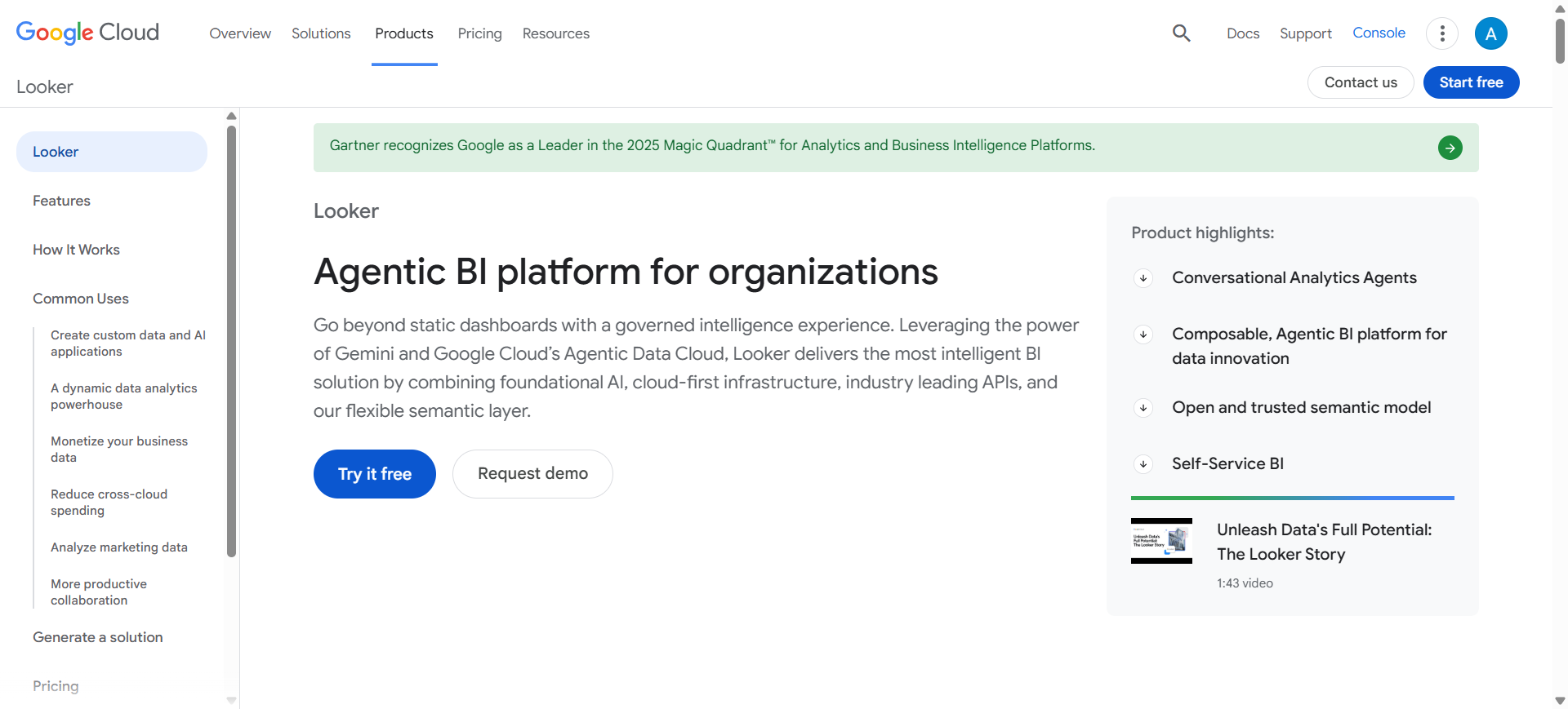
What is Looker AI
Looker AI is a business intelligence and data visualization platform developed by Google Cloud. It helps organizations explore, analyze, and visualize data through dashboards and reports connected to cloud data warehouses. The platform uses AI capabilities such as Gemini in Looker to generate visualizations, insights, and formatting suggestions using natural language prompts.
Looker focuses on centralized data modeling and analytics, allowing companies to build consistent metrics and dashboards across teams. It is widely used by organizations that manage large datasets in platforms like BigQuery and other cloud data systems.
How to Use Looker AI for Data Visualization
- Create a Looker account through Google Cloud and connect your data warehouse.
- Import datasets from platforms like BigQuery, SQL databases, or APIs.
- Use AI prompts or dashboards to generate charts and insights automatically.
- Customize dashboards, apply filters, and share reports with teams or stakeholders.
Benefits of Using Looker AI
- Connects directly with cloud data warehouses for large-scale analytics
- AI helps generate charts and visualizations faster
- Centralized data modeling ensures consistent metrics across dashboards
- Supports collaborative dashboards and team reporting
- Integrates easily with the Google Cloud ecosystem
Use Cases of Looker AI
A SaaS company can connect its customer usage data to Looker AI and build dashboards showing user growth, churn rates, and feature adoption. AI-powered insights help product teams quickly identify trends and improve product performance.
Pros
- Strong integration with Google Cloud and BigQuery
- Centralized data modeling for consistent analytics
- Powerful enterprise-level BI capabilities
Cons
- Requires technical setup and data modeling
- Expensive compared to smaller BI tools
- Best suited for cloud data environments
Pricing
Looker pricing is custom and based on platform usage and number of users, typically requiring an annual enterprise contract. Entry-level deployments can start around $60,000 per year, with larger enterprise implementations costing significantly more depending on scale.
Looker Studio, a lighter visualization tool in the ecosystem, has a free version, while Looker Studio Pro plans can start around $9 per user/month for teams.
Best For
Best for organizations using Google Cloud that need enterprise-grade data modeling and analytics dashboards.
5. ThoughtSpot AI
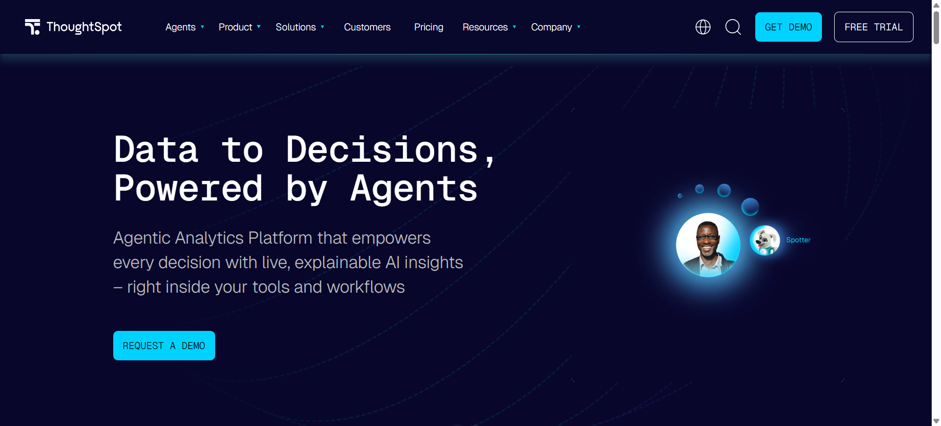
What is ThoughtSpot AI
ThoughtSpot AI is a search-driven analytics and data visualization platform that allows users to explore data using natural language queries. Instead of building dashboards manually, users can simply ask questions and the system automatically generates charts, insights, and visual answers. The platform includes AI features such as Spotter AI and SpotIQ, which analyze data, detect patterns, and surface insights automatically.
It is designed to make analytics accessible to business users without requiring SQL knowledge, while still supporting large enterprise datasets and cloud data warehouses.
How to Use ThoughtSpot AI for Data Visualization
- Sign up for ThoughtSpot Cloud and connect your data warehouse or database.
- Import datasets from sources such as Snowflake, BigQuery, or other cloud systems.
- Ask questions in natural language to generate charts and visual insights instantly.
- Customize dashboards or share visual reports with teams and stakeholders.
Benefits of Using ThoughtSpot AI
- Enables search-based analytics without writing SQL
- Automatically detects trends, anomalies, and correlations
- Generates charts and dashboards instantly from queries
- Works with modern cloud data warehouses
- Helps non-technical teams explore data independently
Use Cases of ThoughtSpot AI
A sales operations team can connect their CRM data to ThoughtSpot AI and ask questions like “Show monthly sales growth by region.” The platform instantly creates visual charts and highlights unusual trends, helping managers quickly identify high-performing markets and areas needing improvement.
Pros
- Powerful natural language search analytics
- Automated insights and anomaly detection
- Designed for large enterprise datasets
Cons
- Setup may require data modeling
- Pricing can be expensive for large deployments
- Customization options less flexible than some BI tools
Pricing
ThoughtSpot pricing starts around $25 per user/month for the Essentials plan and about $50 per user/month for the Pro plan, while large enterprise deployments use custom pricing based on scale and usage.
Enterprise implementations with large datasets can cost significantly more depending on data volume and query usage.
Best For
Best for organizations that want search-driven analytics and conversational data exploration.
6. Julius AI
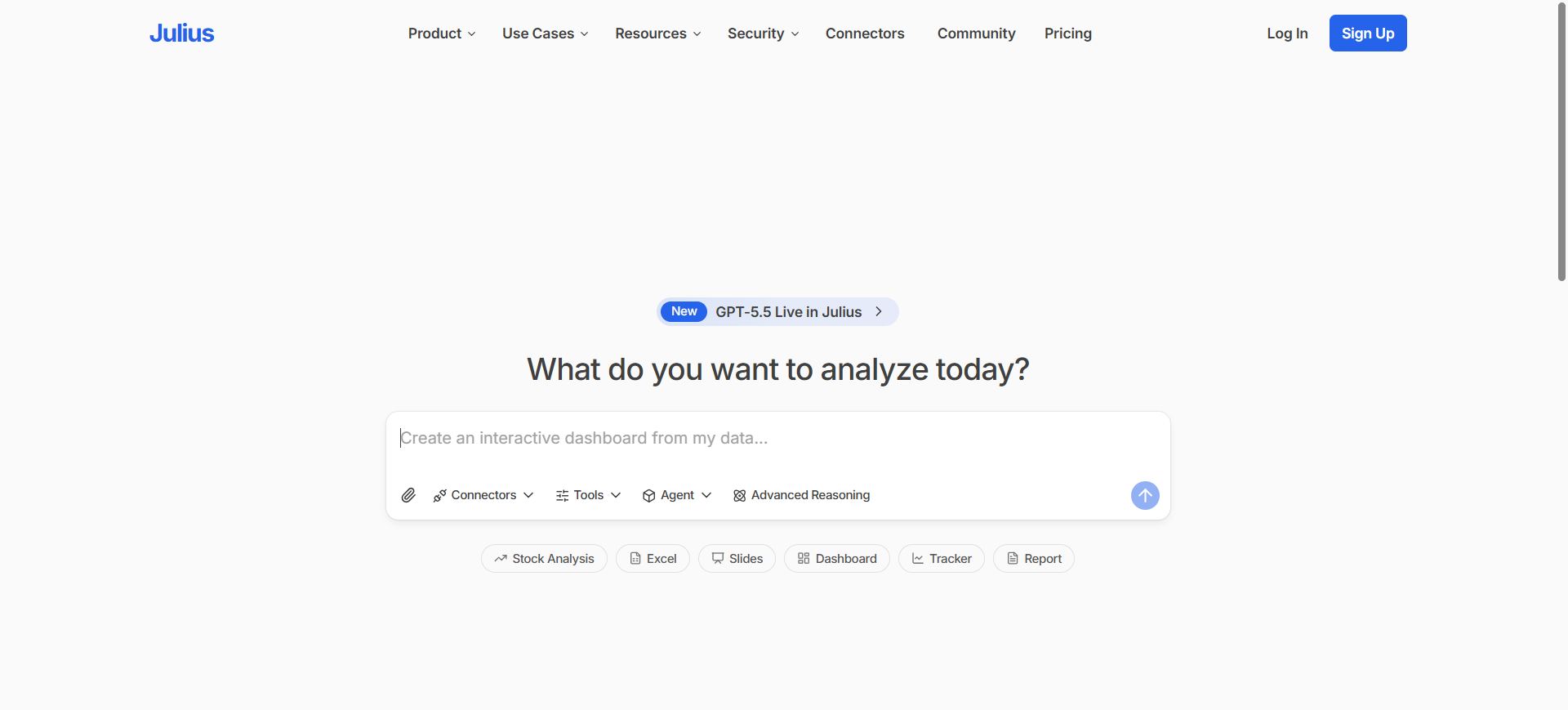
What is Julius AI
Julius AI is a conversational data analysis and visualization tool that allows users to analyze datasets using simple natural language questions. Instead of writing SQL queries or building dashboards manually, users can upload files or connect databases and ask questions about their data. The platform automatically generates charts, tables, and summaries based on those queries.
It works with common data sources like CSV files, Excel spreadsheets, Google Sheets, and databases such as Postgres or BigQuery. Julius AI is designed to help business teams quickly explore data and generate insights without advanced technical skills.
How to Use Julius AI for Data Visualization
- Create an account and sign in to the Julius AI platform.
- Upload datasets such as CSV, Excel, or connect a database.
- Ask questions in plain English like “Show sales trends by month.”
- The AI generates charts, insights, and tables that can be exported or shared.
Benefits of Using Julius AI
- Allows non-technical users to analyze data without coding
- Generates charts and insights instantly from questions
- Works with spreadsheets and databases easily
- Saves analyses in notebooks for repeatable reports
- Speeds up data exploration and decision-making
Use Cases of Julius AI
A marketing team can upload campaign performance data into Julius AI and ask questions like “Which channel generated the highest ROI?” The platform instantly produces charts and summaries that help the team identify top-performing campaigns and adjust their marketing strategy.
Pros
- Very easy to use with natural language queries
- Fast chart generation from datasets
- No coding or SQL knowledge required
Cons
- Limited customization compared to BI platforms
- Can struggle with very complex datasets
- Not designed for full enterprise dashboard systems
Pricing
Julius AI offers a free plan for basic analysis with limited usage. Paid plans typically start around $16–$20 per month, while advanced Pro plans can reach about $37–$40 per month, depending on features and usage.
Enterprise plans with collaboration and larger data capacity are available with custom pricing.
Best For
Best for marketers, analysts, and business teams who want quick data insights without writing code.
7. Domo AI
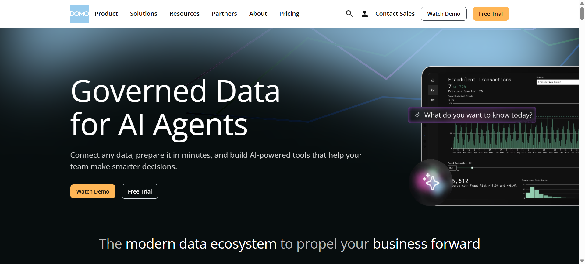
What is Domo AI
Domo AI is an AI-powered data analytics and visualization platform that helps organizations transform raw data into interactive dashboards and insights. It combines business intelligence tools with artificial intelligence to analyze large datasets, detect trends, and generate automated reports.
The platform includes features like AI Chat, which allows users to ask questions about their data using natural language and receive instant visual insights. This helps both analysts and business users explore data faster without complex queries.
Domo AI is commonly used by enterprises to monitor business performance, create real-time dashboards, and automate data analysis across departments such as marketing, sales, and operations.
How to Use Domo AI for Data Visualization
- Create a Domo account and connect your data sources such as databases, spreadsheets, or cloud services.
- Import datasets using Domo’s connectors and data integration tools.
- Use AI Chat or dashboard tools to automatically generate charts and insights.
- Customize visual dashboards and share them with teams or stakeholders.
Benefits of Using Domo AI
- Generates real-time dashboards from multiple data sources
- AI chat interface simplifies data exploration
- Supports predictive analytics and automated alerts
- Integrates with hundreds of business applications
- Enables organizations to monitor business performance in one platform
Use Cases of Domo AI
A retail company can connect sales, inventory, and marketing data to Domo AI to build real-time dashboards showing product performance. Managers can quickly identify which products are selling faster and adjust inventory or marketing strategies accordingly.
Pros
- Powerful real-time dashboards and analytics
- Large library of data connectors
- AI-powered insights and automation
Cons
- Expensive compared to many BI tools
- Setup can require technical expertise
- Pricing model can be complex
Pricing
Domo AI uses custom enterprise pricing based on usage, data volume, and number of users. Typical implementations start around $50,000–$75,000 per year for small enterprise deployments, with costs increasing based on scale and AI usage.
The platform uses a consumption-based pricing model where AI operations and data processing affect overall cost.
Best For
Best for large organizations that need real-time business dashboards and enterprise-level analytics.
8. Zoho Analytics AI
What is Zoho Analytics AI
Zoho Analytics AI is a business intelligence and data visualization platform that helps organizations analyze data and create dashboards using artificial intelligence. The platform includes Zia, Zoho’s AI assistant, which allows users to ask questions in natural language and instantly generate charts, reports, and insights.
It connects to hundreds of data sources such as databases, cloud apps, spreadsheets, and APIs. Businesses use Zoho Analytics AI to monitor performance metrics, discover patterns in data, and build interactive dashboards without complex technical skills.
How to Use Zoho Analytics AI for Data Visualization
- Create a Zoho Analytics account and connect your data sources such as spreadsheets, databases, or cloud apps.
- Import or sync data into the platform using built-in connectors.
- Use the Zia AI assistant to ask questions and automatically generate charts and dashboards.
- Customize visualizations, apply filters, and share reports with your team.
Benefits of Using Zoho Analytics AI
- Natural language queries make analytics accessible for non-technical users
- Automatically generates dashboards and insights using AI
- Connects with hundreds of business apps and data sources
- Supports predictive analytics and anomaly detection
- Cost-effective analytics platform for businesses
Use Cases of Zoho Analytics AI
A marketing team can connect campaign data from Google Ads, CRM systems, and website analytics into Zoho Analytics. Using the Zia assistant, they can generate dashboards showing conversion rates, traffic sources, and campaign ROI to improve marketing performance.
Pros
- Easy to use with AI assistant Zia
- Strong integrations with business apps
- Affordable pricing compared to many BI tools
Cons
- Performance may slow with very large datasets
- Advanced customization can require technical knowledge
- Interface can feel complex for first-time users
Pricing
Zoho Analytics offers a free plan for small teams, while paid plans start around $25–$30 per month depending on users and data capacity. Enterprise plans can reach $145–$575 per month with advanced analytics and larger datasets.
The Zia AI assistant is included within Zoho Analytics plans at no additional cost.
Best For
Best for small and medium businesses that want affordable AI-powered dashboards and business analytics.
9. Metabase AI
What is Metabase AI
Metabase AI is an open-source business intelligence and data visualization platform that helps teams explore and visualize data from databases. It includes an AI assistant called Metabot, which allows users to ask questions in natural language and automatically generate SQL queries, charts, and insights.
The platform connects directly to databases such as PostgreSQL, MySQL, and cloud data warehouses. It is widely used by startups and data teams to create dashboards, track metrics, and analyze business performance without complex BI tools.
How to Use Metabase AI for Data Visualization
- Install the open-source version or sign up for Metabase Cloud.
- Connect your database or upload datasets such as CSV files.
- Use Metabot or the query builder to create charts and dashboards.
- Customize dashboards and share visual reports with your team.
Benefits of Using Metabase AI
- Open-source platform with strong community support
- AI assistant helps generate SQL queries and charts
- Works with many databases and cloud data sources
- Quick dashboard creation with simple query builder
- Ideal for startups and small analytics teams
Use Cases of Metabase AI
A SaaS startup can connect its PostgreSQL database to Metabase AI and create dashboards that track user growth, subscription revenue, and feature usage. The team can quickly analyze product metrics and monitor performance without building a complex analytics system.
Pros
- Free open-source version available
- Simple dashboard and query builder
- Supports many databases
Cons
- Advanced analytics features are limited
- Requires technical setup for self-hosting
- AI capabilities are still evolving
Pricing
Metabase offers a free open-source edition that can be self-hosted with no license cost. Managed cloud plans start around $100 per month for 5 users, with additional users costing about $6 per month each.
Pro plans start around $575 per month for 10 users, while enterprise deployments use custom pricing depending on scale and security requirements.
Best For
Best for startups and development teams that want an open-source BI tool for database analytics and dashboards.
10. Basedash AI
What is Basedash AI
Basedash AI is an AI-native business intelligence and data visualization platform designed to help teams analyze data using natural language. Instead of writing SQL queries or building dashboards manually, users can simply describe what they want to track, and the platform automatically generates charts and reports.
The tool connects directly to databases and business data sources, allowing users to ask questions about their data and instantly visualize the answers. It focuses on simplifying analytics so teams can build dashboards, track metrics, and discover insights quickly without complex technical setup.
How to Use Basedash AI for Data Visualization
- Create a Basedash account and connect your database or data source.
- Import data from SQL databases or business applications.
- Ask questions or describe the dashboard you want to build using prompts.
- The AI generates charts and dashboards that you can customize or share.
Benefits of Using Basedash AI
- Generates dashboards quickly using simple prompts
- Automatically writes and runs SQL queries with AI assistance
- Connects directly to databases for real-time analytics
- Helps teams explore data without advanced technical skills
- Provides automated insights and trend detection
Use Cases of Basedash AI
A startup product team can connect their PostgreSQL database to Basedash AI and ask questions like “Show monthly active users and retention trends.” The platform instantly generates charts and dashboards that help the team monitor product growth and user engagement.
Pros
- Very fast dashboard creation with AI prompts
- Works directly with databases and SQL
- Simple interface for non-technical users
Cons
- Limited visualization customization compared to large BI tools
- Best suited for SQL databases
- Smaller ecosystem compared to enterprise analytics platforms
Pricing
Basedash offers a 14-day free trial that includes full feature access so teams can test AI dashboards and analytics. Pricing typically scales based on seats, usage, and AI actions, with monthly and annual plans available.
Enterprise deployments may include custom pricing, additional AI usage credits, and self-hosted or VPC deployment options.
Best For
Best for startups and product teams that want fast AI-powered dashboards directly from their databases.
Where AI Is Used in Data Visualization
Artificial intelligence enhances many stages of the data visualization process, from data preparation to insight generation. Instead of manually building charts or running complex queries, AI systems can analyze large datasets, detect patterns, and automatically generate visual reports. This allows teams to explore data faster and identify meaningful insights without deep technical expertise.
AI is commonly used in the following areas of data visualization:
1. Automated Chart Generation
AI can analyze datasets and automatically choose the most appropriate chart type, such as bar charts, line graphs, or heat maps. This reduces the time required to manually design visualizations.
2. Natural Language Queries
Many modern analytics platforms allow users to ask questions in plain language. For example, a user can type “Show monthly revenue trends,” and the AI generates a chart based on that request.
3. Pattern and Trend Detection
AI algorithms analyze large datasets to identify trends, correlations, and unusual patterns. These insights are often highlighted automatically in dashboards.
4. Predictive Analytics Visualization
AI models can forecast future outcomes such as sales trends or customer demand. These predictions are then visualized through charts and interactive dashboards.
5. Automated Data Preparation
AI tools can clean, organize, and transform raw data before visualization. This helps ensure charts and dashboards are based on accurate and structured datasets.
Benefits of AI Data Visualization Tools
- Faster data analysis – AI quickly processes large datasets and generates visual insights in seconds.
- Easy for non-technical users – Natural language queries allow users to explore data without coding or SQL skills.
- Automatic insight discovery – AI detects trends, patterns, and anomalies that might be missed in manual analysis.
- Real-time dashboards – Data visualizations update automatically as new data is added.
- Reduced manual reporting – Automated charts and dashboards save time and reduce repetitive analytics work.
Who Should Use AI Data Visualization Tools
Business Analysts
Business analysts use AI data visualization tools to explore datasets, identify trends, and create interactive dashboards. These tools help them analyze large volumes of data faster and present insights clearly to stakeholders.
Marketing Teams
Marketing teams rely on AI visualization tools to track campaign performance, customer behavior, and conversion rates. Visual dashboards make it easier to understand which campaigns are performing well and where improvements are needed.
Sales Teams
Sales teams can monitor revenue growth, pipeline performance, and regional sales trends using real-time dashboards. AI-powered visualizations help sales managers quickly identify opportunities and potential issues.
Product Managers
Product managers use these tools to analyze product usage, feature adoption, and customer engagement. Data visualizations help them make better decisions about product improvements and future development.
Executives and Decision Makers
Executives benefit from high-level dashboards that summarize business performance. AI-generated insights allow them to understand key metrics quickly and make strategic decisions based on data.
How to Choose the Right AI Data Visualization Tool
Selecting the right AI data visualization tool depends on your data sources, team skills, and analytics goals. Modern tools differ in features such as natural language analytics, dashboard customization, and real-time data integration, so evaluating these factors helps ensure the platform fits your workflow.
Here are the key factors to consider when choosing an AI data visualization tool:
Data Integration
Choose a tool that connects easily with your existing data sources such as databases, spreadsheets, and cloud platforms.
Ease of Use
Look for platforms with simple dashboards, drag-and-drop builders, and natural language queries for quick analysis.
AI Features
Select tools that offer automated chart generation, predictive analytics, and AI-driven insights.
Customization
Ensure the platform allows flexible dashboards, chart customization, and easy report sharing.
Scalability and Security
Pick a tool that supports large datasets, real-time analytics, and strong security controls for data protection.
Future of AI Data Visualization Tools
AI data visualization tools are becoming more intelligent and automated. Future platforms will generate charts, insights, and summaries automatically using natural language queries and AI copilots.
Real-time dashboards, predictive analytics, and automated anomaly detection will help organizations move from simple reporting to proactive decision-making. As AI continues to improve, these tools will make advanced data analysis faster, more accessible, and easier for both technical and non-technical users.
Conclusion
AI data visualization tools are changing how organizations analyze and understand data. By automating chart creation, detecting patterns, and enabling natural language queries, these platforms make data insights faster and easier to access. Choosing the right tool depends on your data sources, team skills, and analytics needs, helping businesses turn complex data into clear, actionable insights.
FAQs
Which AI tool is best for data visualization?
The best AI data visualization tool depends on your needs. Platforms like Tableau AI and Microsoft Power BI AI are popular for enterprise analytics, while tools like ThoughtSpot AI and Julius AI focus on conversational data analysis and faster insights.
Can AI automatically create dashboards?
Yes, many modern AI visualization tools can automatically generate dashboards by analyzing datasets. Users can upload data or connect databases, and the AI suggests or creates charts and reports based on the structure of the data.
Do AI visualization tools require coding skills?
Most AI data visualization platforms are designed for non-technical users. They offer drag-and-drop dashboard builders and natural language queries, allowing users to analyze data without writing SQL or programming code.
How do AI data visualization tools work?
These tools use machine learning and natural language processing to analyze datasets, detect patterns, and recommend visualizations. The AI processes the data and automatically generates charts, dashboards, or insights.
What features should I look for in an AI data visualization tool?
Important features include natural language queries, automated chart generation, real-time dashboards, strong data integrations, predictive analytics, and secure data management capabilities.
Are AI data visualization tools suitable for small businesses?
Yes, several AI visualization tools are designed for small and medium businesses. Platforms such as Zoho Analytics, Metabase, and Julius AI offer affordable plans and easy-to-use dashboards.
Share :
