15+ Vertical Billboard Examples to Download
Every business establishment knows that advertising is vital to make their products and services known to the public. However, only a few understood the importance of proper dissemination of ideas as well as hitting the target market. If you are advertising on an area that is not conducive for your target market, your advertisement is not an effective one and you are just wasting your effort, time, and money in the making of those marketing tools. One of the advertising strategies that you must fully utilize because of the cost it entails is the billboards. Billboards are proven effective in disseminating information especially when placed in proper areas and with designs that are perfectly fit for your products and services.
Having a hard time designing your billboards? Check out the examples of designs below and choose one that you prefer for your advertisement.
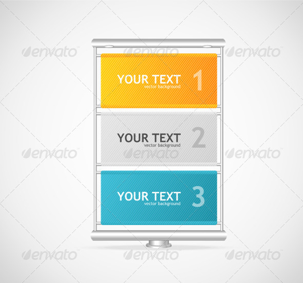
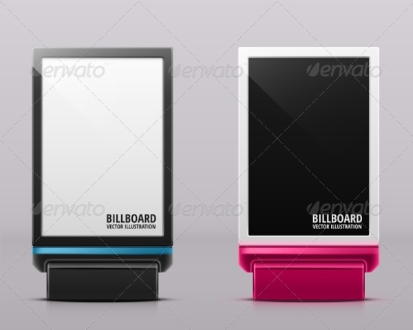
Vector Vertical Billboard
Blank Posters or Billboards
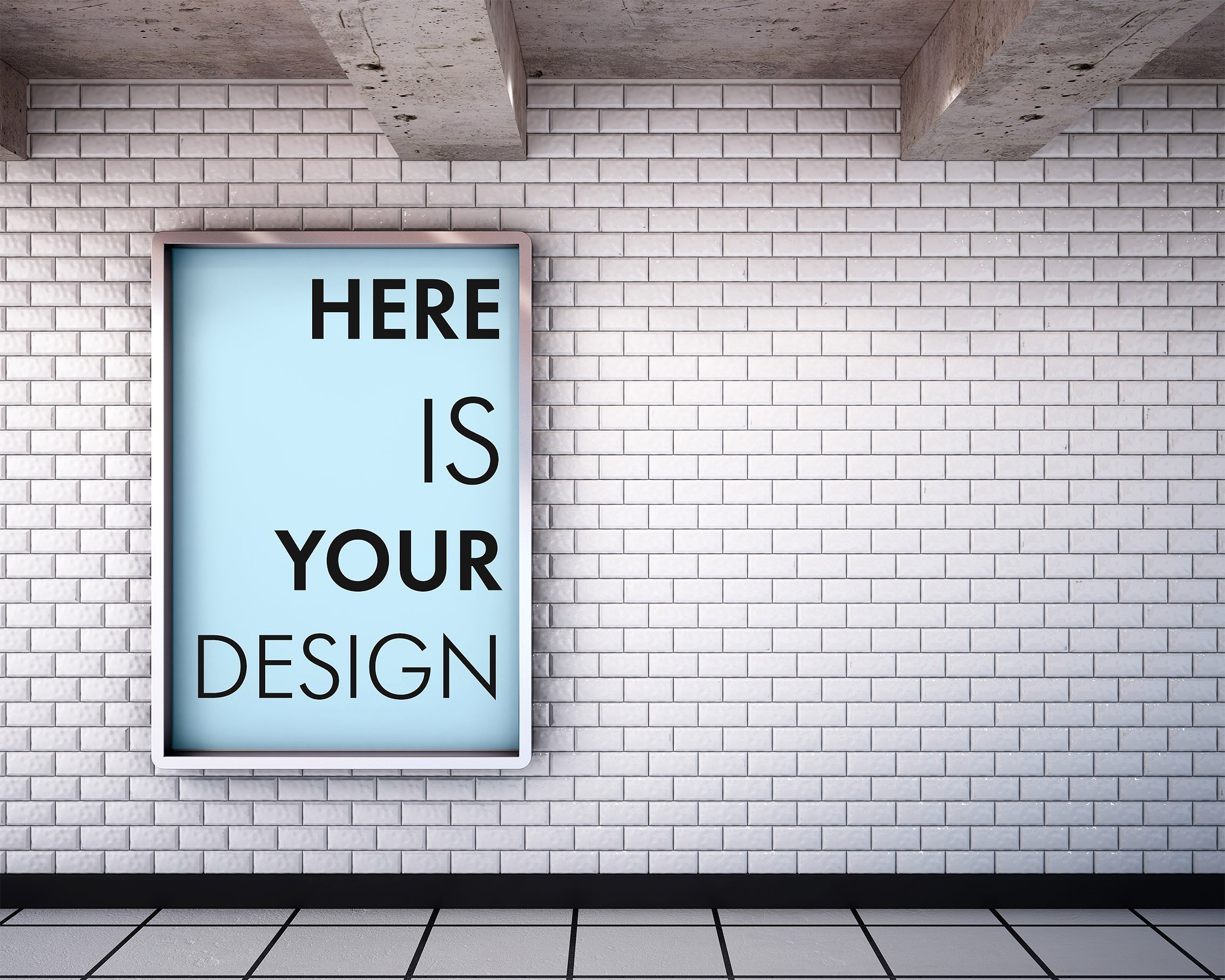
Citylight Blank Vertical Billboard
How to Design an Eye-Catching Billboard
1. Poor vs Great Design
In determining whether or not you have a great design for outdoor advertising, you must have an eye on the lapses that billboard designers commonly commit. On the other hand, you can determine that your billboard is a successful onw if it is readable even by those travelers and drivers running at great speed. There are some things that you must avoid when making your billboard design. They are as follows:
- Clutter. As what experts would always say, keep your billboards simple and direct. Including too much designs and decoration would only make it appear clutter. Additionally, the images you include, if there are too much, cannot be recognizable as seen from afar. This will only make your billboard not interesting at all and not worth the time to take a glance, hence not leaving an impression to the viewer. You may also see signage and billboard designs and examples
- Lack of contrast. Too many color combination can weaken the focus of the message in your billboard. This would also result in low contrast and conflicting emotional responses. Your billboard will seem not organized at all if colors are not used or combined properly. Also note that colors carry their own messages and produce their own subconscious meaning. They will also give an impact and is something that customers can associate with to a certain brand because of certain color combinations. Some color combination will not work simply because they have similar intensity or hue or value. For example, green text in blue background has a low visibility because they are alike in hue and value. Great examples of color combinations, with hierarchy starting from the sharpest color combination with high readability are as follows:
- Yellow background, black font
- White background, black font
- Black background, yellow font
- Black background, white font
- White background, blue font
- Blue background, white font
- Yellow background, blue font
- Blue background, yellow font
- White background, red font
- Red background, white font
You may also like examples of advertisement design
- Small fonts. Be cautious in including details in your billboards for you might never expect that you are already overcrowding your design. You need to scale your fonts so you would know if it is still readable from afar. This is important because you might miss the chance of conveying your message to the viewers since it is unlikely that drivers who cannot read your billboard would dare to look at it again in an attempt to read the small fonts. Large fonts are more appropriate for the important information that you are including in your billboard. The ideal letter height in a certain readable distance are as follows:
- 48 inches – 480 feet
- 36 inches – 360 feet
- 24 inches – 240 feet
- 18 inches – 180 feet
- 12 inches – 120 feet
You may also check out vertical banner designs and examples
- Unreadable fonts. This is another thing that you must be careful in the creation of you billboards—unreadable fonts. Too fancy, cursive, with decorations, and ornate font styles are very hard to read especially from afar. It takes time to read complicated fonts; hence, drivers and moving viewers do not care at all if they cannot read your text as they pass by. You must know what fonts are considered good and appropriate for your billboards and those that are very poor and are not recommended for your designs.
- Good font – These are those that can be quickly read and discerned from afar, are evenly spaced, and are not too thick nor too thin enough that it might affect its readability. You may also see examples of banner design
- Poor font – On the other hands, poor fonts are those with details that will fade into background when seen from afar, those that lose their shapes as they are seen from a distant, those with designs that are fancy or cursive, and those that are too thin and too think which hinders readability. You may also like examples of advertising banner design
Vertical Lightbox Billboard Mockup
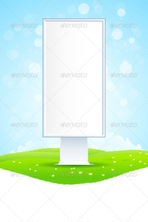
Empty Billboard on Green Landscape
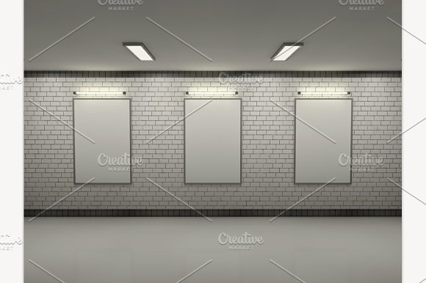
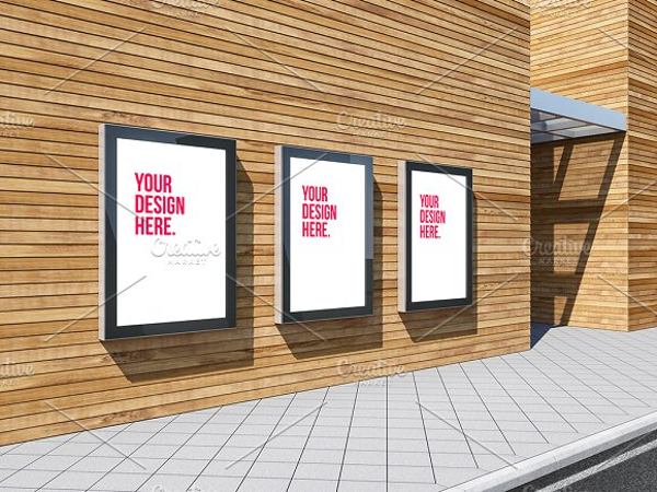
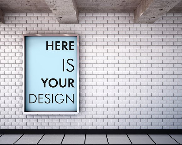
Vertical Posters in the Subway Mockup Set
2. Guidelines in Creating a Billboard
You have to know the basic guidelines in creating billboards for your designs to be effective and eye-catching. They are as follows:
- The golden rule. The golden rule for outdoor advertising is to have six words or less. The lesser the words, the more impact it gives to the people. Viewers can easily read and take in few words especially if they are commuting and travelling as opposed to many words in a single billboard. That only makes your billboard full of clutter and is not interesting at all. You may also see examples of vector design
- Concise message. Be direct and concise to what you would like to say to your target market. This is most efficient advertisement as compared to those that are full of details. People on the streets don’t have enough time to read the full details in your billboard so it is not necessary that you include them. Just filter and cut your words to the shortest length possible but still with compact and fully understable message. You may also like vertical banner designs and examples
- Right font. As has been discussed above, you have to discern on the font type and font size to be used for your billboards. You have to ensure readability as this is the main purpose of your billboard, to disseminate information. It will lose its purpose the moment the audience will turn away from your billboard just because it is not readable because of the fonts that you are using. You may also check out pop-up banner designs & examples
- Simple graphics. Another thing that you must bear in mind is to not include complex graphics. Do not overdecorate your billboards with graphics that are unrelated to the products or services that you are offering. If an image is needed to enhance your billboard, choose the most simple one, and yet those that still stand out from the crowd. It doesn’t have too many details as your target viewers do not have the luxury of time to see those details. Be extra careful also in the composition of your image, the size, the pixels, the resolutions, and contrasts, and better ask for experts’ guidance in choosing an image for your billboard. You may also see printable banner examples
- Colors and contrasts. To reiterate, choose colors that have great readability intensity. As stated above, the color combination with the highest visibility is yellow background with black text. This ensures that the text in your background is readable enough even for the drivers at full speed. This does not also produce optical color distortion in the human eye. A quick tip: black works well with any light colors while white works well with any colors with dark values. You may also like roll-up banner designs & examples
- Lasting impression. If your advertisement does not create impact and impression to your audience, it is meaningless at all. They will not get interested in your offer and they will easily forget your ad. Hence, go beyond what is commonly used by most advertisements but still adhere to the basic guidelines in creating a billboard. For example, you might include a touh of humor, surprise, and beauty, leaving them wondering in awe and thinking about your advertisement afterwards. You may also check out examples of banner ads
- Readability test. Do the readability test or the arm’s length test in when you create your billboard. To perform this, print a design in a business card size. Hold this out in an arm’s length and assess if you can still read it from that far. If not, refine your design until you can read it and until you achieve the output that you desire. You may also see examples of anniversary banner designs
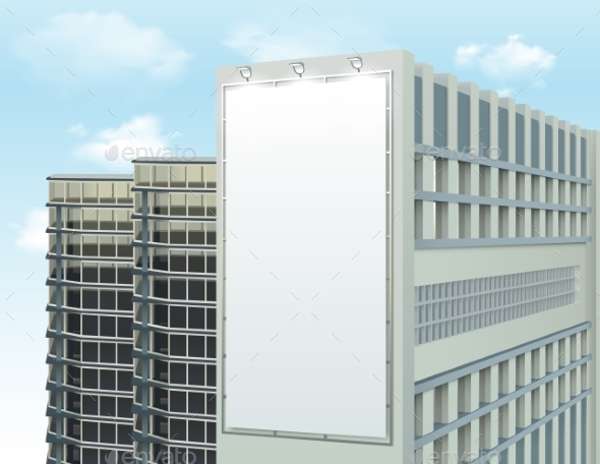
Vertical or Horizontal Billboard
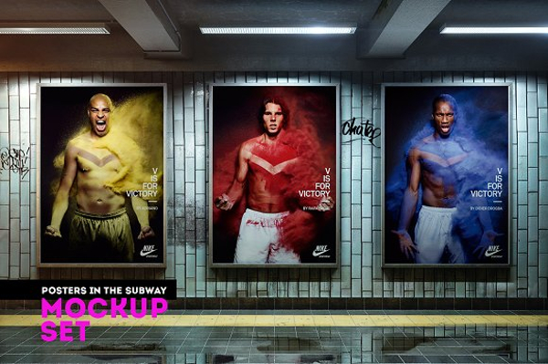
Mockup Billboards in the Subway
Blank Vertical Rectangular Banner with Ad Space Vector Illustration
3. Additional Enhancements
- Three-dimensional. You may add a 3D effect to your billboards where you add a pop up image or realistic image that will separate from your background and the basic design. You may include lifelike surprise that can create an memorable impression even at first glance. You may also see company banner examples
- Glitter and glow. There are products that are offer glitter and glow designs that would make your billboard stand out from the rest. Examples of these products include Gloskin and Scotchlight. This will make your billboard different from the classic plain one. You may also like tips for designing effective banner ads
- Extensions. Aside from the space intended for the billboard, you may add extensions that can go beyond the margins of your panel. There are regulations regarding the maximum allowable size of billboards which depends on the ordinances on the state you are making your advertisement. Make sure that you know the maximum size so that even if you go beyond the rectangular size of your billboard, still, you are not violating any rule in your state. You may also check out examples of superb birthday banners
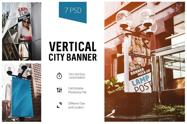
Vertical City Banner Mock-Up
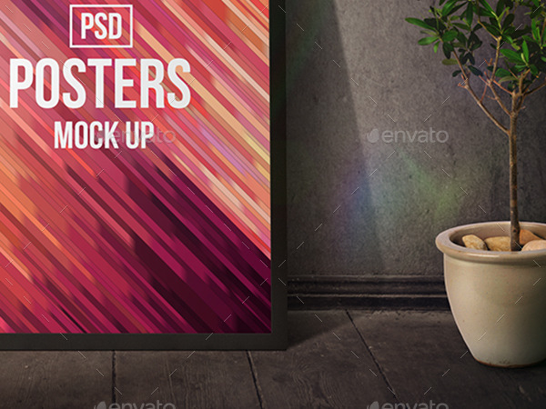
Vertical Posters Mockups
Vertical White Advertising Billboard

Two Vertical Billboards
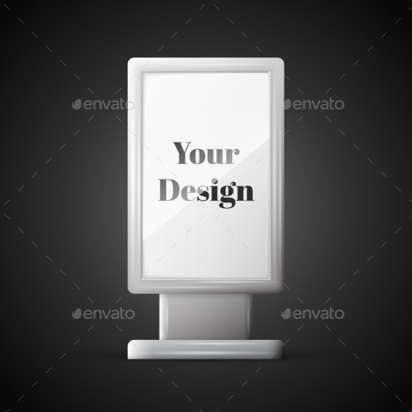
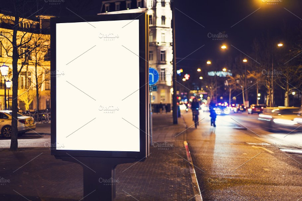
Kiosk Billboard at Night
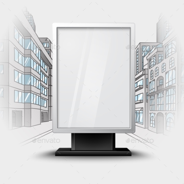
Blank White Vertical Billboard on City Scape
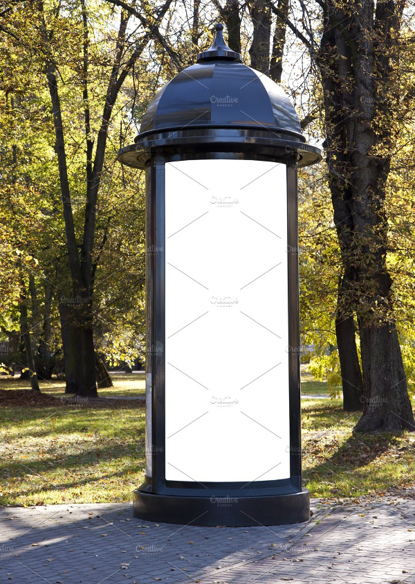
Billboard in the Park
In Sum…
There are a lot of things that you must consider in creating your own billboard. You have to determine what design is great and poor when it comes to outside advertising; the pitfalls of designs such as clutter, lack of contrast, unreadable fonts, and small fonts; the guidelines in creating designs for billboards which includes knowing the golden rule, concise message, right font, simple graphics, colors and contrasts, lasting impression, and readability test; and additional enhancements for your billboard such as making it three-dimensional as well as adding glitter and glow and extensions. You may also like event banner examples
Lastly, if you want other billboard ideas, check out the examples above.
Share :
