03
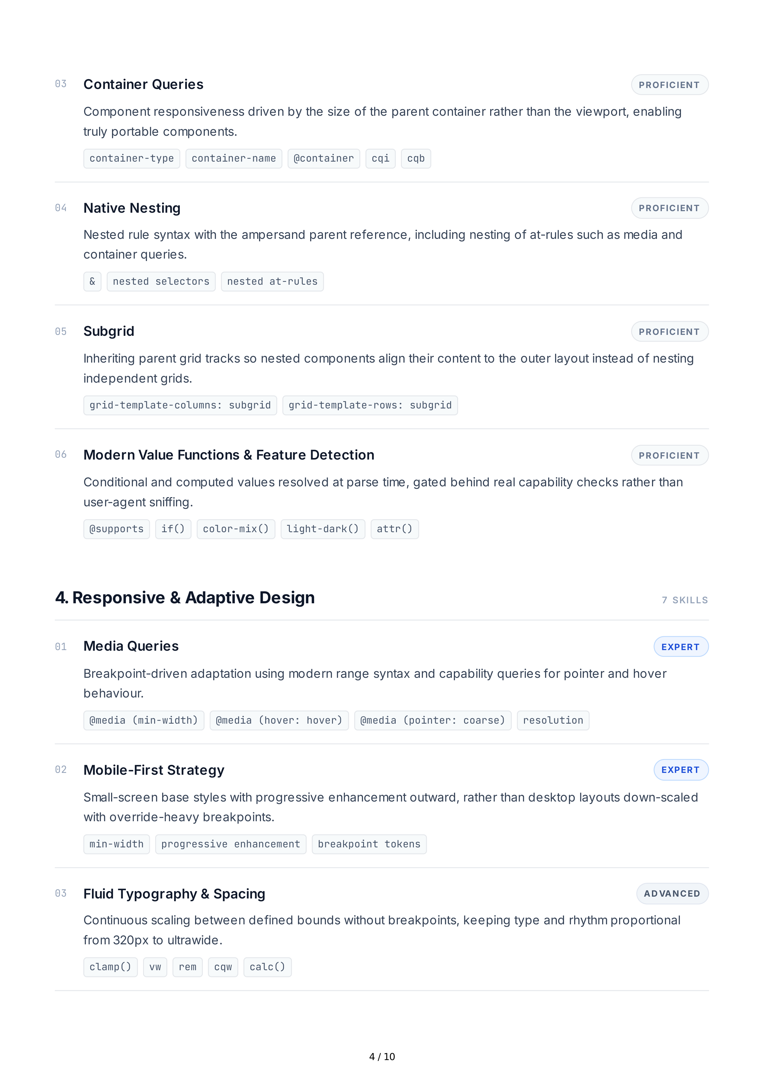
Container
Queries
PROFICIENT
Component
responsiveness
driven
by
the
size
of
the
parent
container
rather
than
the
viewport
,
enabling
truly
portable
components
.
container-type
container-name
@
container
cqi
cqb
04
Native
Nesting
PROFICIENT
Nested
rule
syntax
with
the
ampersand
parent
reference
,
including
nesting
of
at
-
rules
such
as
media
and
container
queries
.
&
nested selectors
nested at-rules
05
Subgrid
PROFICIENT
Inheriting
parent
grid
tracks
so
nested
components
align
their
content
to
the
outer
layout
instead
of
nesting
independent
grids
.
grid-template-columns: subgrid
grid-template-rows: subgrid
06
Modern
Value
Functions
&
Feature
Detection
PROFICIENT
Conditional
and
computed
values
resolved
at
parse
time
,
gated
behind
real
capability
checks
rather
than
user
-
agent
sniffing
.
@
supports
if()
color-mix()
light-dark()
attr()
4.
Responsive
&
Adaptive
Design
7
SKILLS
01
Media
Queries
EXPERT
Breakpoint
-
driven
adaptation
using
modern
range
syntax
and
capability
queries
for
pointer
and
hover
behaviour
.
@
media (min-width)
@
media (hover: hover)
@
media (pointer: coarse)
resolution
02
Mobile
-
First
Strategy
EXPERT
Small
-
screen
base
styles
with
progressive
enhancement
outward
,
rather
than
desktop
layouts
down
-
scaled
with
override
-
heavy
breakpoints
.
min-width
progressive enhancement
breakpoint tokens
03
Fluid
Typography
&
Spacing
AD VANCED
Continuous
scaling
between
defined
bounds
without
breakpoints
,
keeping
type
and
rhythm
proportional
from
320
px
to
ultrawide
.
clamp()
vw
rem
cqw
calc()
4 / 10